April 27, 2020
Regardless of how you create a logo, you've to know what good logo design is. The way you can do that is by being aware of common mistakes.
In today’s crowded online world, it doesn’t take consumers much time to interact with a brand and decide they want to move on. That’s why, as a small business owner, your brand needs to make a strong first impression and grab your audience’s attention from the start.
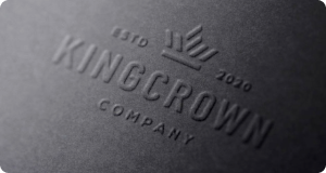
As a crucial part branding is your logo. It can make or break your business’s reputation. In fact, it’s often the first thing your leads and potential customers will look at in order to determine whether you’re worth their time.
In recent years logo creator technology has emerged and changed how many businesses, especially small bootstrapped business create logos. And, although, these logo design tools are amazing they are far from perfect, and you should not rely on them to make pixel-perfect logos. However, the same is true if you use a graphic designer.
The main take away here is that regardless of how you create a logo by tech or human, you as the business owner have to know what a good final logo design should look like. The way you can do that is by being aware of common logo design mistakes.
Your target audience is to your logo what ink is to a printer. Crucial! The point of your logo is to entice your audience to learn more about your business and (hopefully) engage with your offer. But in order to do that, your logo has to appeal to them from the moment they lay eyes on it.
With free graphic design tools it’s become easier than ever for businesses to get creative, unfortunately, many companies create designs that they like, rather than trying to imagine what will speak to the specific audience they’re trying to attract.
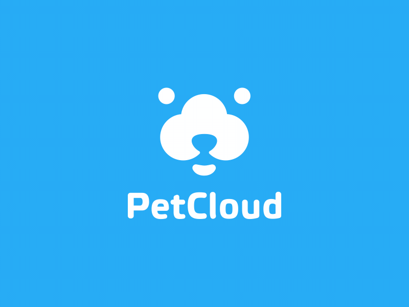
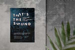
Pet Cloud by Maksim Marakhovskyi
Picture a children’s entertainment company with a black logo sporting gothic fonts. Or, imagine a funeral home with a pink logo. How likely will you be to give your business to either one?
At each step of the logo design process, remember to have your audience in mind.
Don’t get me wrong, it’s a great idea to check out what your competitors are doing and get inspiration from them. However, brands mess up when they go so far as to make a logo that’s all but a copy of their competitors’ designs.
Not only does this border on trademark infringement, but it also hurts your brand’s memorability in the long run.
ok boomer pic.twitter.com/NB617NDFLV
— Slack (@SlackHQ) November 21, 2019
Your logo should be unique to your brand and easily remembered - neither of which is possible if it looks like everyone else’s logo in your niche. Part of what helped Nike become, well, Nike, is that their Swoosh was the only symbol of its kind found in the sports apparel space.
So, don’t be afraid to get ideas from your competition, but try going with a unique icon or switching up your color palette. Which brings us to...
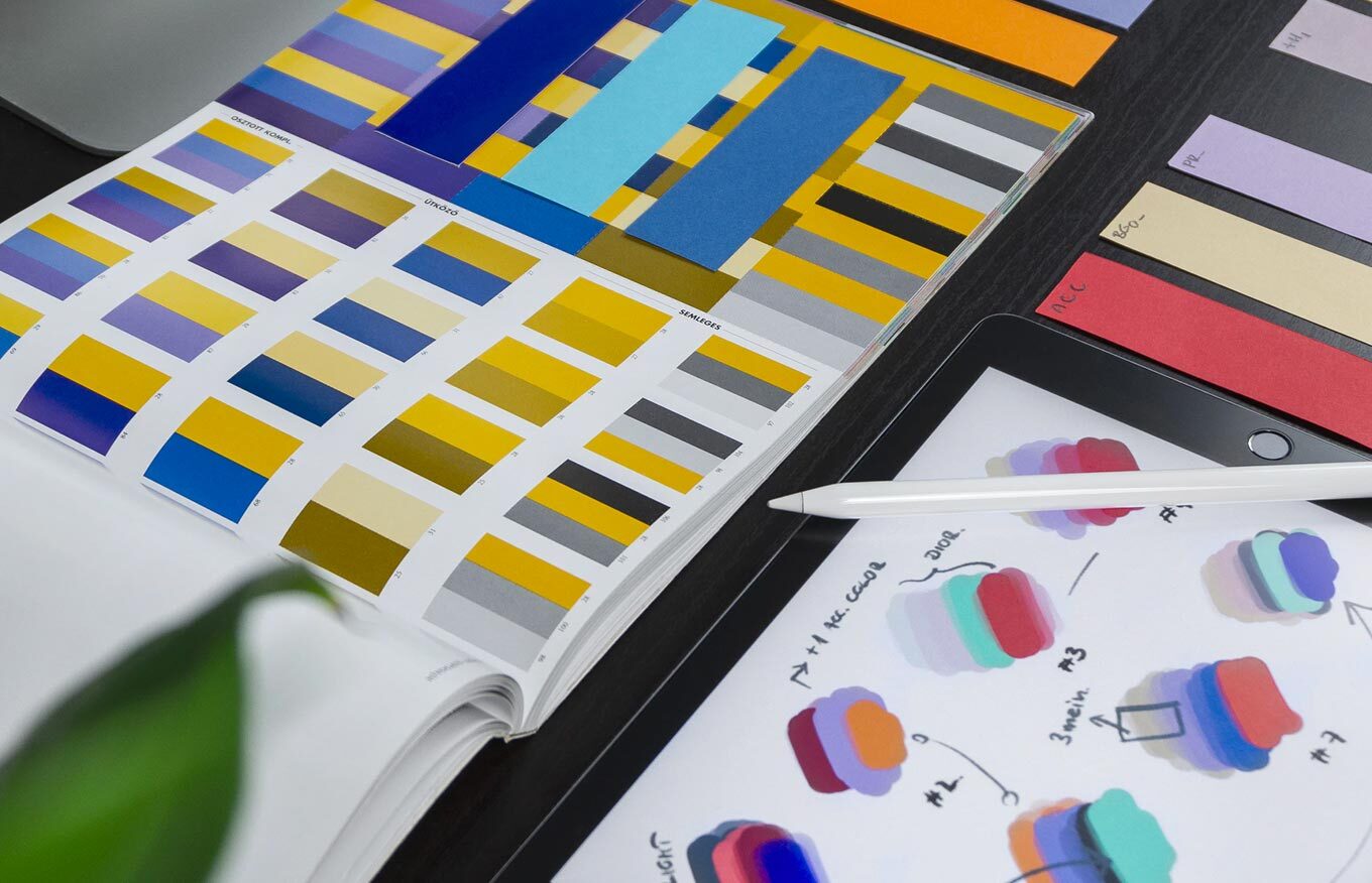
Color psychology, or the effect that colors have on the way we feel and behave, will play a huge role in how effective your logo is. Your logo’s colors are more than just a pleasing aesthetic; they’re a direct signal to your audience about the meaning behind your logo.
And, while you may adore a specific shade of plum or feel blown away by a pale yellow, that’s not enough of a reason to include them in your logo design.
If you’ve already chosen colors for your brand and logo, get familiar with the meaning behind the palette before committing to them. Blues signify sophistication and trustworthiness; reds convey passion and excitement, etc.
Make sure that the colors you choose represent aspects about your brand that you think your customers will connect with.
What, by definition, is a “wrong” typeface for a logo?
For starters, if your audience can’t read your logo font, it might as well not be there at all. Companies often choose hyper-script fonts that seem sophisticated but aren’t legible, or customized typefaces that can’t be sized down.
As a rule of thumb, your logo name needs to be clearly visible, regardless of the size of your logo. Also, like colors, different fonts have different meanings; whether you want your customers to get an elegant and traditional vibe (serif) or think of your brand as bold and innovative (slab serif), you need to choose the font that will send the right message.
The beauty about design is there are loads of elements at your disposal — every type of font; all sorts of color combinations; icons upon icons that seem perfect for your brand.
But one of the biggest mistakes people make is finding a bunch of design elements they love — and then using them all.
Logo Animation for Snapp! by Ali Nazari
In the case of logo design, less is definitely more. It takes approximately 10 seconds for your audience to form an opinion about your logo, and if the design is too messy or complicated, it will instantly turn them off.
To avoid this, choose one font type, between two and three colors, and up to one icon maximum. Make sure they work in harmony together, and you’re good to go.
People love to do what’s trending, but that’s one of the biggest mistakes you can make when designing your logo.
Logo design trends — like gradients or water colors — quickly become outdated, and the last thing you want is for people to think of your brand as tacky and irrelevant.
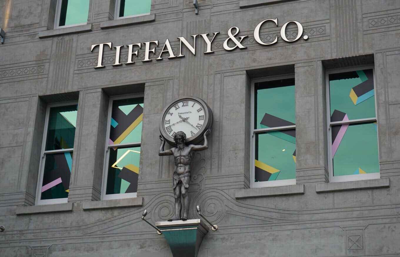
Instead, aim for a timeless logo design, so that your brand stays relevant regardless if you’ve just launched your business or are in your tenth year of success.
If you’re not sure what makes a logo “timeless,” look at the big brands that have been around for decades (think Apple, Tiffany’s, Pepsi, NBC, etc.) and see what they have in common. Then, apply those features to your own logo!
As long as you keep these above mistakes in mind, you should have no trouble designing a logo that makes a long-lasting impact on your audience. Remember to check that your design is timeless, memorable, unique, and different from competitors, and don’t forget to enjoy the creative process!

0 downloads available to unregistered users! Create a free account to get this and explore thousands more files. Already have an account? Log In