February 08, 2018
Time to master typography — the art that should be at the fingertips of every designer, and we’re here with some handy basics you shouldn’t miss.
If you scroll over our freebies, which, as you believe, will be the most-published one? Right, it must be typefaces — the one can super easily do without tons of t-shirt mockups or marble textures just having picked a few nicest ones to their liking.
Fonts, on the contrary, are a tool your assets collection can never be overfilled with — a choosy, thoughtful designer like you are, must be in constant search of the right typographic combination, pairing strong and thin sans serif typefaces or picking the right serif font for your sans. All of above demands so many variants to be tried, and such great understanding of typography, so we just couldn't pass by this essential topic. So we keep adding more and more various typefaces to our richest library of professional assets — from smart displays to modest slabs — and now meet our typeface guide, bringing all the key notions and tips together. Here we go!
If you use typography, be sure to know and nail the key font types. Actually, we will focus on 5 of them, that make a stable basement of modern typography and direct all further innovations and calligraphic discoveries.
Canonized by Middle-age typography and Microsoft Office typeface collection (Times New Roman or Garamond are a nice example) their style is obviously defined by the serif — a line or shape at the end of a letter or symbol, adding a touch of formality and restraint that you treat as a note of charm.
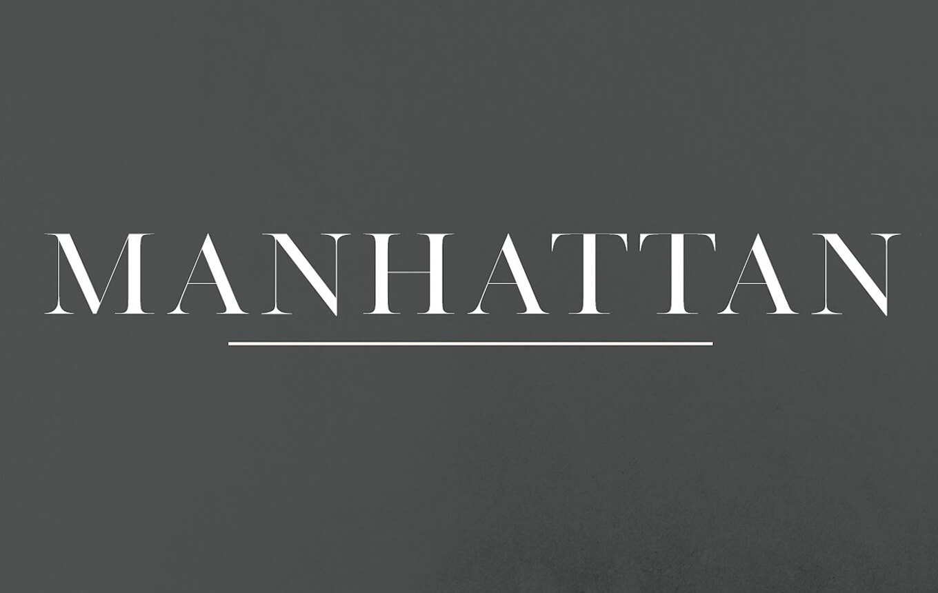
Manhattan | A High Class Serif by Jen Wagner Co
Serifs tend to bring ultimately emotional power to the text you apply them to as well as are extremely good for massive texts perception, so they are a great choice for printed production (newspapers, cards, books, etc) as well as logos, slogans, titles, business cards and may be easily paired with other typefaces. Sans fonts are the best choice here, as the emotive character of serif placed together with a fine script of slab must turn into a typographic cacophony.
Or just Sans if you like it simpler. These, evidently, are deprived of serifs at the end of strokes what makes them look pretty modest and laconic — right what you may be searching for web and design projects typography.
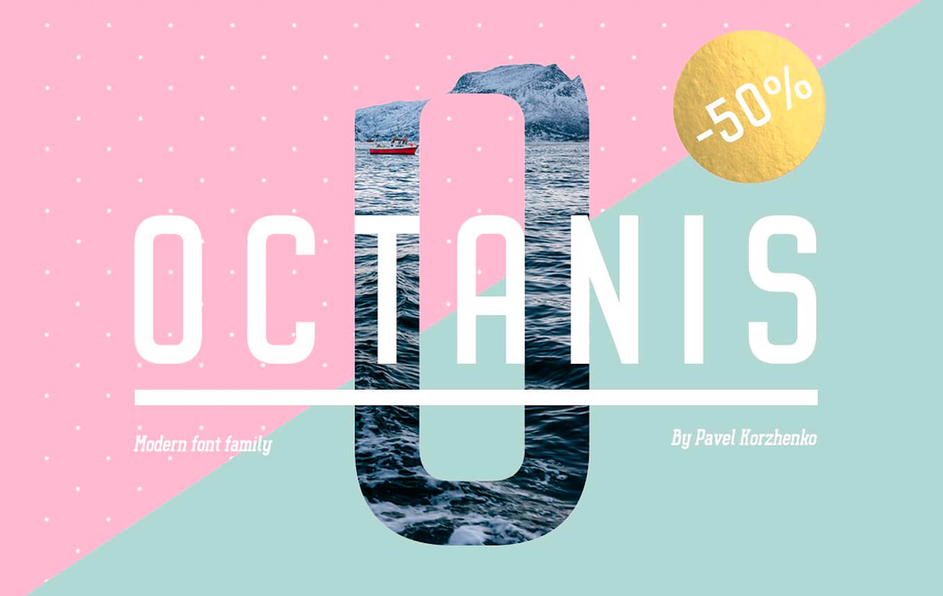
Octanis Font Family by Vintage Voyage Design Co.
Being brought in tons of variations, sans fonts libraries are extremely numerous and include strong and thin ones, minimalistic and fancily decorated. And that's actually the reason for their ultimate combination capacity — you may pair sans with ANY other typeface: sophisticated serif, romantic script and even a weird-looking display or slab font. Or use it separately as, just to say it twice, it already looks laconic and yet all-sufficient when the question touches its use for posters, banners, and apparel design.
The Slab or Egyptian typestyle initially rose to bring ultimate expression to advertising industry — and it still does, to be frank. Its bold weighted display version has a lot of visual impact and can be identified by their heavy serifs with no bracketing.
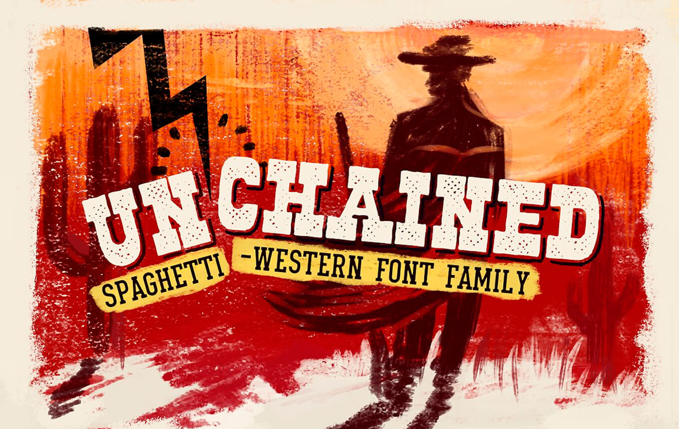
Unchained Font Family by Vintage Voyage Design Co.
Paired with more 'peaceful' sans typefaces, slab is loud and highly emotional — it looks like a scream transformed into letters and put on the paper or screen. That's why it's no good for big paragraphs (otherwise you may have the same feeling that you do while getting messages written with CapsLock ?), but adding it's fierce expression to crown your product overview, poster, logo or web project is a great idea and you may be sure your community will receive the message.
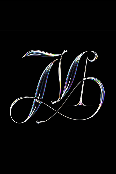
Smooth and elegant, script typefaces have a fluid and flowing hand-written stroke, and whether it's a pen or a brush, their mood can greatly vary — from aristocratic sophistication to calligraphic shabby chic.
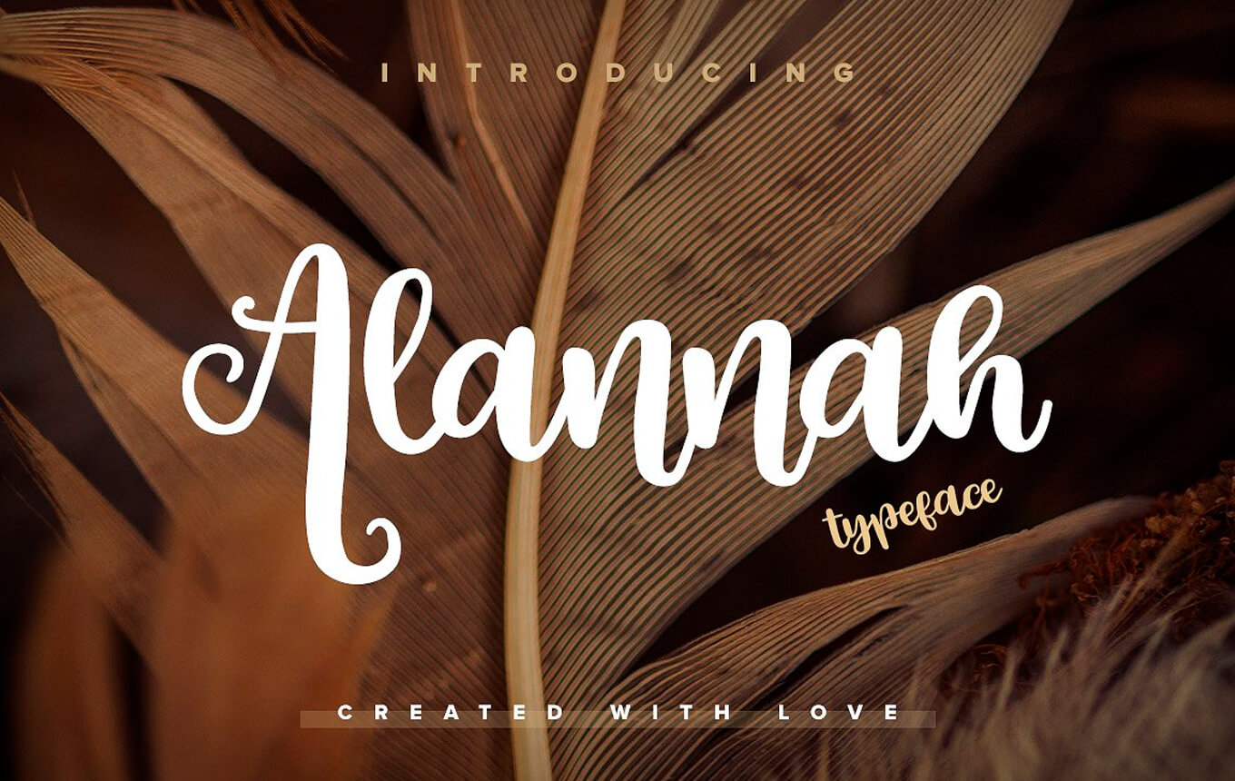
Alannah Script Font by Pixelbuddha team
And, what's logical, the mood and the character of a script typeface defines its use — some are a perfect complement to wedding invitations while others can be pretty casual-looking and match some minimalistic stationery or social media projects.
It may seem quite weird to put display fonts into a different category, as they can be slabs, serifs, sans serifs and scripts — and the trait that places them above all types already listed is the character. Right, display fonts are always extremely bright and vibrant with a complicated design that needs extremely calm and timid pair font.
Devious Typeface by Graptail
Article headlines, posters, packaging, branding, book covers — the more expression you need to accumulate in a single quote or line, the more effective the display typeface will be. Just be sure it conveys the right message to the community, it's essential to keep control of the smallest non-verbal details.
It must be clear now that with different types of fonts comes a vast majority of appearances, characters and messages they may canvey. And the one might be ready to stop there, but no, the typography has brought OpenType features for even more versatility and artistic freedom.
When I think about OpenType, I do feel pretty puzzled about how designers worked before it was introduced somewhere in 1996 by Adobe and Microsoft. The well-known .otf format your treat with no surprise today actually made a revolution in typography twenty years ago.
It makes you free in your choice of platform: both Windows and Mac are fine. It makes you free in your choice of language: OpenType fonts can make multilingual typography easier by including multiple language character sets in one font. It also makes you free in choosing HOW you want your typography to look like: it enables easier access to swashes, contextual & stylistic alternates.
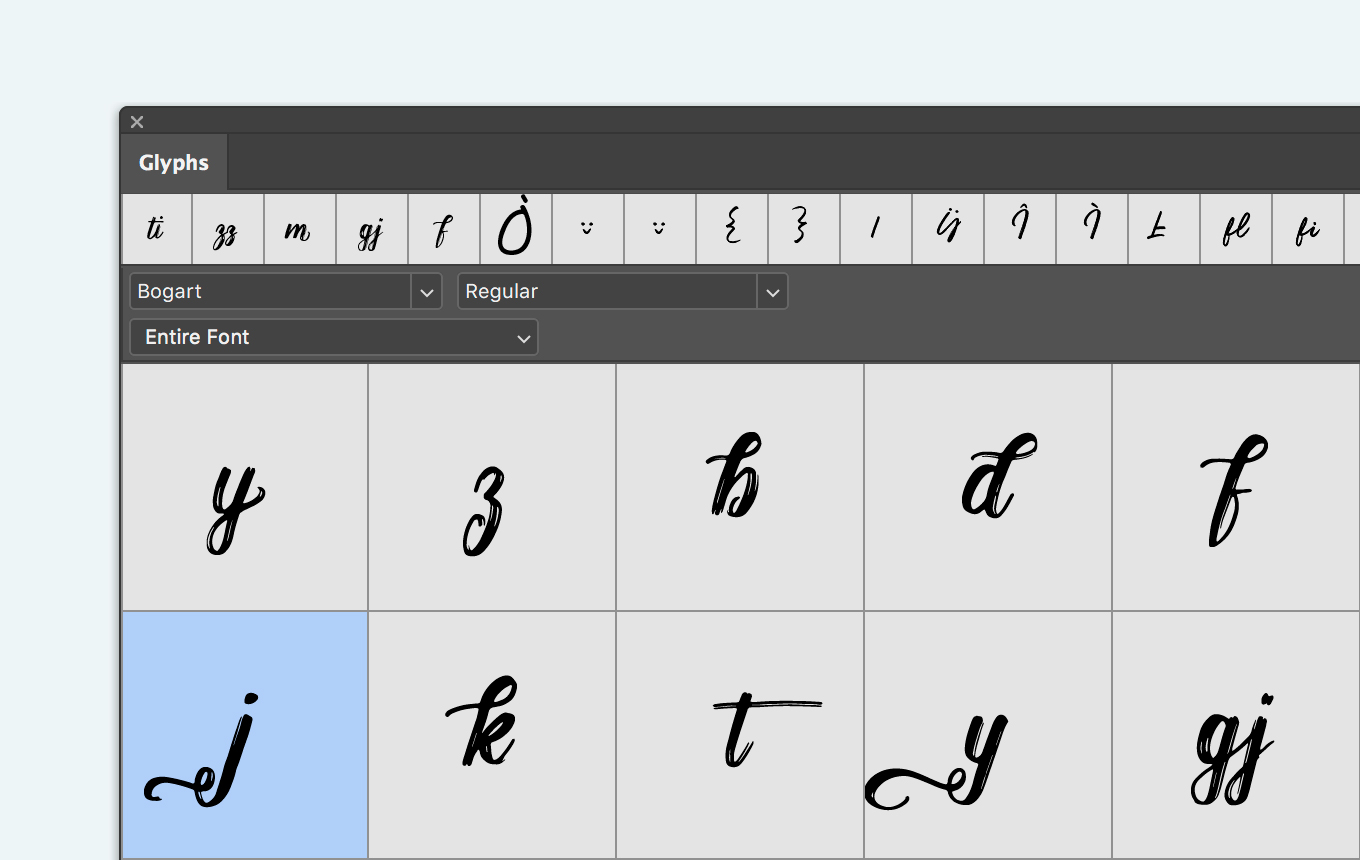
Alternative glyphs from Bogart Script Font
That's how it performs today — on a single OTF typeface downloaded you get all the languages needed (with accents and all sorts of extras), and if you want to have it for a title with some nice swashes on, you just pick the right option in your design app and that's it!
If yesterday typefaces were crafted by foundries of the highest level, today the same tools are available to everyone, and it's already up to you solely to choose between professional software and Illustrator or Sketch extensions. And, as a result, the industry's lit by new shiny typographic trends and discoveries, that we're happy to share with you:
A fresh trend, that's already got its laurels thanks to the absolute vibrancy of such typefaces. Tending to be bright-colored, they act as display ones and can add a nice touch of personality and fun to your design — and it's great to see more and more well-known creators come with their own realizations of color fonts.
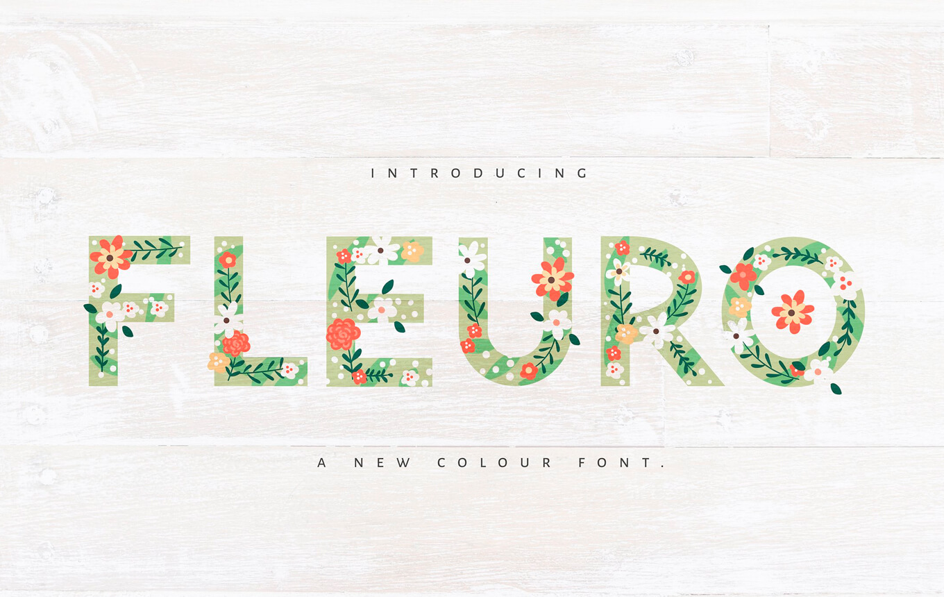
FLEURO Colour Font by Nicky Laatz
They've come along with the color ones, bringing the same massive doze of joy — but in vector format. Are a greate source of inspiration and always ready to quench your vibrancy thirst! ?
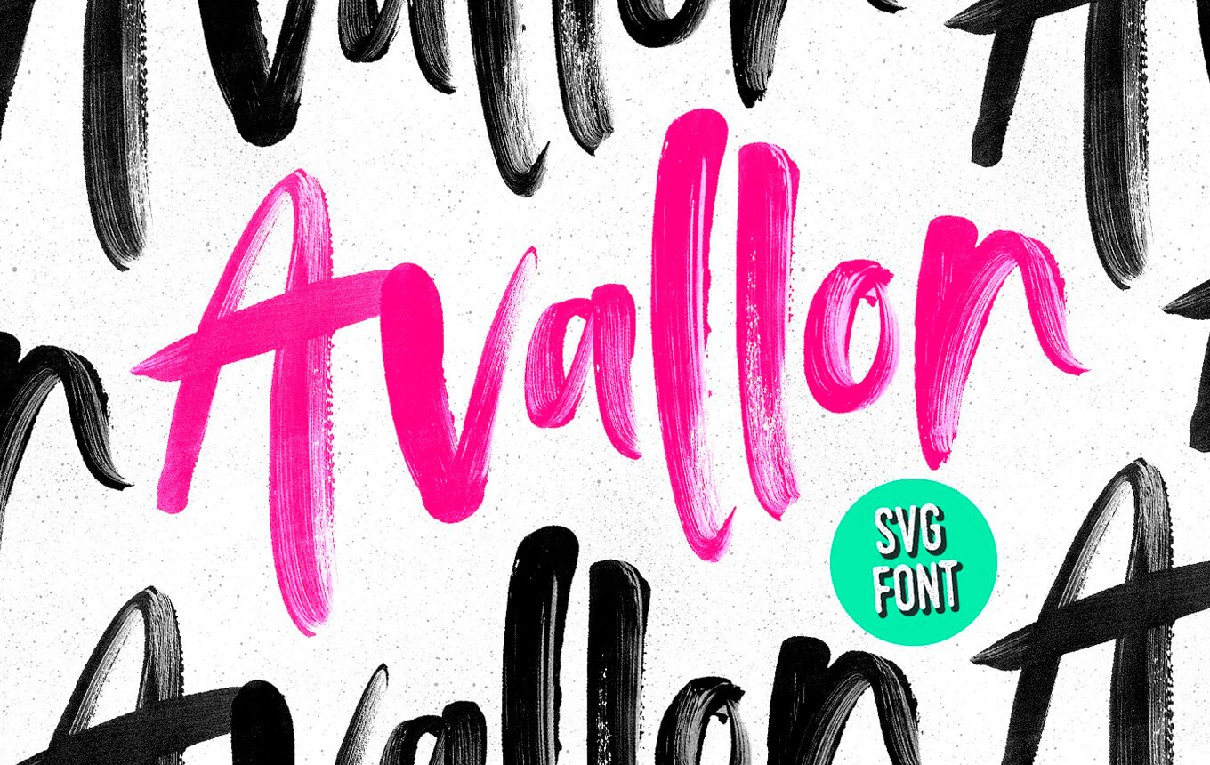
Avallon OpenType-SVG Font by Sam Parret
And these are a new blood in typography that we absolutely adore! Your OTF is never the same with this technology, and a single font file will be able to behave like an infinite multitude of styles. Caught it? One font is an endless variety of styles with as many axes of interpolation as you wish: weight, width, contrast, change in the height of ascenders and descenders, animation.
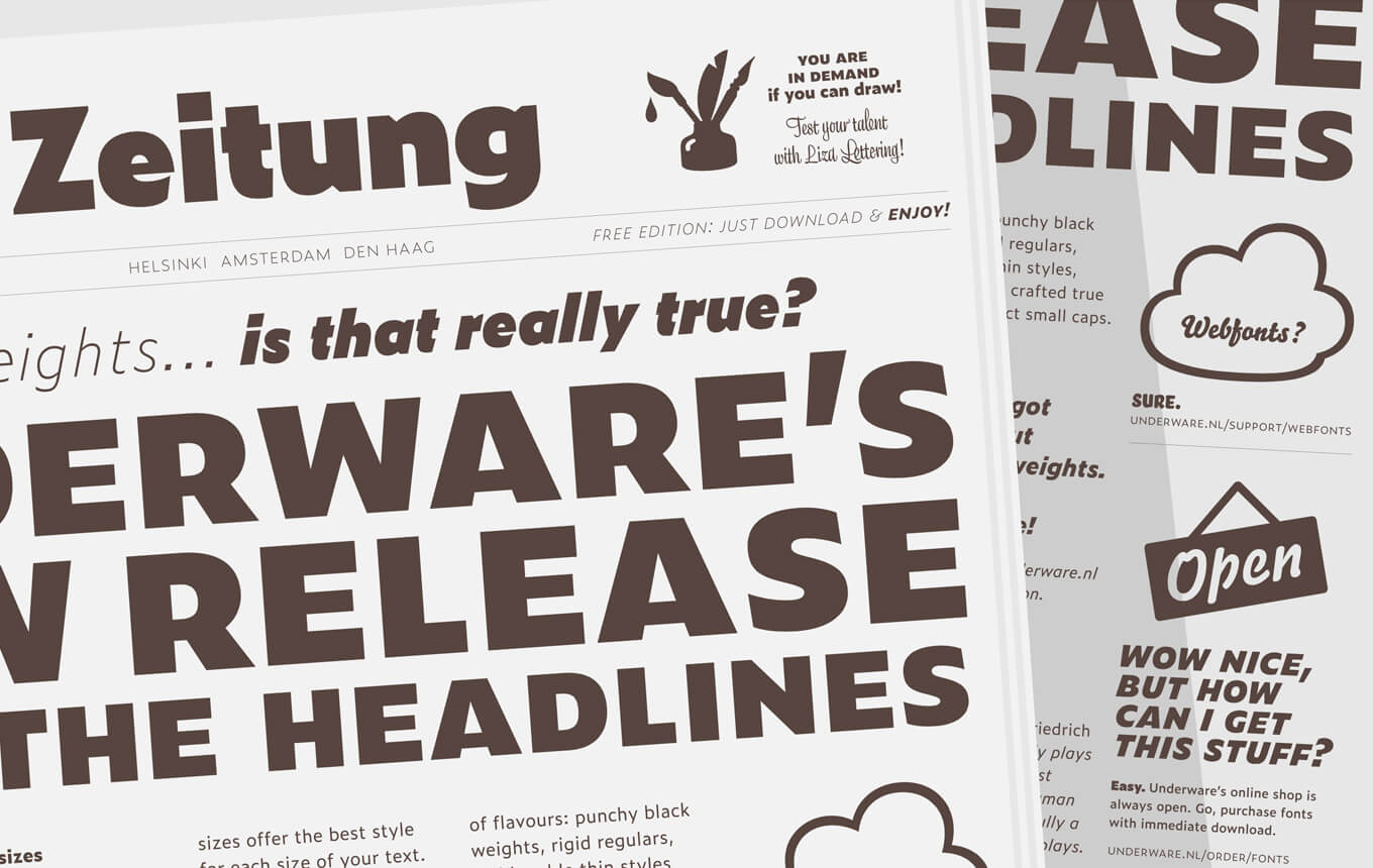
Zeitung by Underware
And who knows what trends are gonna be introduced tomorrow? I mean what cuties haven't we seen and combined yet — that's a question that must turn into some super exciting discoveries as we believe in Pixelbuddha. And we hope to keep you permanently up-to-date with the hottest of them. And in the meantime aren't you excited enough to get the fonts your toolbox seems to be missing?

0 downloads available to unregistered users! Create a free account to get this and explore thousands more files. Already have an account? Log In