Once upon a time in far sun-drenched Italy - or, to be more exact, on December 11, 1980, a trio of young furniture and product designers from Milan had a cozy home party. Yummy Italian food, superb wine, talks about the latest trends and Bob Dylan’s music.
When came the time of the song “Stuck Inside of Mobile with the Memphis Blues Again,” these very designers got so greatly inspired and stunned, that they finally got round to starting a new design era (we’ve also given this track a go, but in our case, no magic happened).
Well, they’ve started not just a new era, but a rebel against the uniform, slick and minimalist aesthetic of the 70’s. Actually, it brought the idea of free, unlimited self-expression of a creator. Or not. Or it was pure anarchy for the industry and was ambitiously aimed to resist the notion of good taste.
But What Was Memphis?
The formula of that Memphis contained three essential elements: Art Deco, Pop Art, and 1950’s Kitch brought together to embrace striking geometric figures and materials from one side and live color palettes from another. So, little about Memphis was truly innovative - let’s be honest!
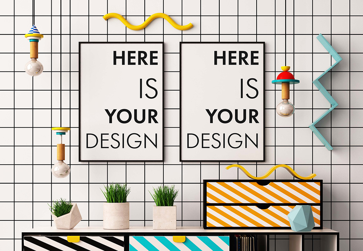
The whole point of Memphis was to demonstrate that design can mutate like bacteria, leaving behind good taste, visual harmony, and dogma of the industry. Instead, it was all about bold, often clashing colors, seemingly haphazard arrangements of geometric forms, and the use of the plastic laminate.
And Here The World Has Gone Crazy
Indeed, Memphis’ colorful furniture was described as “bizarre” or “loathed,” or as “a shotgun wedding between Bauhaus and Fisher-Price.” On the other side, you’d better keep in mind, that soon the community didn’t give a damn about the critics - then bars, shops, and even flats and houses took a new, cosmo-freaky look (BTW, Karl Lagerfeld was the one to start this errr...flashmob and furnished his Monte Carlo apartment with Memphis). And such master of ‘haute couture’ as Christian Dior factored in it in his collection.
But let’s admit that quite shocking at first sight and still pretty shocking at the second, Memphis nevertheless slowly vanished from the pages of Vogue to be back in graphic design in 2016 and today, in 2017 it keeps gaining in popularity.
The 80’s Trend Has Risen And Conquered Digital Design
The geometric and colorful spirit of Memphis has burst into graphic design to mix turquoise and gold, purple and yellow, bright metal and plastic. In web design juicy, even a bit grotesque color combinations get destined to hit the stage - big typography and bold colors are the right detail to grab your attention and give you a sign: “Click me! Click me now! I was made to be clicked on!”
Indeed, flat, vectorized style is getting more and more likely accented with saturated, bold color choices; photos are now omitted and replaced by a new essential art element - geometric shapes, strokes, and squiggled lines
Colors Go First
Every color featured in Memphis design is almost neon even a bit grotesque, without the abundance of tints or tones you’ve got used to. But on the contrary, Memphis design can also follow a far more minimalist color pattern, featuring black and white as the primary colors, adding some striking accents. But still the main law of this style remains intact - the more cheerful and happy colors you choose and apply, the better.

From Perceptible To Visible: Shapes
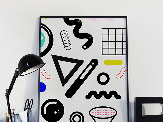
In Memphis shapes include squares, circles and triangles and both sharp edges and hand-drawn look are welcome. Patterns might be as flat, as “fake 3D” (quite a widely-spread trend in older Memphis artworks), so all the “rules” you’re accustomed to seem to go out the window.
Not To Leave The Details Behind
Another important feature of Memphis, thick strokes and squiggles appears to be one of the key style-identifying factors. Almost every example includes a set of strokes and lines (both mouse and hand-drawn) that seem to freely fill the screen.
Black, white or in full color - no matter what you opt for, but the elements are supposed to have a lot of contrast and draw users through the design.

Right Font - That’s About Perfection
Finally, the typography. With Memphis, you can’t resist using the typefaces that you never considered possible for most projects. ORDINARY projects, you mean. But, as you probably understand already, Memphis is not about ordinary projects.
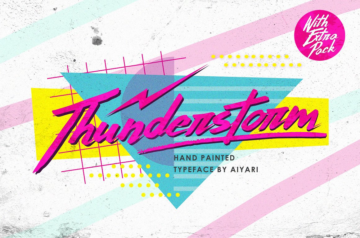
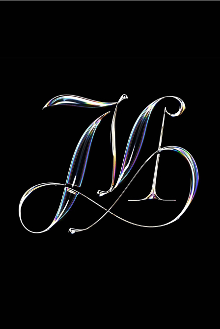
Bold, blocky sans serifs, bubble lettering or handwriting style. The fonts are supposed to have some drama, some geometric look to mimic the other elements of the design, so if it starts reminding the strokes and squiggles of the pattern - you’re on the right path. Just don’t forget to opt for something with lots of contrast and here’s the success.

Epilogue
The odds are good you’re now shifting gaze from one image to another in some surprise or even stun, and it’s pretty okay, ‘cause Memphis is not the style you may treat indifferently. Love it or hate it, there is no third option.
But before you make you choice and close the window, ask yourself, when was the last time you left your community agape. When was the last time you shocked your customers and run the venture?
Memphis is not for cowards. And you are not the one.

