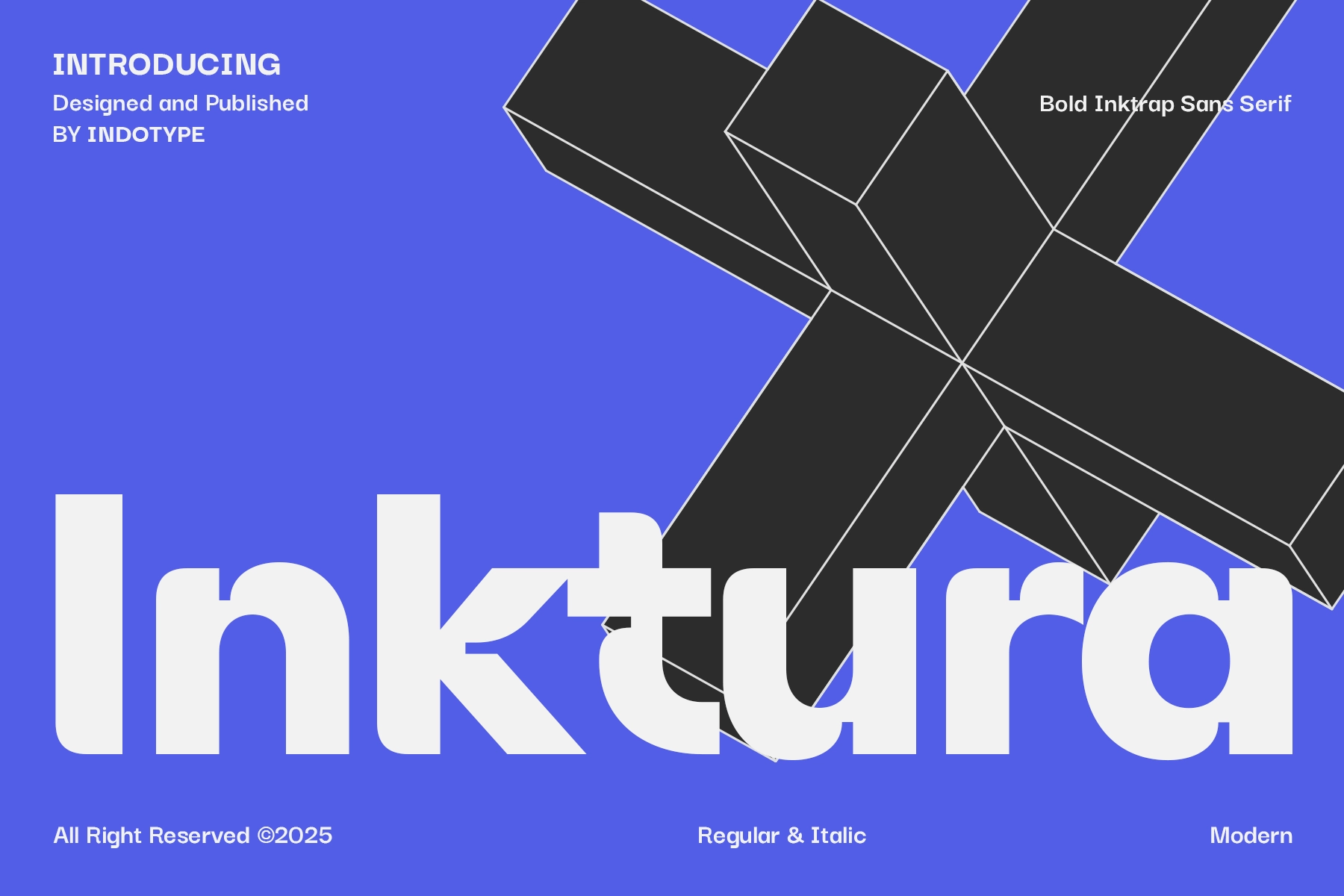
Inktura - Bold Ink Trap Sans Font


About the product
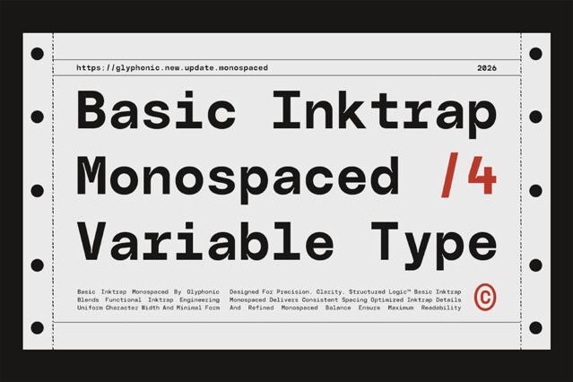
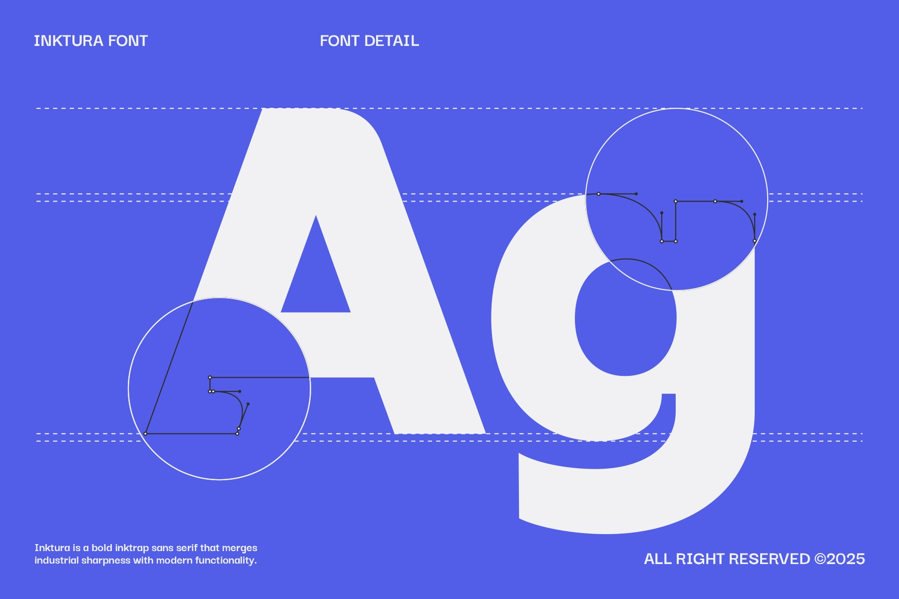
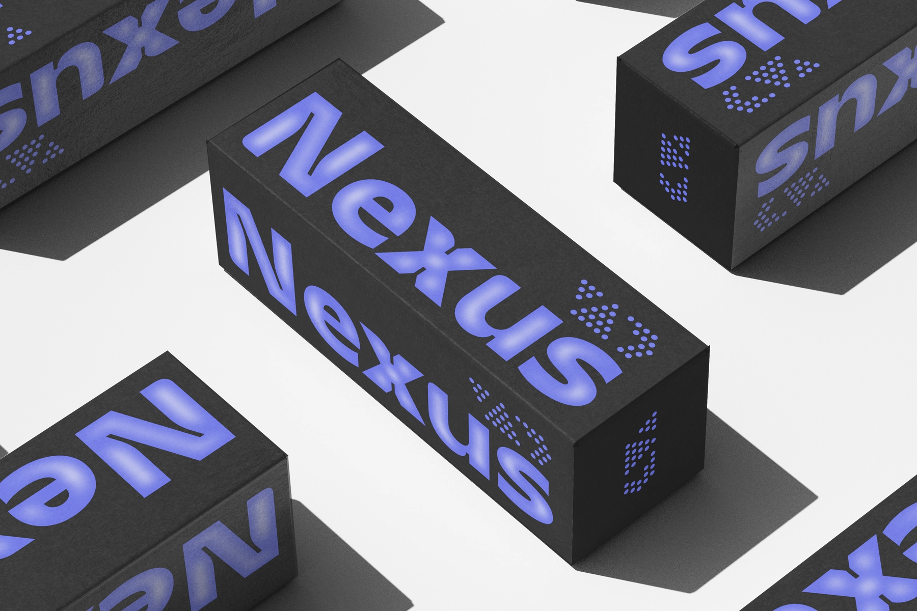
Ink traps are a letterpress-era compensation technique — notches cut into the inner corners of letterforms to prevent ink from pooling and blurring the junction. Inktura, published by Indotype Foundry, takes that functional detail and runs it as the central visual argument: a bold inktrap sans serif font where every sharp wedge-shaped cutout at the A-apex, the g-bowl entry, and the K-joint reads as precision rather than accident. The construction is wide and heavy with flat-cut terminals and large open counters, which keeps the rhythm clear even when the weight is extreme.
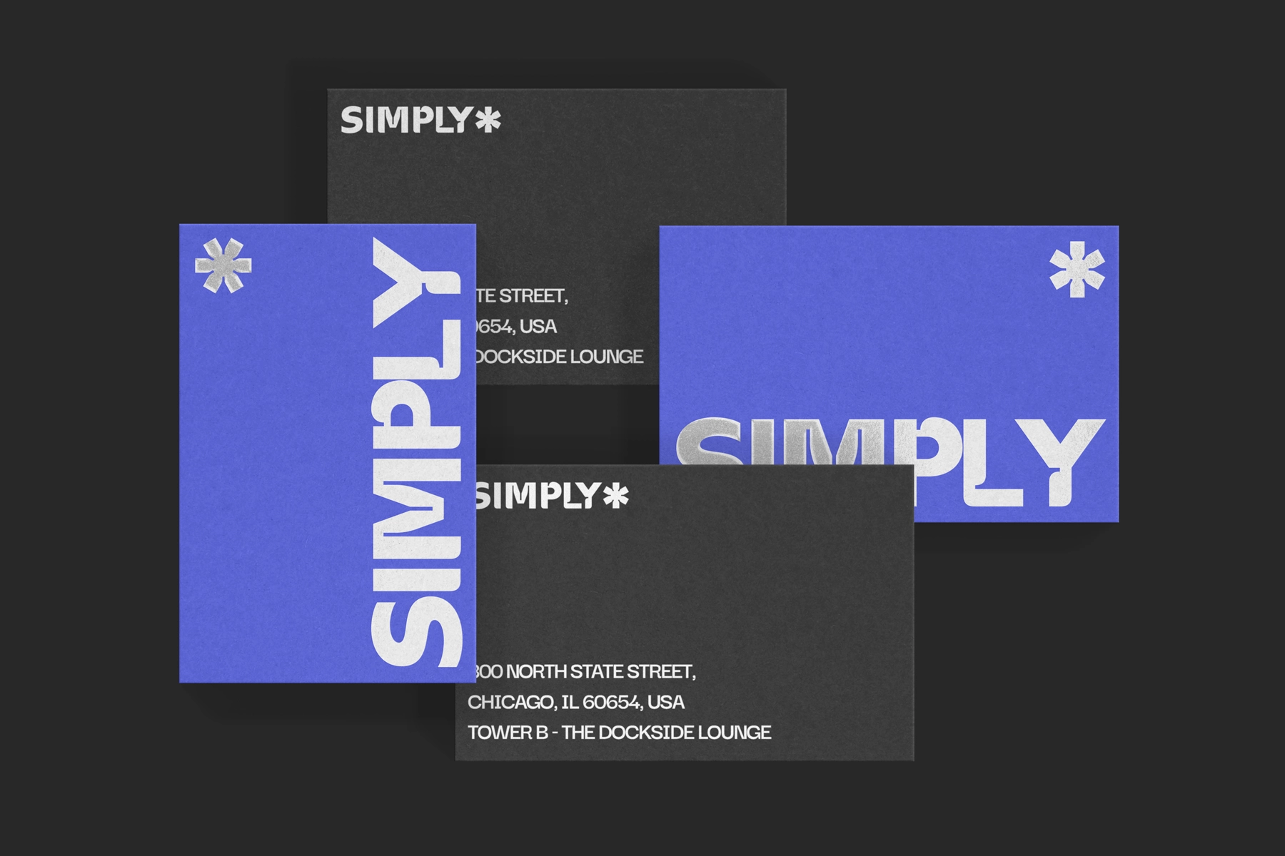
The italic adds geometric forward lean without softening the industrial character — both styles work at short headline distances and hold under foil, emboss, or reverse-out print conditions. Use Inktura for brand wordmarks, poster headlines, album and book covers, packaging with a technical or architectural register, magazine titles, and UI hero text.
Features:
- Included formats: OTF, TTF, WOFF, WOFF2
- 2 styles: regular, italic;
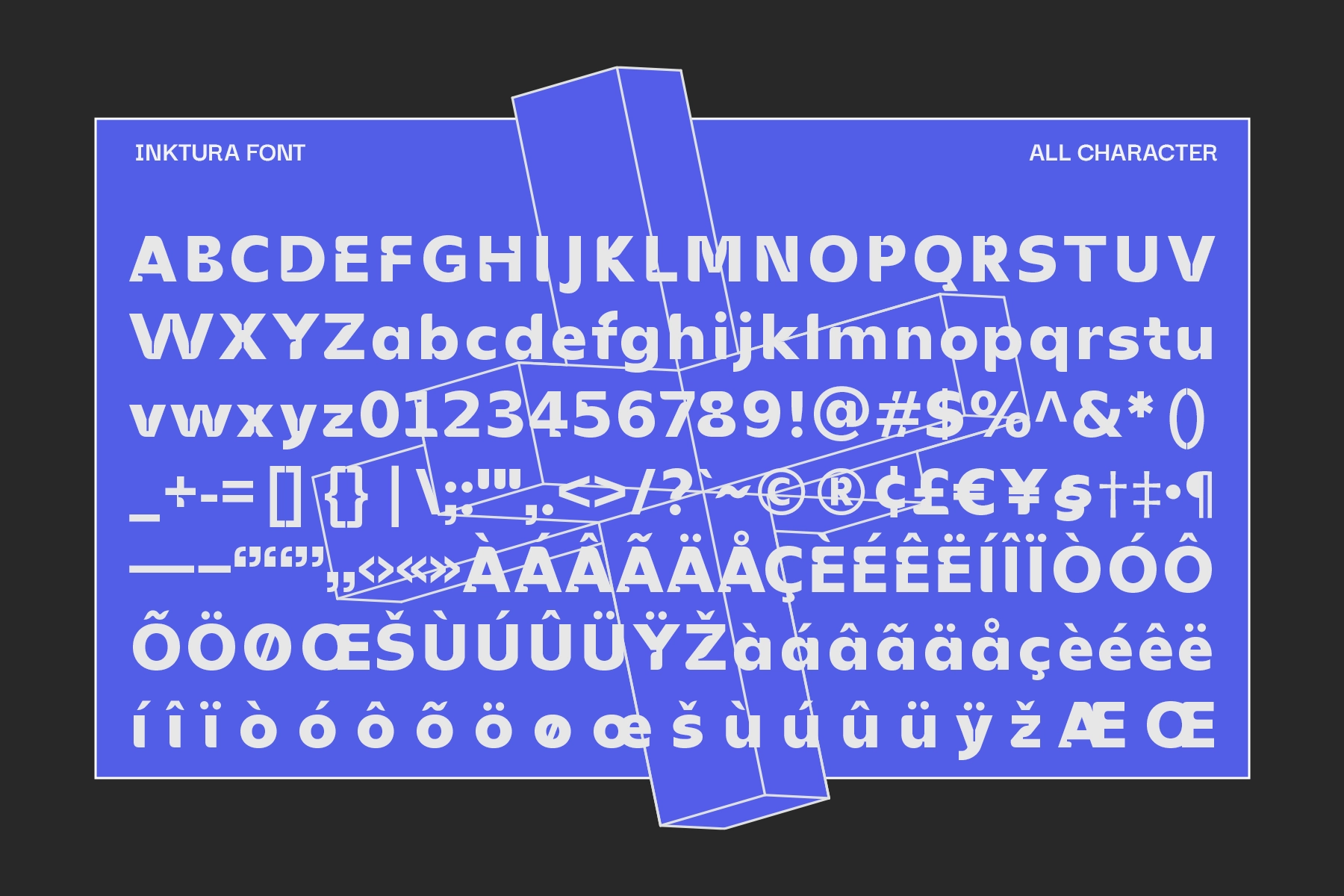
- Uppercase & lowercase;
- Numerals, punctuation & symbols;
- Ordinals & superscript numerals;
- Multilingual support;
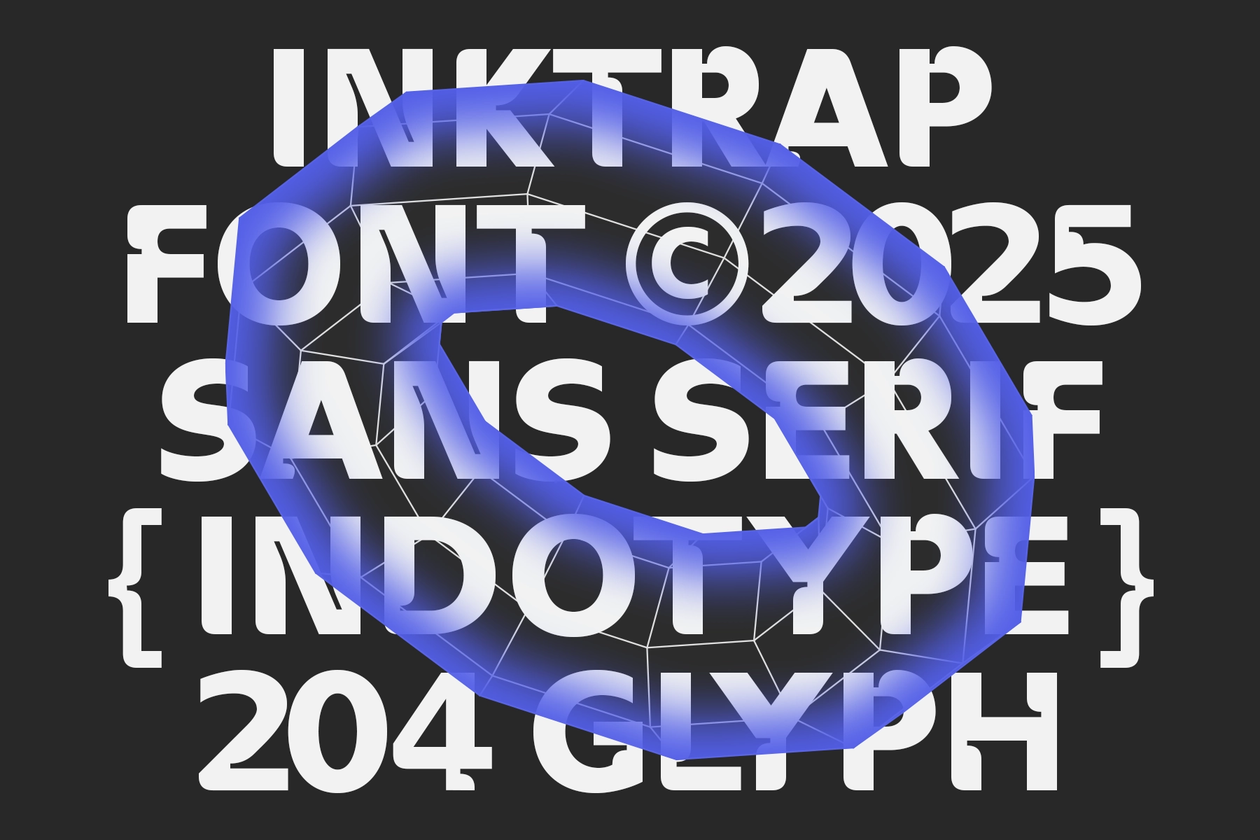
- 206 glyphs per style.