

- Poster
360
- Device
279
- T-Shirt
135
- Sticker
121
- Book
79
- Box
114
- Sign
127
- Paper
- Can
52
- Flyer
30
- Display
55
- Frame
40
- Bottle
44
- Wall
54
- Badge
38
- Vinyl
29
- Letterhead
41
- Tote Bag
36
- Shopping Bag
101
- Outdoor
202
- Cosmetic
88
- Storefront
92
- Magazine
54
- Stationery
124
- Billboard
144
- Business Card
- Packaging
221
- Advertising
- Branding
222
- Clothing
196

- Sans Serif
340
- Calligraphy
48
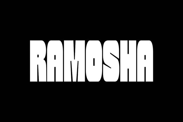
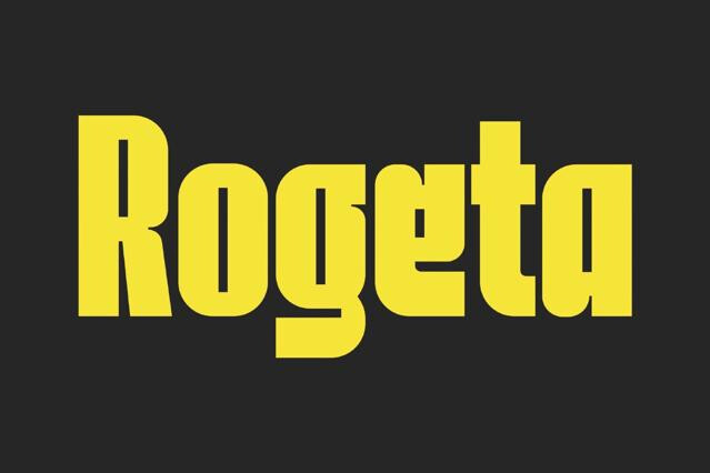
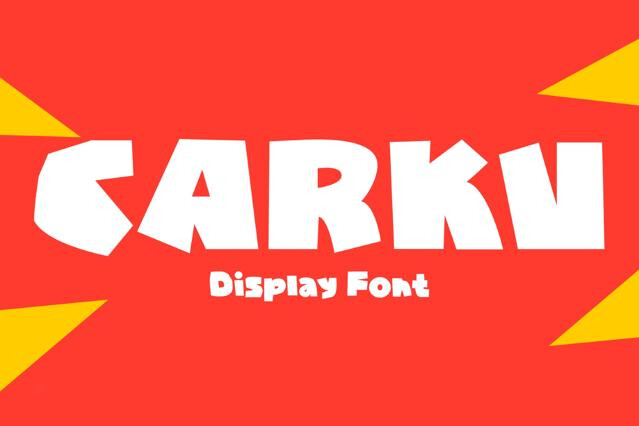
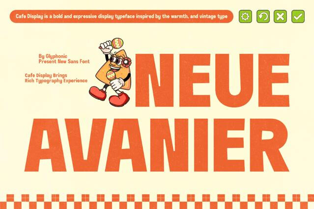
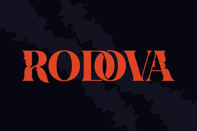
- Display
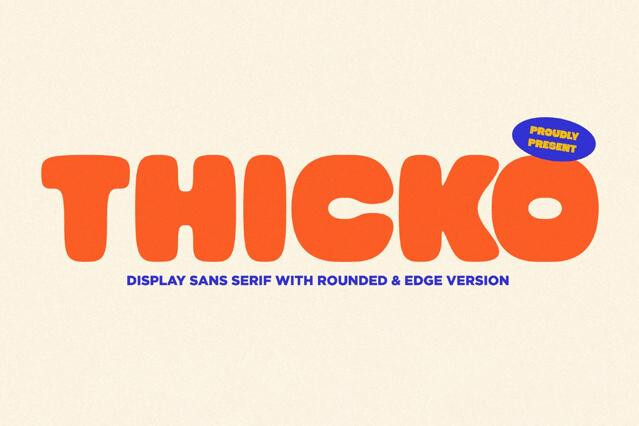
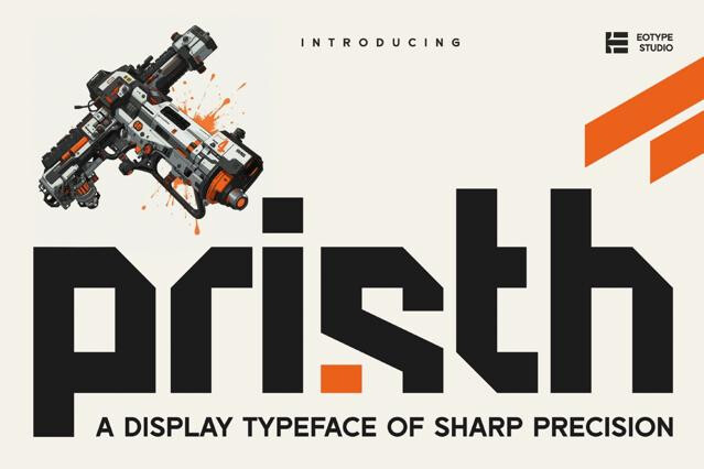
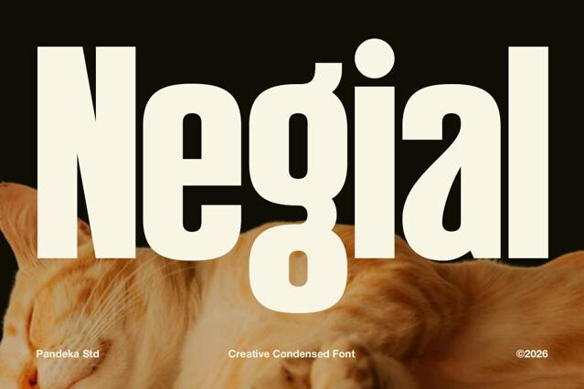
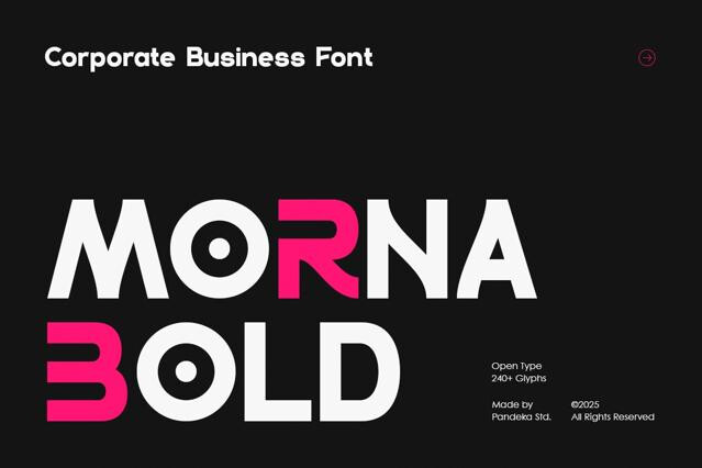
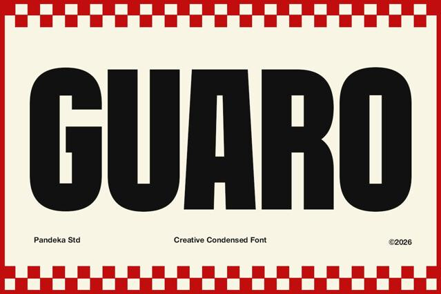
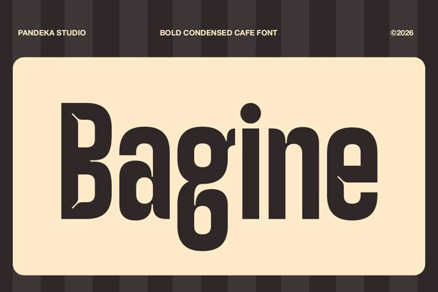
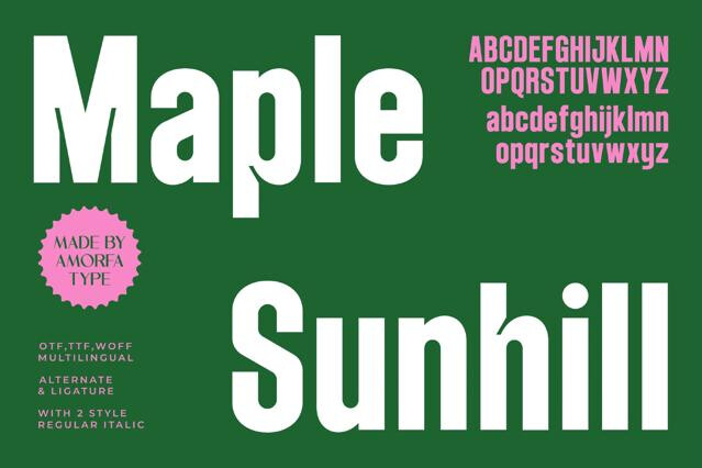
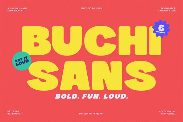
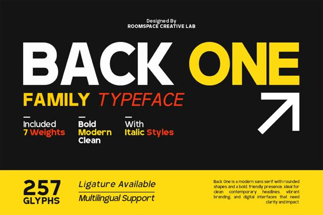
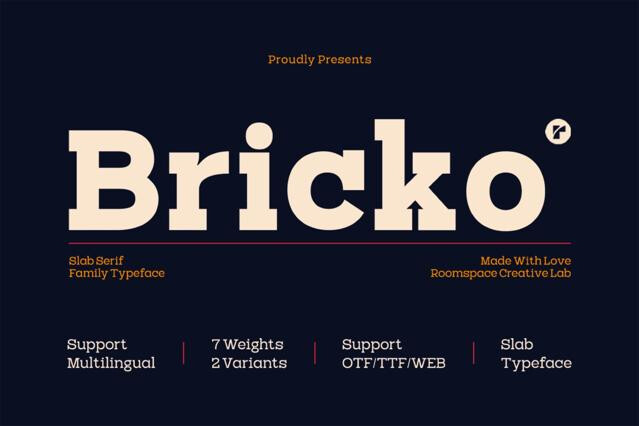
- Bold
296
- Script
- Serif
254
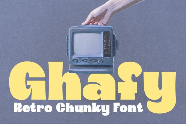
- Retro
132
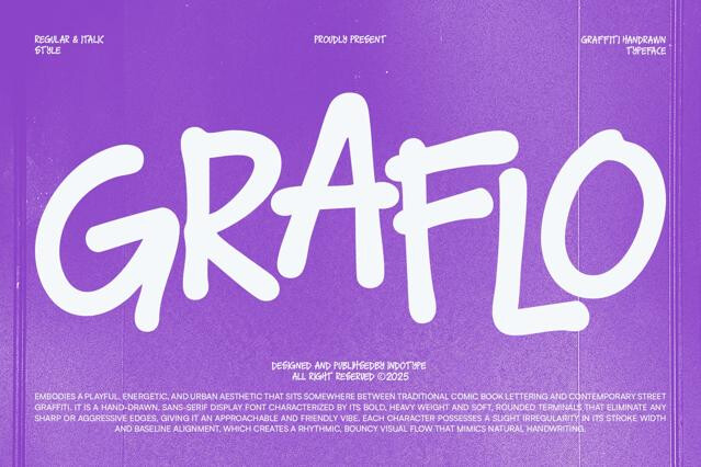
- Graffiti
60
- Y2K
48
- Elegant
- Western
69
- Gothic
61
- Futuristic
85
- Bubble
61
- Playful
139
- Art Deco
51
- Wedding
96
- Sports
55
- Brush
128
- Pixel
85
- Groovy
- Signature
86
- Cartoon
90
- Medieval
59
- Typewriter
51
- Blackletter
- Marker
75
- Grunge
49
- Monoline
46
- Handwriting


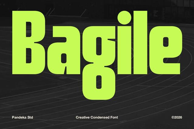
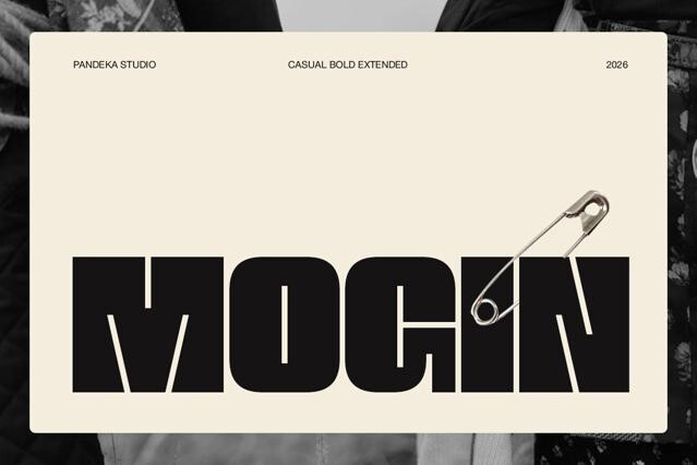
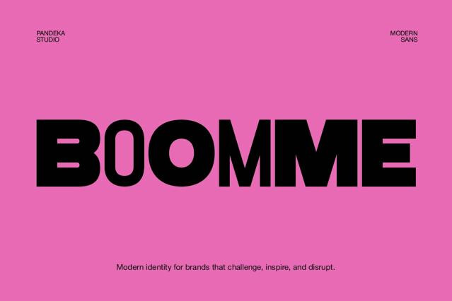
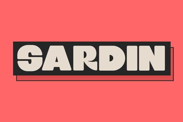
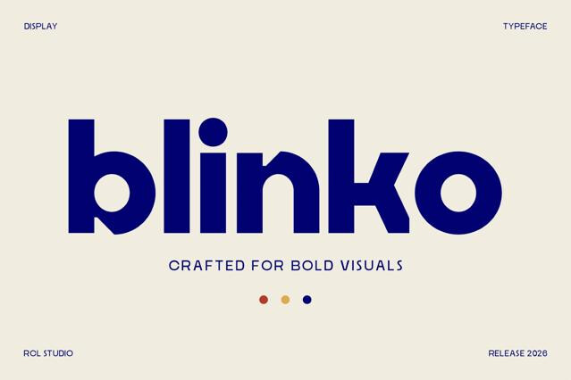
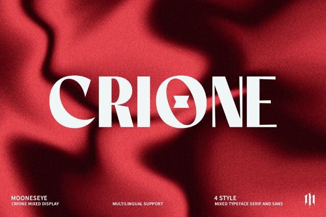
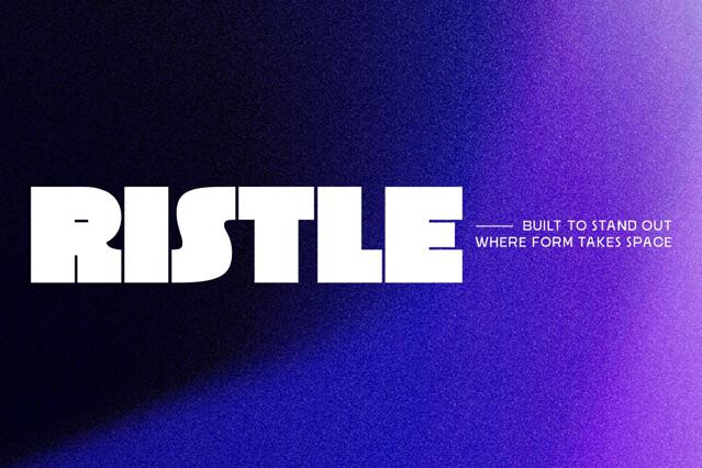
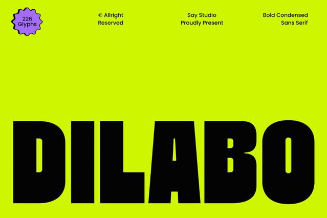


Bold fonts for headlines, packaging, and high-impact branding
Bold fonts are about presence. We pulled together those that fill the page with weight and refuse to be overlookedl. The collection ranges across heavy grotesques, blocky slab serifs, condensed power fonts, and expressive display designs drawn to be as thick as they are loud. Some come with width and weight axes so you can push the intensity exactly as far as the layout allows.
What bold font is built to do
Weight is the most immediate signal of hierarchy a designer has. These fonts put it to work wherever a message has to land first and land hard.
- Headlines and cover lines that anchor a layout.
- Calls to action, prices, and promotional bursts.
- Sports, streetwear, and energy-brand wordmarks.
- Packaging fronts and shelf-impact naming.
- Posters, banners, and large-format advertising.
- Social graphics where a single word has to dominate.
Using weight without overusing it
Bold earns its impact through contrast. The moment everything turns heavy, the emphasis collapses and the page reads as noise. We think of these fonts as the punctuation of a layout — reserved for the one or two elements that genuinely deserve the spotlight, with lighter type carrying the rest.
A note on legibility
Heavy doesn't automatically mean clear. Dense strokes can close up counters and blur fine detail at small sizes, so we'd keep the boldest cuts at display scale and hand the captions to something lighter. fonts with open, generous counters are the ones that survive being shrunk.
Not quite. The bold weight of a text family is one option within a system, while the fonts in this category are designed from the ground up to be heavy. Their proportions, spacing, and counters are drawn for impact rather than scaled up from a lighter master.
Bold works when you need emphasis, hierarchy, or raw presence: a headline, a price, a single power word. It hurts when everything is bold, because then nothing stands out. Remember, weight is a tool for contrast, not a default setting.
It depends on the design. Fonts with open counters hold up reasonably small, while very dense or tightly spaced ones can fill in and turn muddy. For captions and fine print, a regular weight is usually the safer call.
Yes — heavy type is a staple of sports, streetwear, and energy-driven brands. The solidity reads as confidence and power, which is why so many wordmarks in those spaces lean bold.
That's the ideal use. A heavy headline over a light, neutral body creates a clear hierarchy and lets the weight carry the drama while the supporting text stays readable.
Many bold families offer width variations, and some are variable across both weight and width. Width options are noted on the product page when available — useful when you need a heavy font to fit a tight or wide space.