


Futuristic fonts for tech, gaming, and forward-thinking brands
Futuristic fonts translate the idea of "what's next" into type. Built around geometry, precision, and a machine-made feel, they give projects an immediate sense of technology, motion, and innovation.
We've gathered styles that range from sleek and minimal to heavily detailed sci-fi display fonts, so you can match the typeface to the mood of your product rather than forcing the concept. The selection covers clean tech-brand sans,cyberpunk display lettering, terminal-style monospace, and angular logo fonts designed for screens and key art.
Where a futuristic typeface earns its place
A futuristic typeface is really a positioning tool. It shapes a forward-thinking, technical, step-ahead brand, often before a word has been read. That signal is most valuable in fields where being current is itself the value proposition:
- Tech, AI, and SaaS branding and product launches.
- Game titles, splash screens, and HUD interface elements.
- Album covers and posters for electronic and experimental music.
- Sci-fi film, series, and concept-art typography.
- Web3, crypto, and startup identities that lean on innovation.
- Motion graphics, intros, and animated lower thirds.
The range you'll find inside
The hard part isn't finding a futuristic font but deciding how loud a future you're selling. The same brief can land as credible or maximal and cinematic. Push too far and a project dates fast, play it too safe and it loses the edge entirely. So the spread runs from restrained, brand-safe geometry to full sci-fi spectacle:
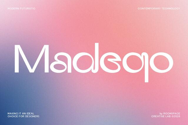
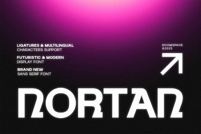
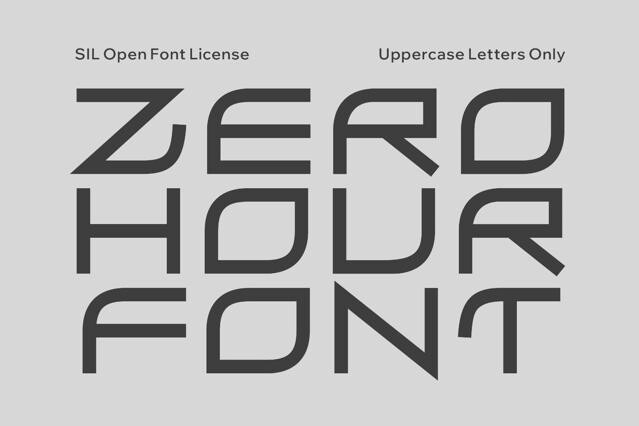
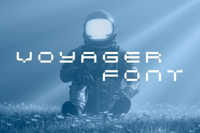
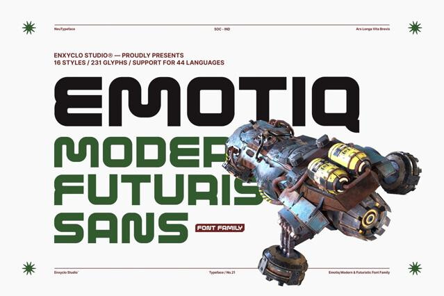
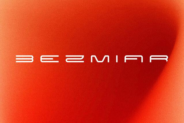
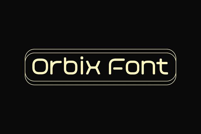
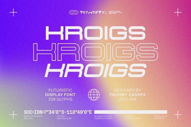
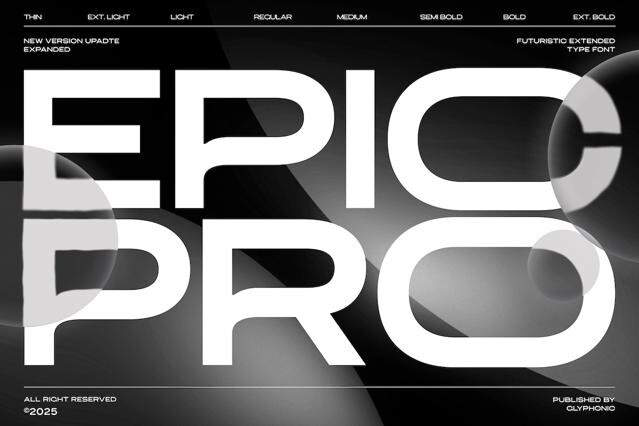
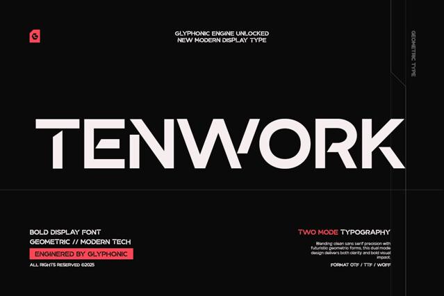
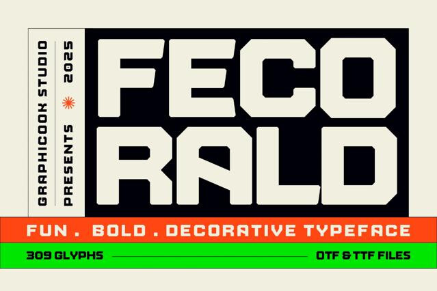
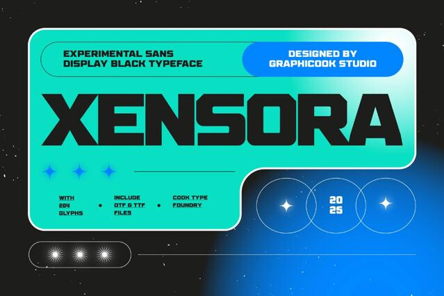
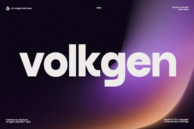
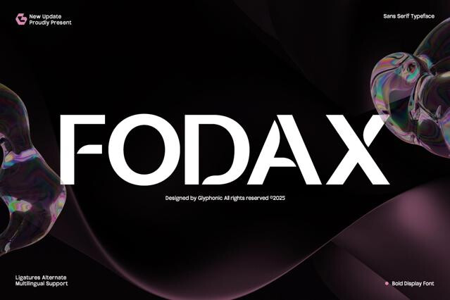
- Geometric tech sans — clean, neutral, and brand-safe, the rounded-square lineage of Eurostile and the orbital geometry of Orbitron.
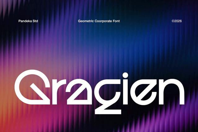
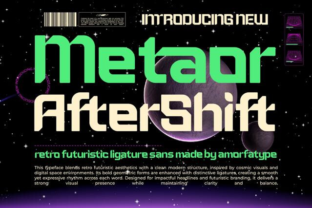
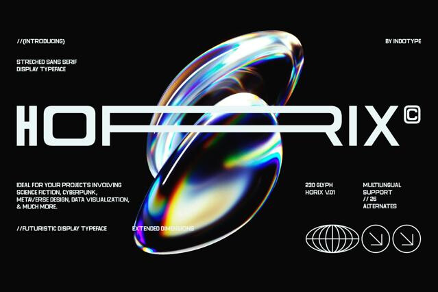
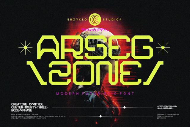
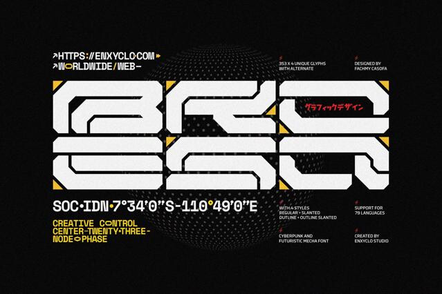
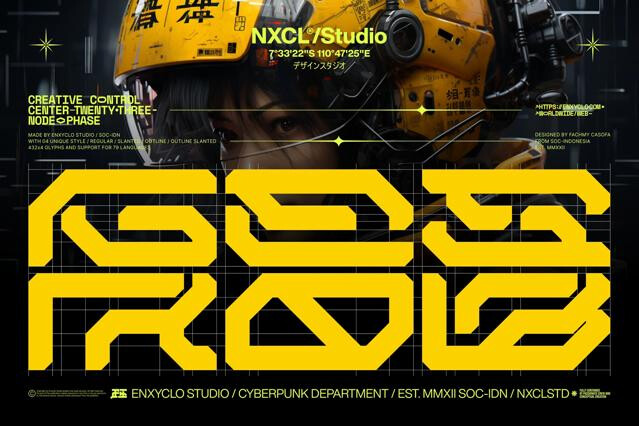
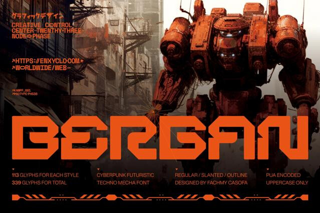
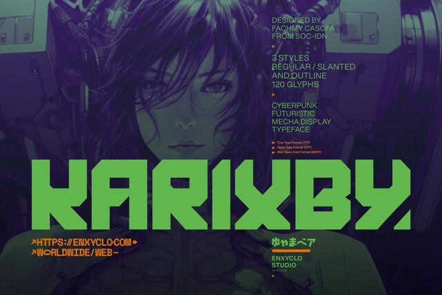
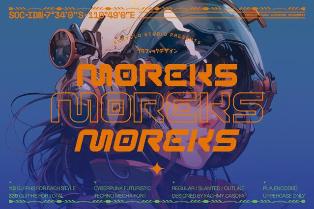
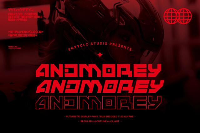
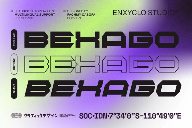
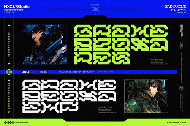
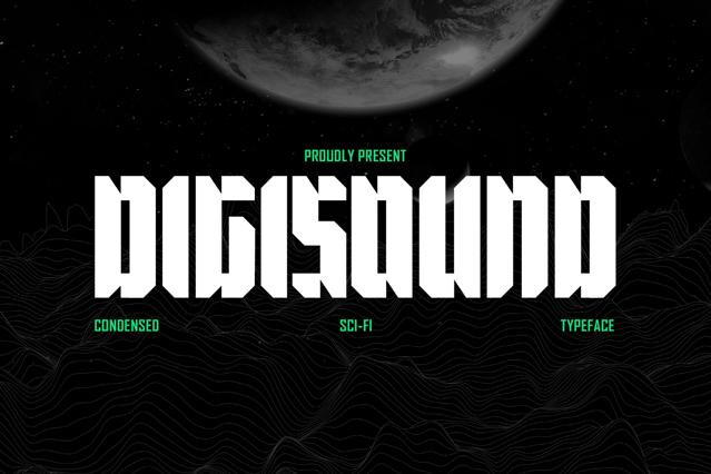
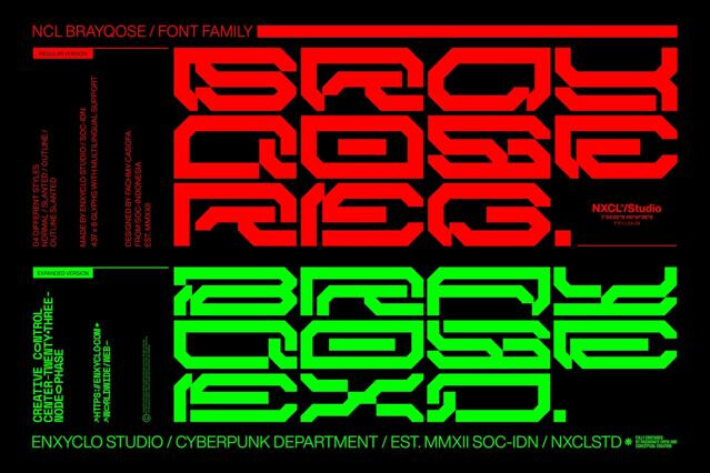
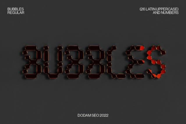
- Cyberpunk display fonts — heavy detailing, glitch cues, and neon energy, in the angular register that Rajdhani lent to Cyberpunk 2077.
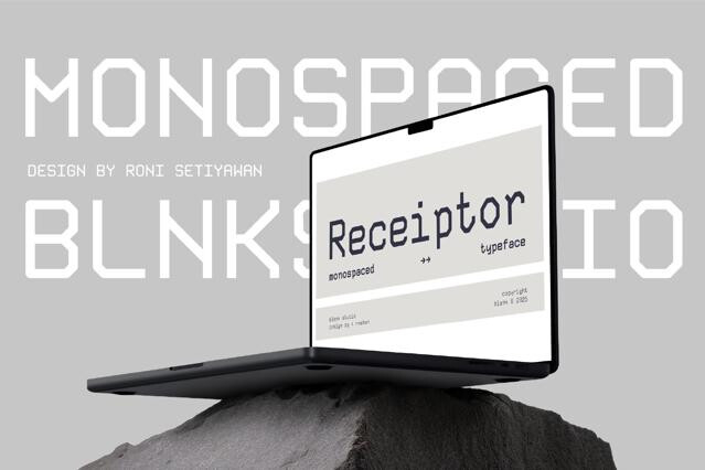
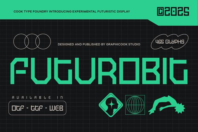
- Monospace and terminal styles — code, data, and interface aesthetics, descended from the machine-readable look of OCR-A and computer terminals.
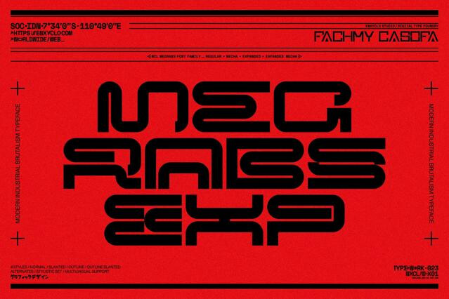
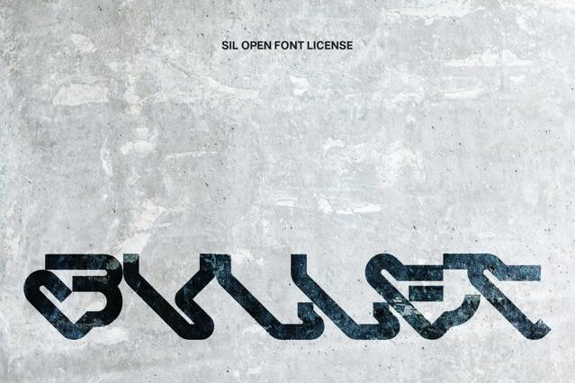
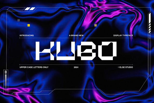
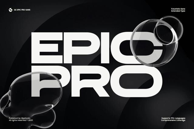
- Angular logo fonts — sharp silhouettes built for marks and wordmarks, the squared military-sci-fi register typified by Bank Gothic.
- Layered and outline sets — for depth, glow, and motion-ready lockups.
Getting the most out of futuristic fonts
A strong futuristic font might carry an entire concept, but it works best with restraint. Let it lead the headline or logo, then ground the layout with a neutral supporting font and generous spacing. Because many of these designs are display-first, we suggest testing them at real screen sizes before committing. The idea is that sharp terminals and tight counters behave differently at 12px than they do on a poster.
Futuristic is the broad umbrella for any forward-looking aesthetic; sci-fi dramatizes imagined fictional worlds; tech reads as present-day engineering; space focuses on the cosmos. A futuristic font simply signals "tomorrow" without committing to a specific genre.
The forms suggest something engineered. E.g., geometric construction, cut corners and notches, condensed or stretched proportions, even minimal strokes, and a clean, constructed precision.
The cleaner, more legible designs work well for tech UI, dashboards, and product branding. The heavily stylized display s are best kept for titles and key art.
Sometimes. Yesterday's vision of the future can age into retro fast (see Y2K). We favor cleaner, more restrained futuristic fonts for durable branding, and save the trend-heavy styles for projects where a refresh is expected.
Tech and innovation branding, gaming, automotive and aerospace, electronic music, events, etc.
Choose a font with one genuine distinguishing detail rather than the most default "techno" option, and let clean layout and space do the rest.