

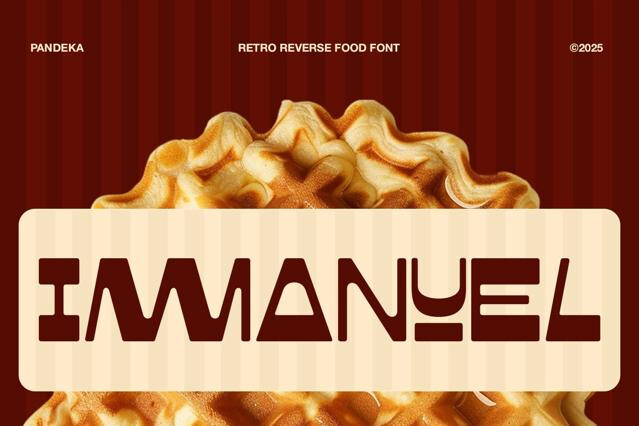
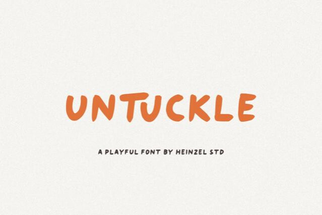
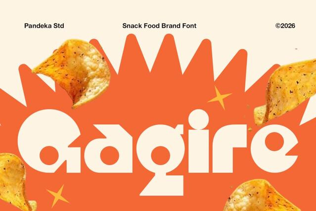
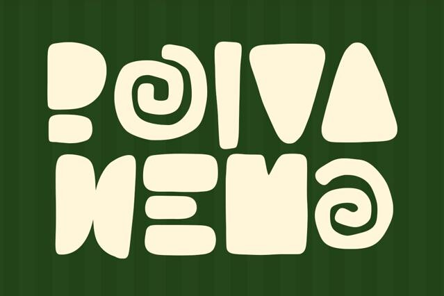
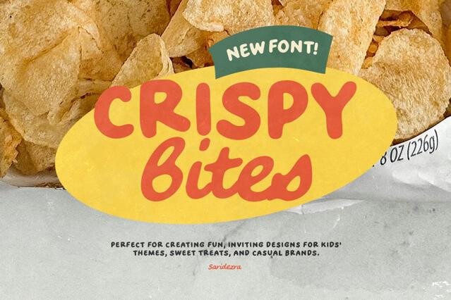
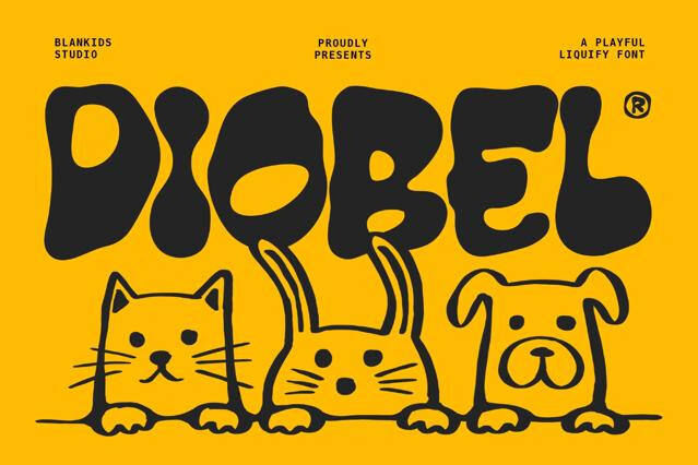
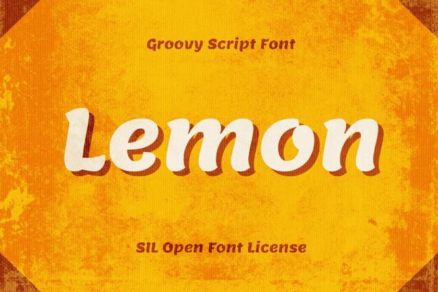
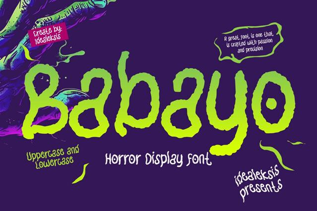
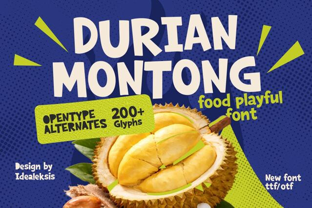


Playful fonts for friendly, approachable, and fun branding
We rounded up the fonts that trade corporate precision for warmth and character: bouncing baselines, soft shapes, and quirky details that tell a viewer this brand doesn't take itself too seriously. The collection runs from chunky rounded sans families with full weight ranges to wonky hand-drawn display fonts bursting with personality. Whatever the level of mischief, the goal is the same: type that’s human, friendly, and genuinely fun to look at.
What gives type its sense of fun
Playfulness is a set of deliberate decisions, not an absence of craft:
- Rounded terminals and soft, generous curves.
- Bouncing or irregular baselines that add bounce.
- Exaggerated proportions and oversized details.
- Unexpected quirks that reward a second look.
Matching whimsy to audience
The amount of play a project can carry depends entirely on who it's for. Children's brands, toys, and games can go all in; a snack brand or casual app wants warmth with a steadier hand; a friendly service brand might want just one bouncy detail in an otherwise clean system. We sort the collection so you can dial the personality up or down to fit.
Keeping friendly from tipping into messy
Playful and sloppy look similar from a distance but read very differently. Consistent spacing, considered pairing, and a clean layout are what keep a whimsical font on the right side of that line. Give a playful display headline a simple, warm sans for body text, and the whole design stays cheerful without losing its footing.
Soft, rounded shapes, irregular or bouncing baselines, exaggerated proportions, and unexpected details all signal friendliness and fun. Playful type deliberately breaks the precision of a corporate sans to feel human and spontaneous.
Not at all. They suit kids' brands beautifully, but they also fit food and snacks, games, casual apps, events, etc. The trick is matching the level of whimsy to the audience.
Yes — friendly isn't the opposite of polished. A well-drawn playful font with consistent spacing and a clean layout reads as intentional and warm. Sloppy execution, not playfulness itself, is what makes type look amateurish.
Many of the rounded sans families do, which lets you build a full hierarchy in one warm voice. The more illustrative, hand-drawn fonts are often single-weight display designs. Weight options are listed per product.
Give it a simple, friendly companion, e.g., a clean rounded or humanist sans for body copy keeps the tone consistent without competing. Avoid pairing a whimsical font with a severe, high-contrast serif, which sends mixed signals.
Very much so — playful type is a staple of snack packaging, toy brands, and casual logotypes. Confirm the license covers logo and commercial use, especially for products you intend to sell.