


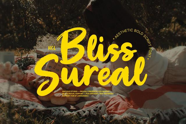
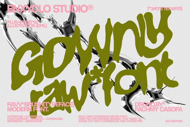
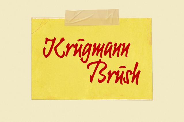
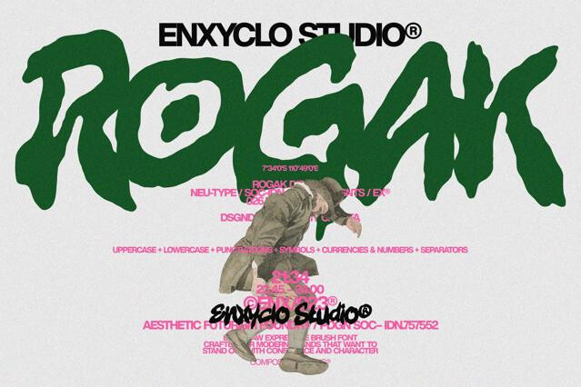


Brush fonts for bold, energetic, hand-painted lettering
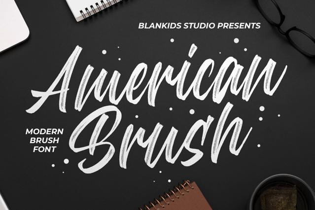
Brush fonts put the gesture back into type. You can see the tool in every stroke — the swell where the brush pressed down, the dry drag where it lifted, the rough bite of ink along the edge — and that visible energy is why we lean on this collection whenever a design needs movement and force.
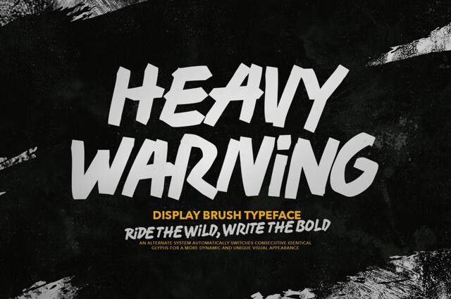
Inside you'll find the whole range: smooth modern brush scripts, punchy all-caps brush display, and raw ink-heavy fonts with serious textural grit. The best of them carry alternate glyphs so that no two repeated letters look stamped from the same mold.
The look of a loaded brush
What sets these fonts apart is the honesty of the mark — width that breathes with pressure, and texture that no neutral typeface can fake.
- Strokes that swell and taper with the motion of the hand.
- Dry-brush edges and ink buildup at the turns.
- An energetic, gestural rhythm across the whole word.
- Alternate forms that keep repeated letters from matching.
Where brush type carries momentum
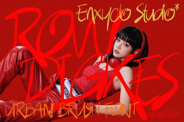
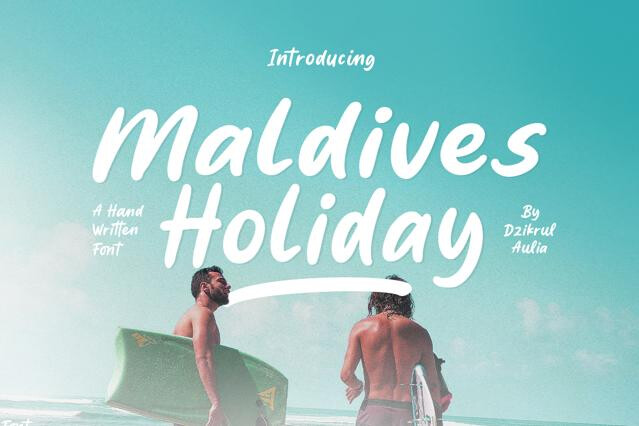
Brush lettering reads as confident and kinetic, which is why it owns a particular set of categories. Sports and athletic identities, streetwear graphics, music and event promotion, and energy-driven lifestyle brands all draw on its raw forward push — the type looks like it's already in motion.
Keeping the texture intact
Brush fonts are display tools, full stop. Their fine edges and heavy strokes thrive large and turn to mud when shrunk, so we'd hand the headline to the brush and the body copy to a clean neutral font. For print, export at high resolution so the dry-brush detail survives the trip to the page.
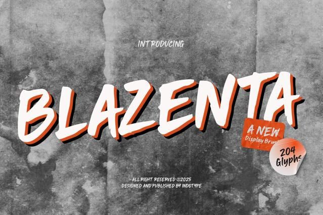
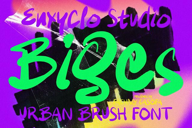
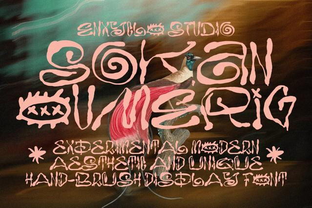
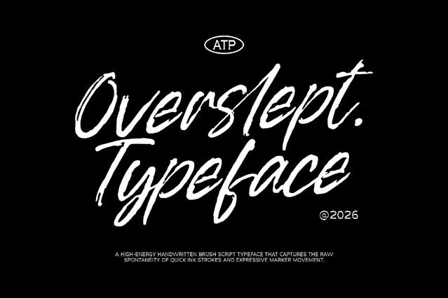
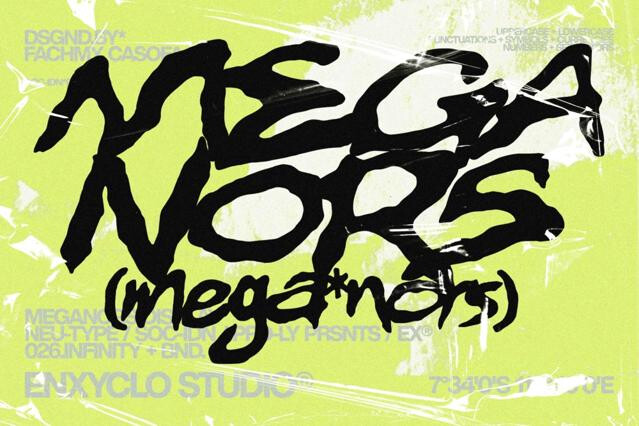
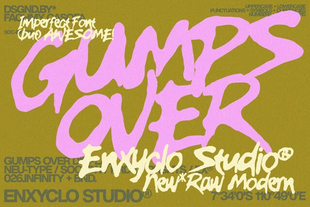
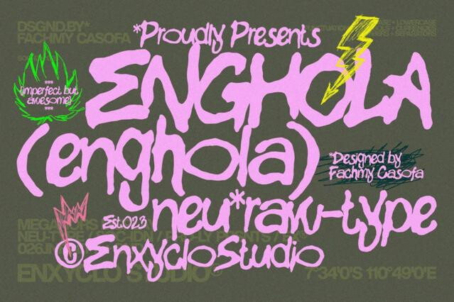
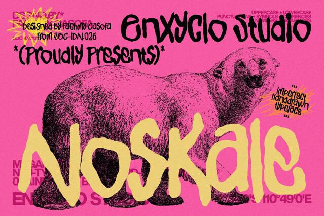
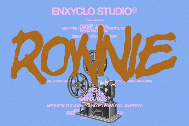
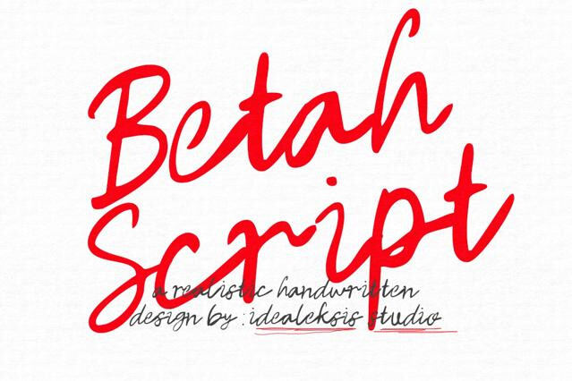
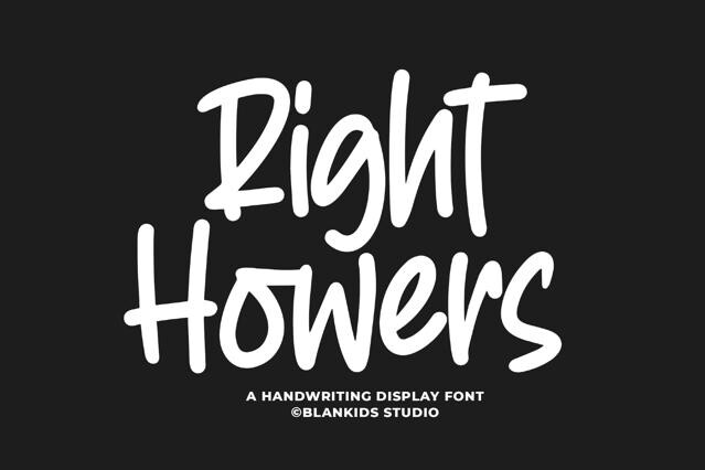
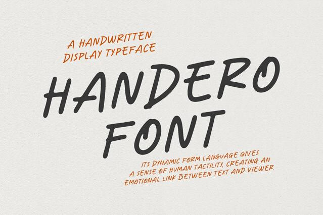
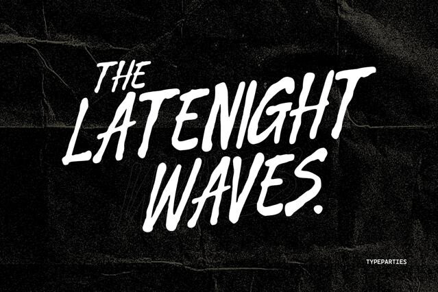
A brush font reproduces the look of lettering painted with a brush: variable stroke width that swells and tapers, dry-brush texture along the edges, and an energetic, gestural rhythm. The hand and the tool are both visible, which is exactly the appeal.
Both can connect and flow, but brush fonts foreground the texture and force of the tool — rough edges, ink buildup, raw energy — while traditional scripts emphasize smooth, controlled calligraphic line. Brush reads as bold and expressive; classic script reads as refined.
At display sizes, yes — that's where brush fonts live. The fine dry-brush detail can fill in or pixelate when shrunk, so we'd keep them large and export at high resolution for print. Test the roughest fonts at final size before you finalize.
The better ones do — multiple versions of common letters and OpenType contextual alternates keep the gesture varied, just as a real brush never repeats a stroke identically.
Sports and athletic branding, streetwear, music and event promotion, energy and lifestyle products, and more.
Not advisable. The texture and weight that make them striking at headline size turn muddy and tiring at small sizes. Pair a brush headline with a clean, neutral font for everything that needs to be read at length.