

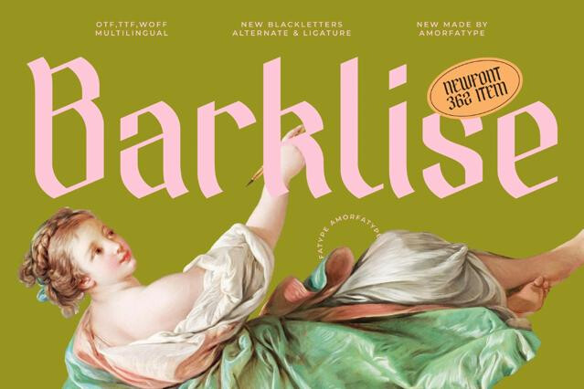
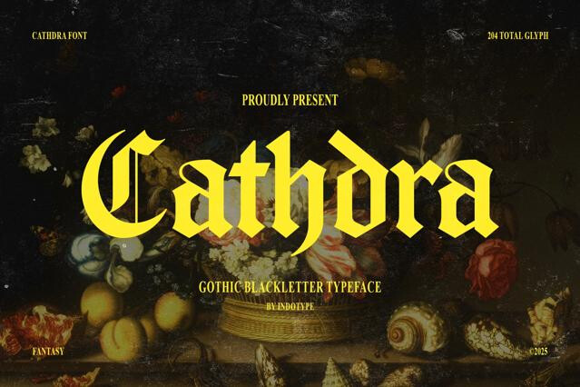
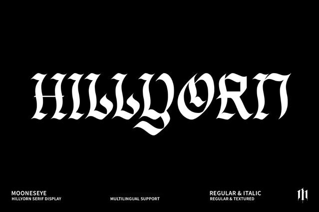
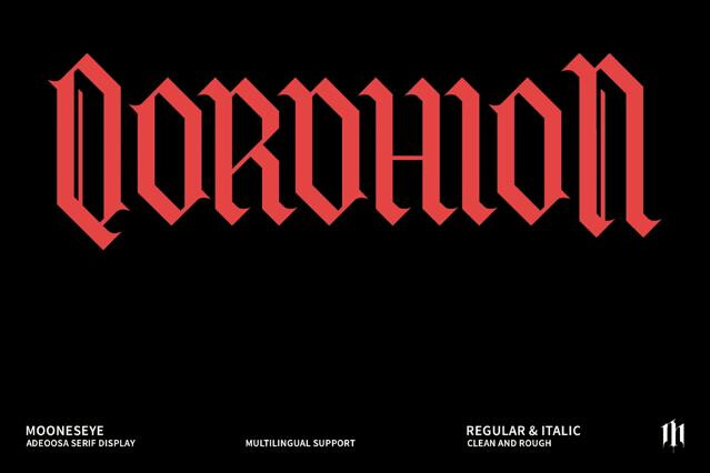
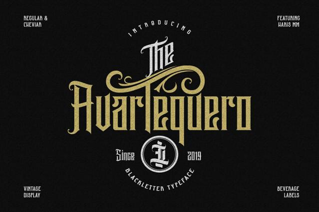
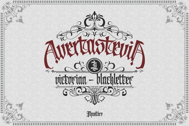
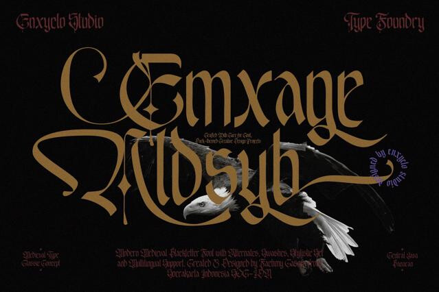
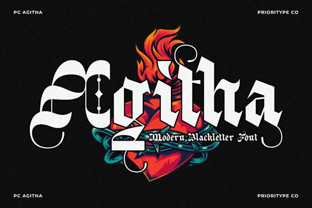
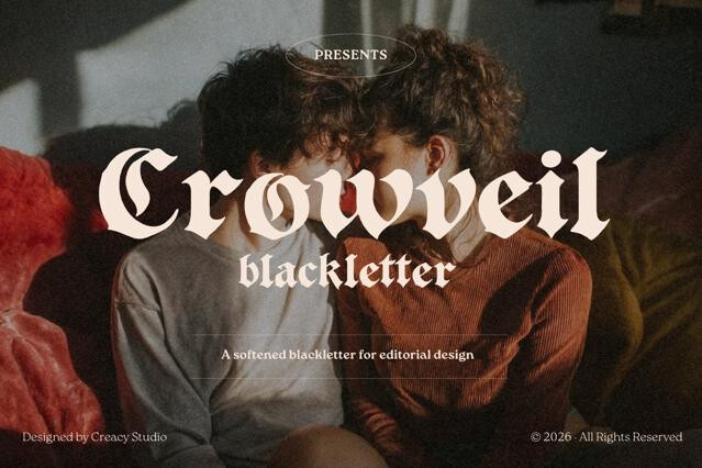
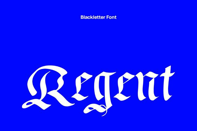
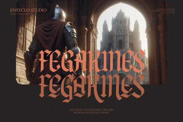

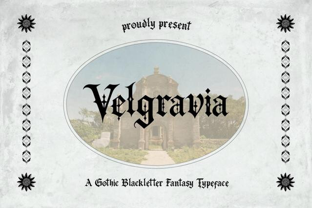


Blackletter fonts for old-world authority and dramatic weight
Blackletter fonts are born from medieval scribes and reborn through metal, tattoo, and streetwear culture. They’re described as dense, angular, and ornate, calligraphic scripts that ran European printing for centuries. We've curated fonts that honor the tradition — Textura, Fraktur, and Schwabacher forms — alongside modern interpretations that strip the ornament back for contemporary brands.
This is the typographic term for what's popularly called gothic, suiting heavy music, certificates, tattoo culture, and heritage branding.
Projects where blackletter type belongs
Few styles announce heritage and authority as fast as blackletter. It carries centuries of association with the sacred, the official, and the defiant all at once, which is what lets it move so easily between a diploma and a metal record sleeve:
- Band logos, album art, and music merch.
- Tattoo lettering and flash design.
- Streetwear graphics and apparel.
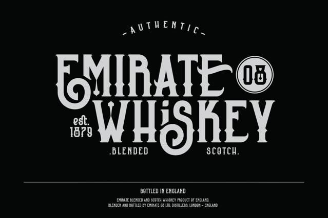
- Craft beer, spirits, and premium beverage labels.
- Certificates, diplomas, and ceremonial documents.
- Editorial headlines with a historical or dramatic angle.
The variations in our selection
Blackletter runs from the reverent to the raw, and the choice is really about how much history you want on the surface versus how much legibility you'll trade for it. A faithful historical style reads as authentic but resists a modern eye; a stripped-back modern cut reads cleanly but gives up some of the drama. Matching that balance to the audience is the job, so we keep both ends represented:
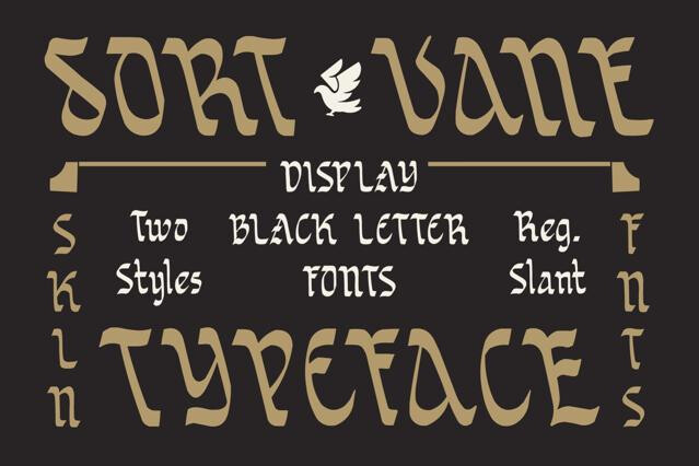
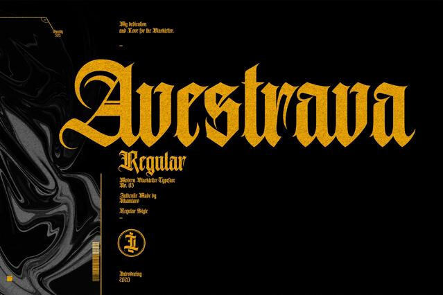
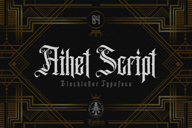
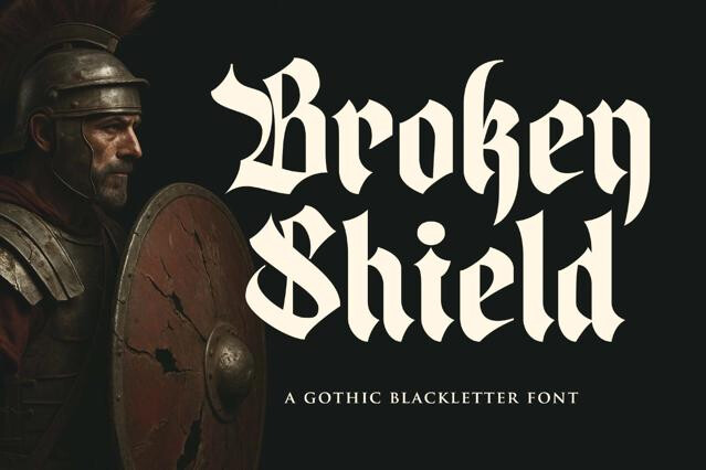
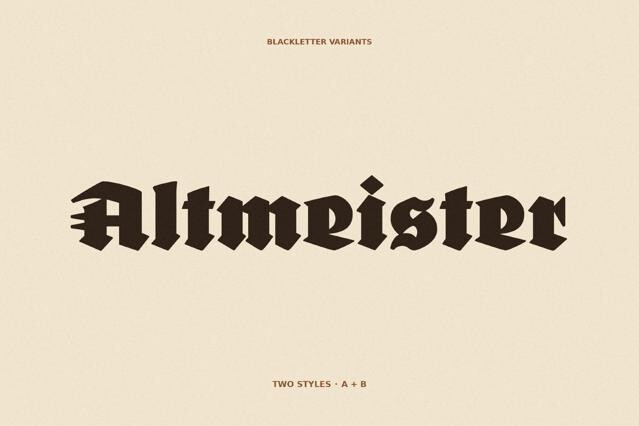
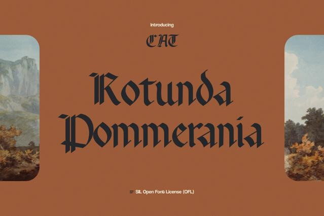
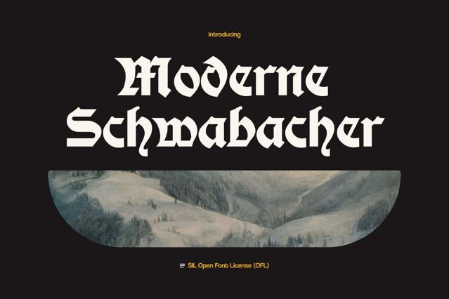
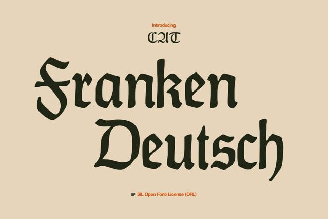
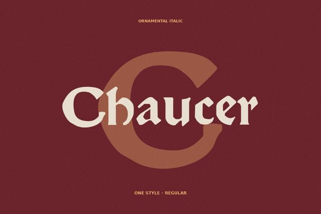
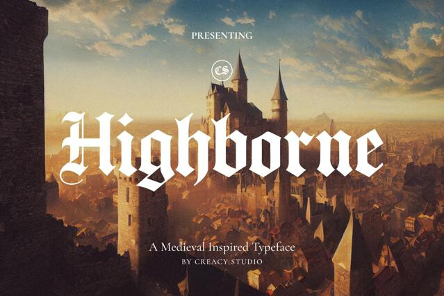
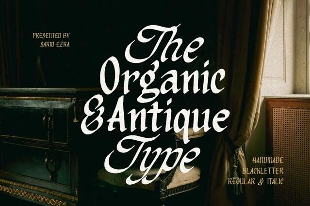
- Classic Textura and Fraktur — the tall, woven hand of high-medieval manuscripts and the broken, curved style that ran German printing for centuries, the most period-faithful forms.
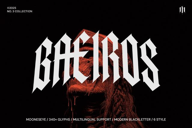
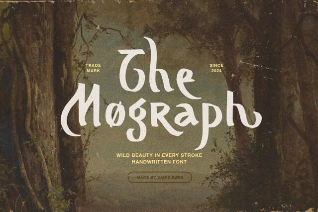
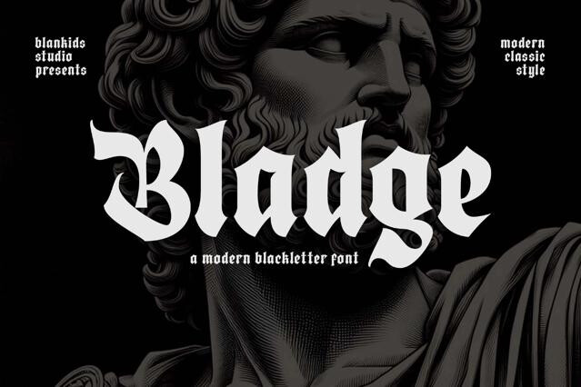
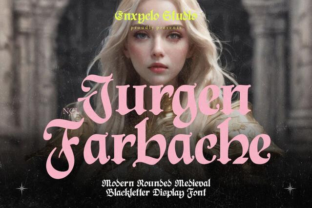
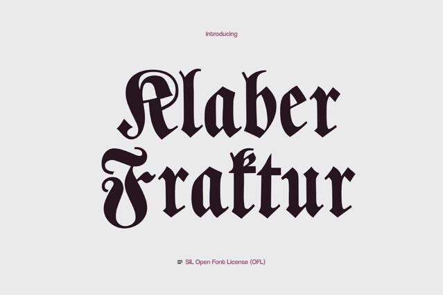
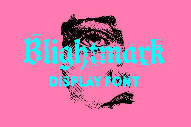
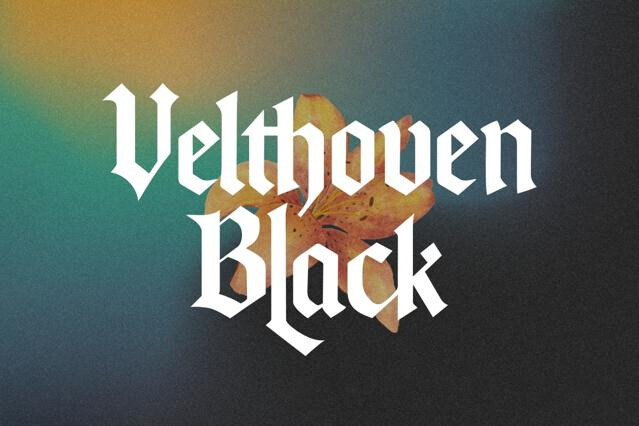
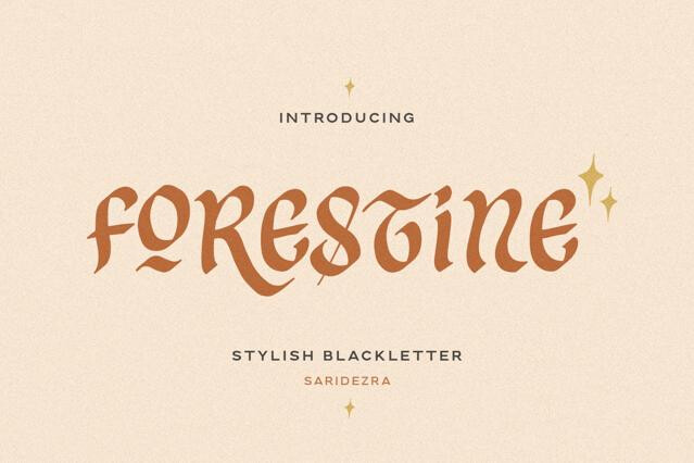
- Modern blackletter — contemporary redrawings that keep the gothic skeleton but open the forms up for present-day branding.
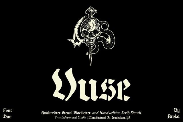
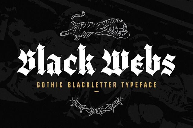
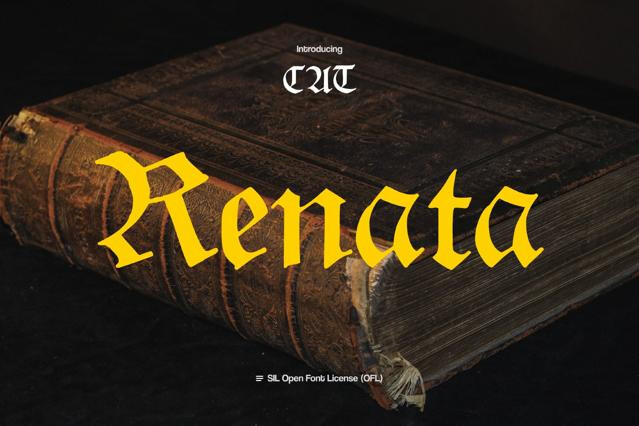
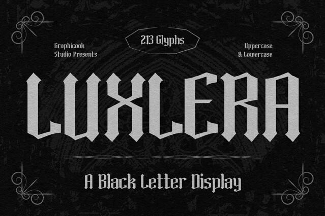
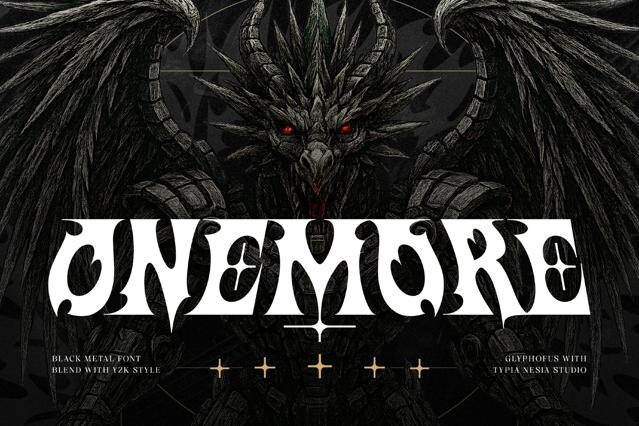
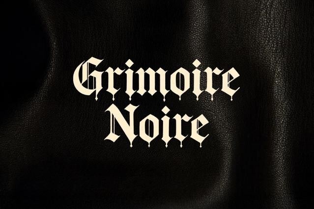
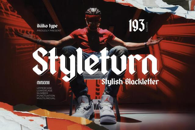
- Rough and inked versions — the same hands roughed up with ink and wear, carrying blackletter's metal-and-tattoo afterlife rather than its monastic origins.
- Decorative and ornamental caps — descended from illuminated initials, built to begin a word as a single drop capitaд.
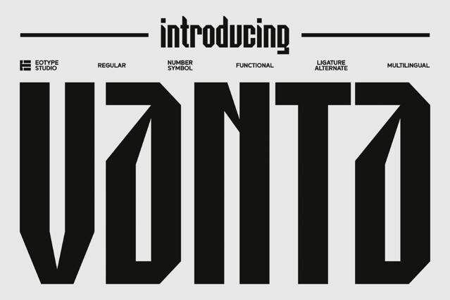
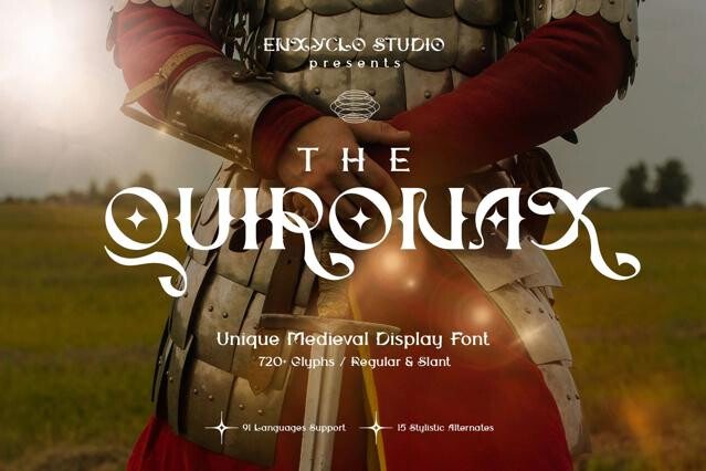
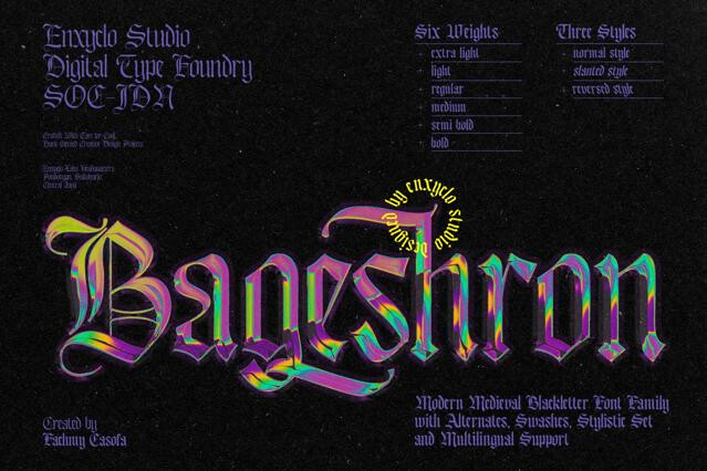
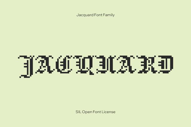
- Hybrid styles — blackletter spirit fused with sans-serif clarity, the newest layer where the tradition meets modern streetwear.
Handling blackletter fonts with care
This is type that rewards restraint and punishes overuse. Keep it to short, deliberate moments, like a name, a title, a single bold word. Plus, lean on mixed case rather than all caps to protect legibility. A plain supporting font and breathing room around the lettering will let all that intricate detail register.
Blackletter is the family of dense, angular, calligraphic scripts that dominated European writing and printing from the medieval period — characterized by heavy vertical strokes, narrow spacing, and ornate capitals. "Gothic" is the looser popular name for the same thing.
The main hands are textura (tall, narrow, woven), fraktur (curved, broken strokes), schwabacher (rounder, German vernacular), and rotunda (rounder, southern European). Each carries a distinct period and regional flavor.
In popular design use, yes — they refer to the same style. "Blackletter" is the precise typographic term; "gothic" is the common name (though "gothic" historically also meant plain sans serifs, which adds confusion). We treat them as the same category from two angles.
The dense vertical strokes and ornate, similar letterforms reduce differentiation, and the decorative capitals were never meant to combine.
Heavy metal and rock branding, tattoo and streetwear culture, certificates and diplomas, newspaper mastheads, beer and spirits labels, and heritage identities.
As decorated initials — one capital to begin a word, then lowercase forms after. Setting whole words or lines in blackletter capitals breaks both the design logic and legibility.