

- Poster
360
- Device
279
- T-Shirt
135
- Sticker
121
- Book
79
- Box
114
- Sign
127
- Paper
- Can
52
- Flyer
30
- Display
55
- Frame
40
- Bottle
44
- Wall
54
- Badge
38
- Vinyl
29
- Letterhead
41
- Tote Bag
36
- Shopping Bag
101
- Outdoor
202
- Cosmetic
88
- Storefront
92
- Magazine
54
- Stationery
124
- Billboard
144
- Business Card
- Packaging
221
- Advertising
- Branding
222
- Clothing
196

- Sans Serif
340
- Calligraphy
48
- Display
- Bold
296
- Script
- Serif
254
- Retro
132
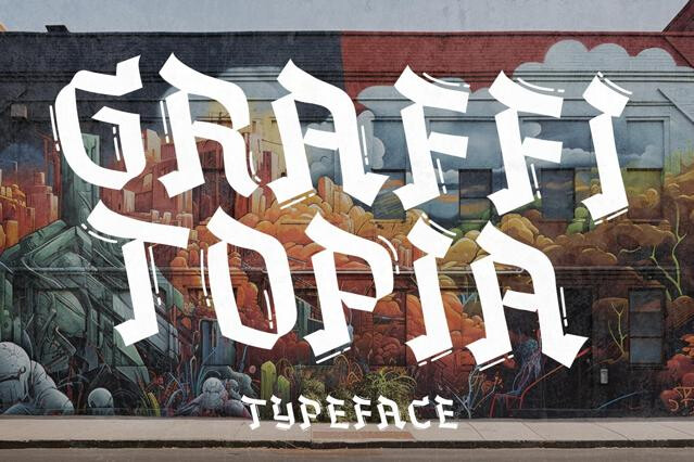
- Graffiti
60
- Y2K
48
- Elegant
- Western
69
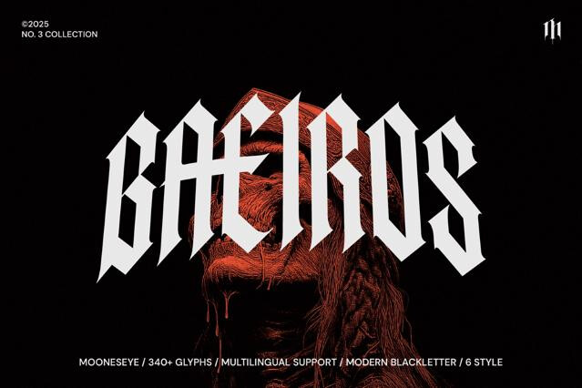
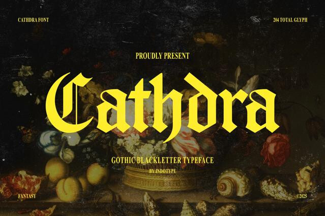
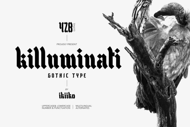
- Gothic
61
- Futuristic
85
- Bubble
61
- Playful
139
- Art Deco
51
- Wedding
96
- Sports
55
- Brush
128
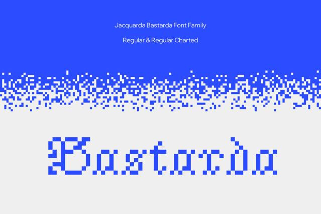
- Pixel
85
- Groovy
- Signature
86
- Cartoon
90
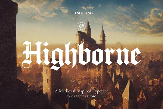
- Medieval
59
- Typewriter
51
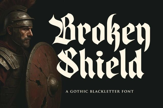
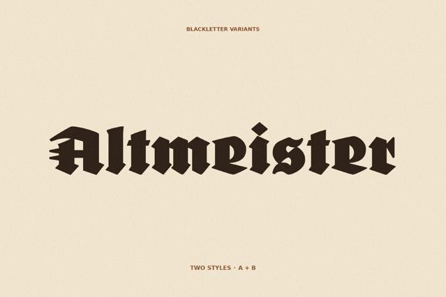
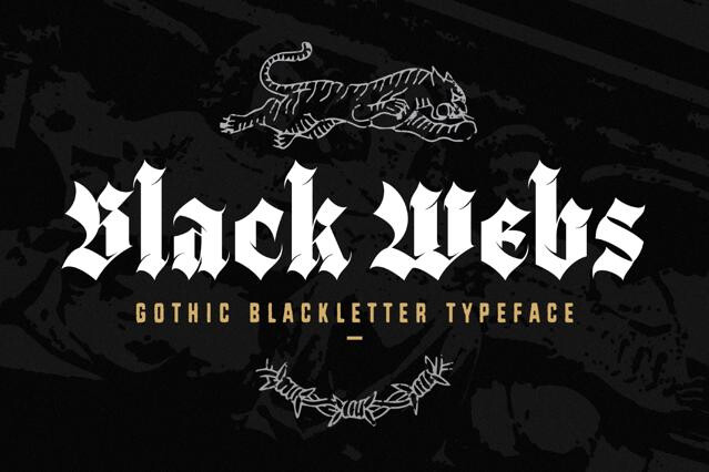
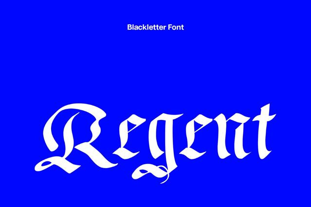
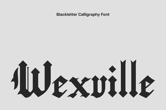
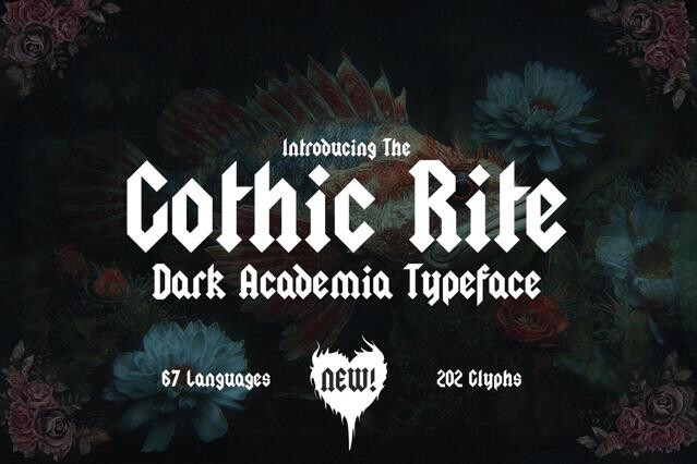
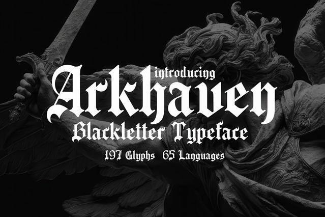
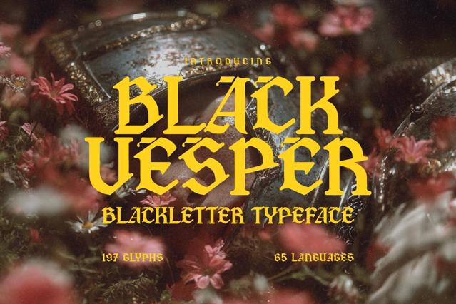
- Blackletter
- Marker
75
- Grunge
49
- Monoline
46
- Handwriting


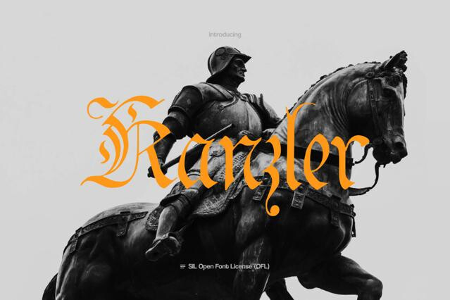
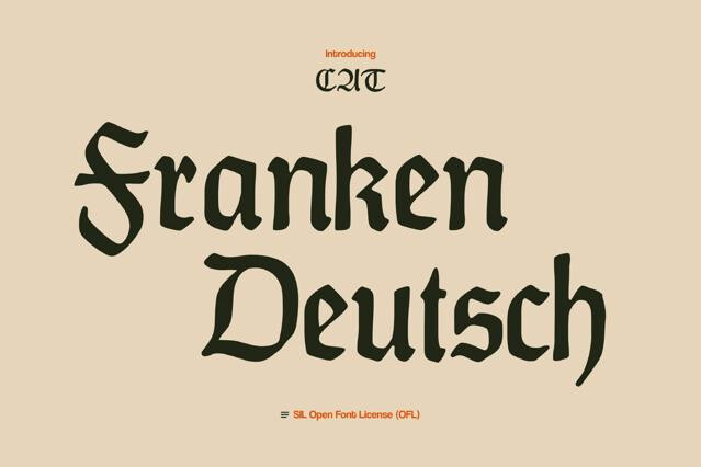
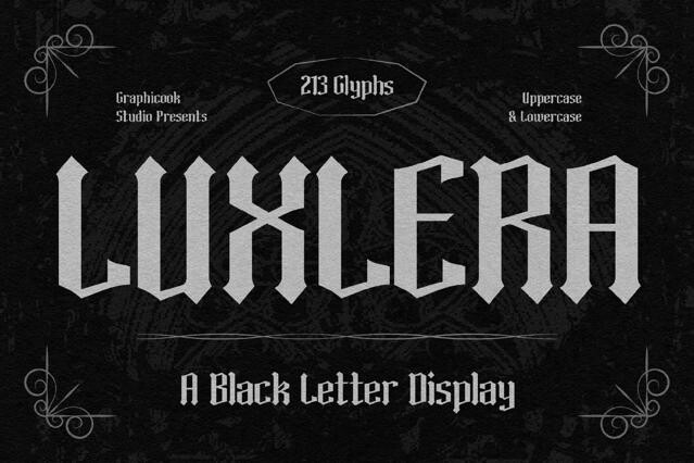
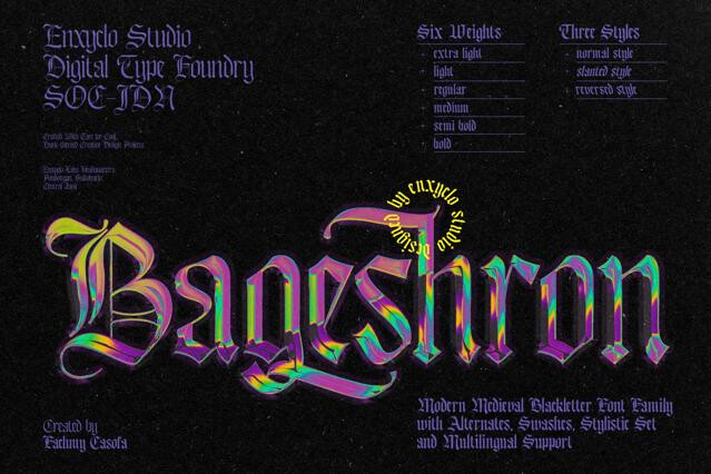

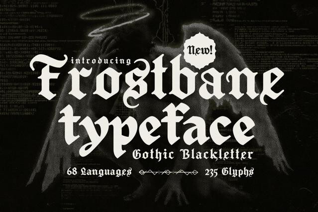


Gothic fonts for blackletter drama and old-world authority
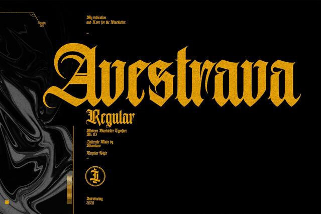
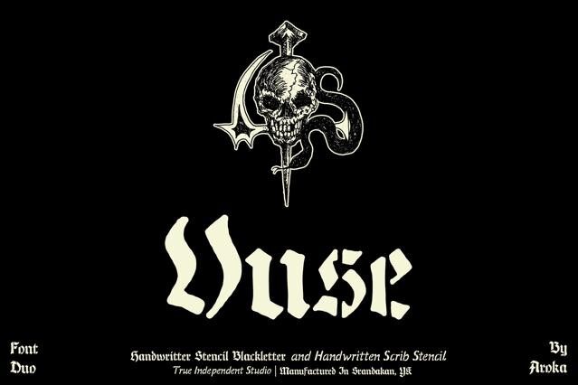
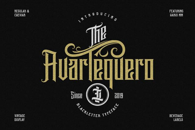
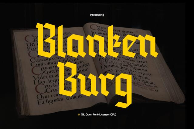
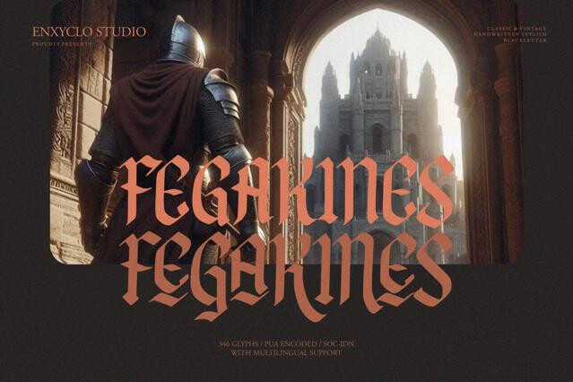
Dense, angular, and ornate, the blackletter tradition runs from medieval manuscripts through early European printing into modern metal and tattoo culture — and we've gathered the fonts that summon that dark authority in a single word. Our selectionspans the historical hands and their modern descendants, suited to heavy music branding, streetwear, certificates, and editorial reaching for drama.
Where gothic fonts command attention
Few styles carry as much instant authority as blackletter. It reads as heritage, intensity, and craft all at once, which is why it bridges worlds as different as antique formality and subcultural defiance. The weight is the whole point: gothic fonts suit projects made powerful, rooted in tradition, or proudly oppositional, sometimes all three..
- Metal, rap, and music branding.
- Luxury and high-fashion streetwear.
- Tattoo-inspired graphics and merch.
- Newspaper mastheads and editorial titles.
- Brewery, distillery, and craft labels.
The forms we've collected
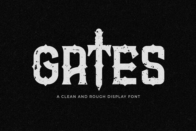
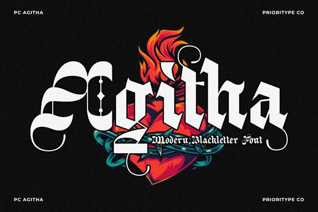
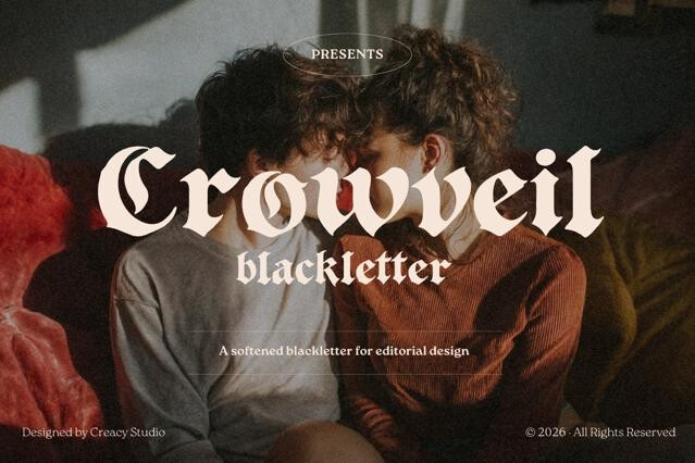
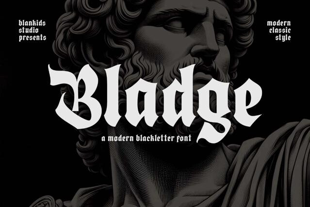
Blackletter is a long lineage of hands, and they're genuinely not interchangeable. Each was drawn in a different century for a different purpose, and each trades authenticity against legibility in its own way. Reach for the most ornate medieval form when a modern audience just needs to read the word, and the effort backfires
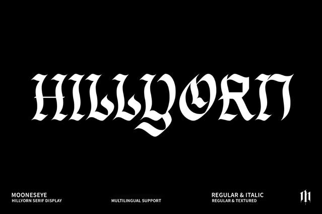
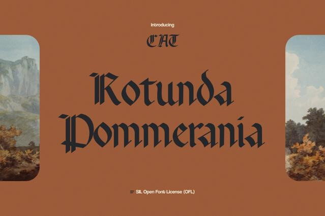
- Textura — the tall, tightly woven hand of high-medieval manuscripts and the earliest printed books, the most austere of the lineage.
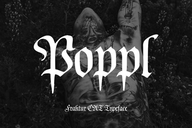
- Fraktur — the broken, more flowing style that dominated German printing for centuries, softer in its curves while still reading as deeply historical.
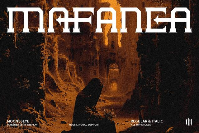
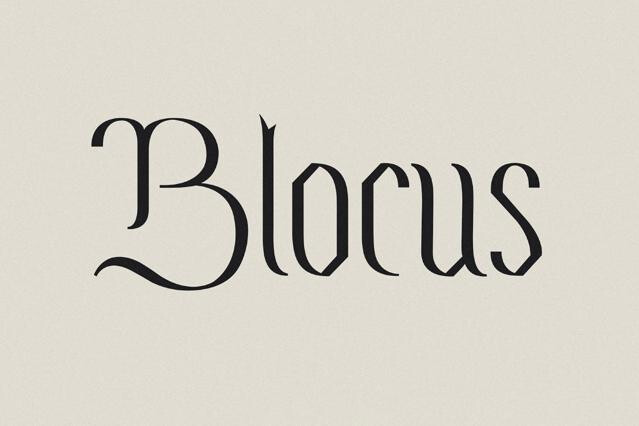
- Modern blackletter — contemporary redrawings that keep the gothic skeleton but open the forms for legibility, made for present-day branding.
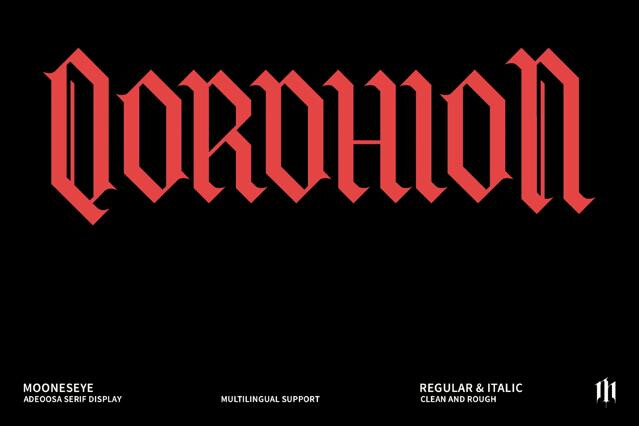
- Ornamental gothic — the heavily decorated, Victorian-descended display end, where flourish and drama matter more than period accuracy.
Reading the fine print on legibility
A quick word on the name: "gothic" historically also meant plain sans serifs, but here it means blackletter. And blackletter is built for atmosphere, not reading. The ornate capitals don't combine, so use them as decorated initials and never set whole words in caps. Keep it to short headlines and names, and let a clean font carry anything that has to be read.
Confusingly, both — in type history "gothic" has long been used loosely for plain sans serifs (as in "News Gothic"). But in popular design use, and in this collection, gothic means blackletter: the dense, angular, ornate medieval style. We use the popular meaning.
They're the historical sub-styles of blackletter: textura is the tall, narrow, woven look of medieval manuscripts; fraktur has more curves and broken strokes; schwabacher and rotunda sit between.
Yes, by nature. The dense forms and ornate capitals prioritize atmosphere over legibility, and all-caps setting makes it worse.
Heavy metal and rock branding, tattoo and streetwear culture, luxury and heritage labels, certificates and diplomas, and editorial reaching for darkness, drama, or old-world authority.
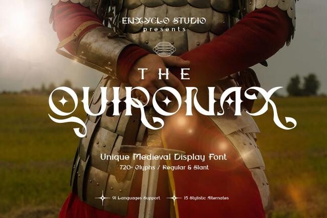
They overlap heavily. Gothic blackletter is the dominant medieval lettering style. We separate them so "medieval" can also cover broader period flavors (manuscripts, fantasy, illuminated capitals) while "gothic" centers on blackletter specifically.
Often, yes — blackletter capitals are highly decorative and don't combine with each other, so they're meant as initial letters, not for setting whole words in caps. Use them to begin a word, then switch to lowercase forms.