


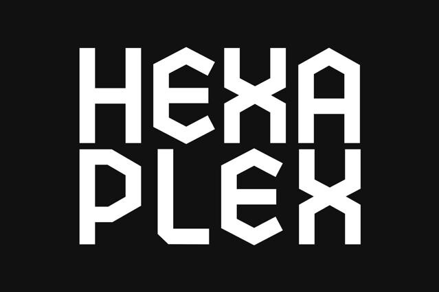
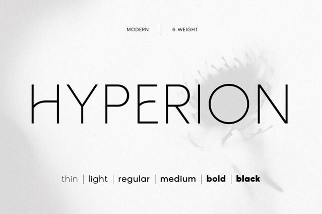
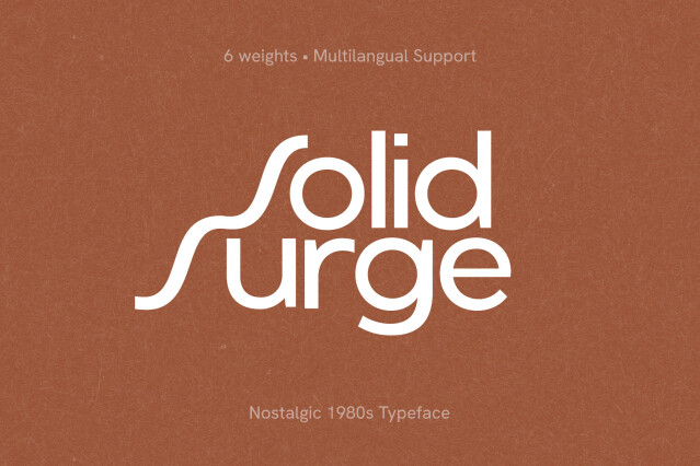
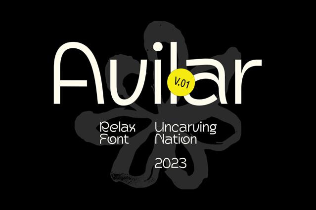
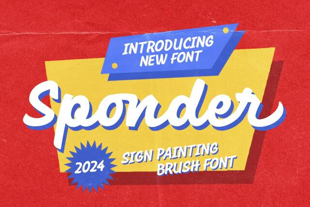


Monoline fonts for clean logos and even-stroke lettering
Monoline fonts are built on a single, even stroke. They hold no thick-thin contrast, no flourish for its own sake, just one consistent line that runs through every letter. That restraint is the whole point: it reads as confident and approachable, which is why it sits so comfortably in contemporary branding.
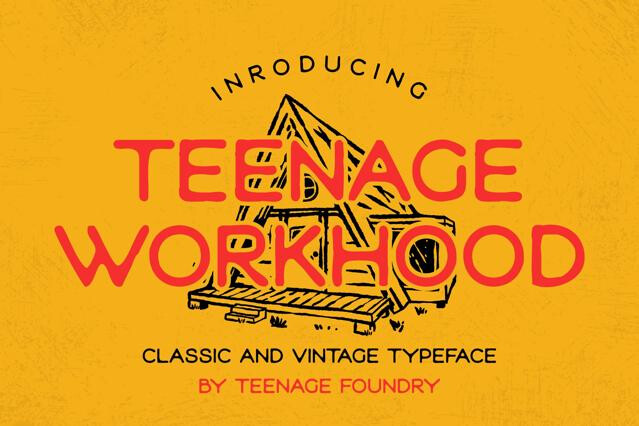
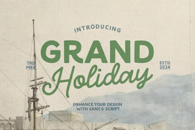
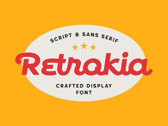
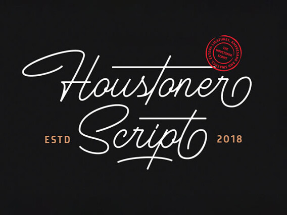
Our selection gathers the breadth of the style, from flowing monoline scripts to minimal geometric sans. We've kept the focus on fonts that stay legible at small sizes and scale cleanly into logos, packaging, and digital interfaces.
What designers do with them
A monoline font's even weightmakes it so dependable in production. With no fragile hairlines to drop out, it reproduces the same way whether it's foil-stamped, embroidered, reversed out of a dark background, or shrunk to a favicon. For identity work, its predictability is worth much — a designer can hand the file to a printer, a sign-maker, or a developer and trust the result.
- Wordmarks and lettering-based logos.
- Packaging for food, beauty, and lifestyle products.
- Wedding and event suites that want elegance without fuss.
- App icons, UI labels, and digital product branding.
- Handwritten-style headlines for warm, personal copy.
Monoline fonts variations you'll find
Because the weight never changes, all of a monoline font's personality has to live somewhere else: e.g., in the shape of the curves, the way letters connect, how much the line loops or stays strictly geometric. That's why two designs built on the same even stroke can feel worlds apart, and why it's worth looking past the "monoline" label to how a given font actually moves:
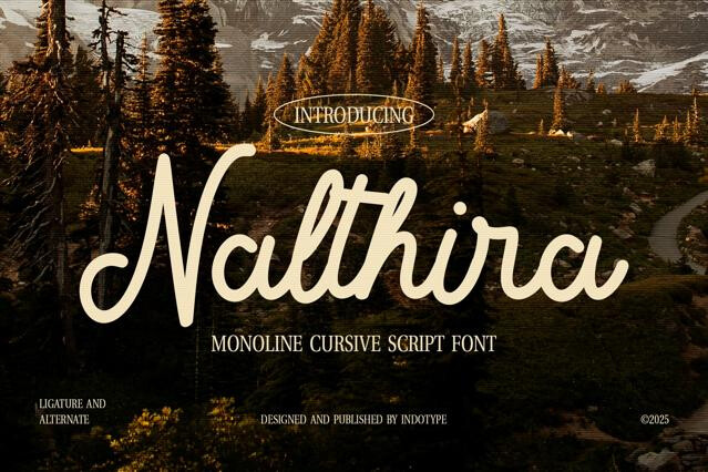
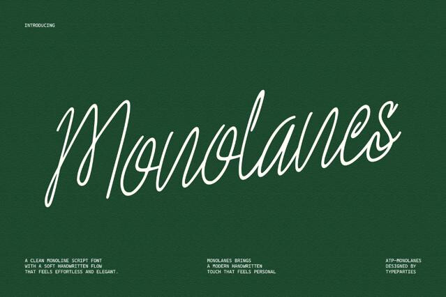
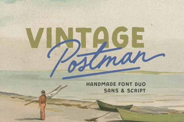
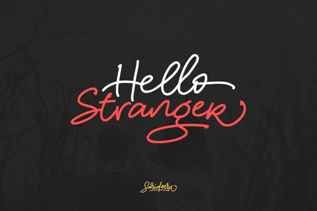
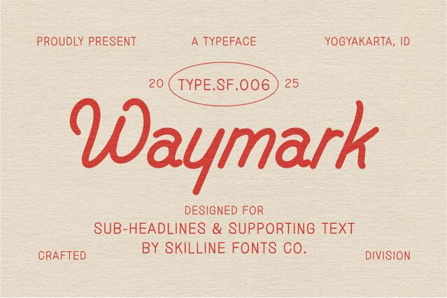
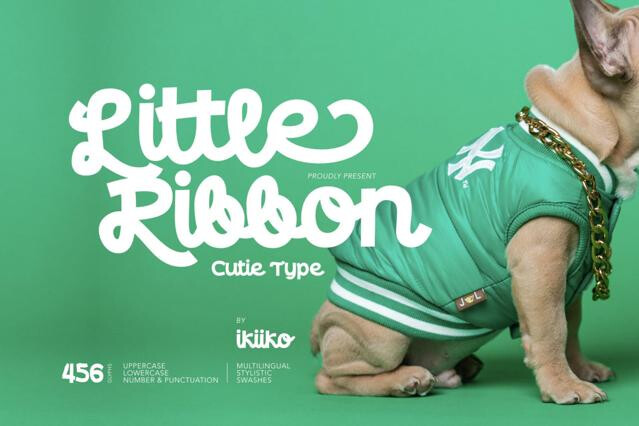
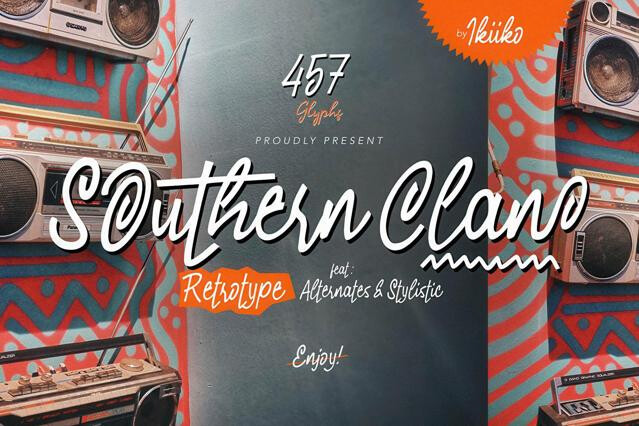
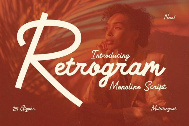
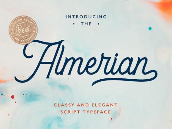
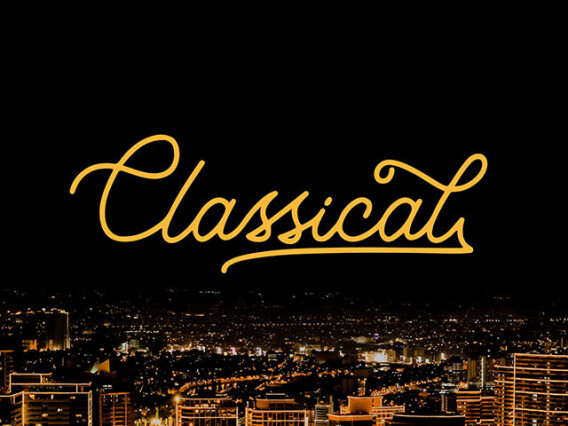
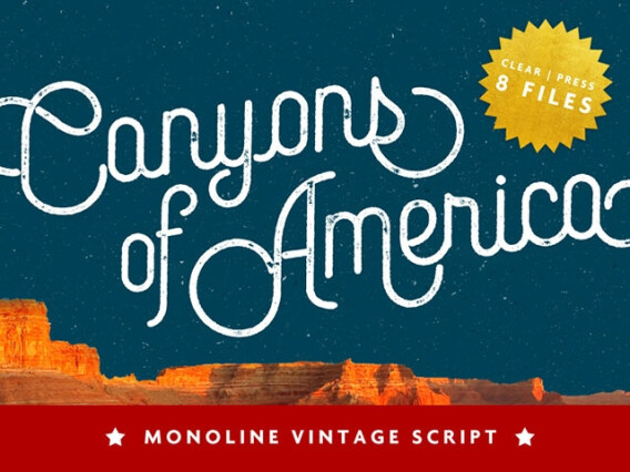
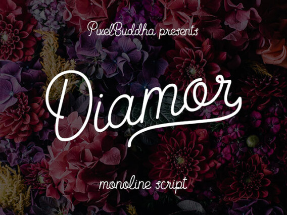
- Monoline scripts — flowing, connected handwriting with a uniform line.
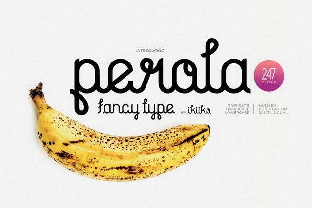
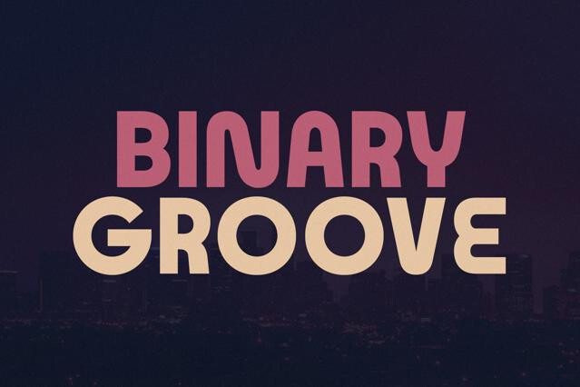
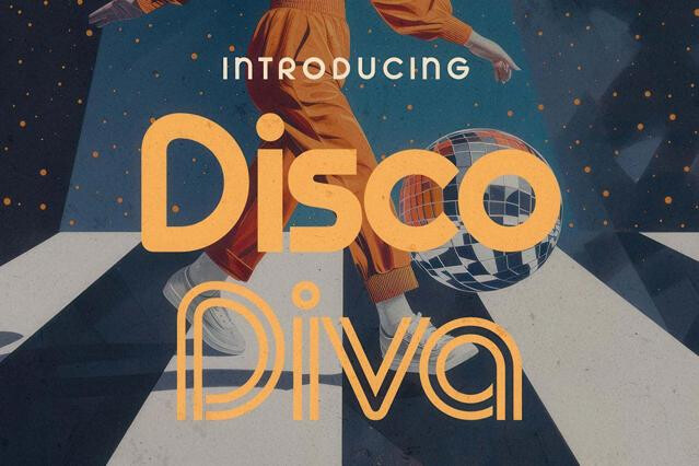
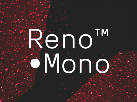
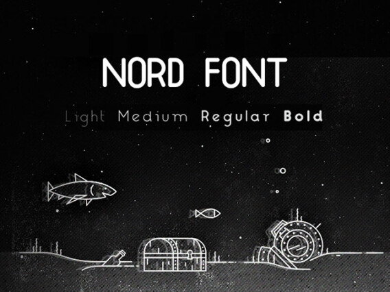
- Geometric monoline sans — clean, rounded letterforms based on circles and straight lines.
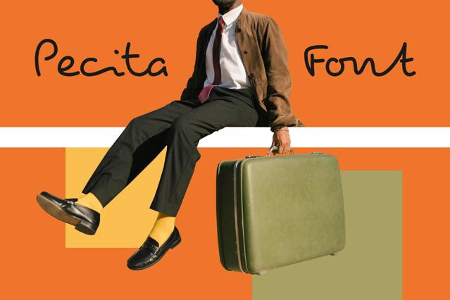
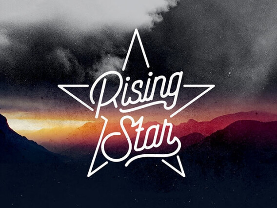
- Signature styles — casual, personal autographs ideal for personal brands.
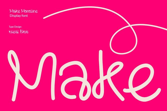
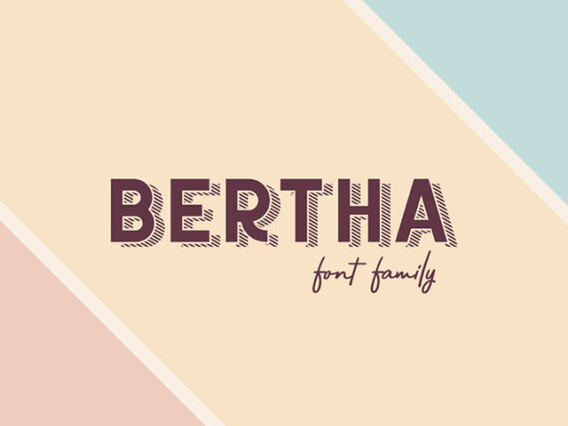
- Decorative monoline — playful versions with subtle swashes and ligatures.
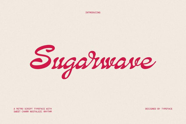
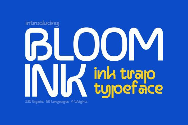
It describes type drawn with a uniform stroke width throughout — the line never thickens or thins. The absence of contrast gives monoline fonts a smooth, even, almost hand-drawn-with-a-marker quality, whether they're scripts or sans.
Their even weight is legible and reproducible at small sizes and in single-color print, where high-contrast scripts lose their hairlines.
Generally yes. With no fragile thin strokes to drop out, they survive embroidery, engraving, single-color printing, and small-scale use better than contrast-heavy fonts.
The sans and simpler designs can work for short text, though the even weight gives less of the rhythm that aids long reading. Monoline scripts are display-first, so keep them to logos, headlines, and short accents.
Very well. A monoline script logotype sits comfortably above a clean geometric or humanist sans, since both share an even, modern sensibility. We'd keep the supporting font equally restrained so the consistency carries through.