


Retro fonts that channel the design language of past decades
Retro fonts are time machines. We gathered the fonts that quote a specific era on purpose — the groovy curves and tight swashes of the 70s, the neon geometry of the 80s, the optimistic punch of mid-century advertising — and put them within easy reach for any project that wants instant nostalgia.
Unlike genuinely aged vintage type, retro is a knowing tribute. These fonts wear their decade proudly, with the proportions, flourishes, and color logic that make a viewer place them in time the moment they see them.
Reading the decades
Each era left a distinct typographic fingerprint, and recognizing them keeps the reference precise:
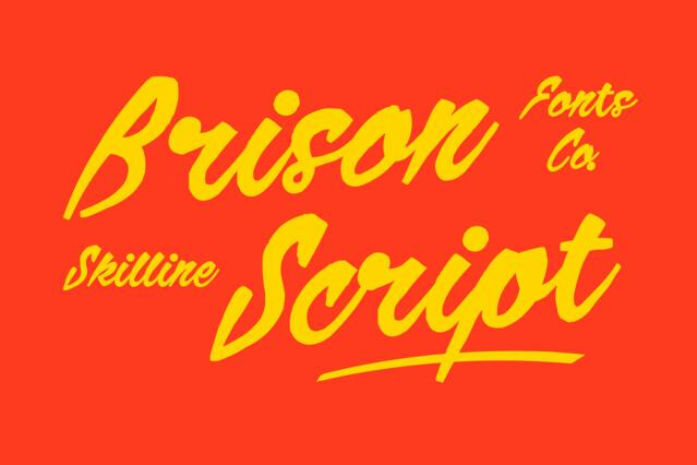
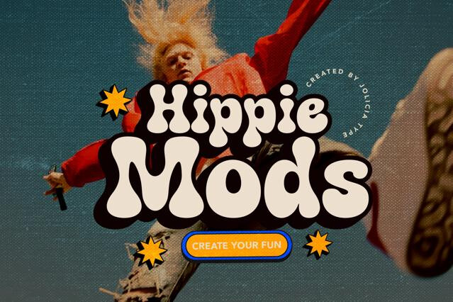
- 50s–60s — friendly mid-century scripts and bouncy advertising display.
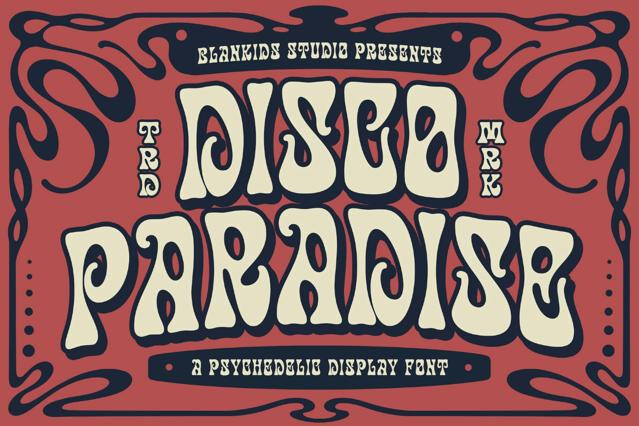
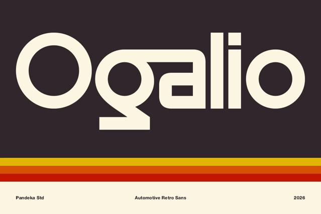
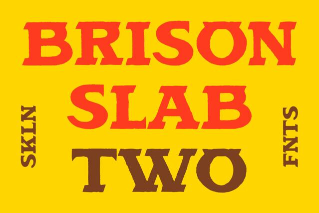
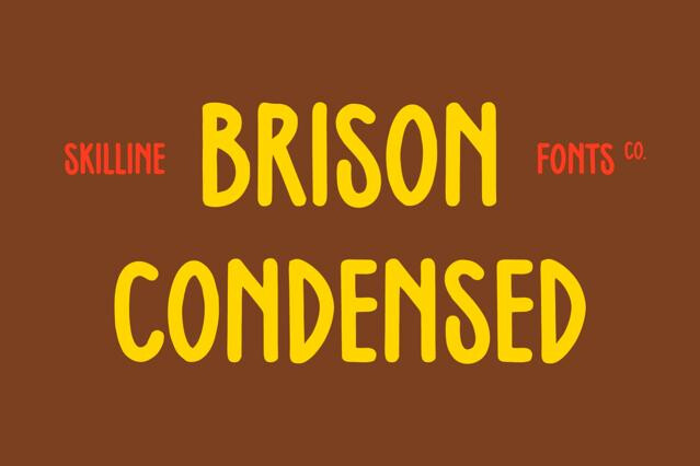
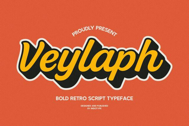
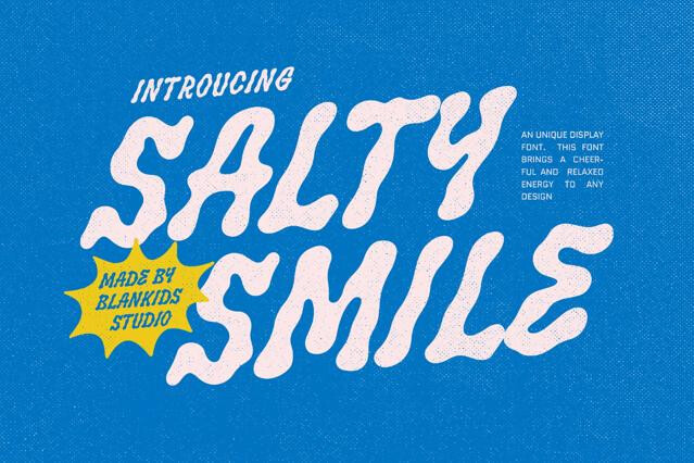
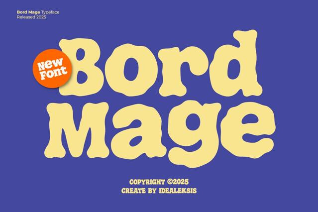
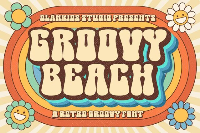
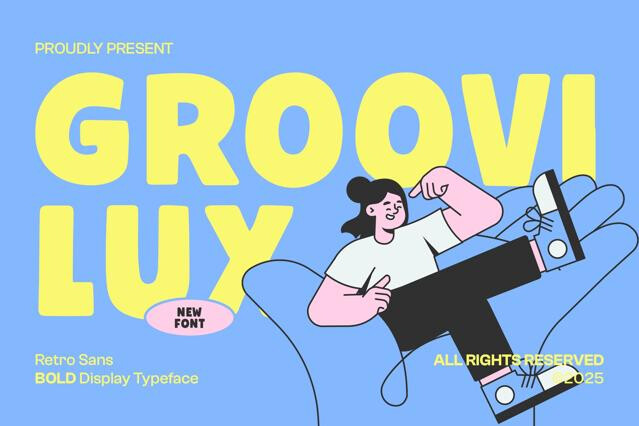
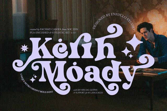
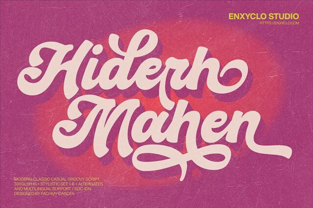
- 70s — groovy, tight-curved fonts with looping swashes and warm color.
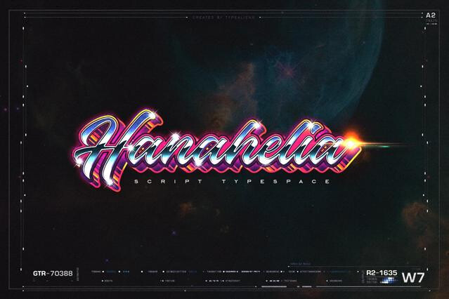
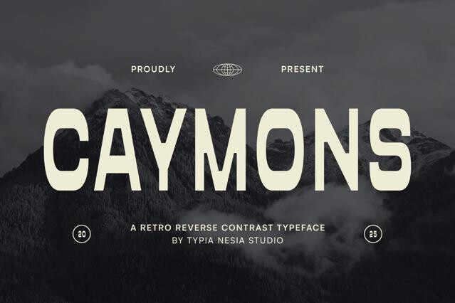
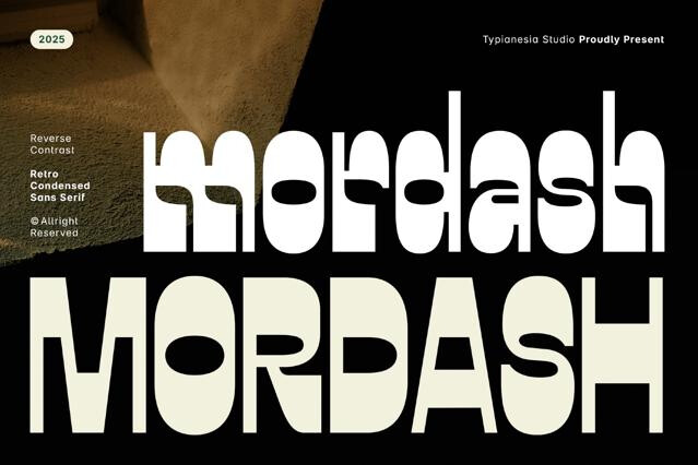
- 80s — geometric, neon, chrome, and synth-driven display.
Committing to one era
The fastest way to lose a retro concept is to mix decades. A 70s groove paired with 80s neon reads as muddled rather than nostalgic, so pick a single era and let color, layout, and imagery all pull in the same direction.
Retro fonts reference a particular recent decade with a stylized, knowing nostalgia. They quote the 60s, 70s, or 80s on purpose. Vintage fonts aim for genuine age and period authenticity, feeling like artifacts rather than tributes.
Most retro fonts draw from the 1950s through the 1980s — mid-century advertising scripts, groovy 70s display with tight curves and swashes, and 80s geometric and neon styles.
With caution. A 70s groove font and an 80s neon display send conflicting era signals and can read as confused. We'd commit to one decade per project and let the rest of the design — e.g., color, layout, imagery — reinforce it.
Nostalgia cycles are long and recurring, and specific retro styles resurface reliably as generations rediscover them. That said, heavy era-specific styling does date a design intentionally, which is usually the point.
Often the strongest results come from a retro display font set in a clean, contemporary layout — the contrast keeps the nostalgia from sliding into pastiche. Let one era-defining headline carry the reference and keep the structure modern.
Frequently, yes — the looping 70s swashes and connecting forms live in stylistic sets and contextual alternates. Enable those features to get the authentic flourishes; the product page lists what each font includes.