

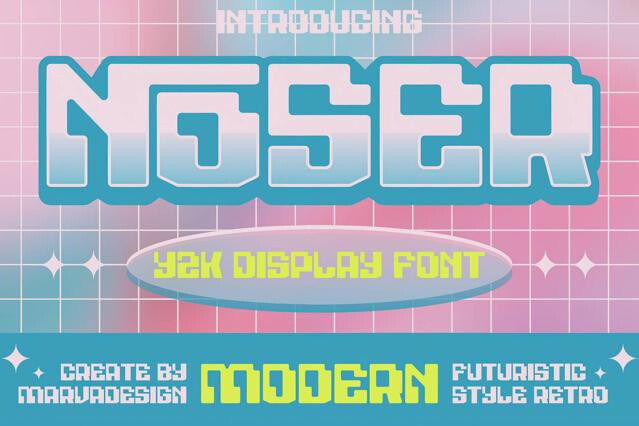


Y2K fonts for chrome, gloss, and millennium-era nostalgia
Y2K fonts bottle a very particular optimism: the late-90s-into-2000s moment when the internet was new, the future was shiny, and everything came coated in chrome. We've gathered the fonts that revive that look: bubbly inflated forms, metallic gloss, and rounded techno sans straight out of an early dot-com daydream.
The style is enjoying a full cultural comeback, and it lands hardest in fashion, music, beauty, and social design aimed at audiences who feel the nostalgia in their bones.
Where Y2K fonts belong
When a brand reaches for Y2K look, it's telling a younger audience that it speaks their language and doesn't take itself too seriously. The aesthetic works hardest in spaces where culture moves fast and the reference is understood instantly, so the type does the positioning before anyone reads a word.
- Hyperpop and electronic music covers, mixtapes, and single artwork.
- Streetwear graphics, fashion lookbooks, and seasonal drops.
- Social content for Gen Z audiences and meme-adjacent branding.
- Posters, flyers, and event identities with a club or rave feel.
- Packaging and merch that lean into early-2000s tech nostalgia.
The styles inside this collection
Picking a Y2K font is really a question of how much shine, irony, and chaos a project can carry. The same era reference reads as slick and aspirational or loud and tongue-in-cheek depending on the corner you pull from. Fashion-facing work usually wants the polished, futuristic end; meme-adjacent and music projects strive the noisier, more screen-broken side. We've kept the spread wide so you can dial that tone precisely:
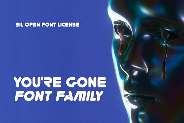
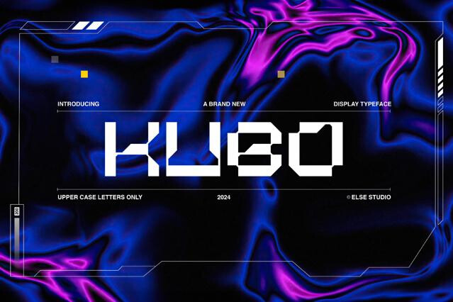
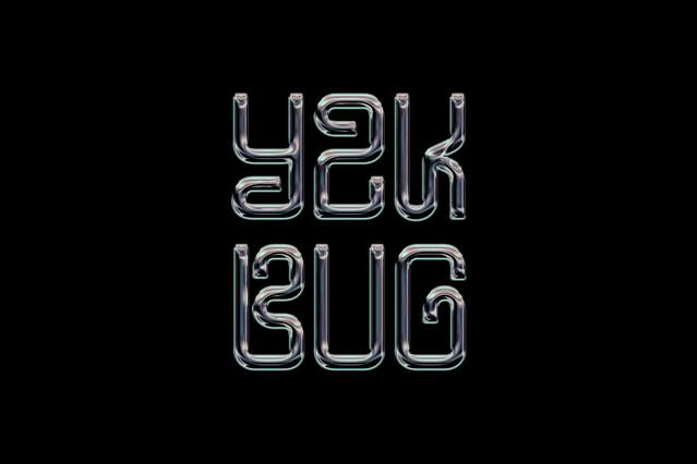
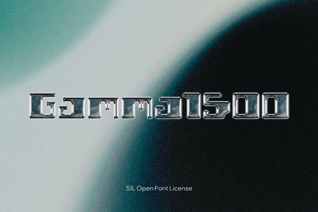
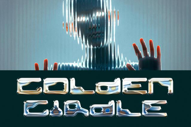
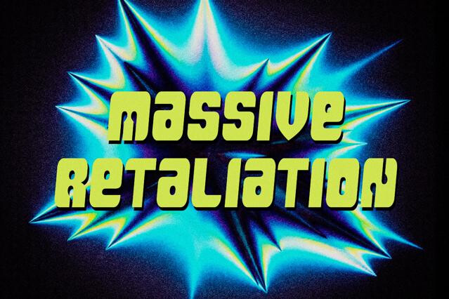
- Chrome and metallic fonts — reflective, beveled lettering with that liquid-mercury finish.
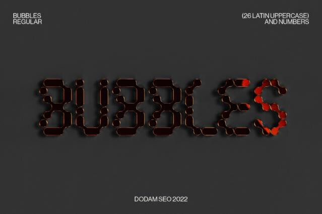
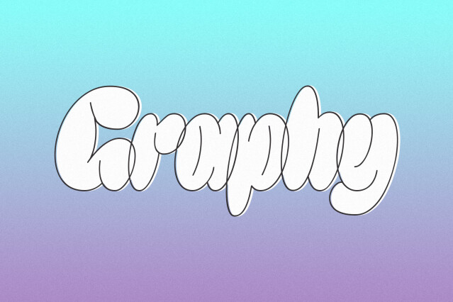
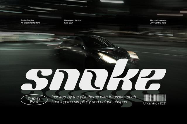
- Bubble and inflated sans — soft, rounded volumes that feel like blown plastic.
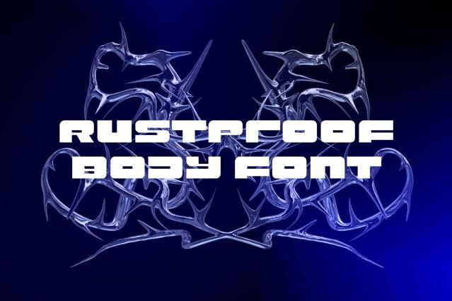
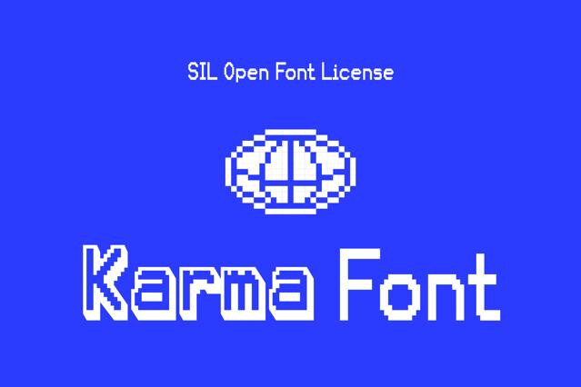
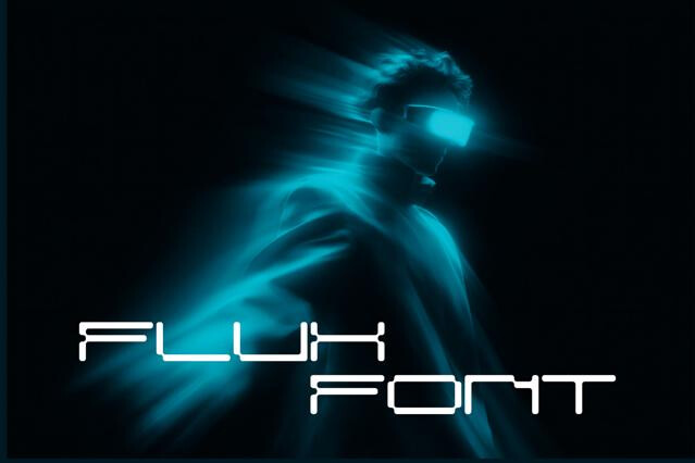
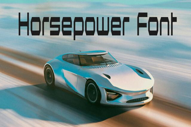
- Techno and pixel fonts — screen-born letterforms tied to early interfaces and gaming.
- Glitch and distorted display — corrupted, fragmented type for a digital-decay edge.
It's a specific cocktail: glossy, inflated, bubble-like forms; chrome and metallic effects; rounded techno-futuristic sans; and a candy-colored technology aesthetics.
Retro is a broad umbrella across many decades, while Y2K pinpoints roughly 1998–2004 — the chrome-and-bubbles internet moment. It's more specific and more digital than 90s grunge, and glossier and more naive than the styles that followed.
Sometimes — certain Y2K fonts ship as layered or color fonts carrying the metallic shine. But most are clean forms you finish with effects yourself. Layered and color versions need software that supports them, so check the format on the product page.
Yes, and that's usually the intent. The whole appeal is the era reference. We'd treat it as a deliberate temporal statement for fashion, music, and culture work.
The trend is culturally specific. It resonates strongly with Gen-Z and millennial-nostalgia audiences across fashion drops, music, beauty, and social content.
That's the smart move. Let one glossy Y2K font carry the statement and support it with a clean techno or neutral sans. Too many chrome effects at once tip the design from nostalgic into noisy.