

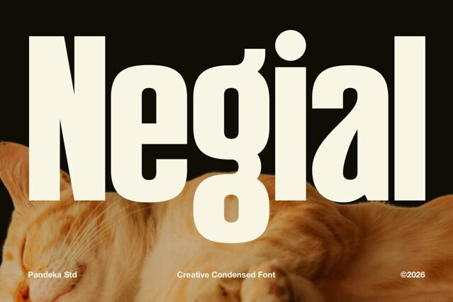
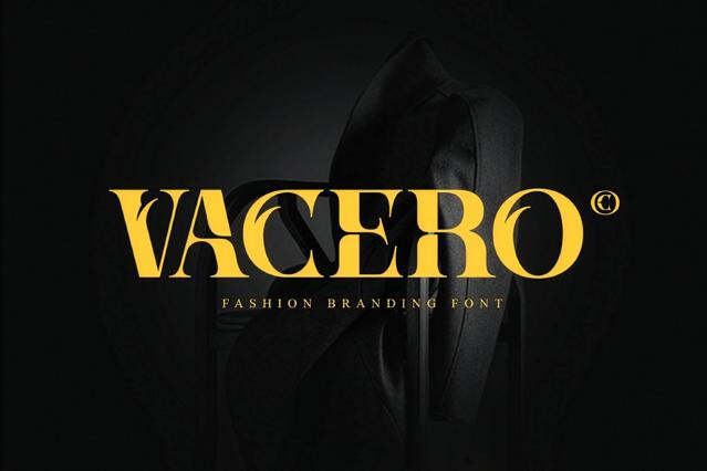
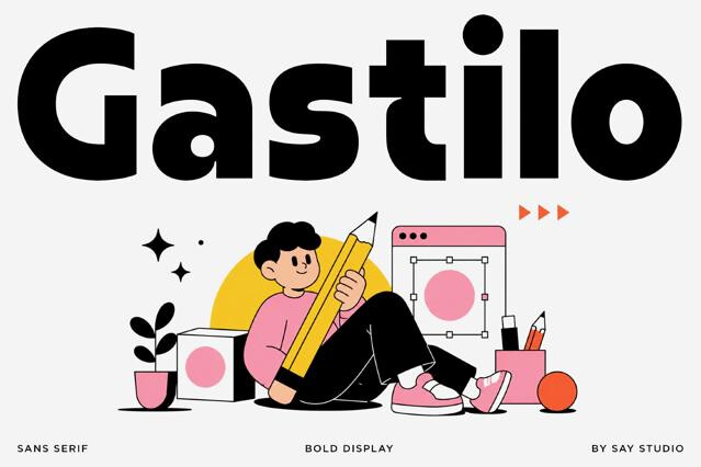
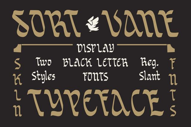
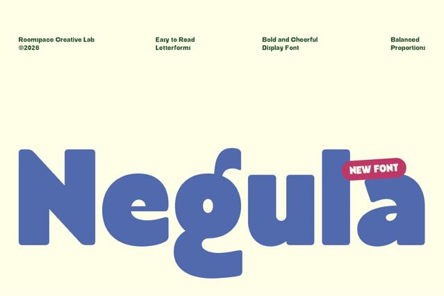
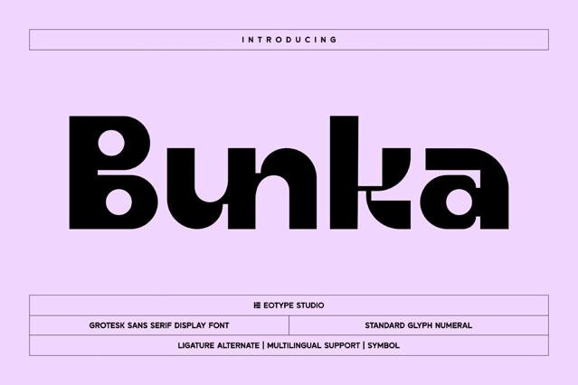
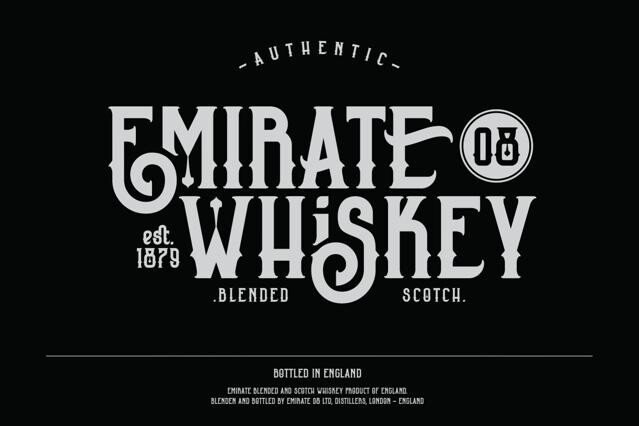
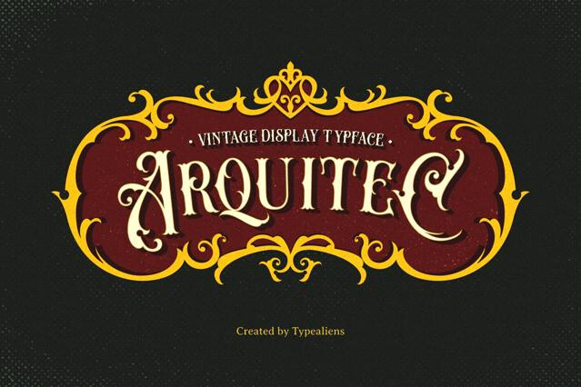
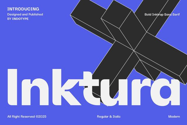
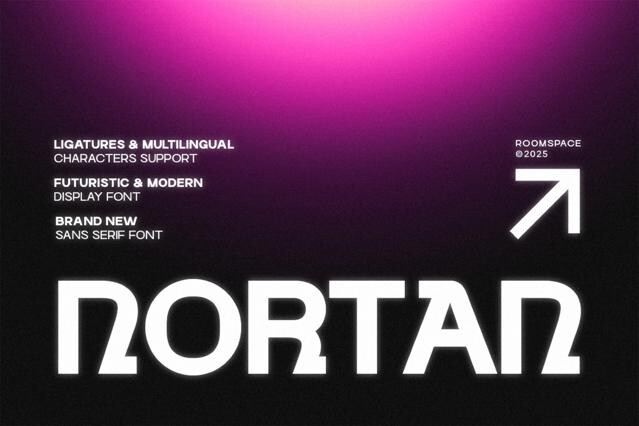
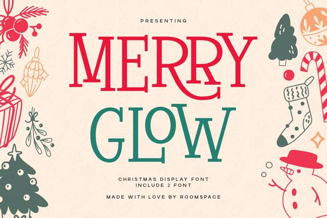
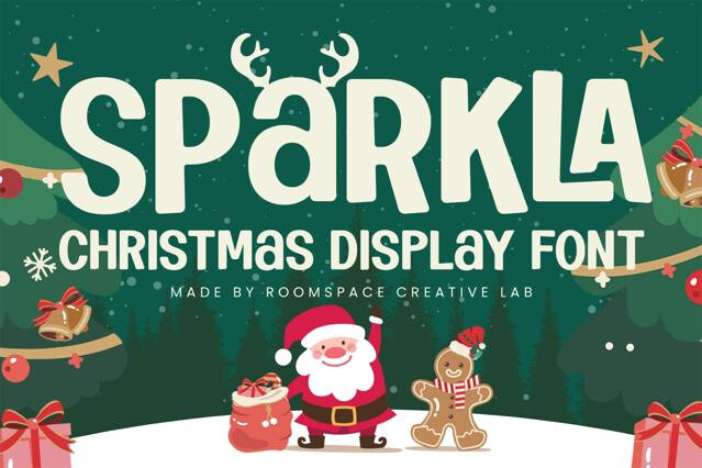


Display fonts for headlines, branding, and high-impact typography
Display fonts are the loudest voice in a typographic system. We've gathered the fonts you reach for when a layout needs a focal point — the headline that stops a scroll, the logotype that defines a brand, the title that sets the mood before a single line of body copy is read.
This category spans a wide tonal range: confident editorial serifs, brutalist sans with attitude, condensed fonts for tight column work, and expressive forms drawn purely for personality. What they share is purpose — they're made to be looked at, not read for minutes at a time.
Where display fonts do their best work
These are the fonts that carry hierarchy. They establish the first thing a viewer sees and decide how the rest of the design feels.
- Editorial headlines, cover lines, and pull quotes.
- Logotypes, wordmarks, and brand signatures.
- Poster titles, event names, and campaign keywords.
- Packaging fronts and product naming.
- Hero sections, landing pages, and app splash screens.
- Title cards, motion graphics, and opening sequences.
Choosing the right level of personality
Not every project wants a font that shouts. We organize display type along a spectrum — from near-neutral fonts with one memorable detail, to fully expressive designs that become the concept themselves. Match the volume of the font to the volume of the message: a serious brand wants restraint, a music or fashion drop can afford to be loud.
Pairing display type with a working system
A display font rarely works alone. Give it a calm companion, e.g., a clean sans for interface and captions, or a readable serif for body — so the contrast reads as intentional rather than chaotic. The rule of thumb we follow: one font does the performing, the rest do the supporting.
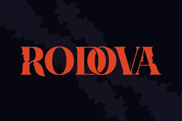
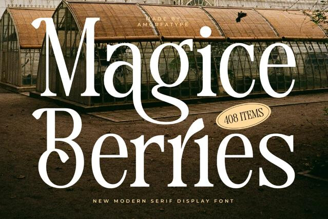
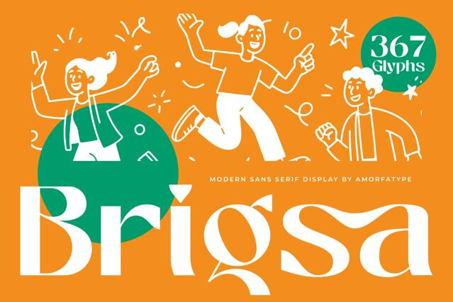
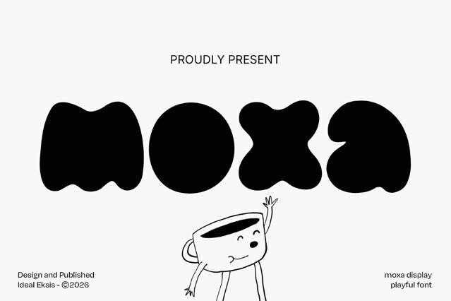
A display font is any typeface designed to perform at large sizes, where distinctive shapes, high contrast, or unusual proportions become an asset instead of a distraction. The defining trait is intent: it's drawn for impact at the top of a layout, not for comfort across a page of text.
We'd advise against it. Their tight spacing, exaggerated forms, and decorative detailing are tuned for short bursts of text — a headline, a title, a brand name — and tend to tire the eye in paragraphs. Pair them with a neutral text font instead.
Many do, especially the more expressive ones, where stylistic sets and contextual alternates let you fine-tune the look of a single word. Each product page lists the OpenType features included, so you can check before downloading.
The reliable approach is contrast with restraint: let the display font do the talking, and support it with a quiet sans or serif for everything else. The more dramatic the headline type, the more neutral its companion should be.
Yes, and it's one of their most common uses. A display font can become the recognizable signature of a brand — just confirm the license covers logo and commercial use for your specific project.
They will. Display type holds up at large sizes in both, though very thin or highly detailed fonts benefit from a bit of testing at small screen resolutions before you commit.