

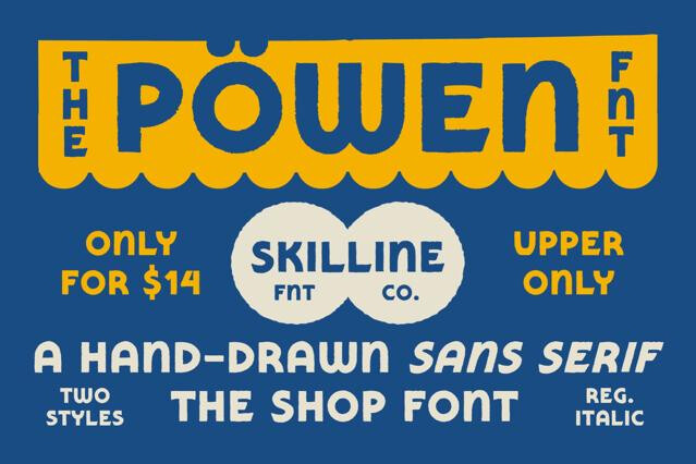
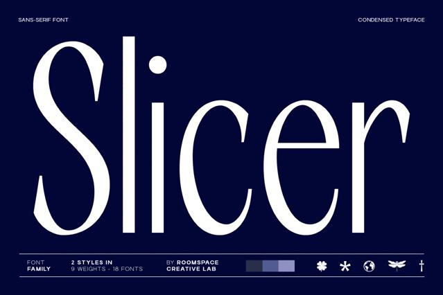
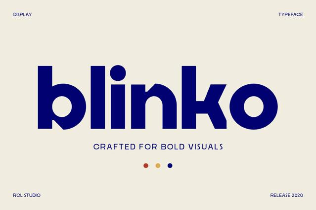
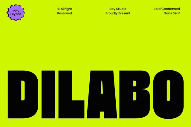
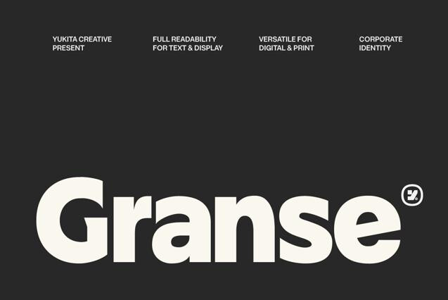
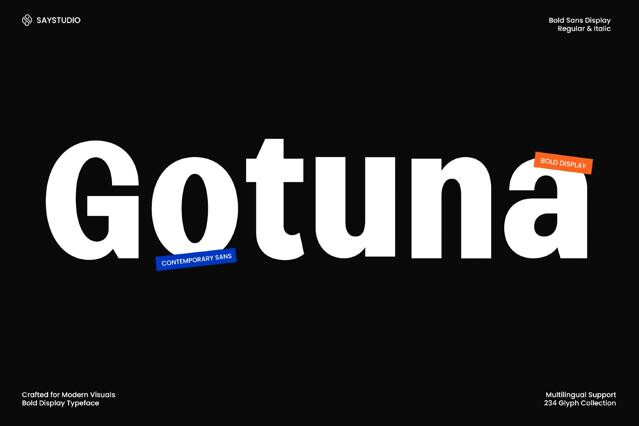
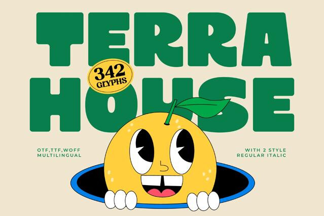
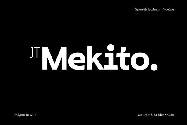


Sans serif fonts for interfaces, branding, and modern editorial design
Sans serif fonts are the quiet backbone of contemporary design. Without the finishing strokes of a serif, they read as direct, neutral, and unmistakably modern, which is exactly why we see them everywhere from product interfaces to brand systems to print.
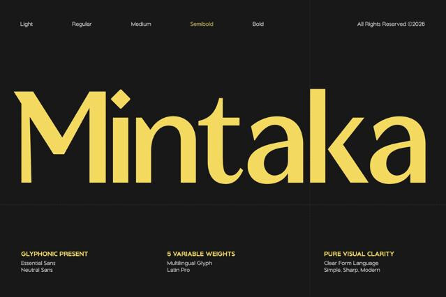
We've assembled families that cover the full range of the genre: clinical grotesques, warm humanist fonts, precise geometric sans, and characterful designs that keep their personality without sacrificing legibility. Many ship in broad weight ranges or as variable fonts, ready to carry an entire hierarchy on their own.
Why designers reach for sans serif fonts
Clarity is the headline feature. A good sans holds its shape from a 9-pixel caption to a billboard, which makes it the safest foundation for systems that have to scale across media and devices.
- App and web interfaces, dashboards, and navigation.
- Brand identities that need a clean, current voice.
- Body text in digital articles, documentation, and reports.
- Wayfinding, signage, and information design.
- Presentations, decks, and data-heavy layouts.
- Logotypes and wordmarks that favor precision over ornament.
Knowing the sans serif classification
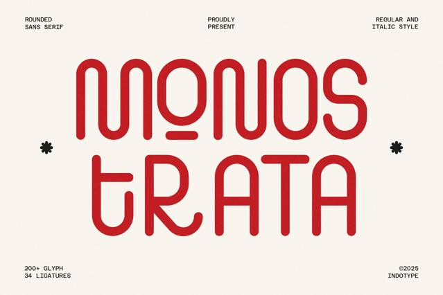
The word "sans serif" hides a lot of variety. Grotesques bring a mechanical, no-nonsense feel; humanist fonts soften their proportions for warmth and reading comfort; geometric designs lean on pure shapes for a modern, architectural look. We sort the collection so you can choose the temperament, not just the style label.
Building a system around one family
The economy of a sans serif is part of its value. A single family with enough weights can run the headline, the interface, and the body without ever introducing a second typeface — and that restraint often reads as more confident than a busy mix. When you do pair, a sans sits comfortably beneath a serif display font for a clean editorial contrast.
The absence of small terminal strokes means fewer fragile details to break down at low resolutions, so letterforms stay legible from large headers to tiny UI labels. Many of the families we carry were drawn specifically with screen rendering and variable weights in mind.
Humanist and neutral sans fonts read comfortably in paragraphs, which is why they dominate apps, documentation, and digital publications. If you're setting long print articles, test the specific font — some grotesques are tuned for display and feel tight in extended copy.
Most do, ranging from hairline to black, and a growing number ship as variable fonts that let you dial in any weight along the axis. Weight range is listed on each product page so you can confirm the family covers your hierarchy.
Coverage varies by font. Many include extended Latin, and some add Cyrillic or other scripts. Сheck the character map on the product page if multilingual support is a requirement for your project.
Grotesques are the classic 19th-century model with even strokes; humanist sans borrow calligraphic proportions for a warmer, more readable feel; geometric sans are built from circles and straight lines for a clean, modern look. Each subgroup carries a different tone, so the choice shapes how impersonal or friendly your design reads.
Absolutely. That versatility is the whole appeal. A single well-built sans family can anchor a logo, run the navigation, and set the body copy, keeping a product visually coherent end to end.