

- Poster
360
- Device
279
- T-Shirt
135
- Sticker
121
- Book
79
- Box
114
- Sign
127
- Paper
- Can
52
- Flyer
30
- Display
55
- Frame
40
- Bottle
44
- Wall
54
- Badge
38
- Vinyl
29
- Letterhead
41
- Tote Bag
36
- Shopping Bag
101
- Outdoor
202
- Cosmetic
88
- Storefront
92
- Magazine
54
- Stationery
124
- Billboard
144
- Business Card
- Packaging
221
- Advertising
- Branding
222
- Clothing
196

- Sans Serif
340
- Calligraphy
48
- Display
- Bold
296
- Script
- Serif
254
- Retro
132
- Graffiti
60
- Y2K
48
- Elegant
- Western
69
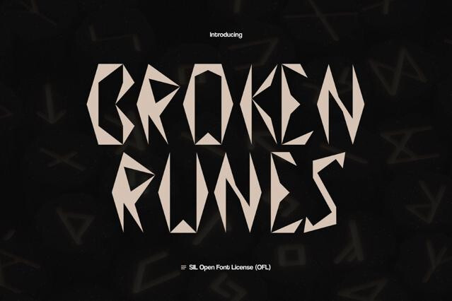
- Gothic
61
- Futuristic
85
- Bubble
61
- Playful
139
- Art Deco
51
- Wedding
96
- Sports
55
- Brush
128
- Pixel
85
- Groovy
- Signature
86
- Cartoon
90
- Medieval
59
- Typewriter
51
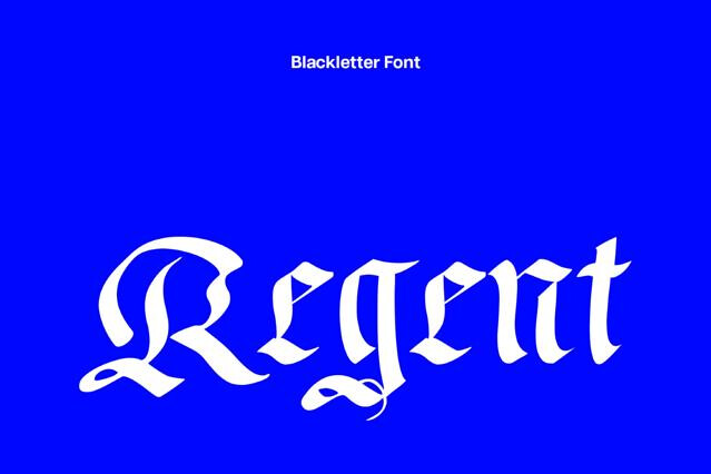
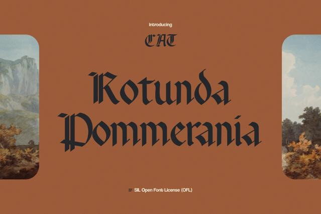
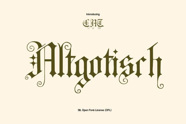
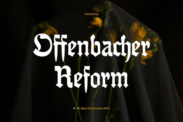
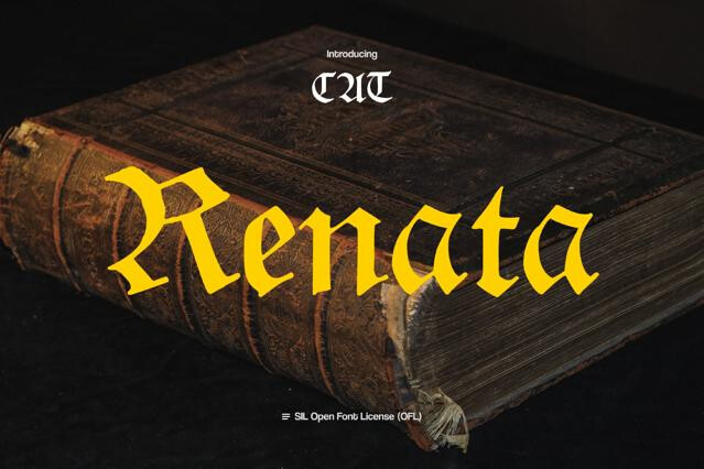
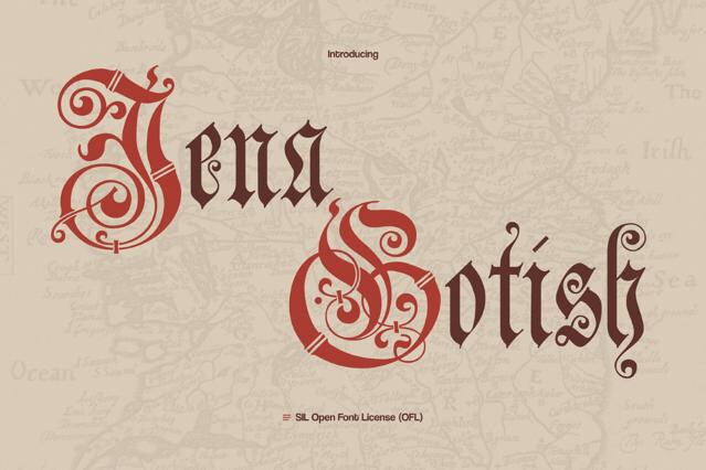
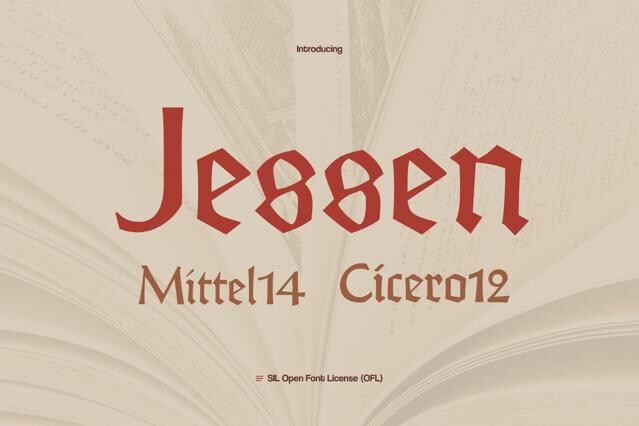
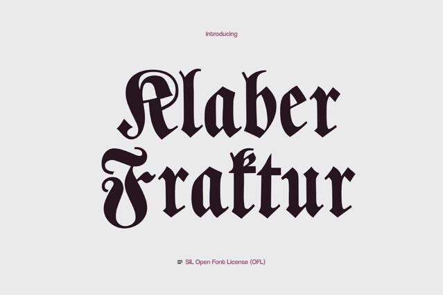
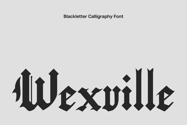
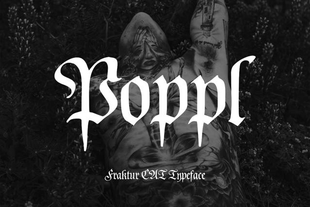
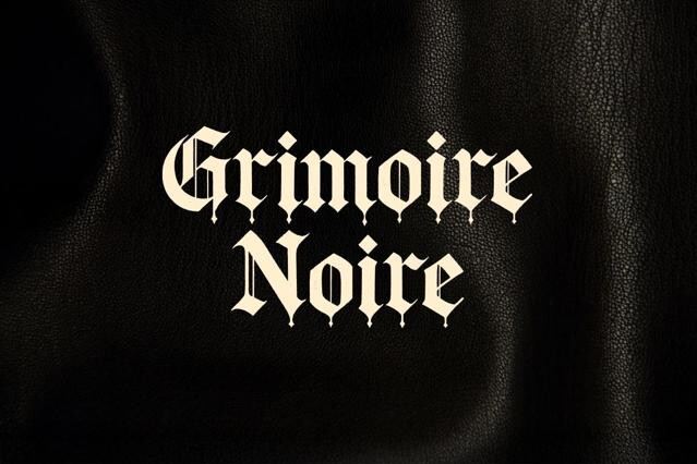
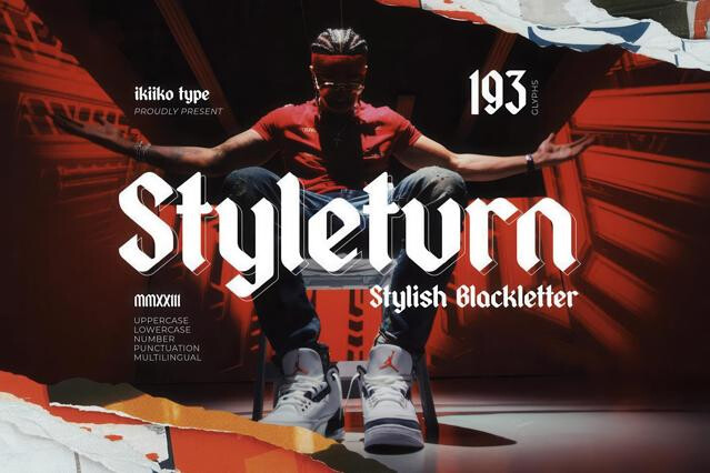
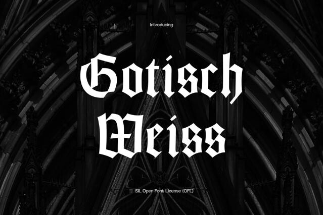
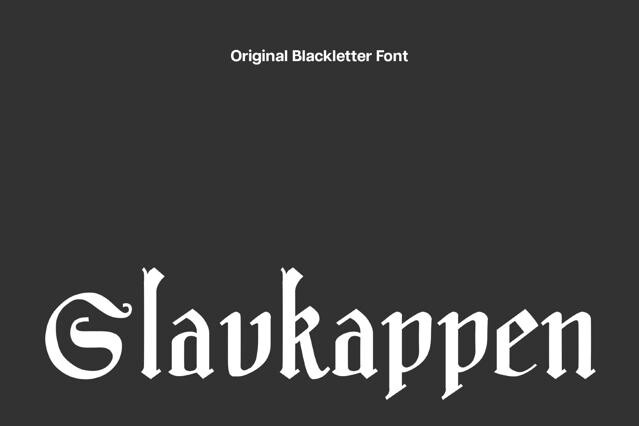
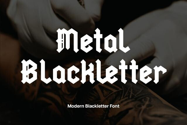
- Blackletter
- Marker
75
- Grunge
49
- Monoline
46
- Handwriting


Gangster tattoo fonts for street culture and hand-inked lettering
Gangster tattoo fontsare indeed drawn from decades of tattoo, lowrider, and street culture. They channel the fine-lined Chicano script and dramatic old-English blackletter that became a recognizable language of identity and defiance — and we've gathered the fonts that wear that tradition proudly. Our selection spans the script and blackletter styles at the heart of the look, suited to streetwear, music, tattoo design, and urban branding.
Where gangster tattoo style lives
Gangster tattoo fonts come loaded with cultural meaning. Such lettering reads as loyalty, toughness, roots, and identity, drawn from decades of tattoo, lowrider, and street tradition. The style sits naturally in culture-driven work, while conveying the respect for where it comes from.
- Hip-hop and rap branding.
- Streetwear and apparel graphics.
- Tattoo studio identities and flash.
- Album covers and music merch.
- Posters and culture-led campaigns.
The lettering styles inside
This look rests on just a handful of hands, but each one is rooted in real culture and history — which means the wrong choice reads as costume to anyone who knows the tradition. The distance between a flowing script and a heavy blackletter isn't decorative; each carries distinct meaning on the street and in the studio:
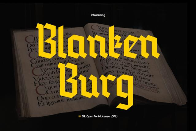
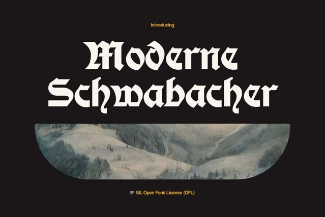
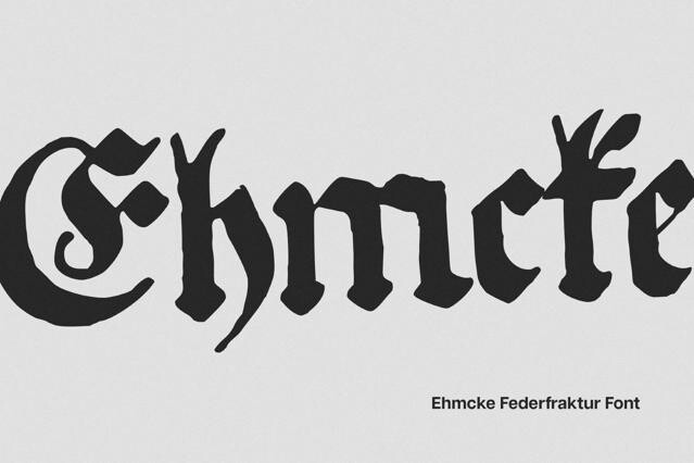
- Old English blackletter — medieval European letterforms that crossed into Western mastheads, diplomas, and legal documents, then into barrio and tattoo culture. There the old-world authority came to stand for family, pride, and permanence.
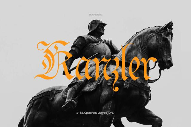
- Chicano script — fine-line, flowing cursive. Born from West Coast lowrider and Chicano communities, descended from the copperplate penmanship taught in schools and reshaped by single-needle tattoo work and placas into a language of identity.
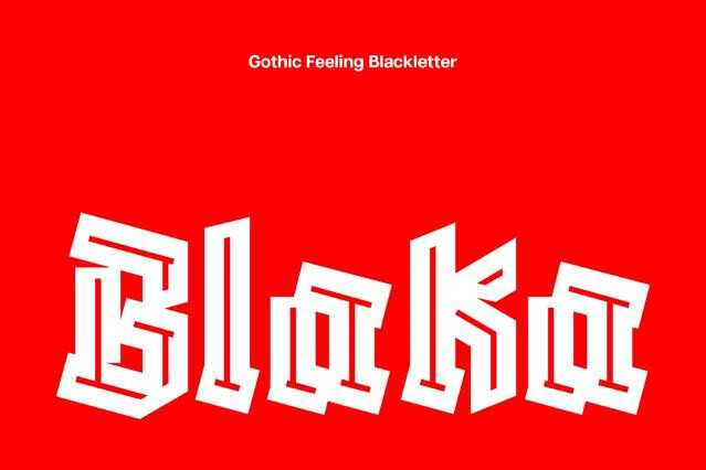
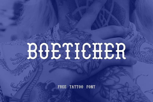
- Tattoo display — bold, decorative lettering in the American traditional flash tradition. Their banner-and-scroll forms are drawn thick on purpose so a name or statement stays legible as ink spreads and ages on skin.
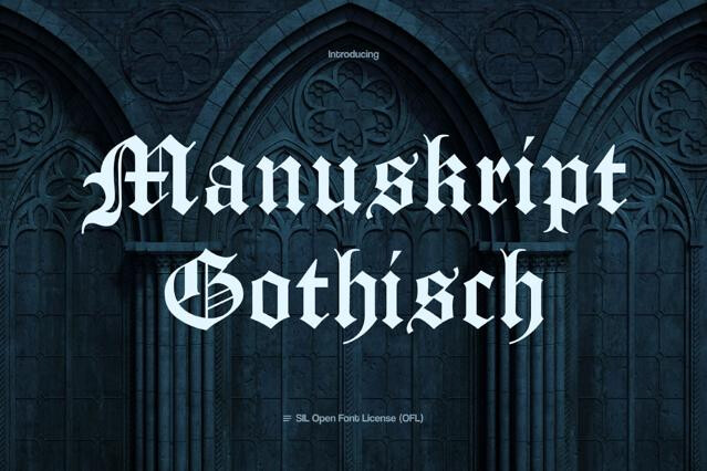
- Gothic hybrid — the newest layer, fusing classic blackletter with graffiti and streetwear energy..
Mainly two traditions: fine-lined Chicano script (the flowing, single-weight cursive of West Coast tattoo culture) and old-English blackletter (dense, ornate, dramatic). Both are staples of tattoo flash and street lettering, often joined by graffiti-influenced display.
It draws on decades of tattoo, lowrider, and street culture — particularly Chicano and West Coast aesthetics — where hand-lettered script and blackletter became a recognizable visual language of identity and attitude.
They're popular references for tattoo lettering, yes. But a real tattoo benefits from a tattoo artist's hand adapting the letters to the body and to how ink ages. We'd treat the font as a strong starting point, not a final stencil.
Streetwear and merch, hip-hop and rap branding, tattoo studios and flash, urban and skate culture.
The Chicano scripts are built to flow with fine, even lines and connecting strokes; turn on OpenType alternates and ligatures for the smoothest joins. Blackletter, by contrast, is dense and unconnected — and shouldn't be set in all caps.
The fine-lined scripts can lose their thin strokes when small, and ornate blackletter clogs. We'd keep both at display size and pair them with clean type for any supporting text.