- Poster
360
- Device
279
- T-Shirt
135
- Sticker
121
- Book
79
- Box
115
- Sign
127
- Paper
- Can
52
- Flyer
30
- Display
55
- Frame
40
- Bottle
44
- Wall
54
- Badge
38
- Vinyl
29
- Letterhead
41
- Tote Bag
36
- Shopping Bag
101
- Outdoor
204
- Cosmetic
88
- Storefront
92
- Magazine
54
- Stationery
125
- Billboard
144
- Business Card
155
- Packaging
224
- Advertising
291
- Branding
222
- Clothing
197


- Sans Serif
340
- Calligraphy
48
- Display
501
- Bold
299
- Script
153
- Serif
254
- Retro
132
- Graffiti
61
- Y2K
48
- Elegant
- Western
69
- Gothic
61
- Futuristic
85
- Bubble
- Playful
139
- Art Deco
51
- Wedding
96
- Sports
- Brush
130
- Pixel
85
- Groovy
- Signature
86
- Cartoon
91
- Medieval
59
- Typewriter
51
- Blackletter
- Marker
- Grunge
49
- Monoline
46
- Handwriting


Imaginice – Raw Playful Family Font


About the product
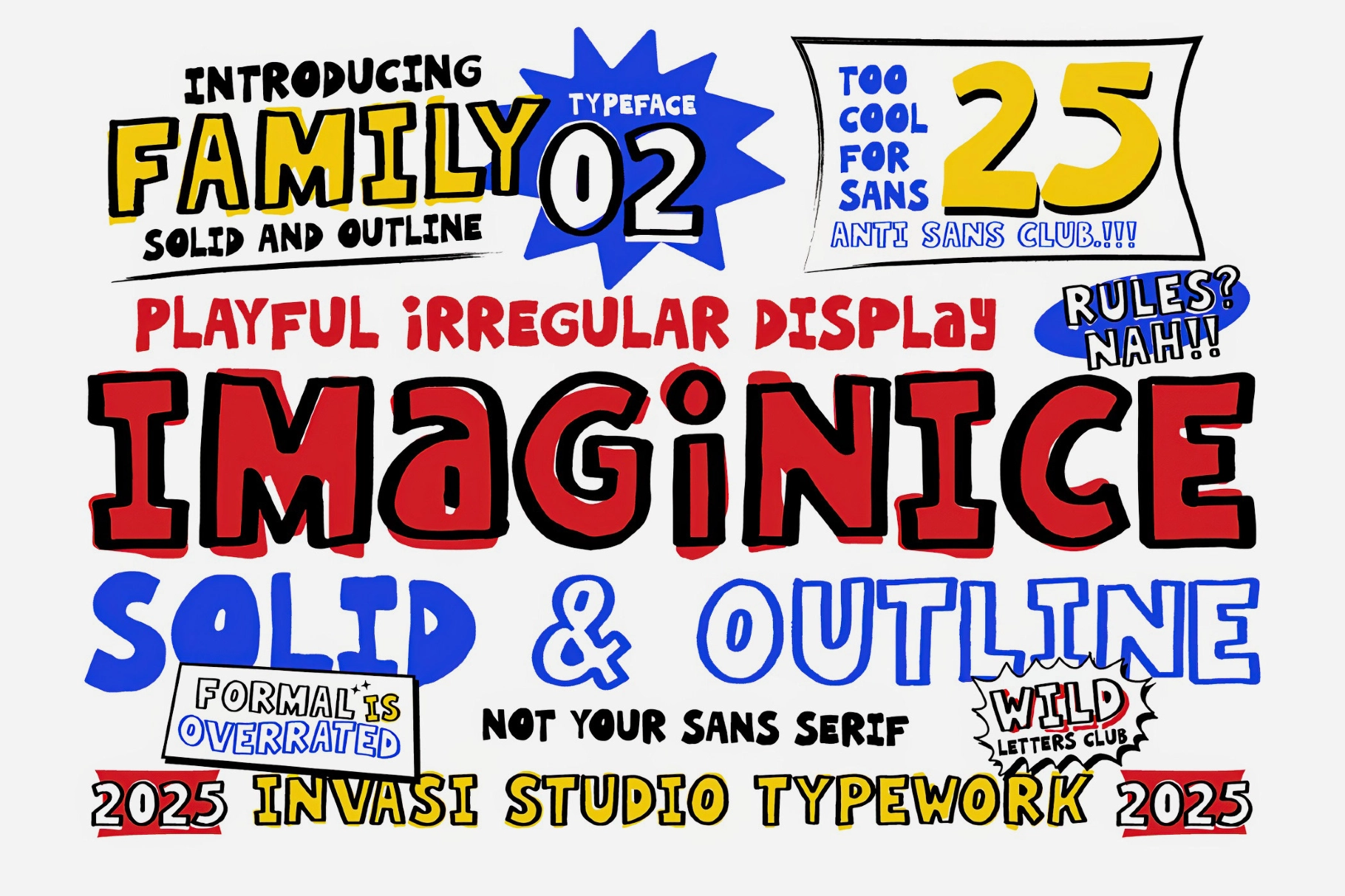
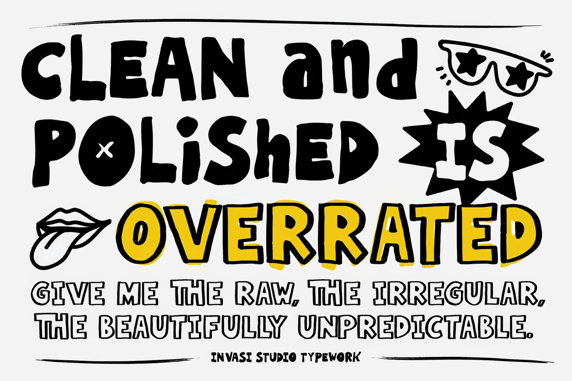
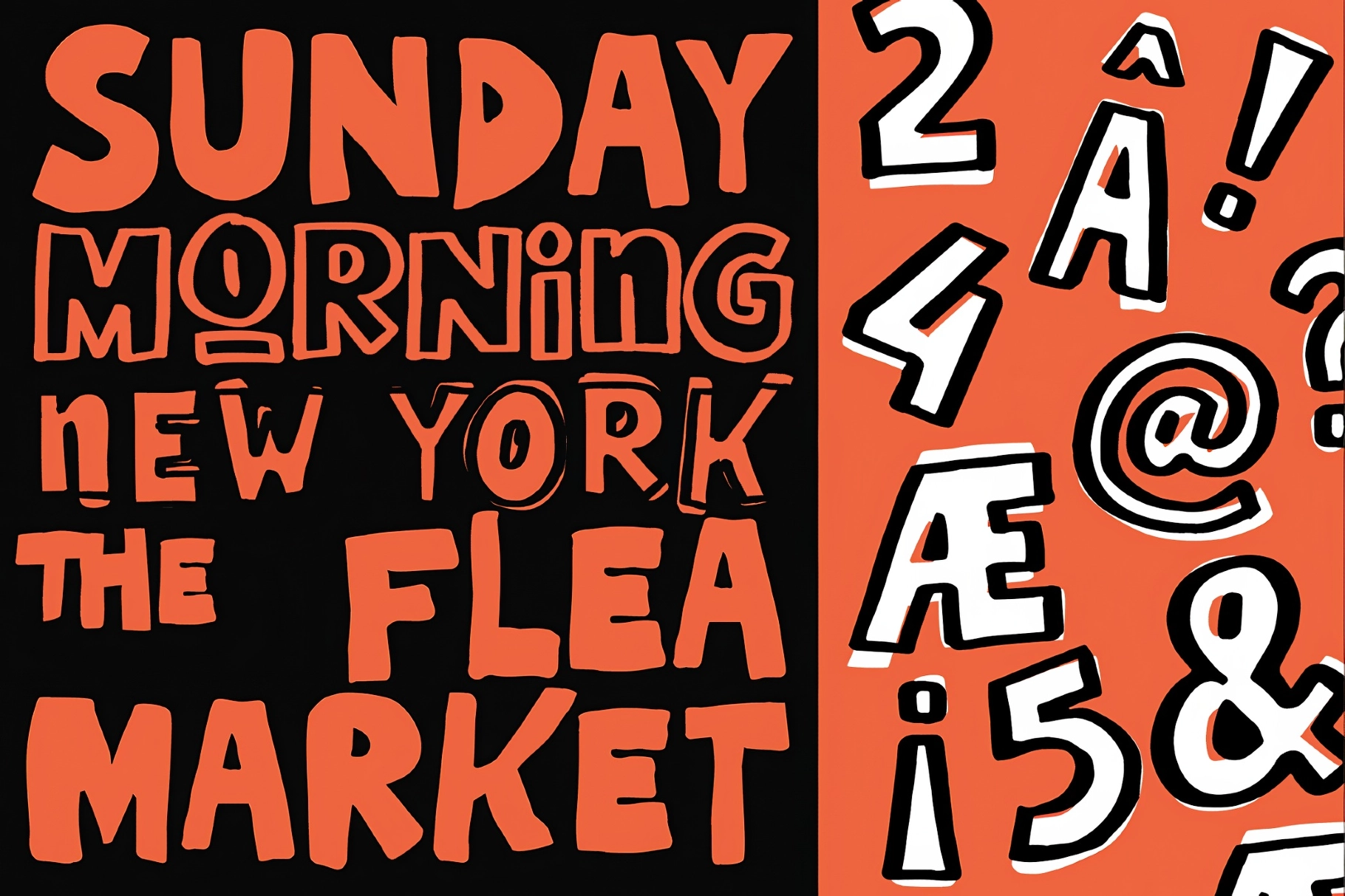
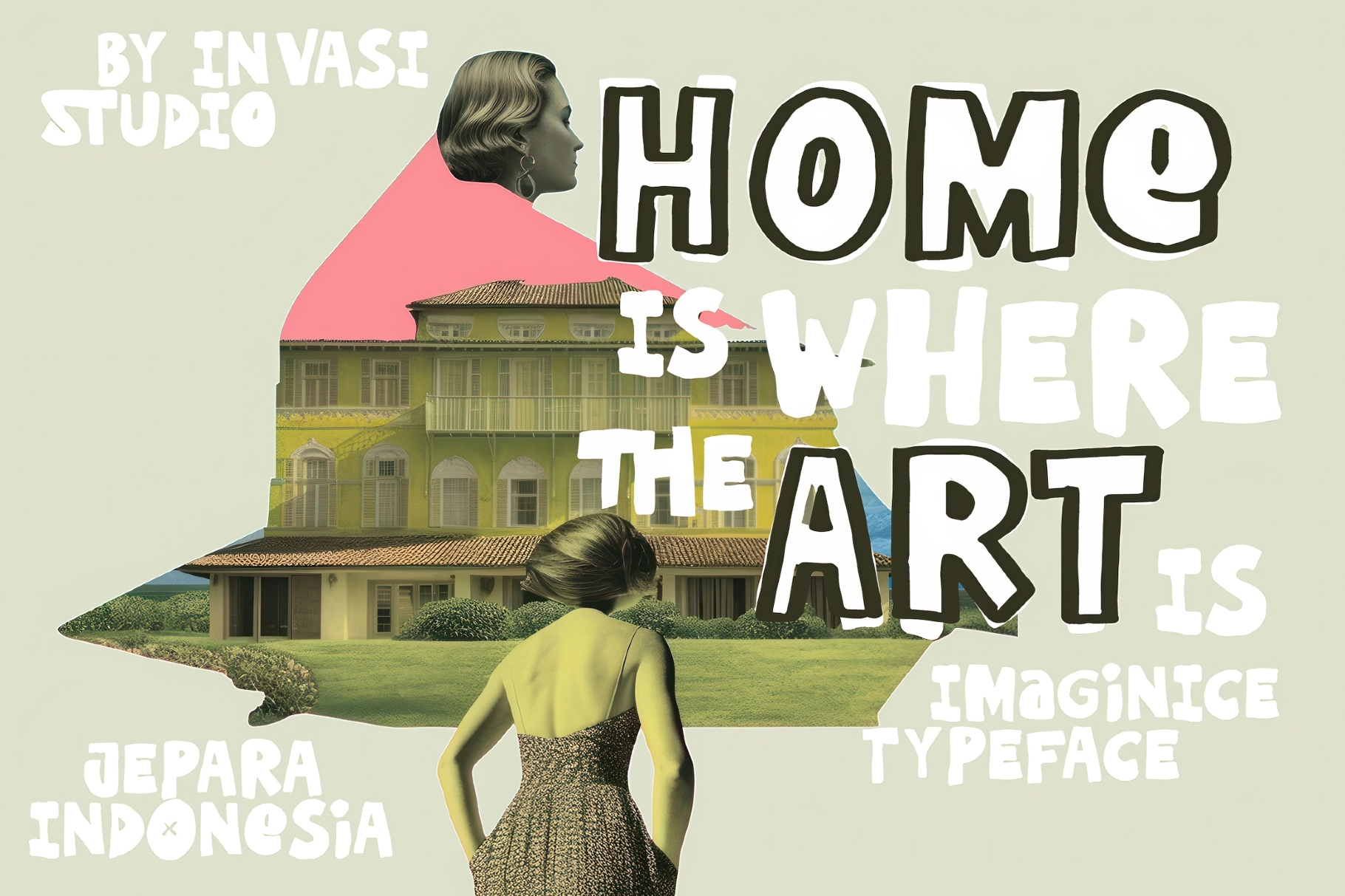
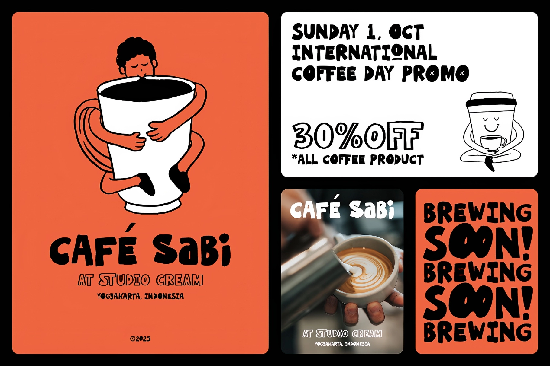
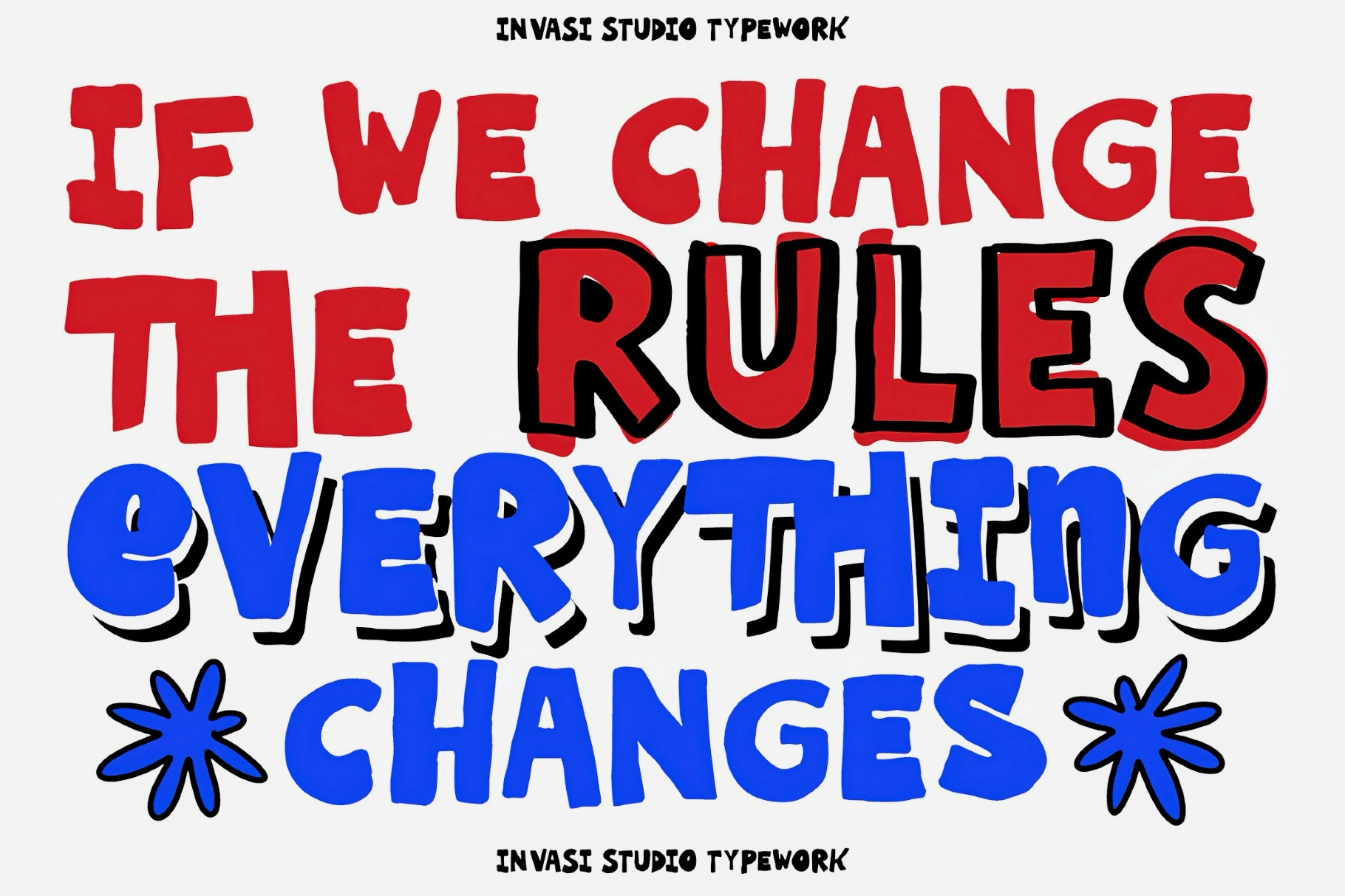
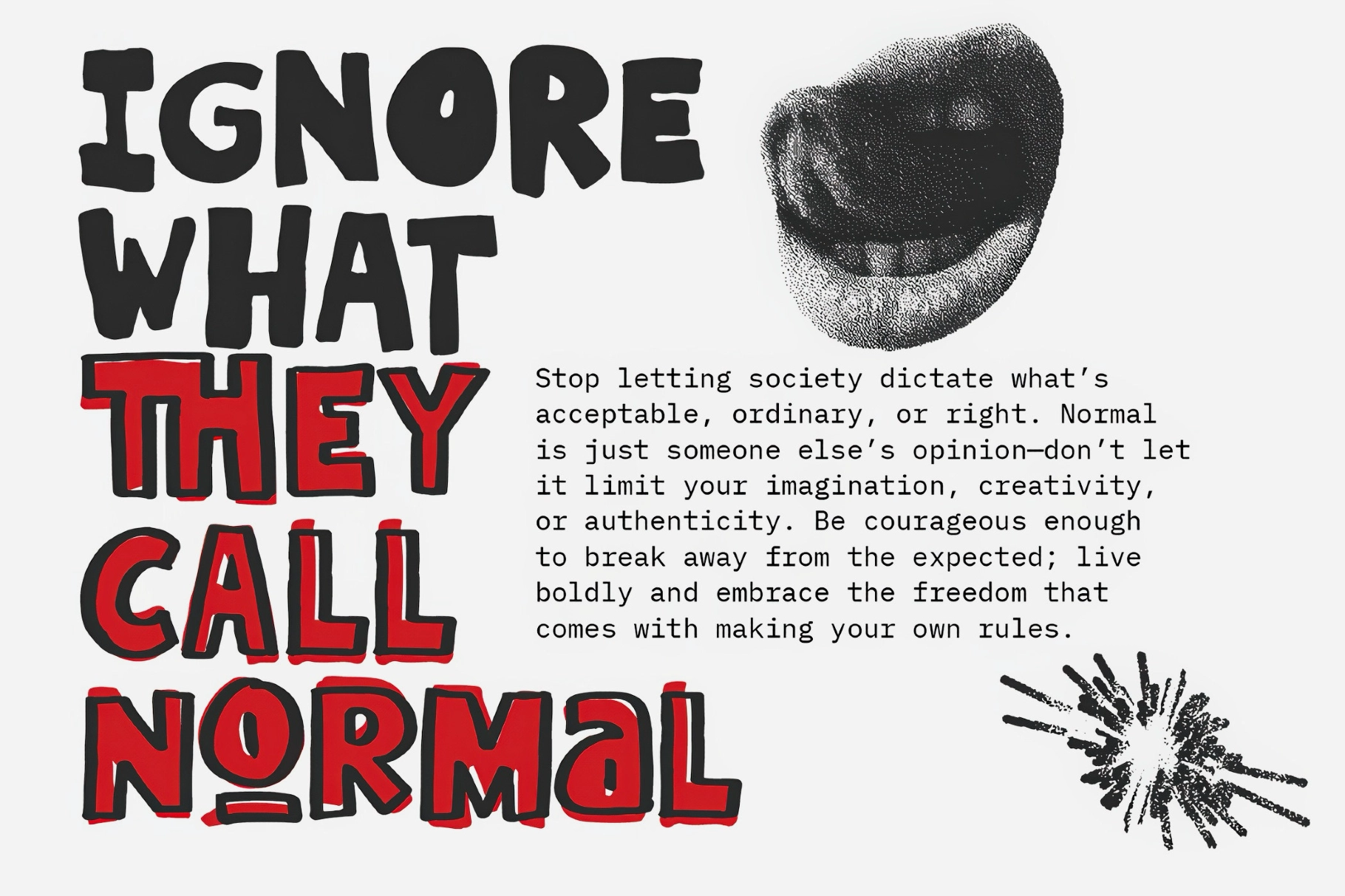
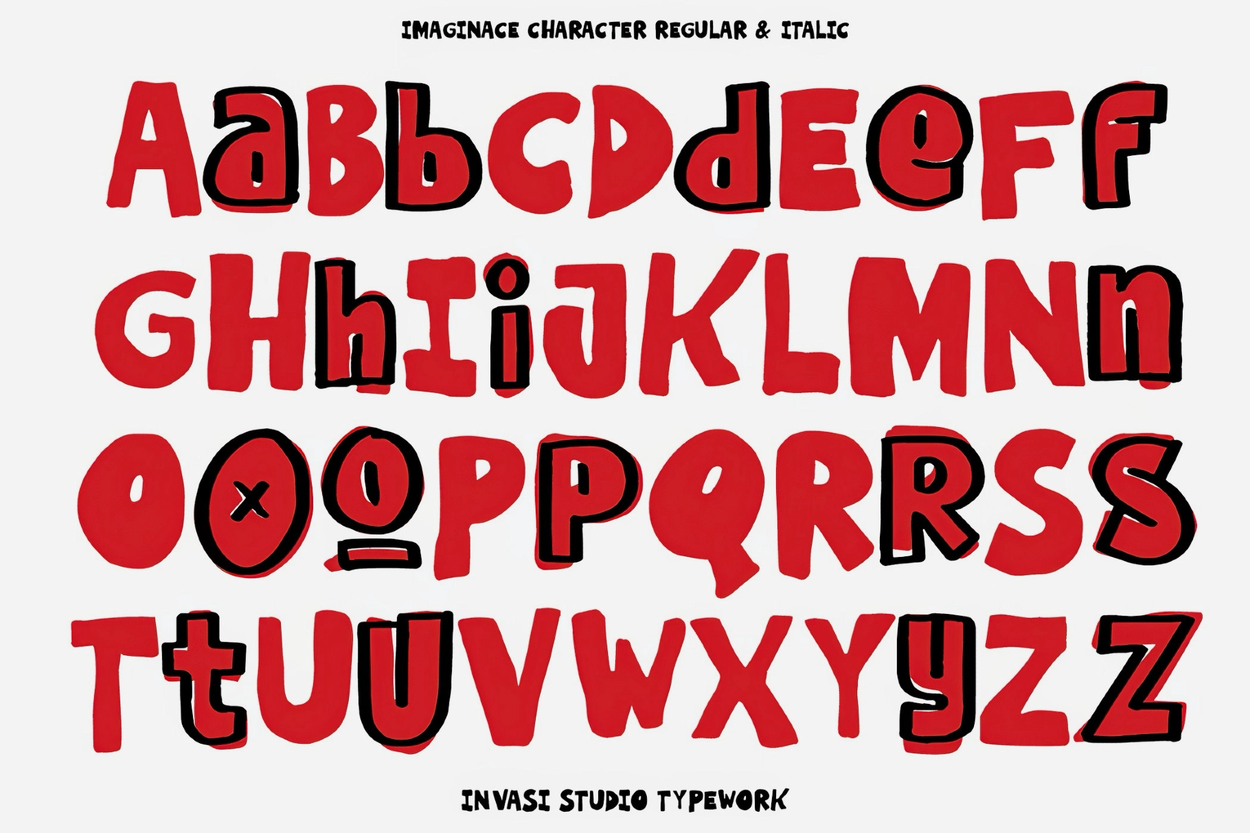
Imaginice seems to have flunked penmanship on purpose. Its letters are hand-drawn and a little off — uneven weights, wobbling baselines, caps and lowercase that refuse to line up — plus the raw, marker-scrawled look of a kid tagging a notebook. This playful display font ships in two builds, solid and outline, so you can fill it in loud or leave it open and sticker-ready.
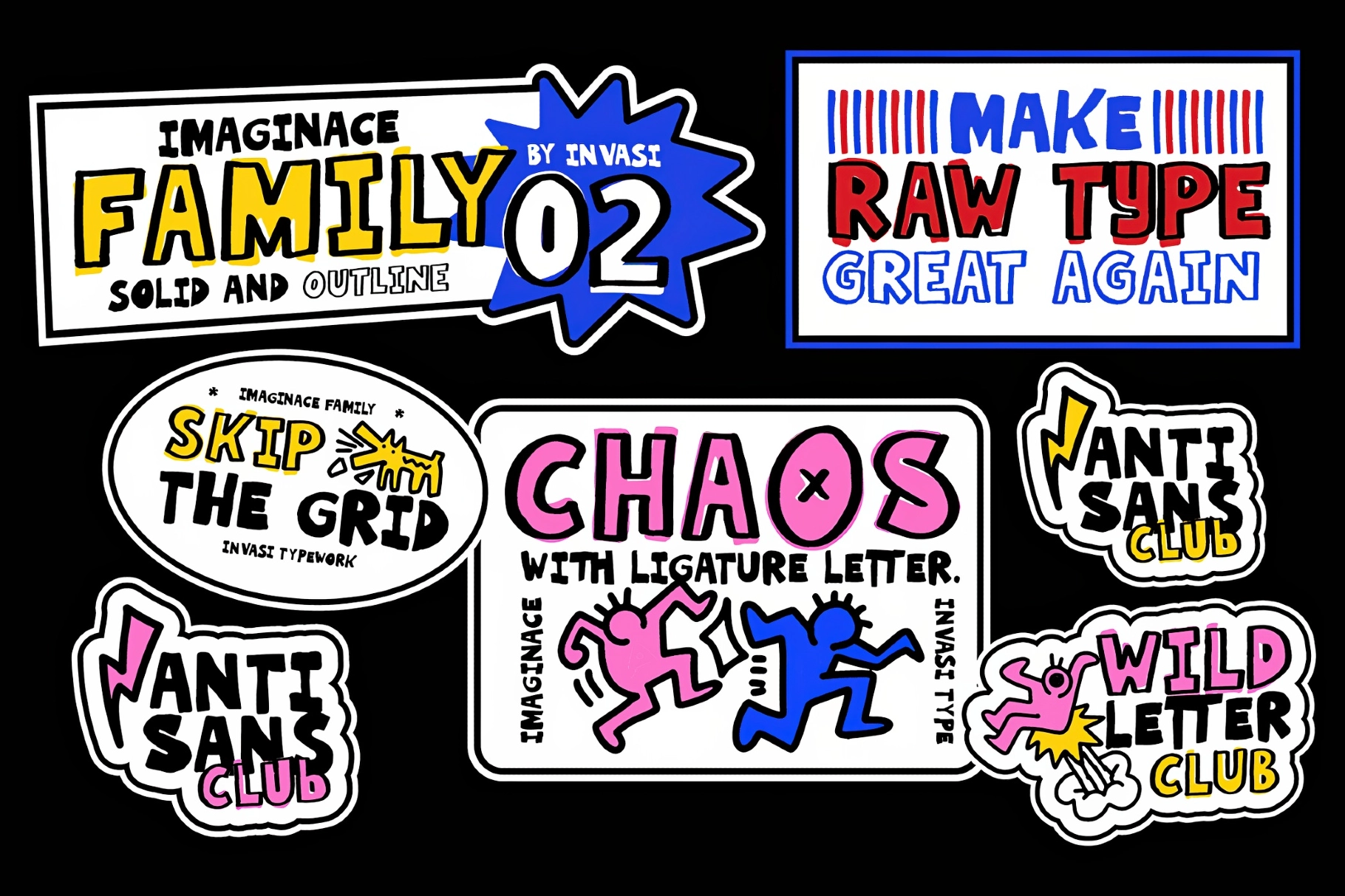
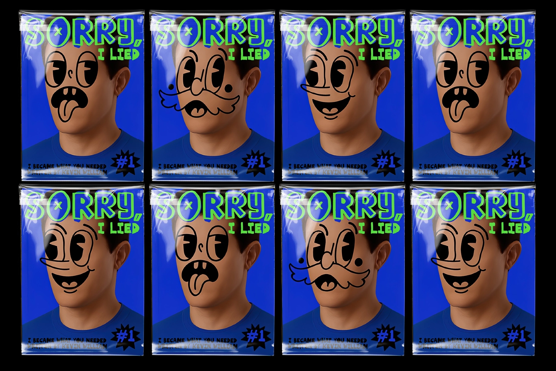
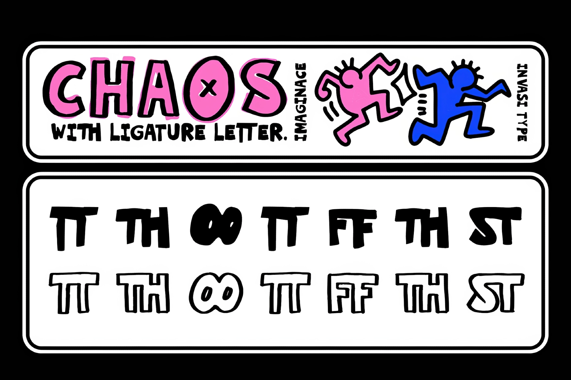
Mix the two the way the previews do: solid caps for the punchline, outline for the setup, one word filled and the next one hollow. Built-in ligatures and alternate letters keep repeats from matching, so a line never falls into a neat rhythm. Put Imaginice on zine covers and comic panels, sticker sheets and skate graphics, music posters, kids' and toy branding.
Features:
- two styles — solid and outline;
- uppercase and lowercase, with alternate letters and ligatures;
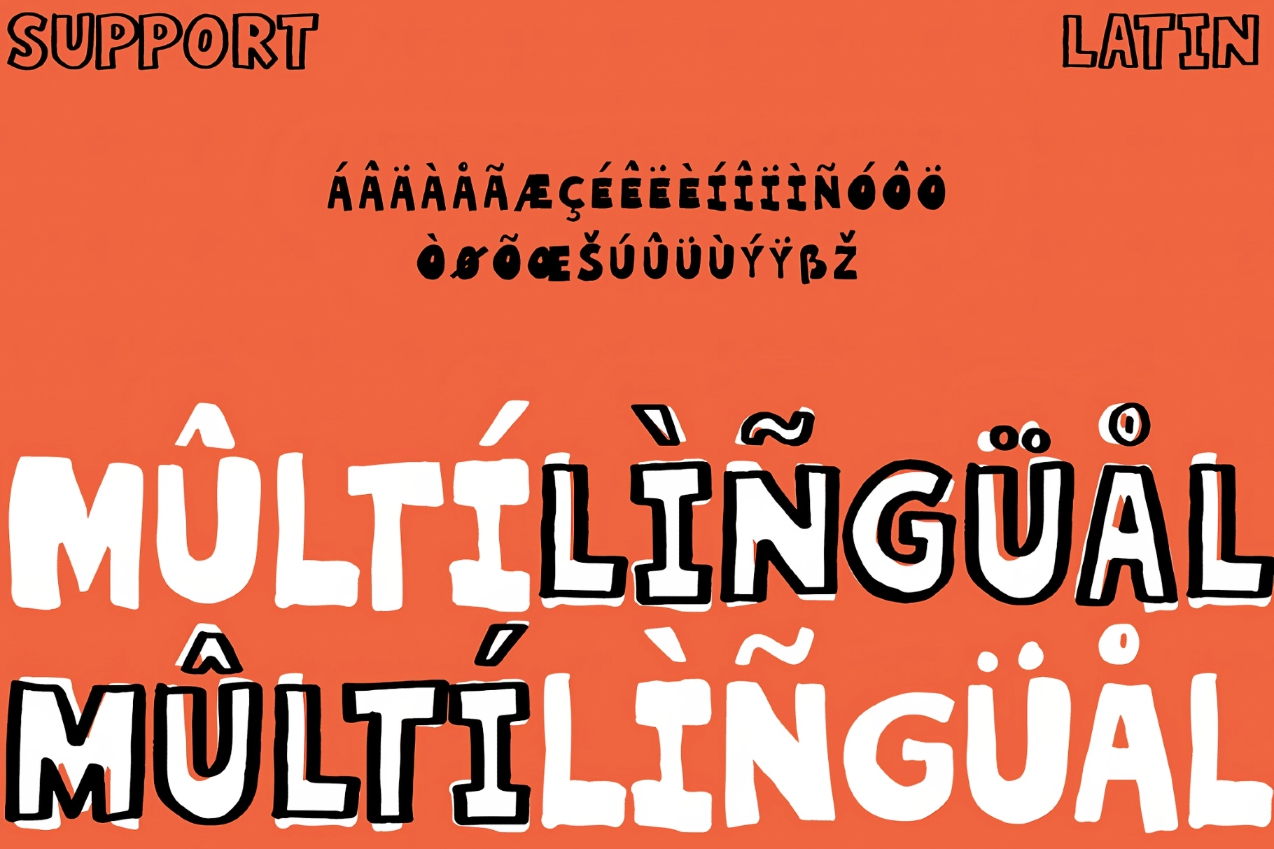
- multilingual support;
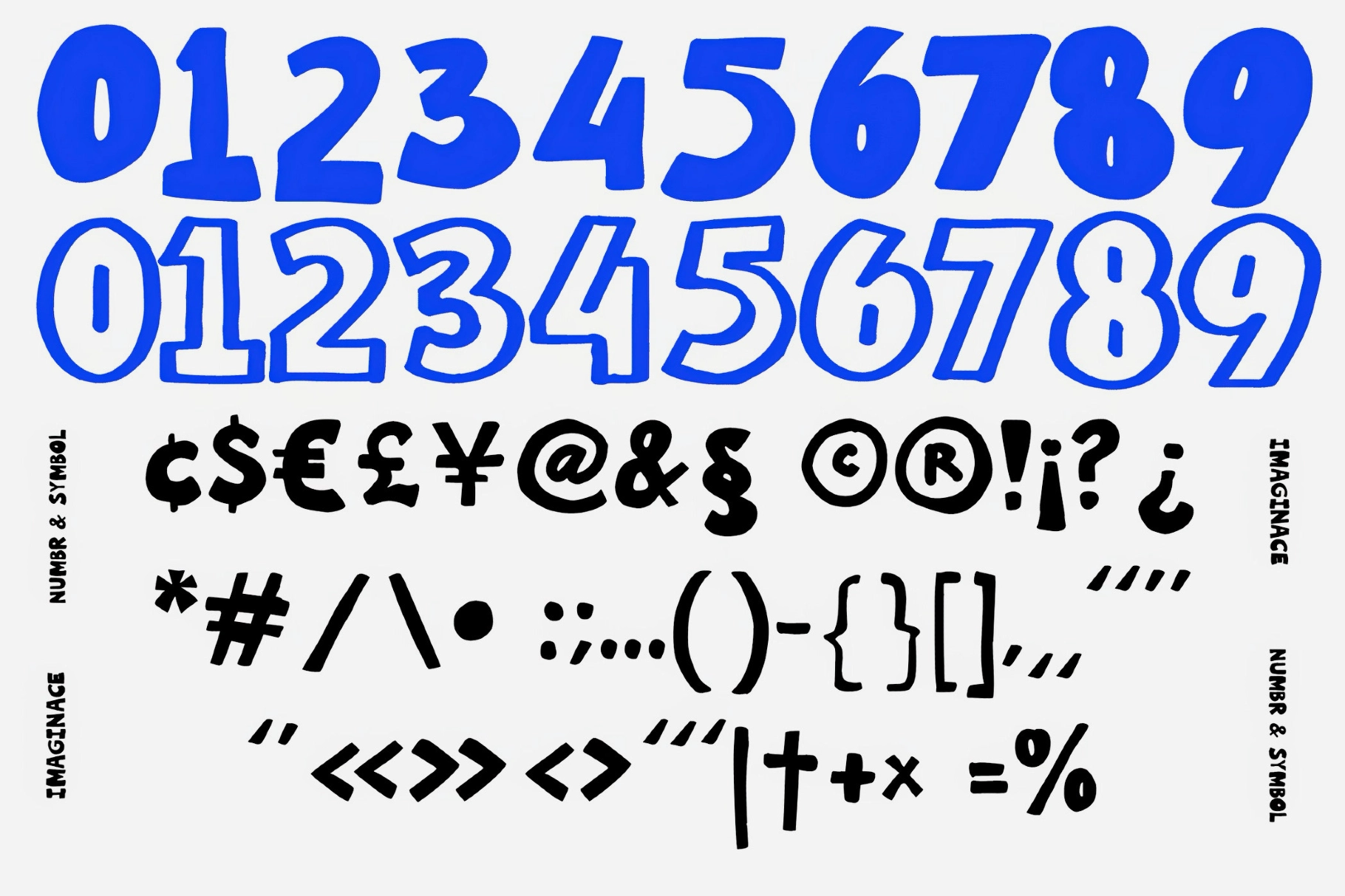
- numerals, punctuation, and currency.