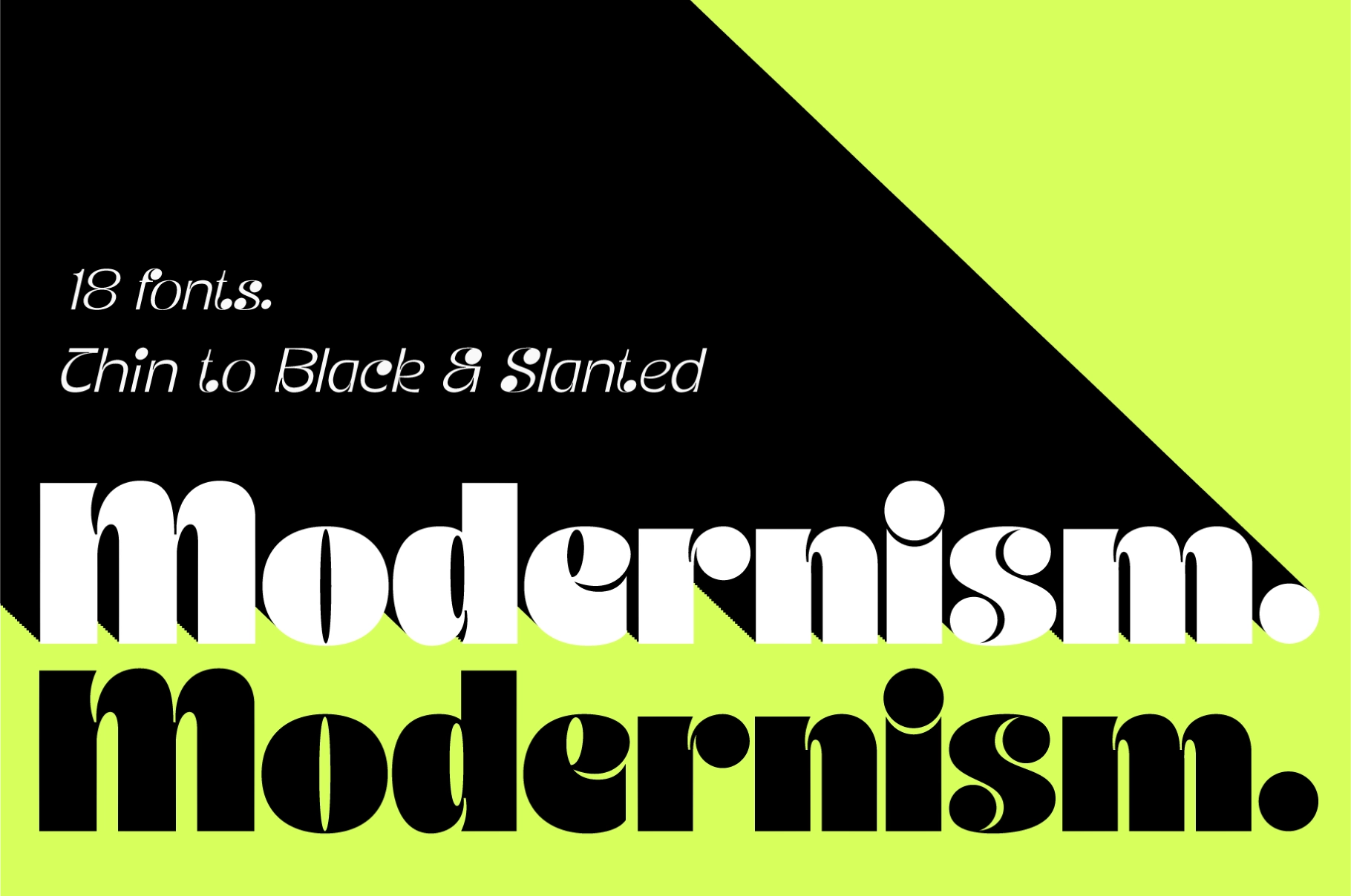
JT Modernism - Modern Funky Font
. Featured in Groovy Fonts, Funky Fonts
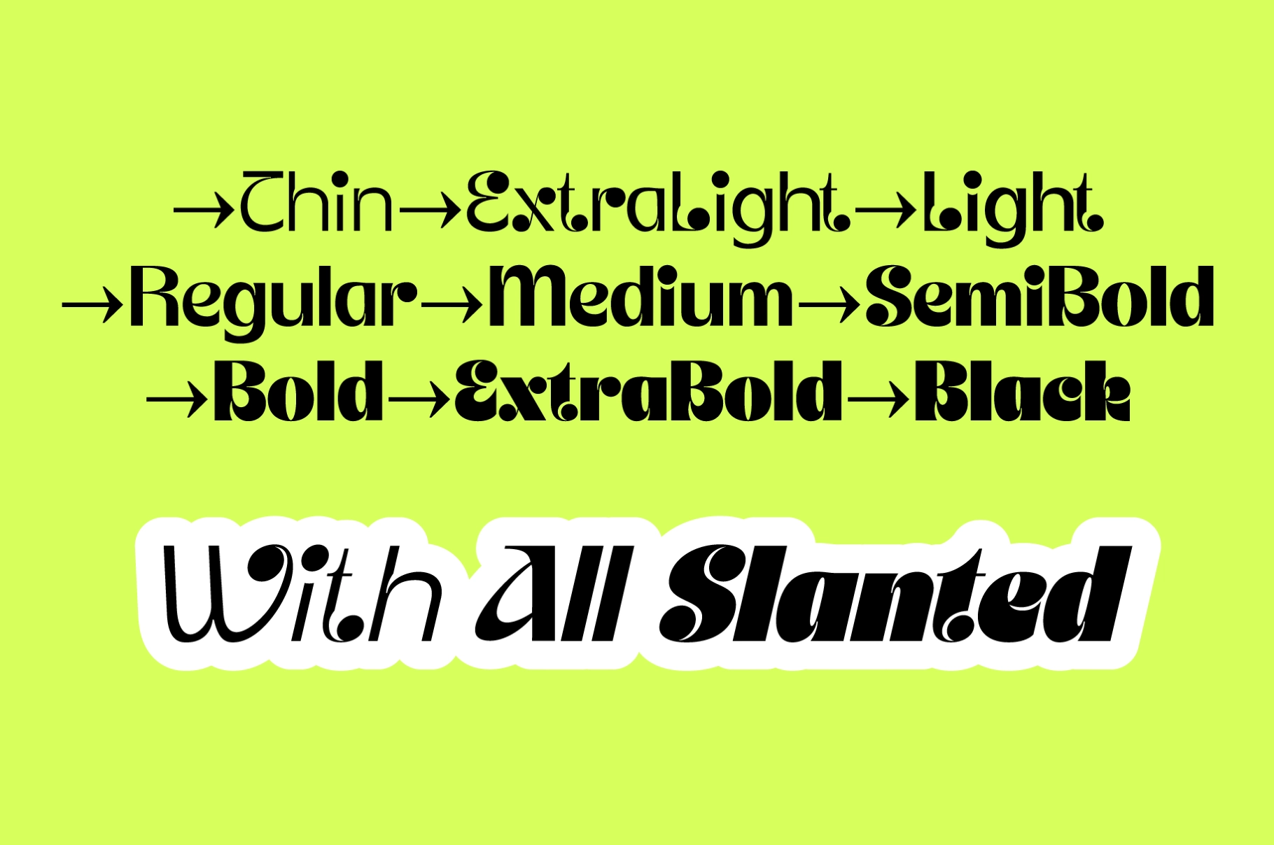


JtModernism-Thin
JtModernism-ThinSlanted
JtModernism-ExtraLight
JtModernism-ExtraLightSlanted
JtModernism-Light
JtModernism-LightSlanted
JtModernism-Regular
JtModernism-Slanted
JtModernism-Medium
JtModernism-MediumSlanted
JtModernism-SemiBold
JtModernism-SemiBoldSlanted
JtModernism-Bold
JtModernism-BoldSlanted
JtModernism-Black
JtModernism-BlackSlanted
JtModernism-ExtraBold
JtModernism-ExtraBoldSlanted
About the product
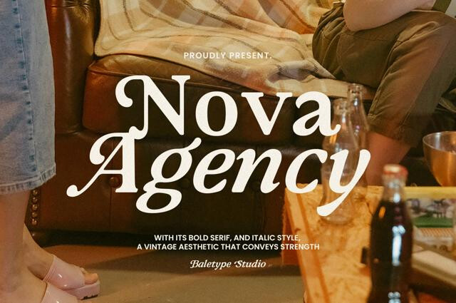
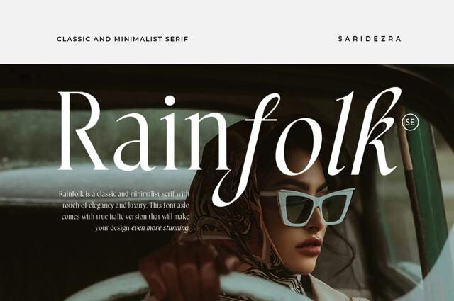
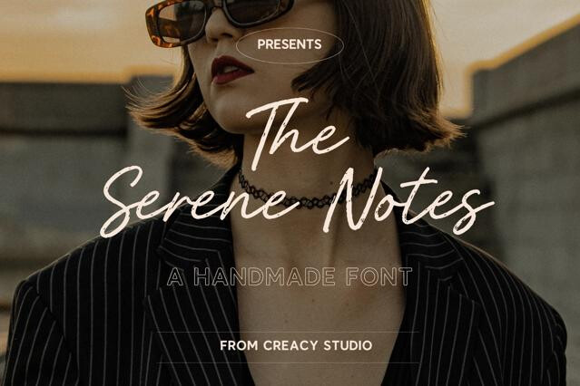
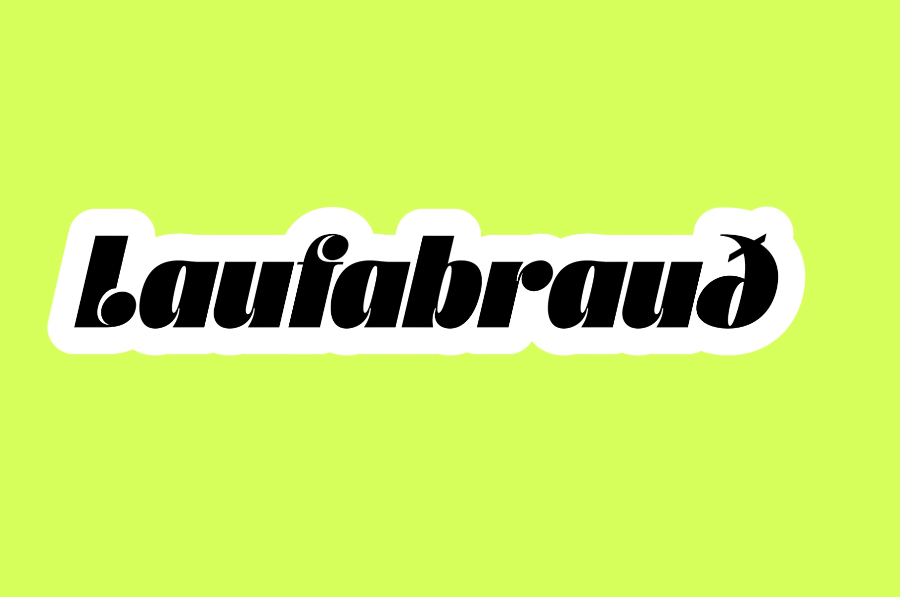
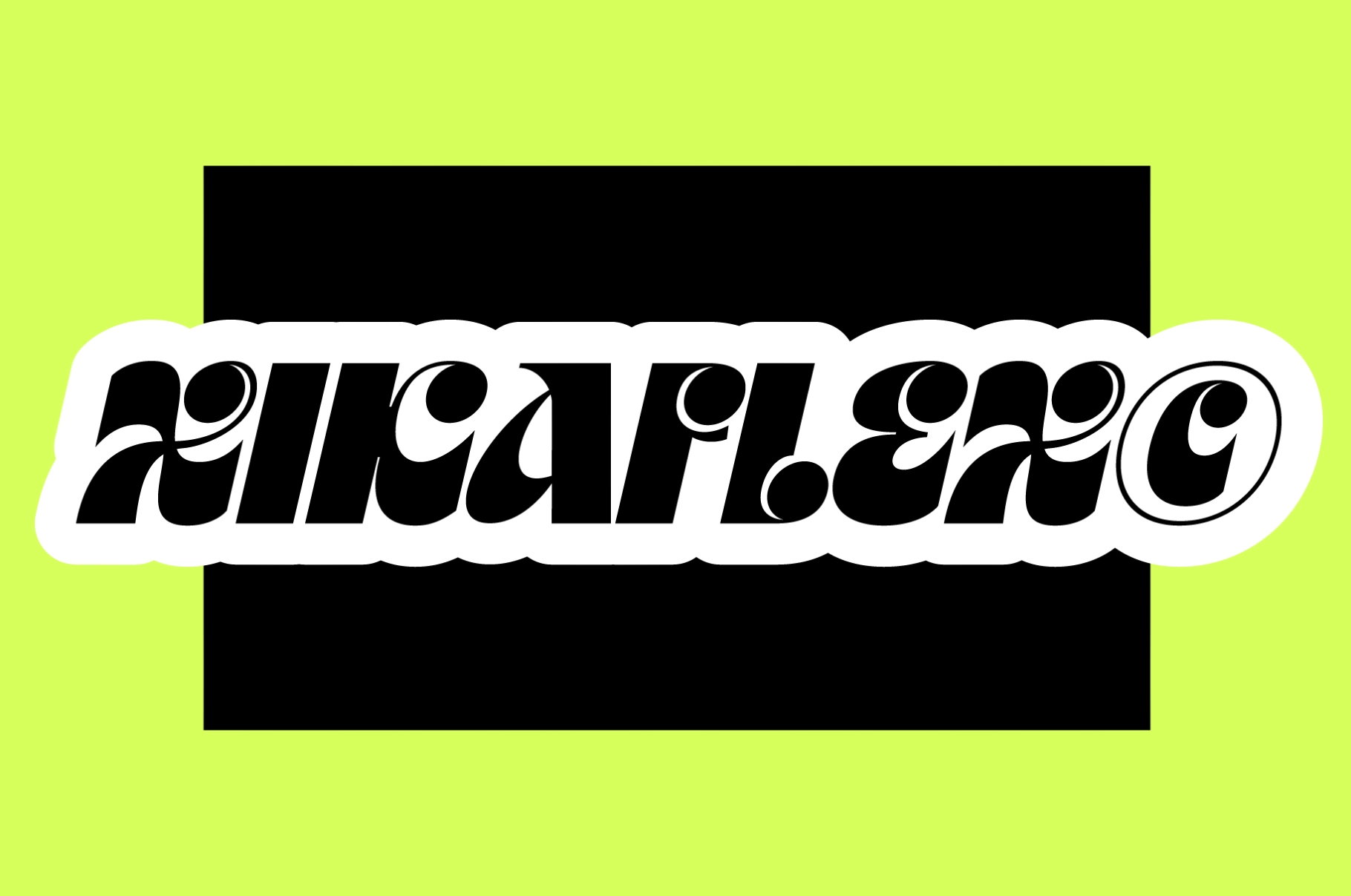
A high-contrast funky serif family with bold curves, tight counters, and a polished retro-futurist attitude. Its slanted cuts and rounded terminals give each word a graphic rhythm that works well for expressive headlines, identity systems, and layouts that need style without trying too hard — rare, but possible.
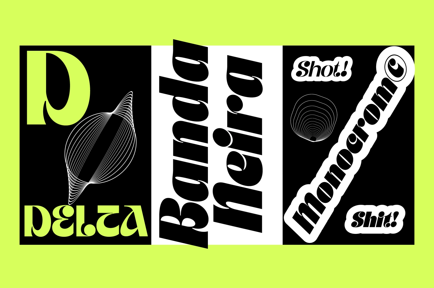
JT Modernism brings 18 font styles from Thin to Black, each with a slanted companion for extra motion and emphasis. It is a strong match for fashion branding, music posters, editorial titles, festival graphics, product packaging, café identities, social media campaigns, website headers, magazine spreads, art books, merch designs, and typographic logos.
Features:
- 18 fonts
- Weights from Thin to Black
- Slanted styles included
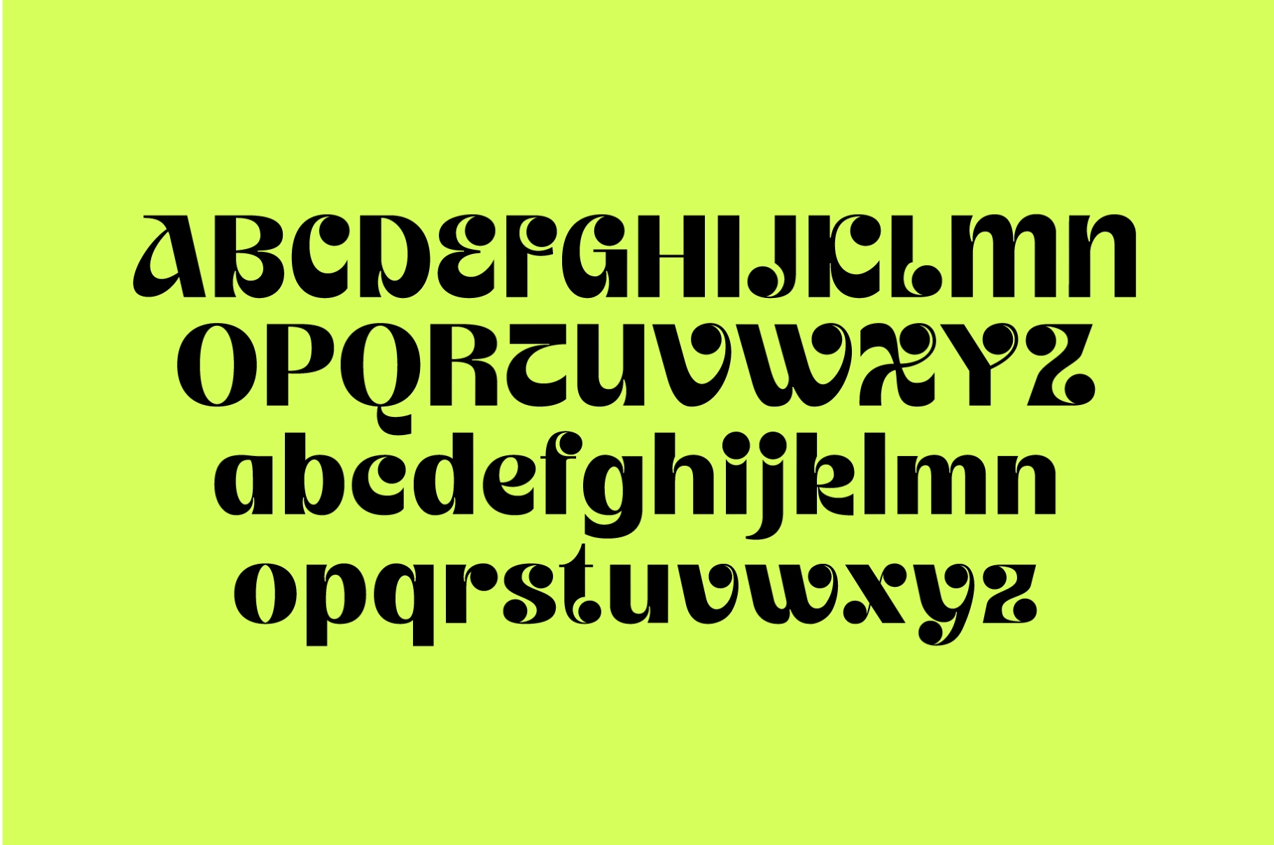
- Uppercase & lowercase characters
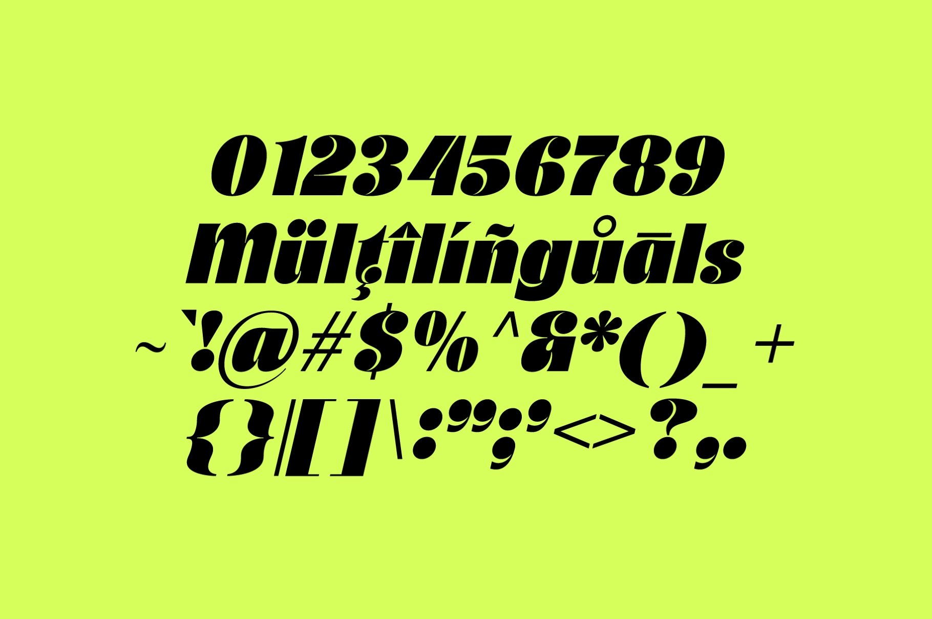
- Numerals & punctuation
- Multilingual support