

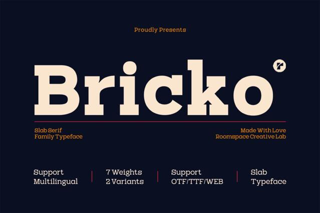
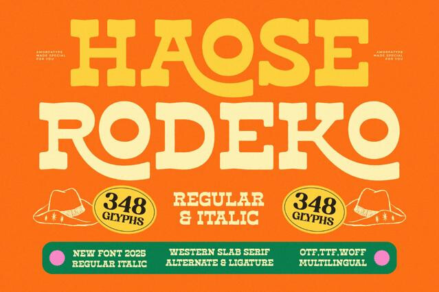
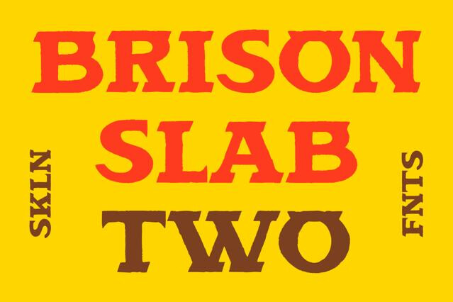
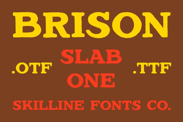


Slab serif fonts for sturdy, confident, and grounded design
Our slab serif fonts play bold, grounded, and architectural. The selection runs from classic Egyptian slabs to geometric and humanist takes built for modern use. We've kept both the rugged, vintage-signage end and the clean editorial end represented, so the range covers a lot.
What slab serif fonts good at
Slabs are workhorses with attitude. They hold up at headline scale and still read cleanly in shorter blocks, which makes them flexible across a brand. Such a dual nature enables a designer to build both the logo and the supporting copy from the same slab family.
- Editorial headlines and magazine design.
- Logos that need weight and stability.
- Vintage and western-inspired branding.
- Packaging and signage lettering.
- Poster and display typography.
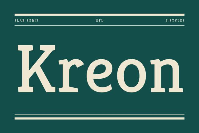
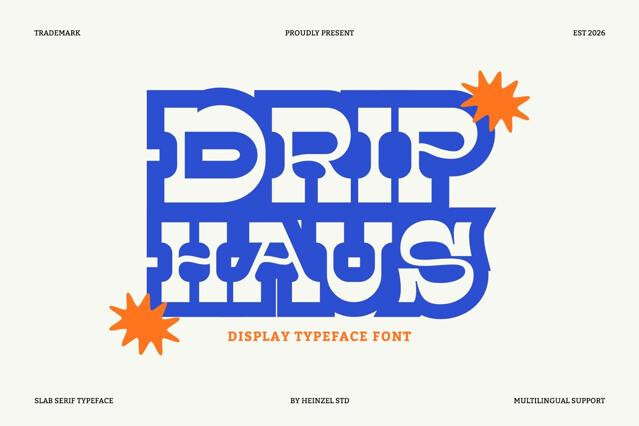
The variants we carry
Slab serifs look like one tidy category until you try to use them, at which point the differences turn practical fast. Some are built to shout from a headline, others to stay comfortable across a paragraph, and few do both equally well. There's also a vintage-to-modern axis running underneath that shifts the whole feel:
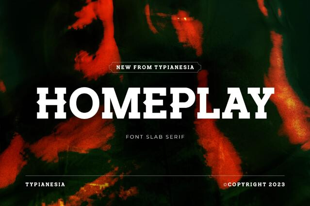
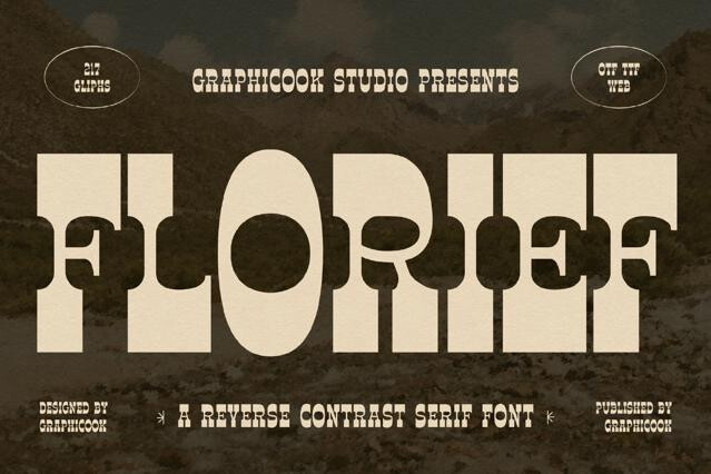
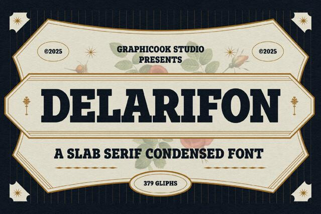
- Classic Egyptian — the original heavy slabs of early-19th-century advertising, born when industry needed a type to dominate a poster.
- Geometric slab — the machine-age construction of the 1930s, cleaner and more rational, built on circles and straight lines for a modern feel.
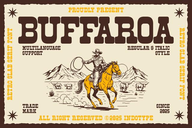
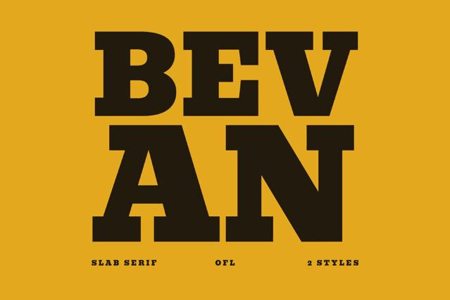
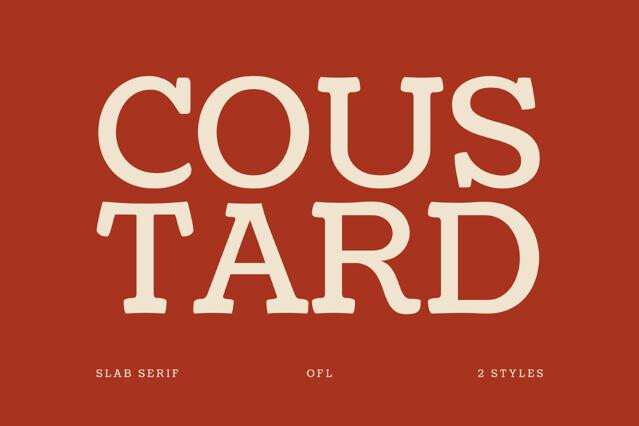
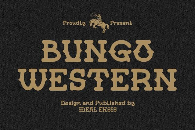
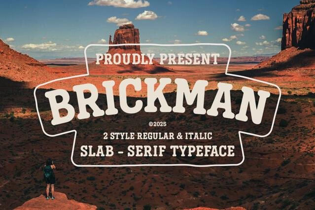
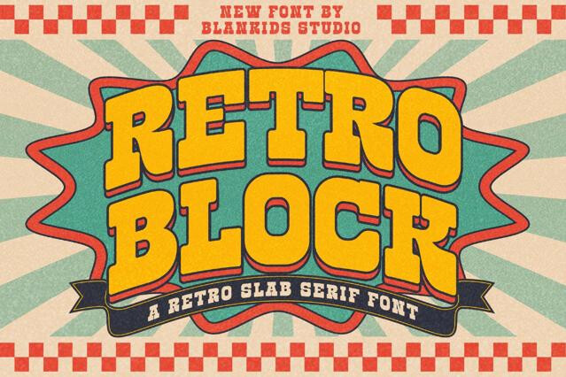
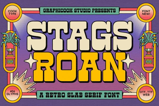
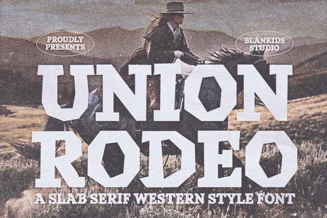
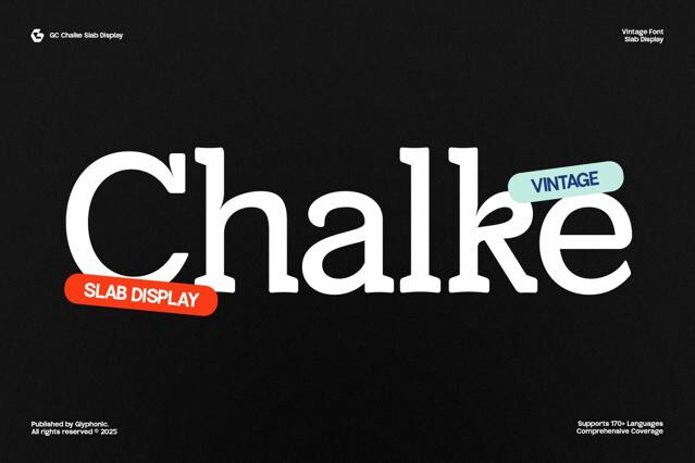
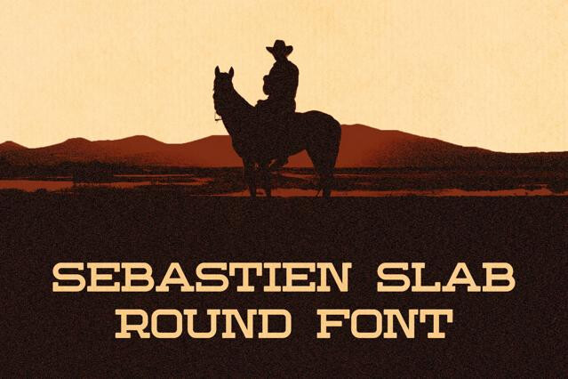
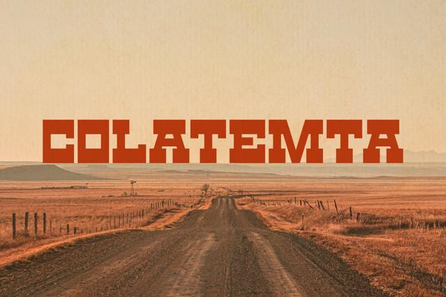
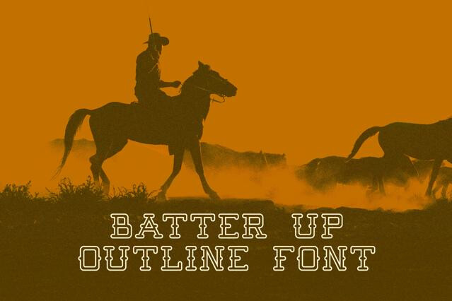
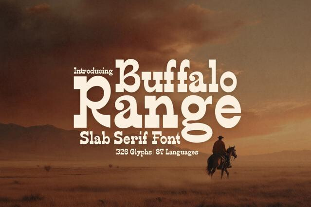
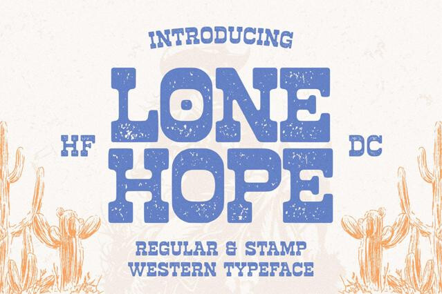
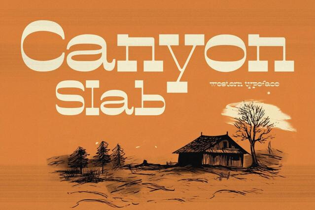
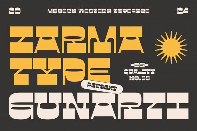
- Vintage and western — the chunky wood-type tradition of frontier playbills and saloon posters, all rugged character and frontier swagger.
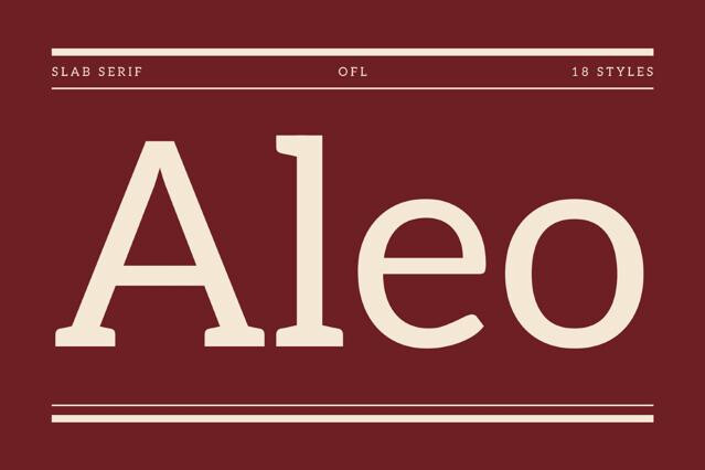
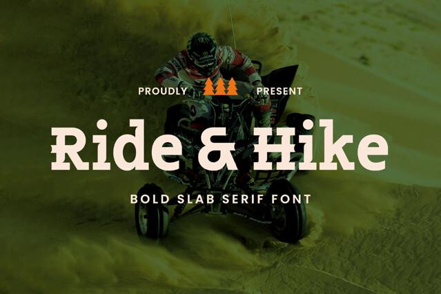
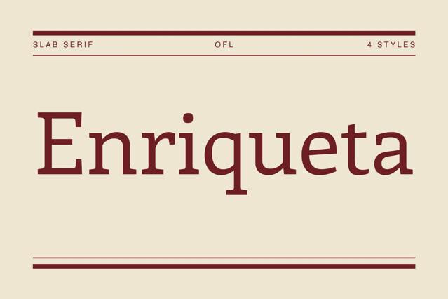
- Humanist slab — the warmer, calligraphy-informed branch tuned for reading, where the slab softens enough to carry longer text comfortably.
Thick, block-like serifs — often the same weight as the main strokes — with low contrast throughout. The sturdy, grounded letterform reads as more robust and modern than a traditional serif, and more authoritative than a sans.
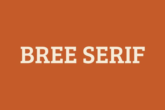
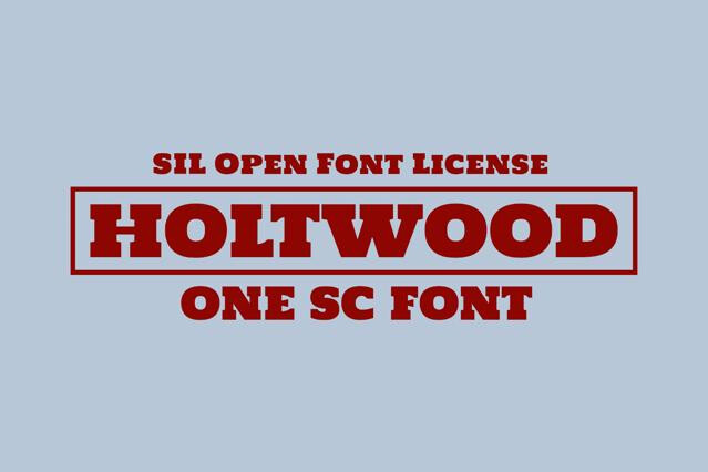
Broadly: geometric slabs (clean, even, built on simple shapes), humanist slabs (warmer, with calligraphic influence and better reading rhythm), and Clarendon-style slabs (with bracketed serifs and some contrast). Each balances impact and readability differently.
Humanist and well-proportioned slabs read comfortably in short to medium text and are popular in editorial and branding. The heaviest geometric slabs are display-first — strong for headlines, tiring in long paragraphs.
They emerged in the 19th century for bold advertising, so they carry a vintage, industrial heritage, yet their low contrast and sturdy forms also read as clean and contemporary.
Branding wanting confident weight, editorial headlines and decks, signage and wayfinding, and display work.
A slab makes a strong headline over a clean sans body, or a sturdy body under a more expressive display font. We'd avoid pairing a heavy slab with a high-contrast serif, since the serif logic competes rather than complements.