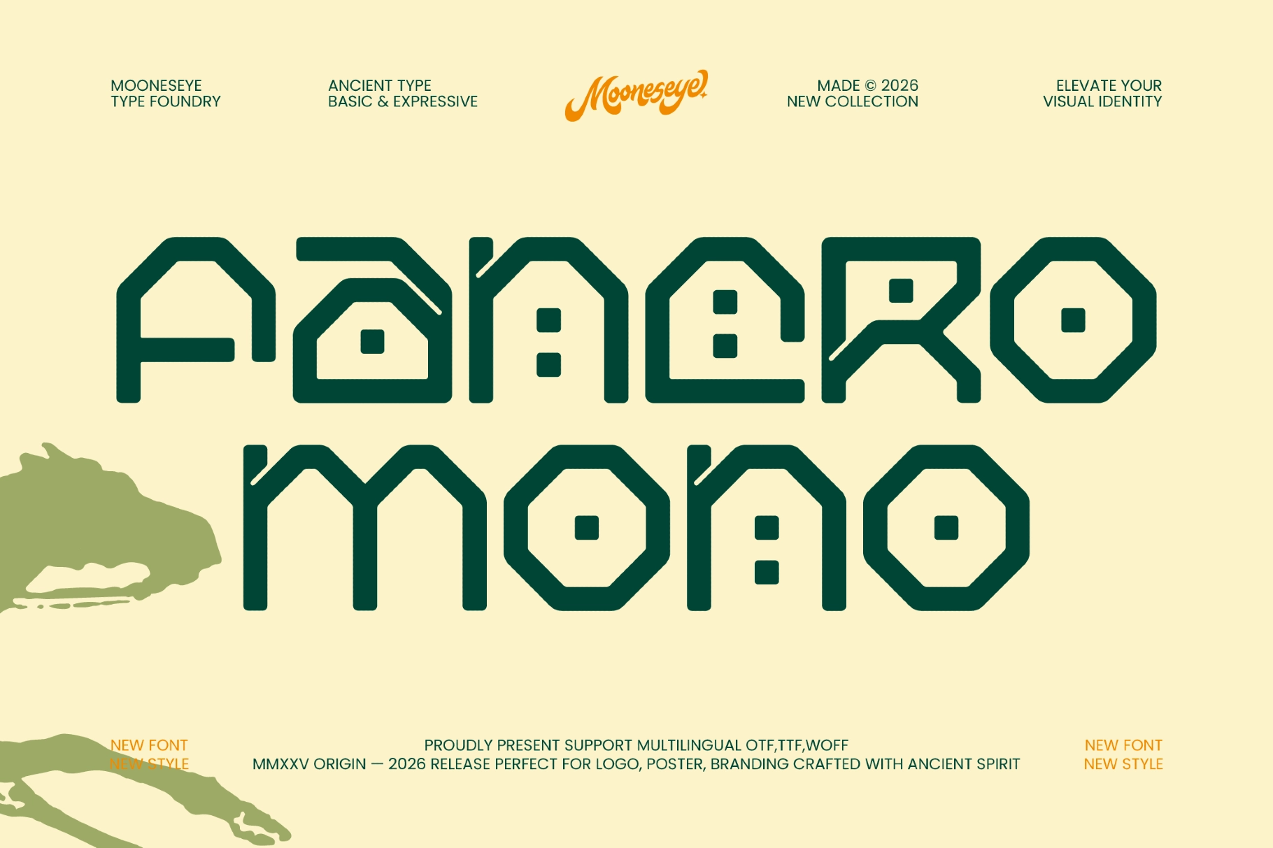
Fancro Mono - Ancient Geometric Display Font


About the product
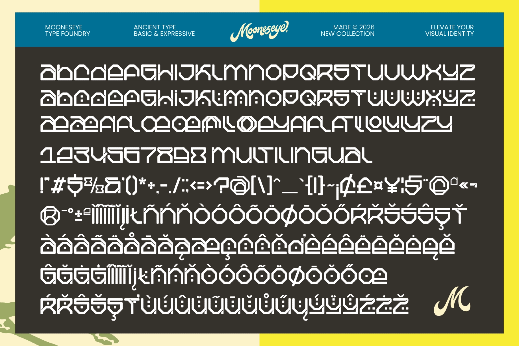
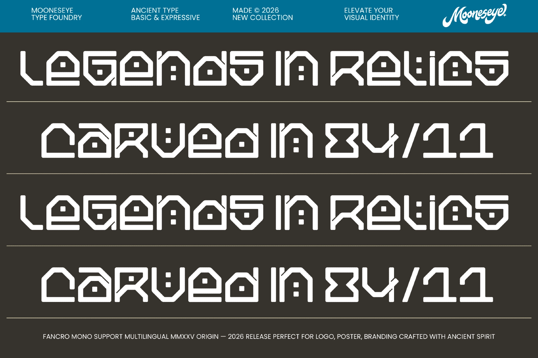
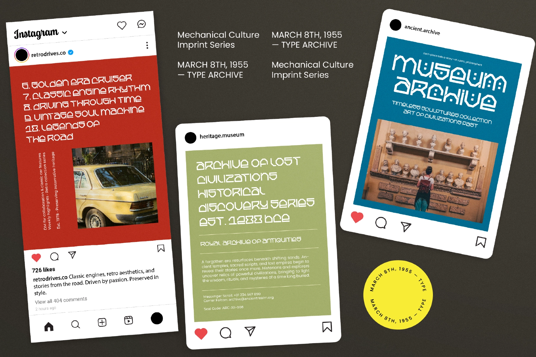
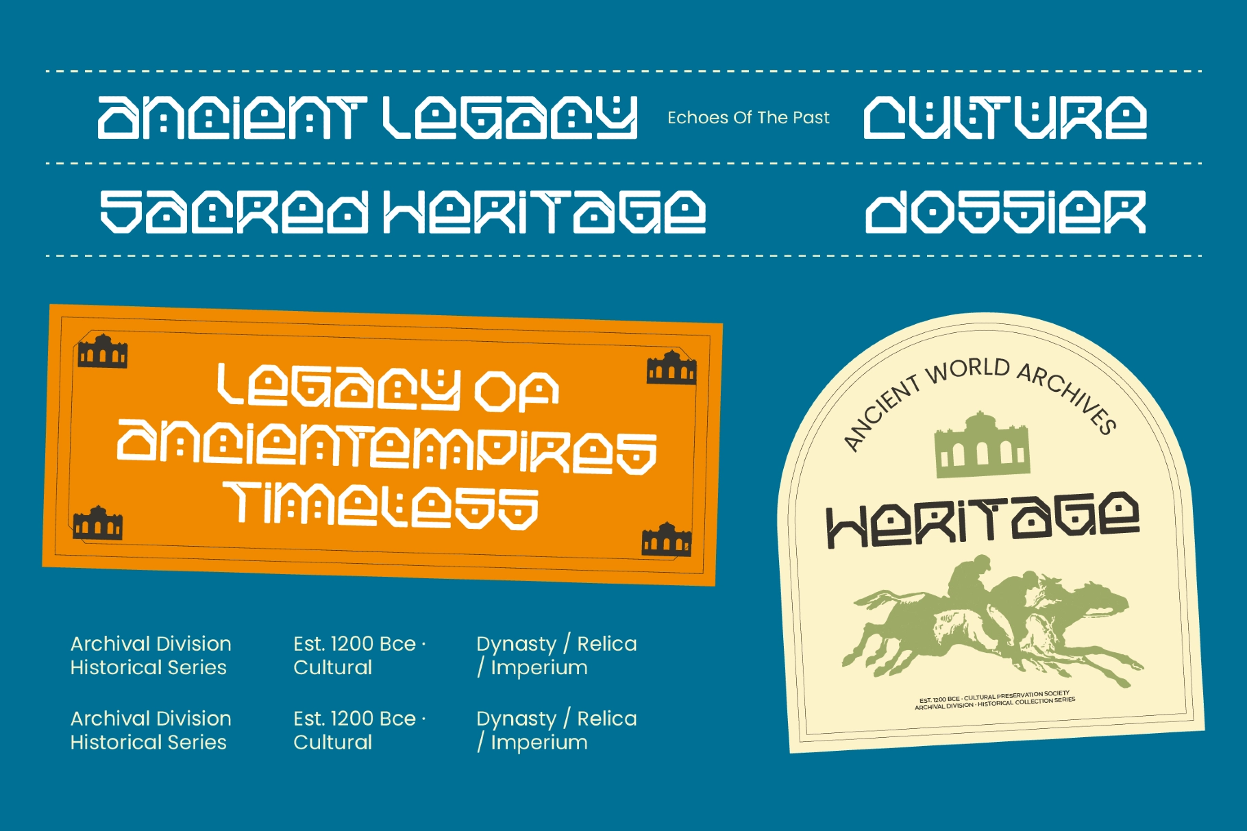
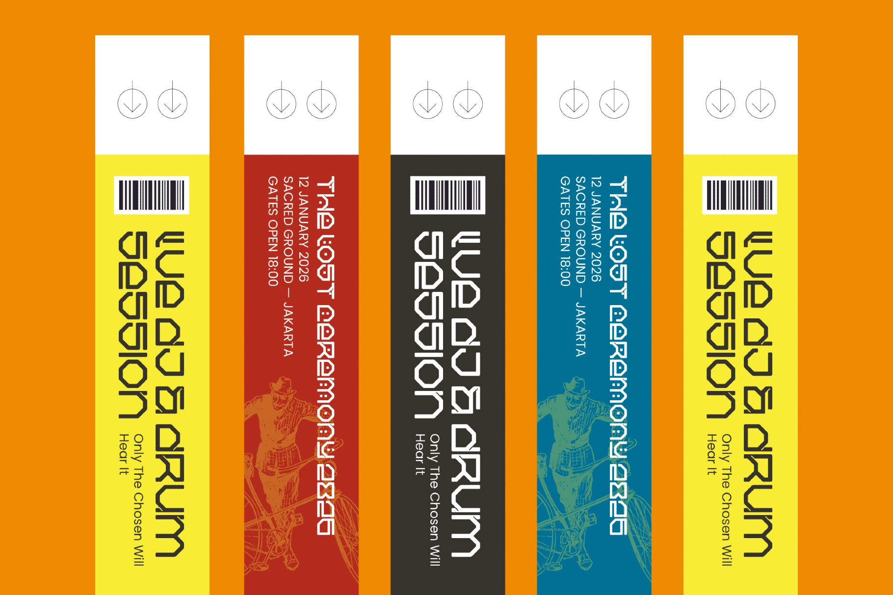
Fancro Mono is an ancient geometric display font built from a tight system of arcs, straight segments, and chamfered angles — every character drawn to the same fixed width, every counter punched with a small square dot that reads like a ventilation slot in a stone facade. The construction sits closer to monumental inscription than to typeface convention: letterforms that look carved rather than drawn, with a structural logic that holds its own at large scale without depending on contrast or weight variation.
The Italic tilts the same geometry without softening it — the result is an angled version of the same architectural slab, not a calligraphic departure. Use the two styles together for contrast in headlines, tickets, and poster layouts where the shift in angle does the work a weight change would do in a conventional serif.
Features:
- Included formats: OTF, TTF, WOFF, WOFF2;
- 2 styles: Regular, Italic;
- Uppercase & lowercase;
- Numerals, punctuation & symbols;
- Standard ligatures, fractions;
- Multilingual support;
- 344 glyphs per style