

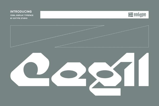
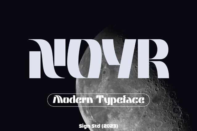
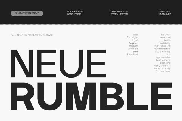


Geometric fonts for clean, modern, and architectural design
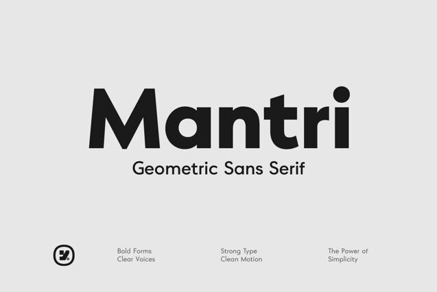
Geometric fonts are typography built like architecture. Their letters come from the circle, the triangle, and the straight line rather than the stroke of a pen. The constructed logic inherited from Bauhaus modernism gives them a cool, contemporary precision we reach for constantly in branding and interface work.
The collection spans disciplined geometric sans suited to whole identity systems, and bolder display fonts that push the construction toward pure abstract shape. What runs through all of them is rational clarity: type looks designed, intentional, and modern.
The logic of the construction
Recognizing how a geometric font is built explains how it behaves. The hallmarks are visible once you know to look:
- Round letters based on near-perfect circles.
- Even stroke weight with minimal contrast.
- Clean verticals, precise angles, and open counters.
- Uniform forms that prize shape over calligraphic rhythm.
Strengths and a trade-off worth knowing
That same uniformity is both the appeal and the catch. Geometric type looks superb in logos, headlines, and modern systems, but the identical round forms can blur the differentiation between letters across long paragraphs. We'd lean on it for display and branding, and test it carefully — or reach for a humanist sans — before trusting it with extended body text.
Why brands keep choosing it
Geometric sans have been the visual language of progress for a century, which is why tech, design, and forward-looking brands return to them again and again. One family with a full weight range can carry an entire minimalist identity — and when you want contrast instead, a warm serif headline over a geometric body is a winning pairing.
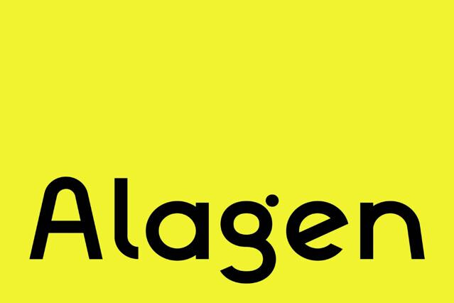
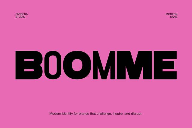
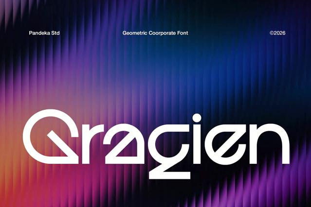
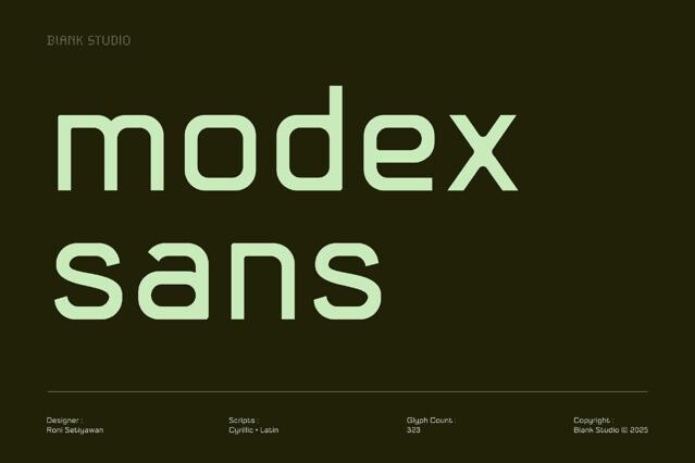
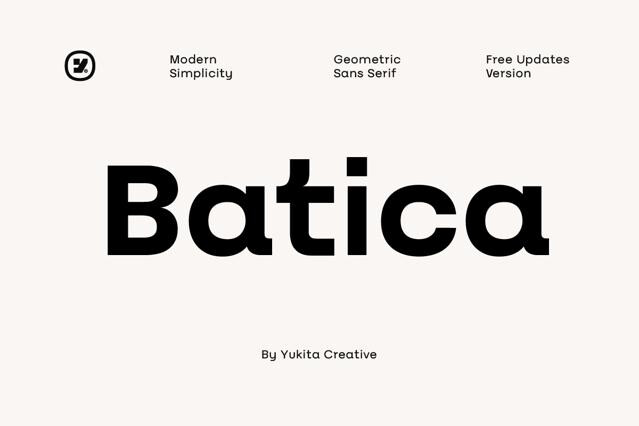
Its letters are constructed from basic geometric forms — near-perfect circles for the round letters, straight verticals, and clean angles. That mathematical logic gives geometric fonts their cool, modern, deliberate character.
Humanist sans borrow calligraphic proportions for warmth and reading comfort; grotesques are the even, mechanical 19th-century model; geometric sans prioritize pure shape over reading rhythm. Geometric fonts look the most "designed" and modern, but their uniform forms can be less comfortable in long text.
For short to medium text, yes — but the very features that make them beautiful (identical round forms, even strokes) can reduce the differentiation between letters in long passages. For extended reading, test carefully or choose a humanist font; for headlines and branding, geometric type excels.
The style is rooted in early-20th-century modernism and has been the visual signature of tech and design-forward brands for decades. We associate that clean, constructed look with progress and precision, which is the message many modern brands want to send.
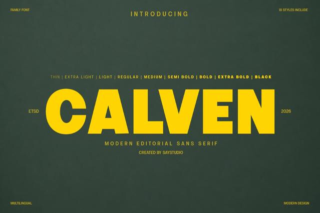
Many do, and a number ship as variable fonts spanning hairline to black. Geometric sans are frequently chosen as the single typeface behind an entire identity, so broad weight coverage is common — check the range per product.
A geometric sans contrasts beautifully under a warm serif headline, or it can run an entire minimalist system on its own. We'd avoid pairing it with another strongly geometric font, since the similar logic creates tension rather than contrast.