

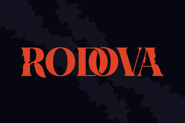


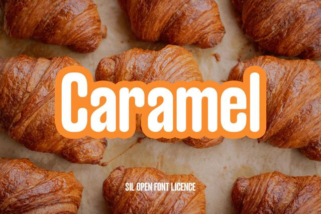
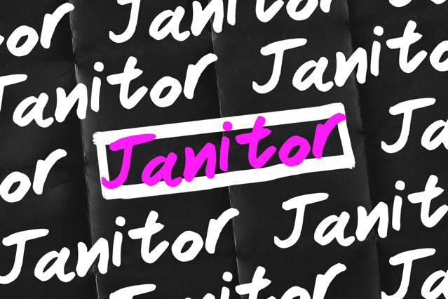
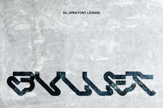
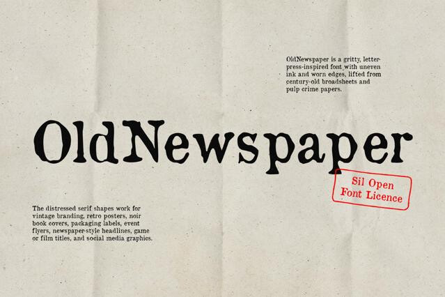
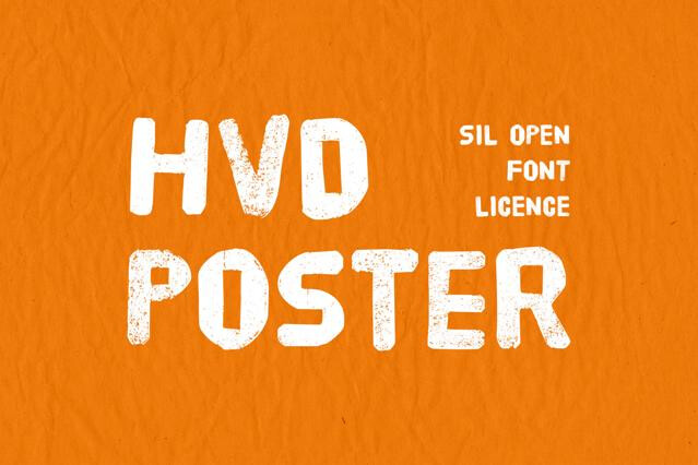


Poster fonts for large-format impact and commanding headlines
Poster fonts are display type with the volume maxed out. Built to dominate a large format and read clear across a room, they're the fonts that carry a poster, a banner, or a wall before any other element gets a look in — and we've gathered the heaviest, most commanding of them in one place.
Matching proportion to format
The right poster font depends entirely on the space it has to fill:
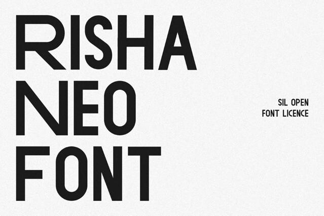
- Condensed — long titles packed into tall, narrow formats.
- Extended — wide presence that fills landscape and square layouts.
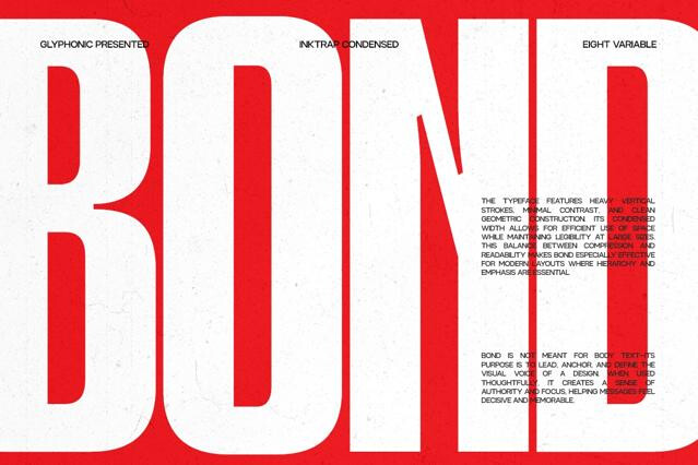
- Massive heavy display — pure weight for maximum stopping power.
Building hierarchy at scale
A poster works on contrast of size. We let one heavy poster font dominate as the focal headline, then drop hard in scale and weight for the supporting information — dates, venue, the small print. That gap between the commanding title and the quiet logistics is exactly what gives a poster its drama and keeps it readable.
Print-ready by nature
This is type made for the big formats — large-format print, banners, billboards, and oversized screens. To keep heavy strokes and fine detail crisp at size, we'd export at high resolution for print, and if a poster font is doing double duty as a wordmark, test it small too, where it also has to survive.
Poster fonts are a subset of display type optimized for the largest scales and the most commanding presence — extreme weight, dramatic proportions, and impact tuned for big formats. All poster fonts are display fonts; not all display fonts are heavy or large enough to anchor a poster.
It depends on the format. Condensed fonts let you fit long titles into tall, narrow space; extended and massive fonts fill a square or landscape format with sheer presence. We'd match the proportion to the poster's shape and the length of the headline.
They're built for the opposite: maximum impact at maximum scale. Many lose their finesse or clog when shrunk, so we'd reserve them for the headline and the largest type, with a cleaner font handling any smaller information.
Let one heavy poster font dominate as the focal headline, then drop sharply in scale and weight for supporting details. The contrast between the commanding title and the quiet logistics is what gives a poster its structure and drama.
Yes — poster type is at home in large-format print, banners, billboards, and oversized digital displays alike. For print, export at high resolution so heavy strokes and any fine detail reproduce cleanly at size.