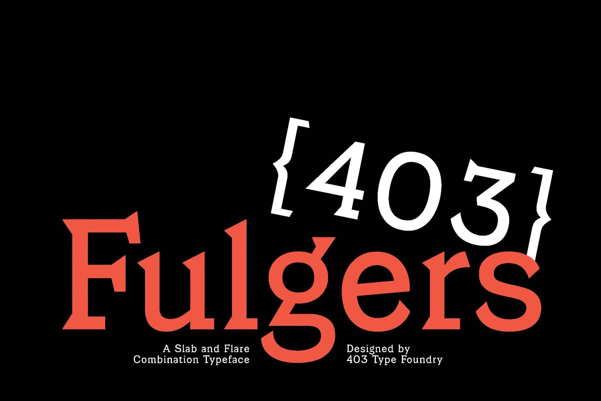
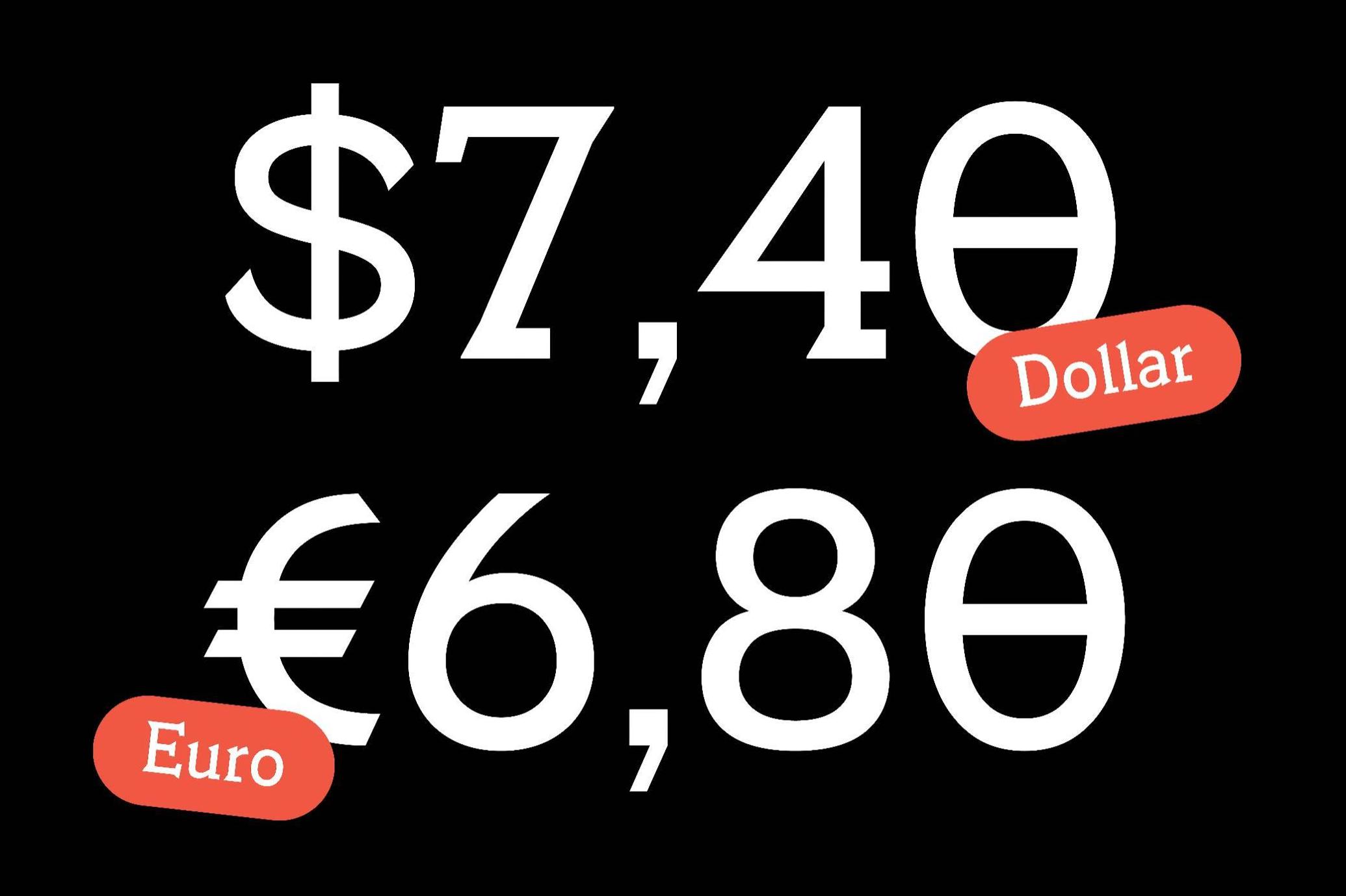
403 Fulgers Serif


About the product
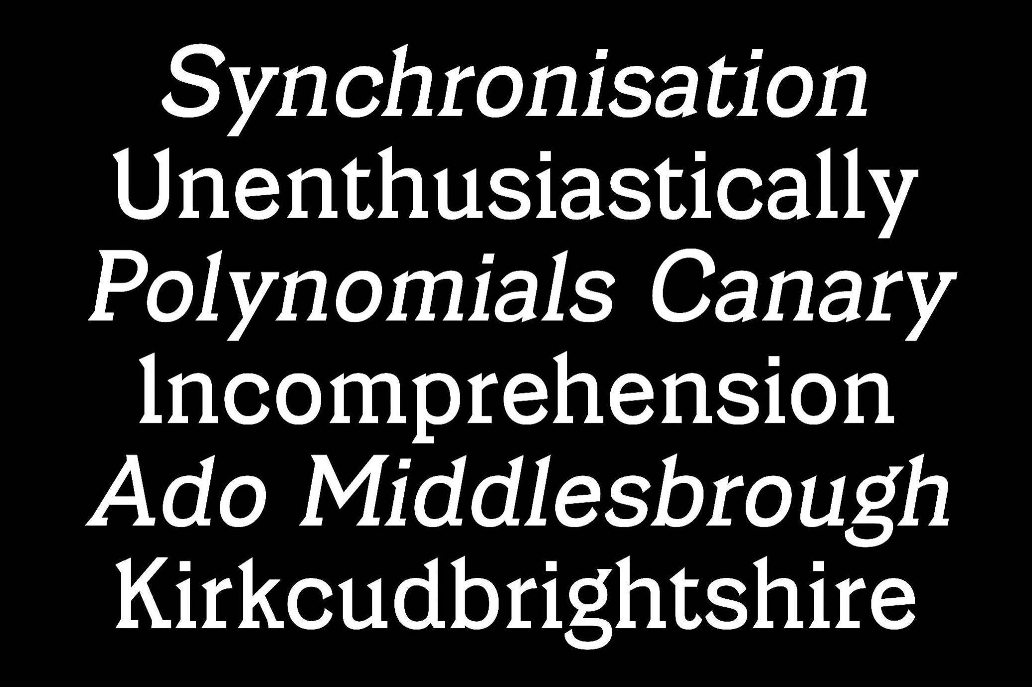
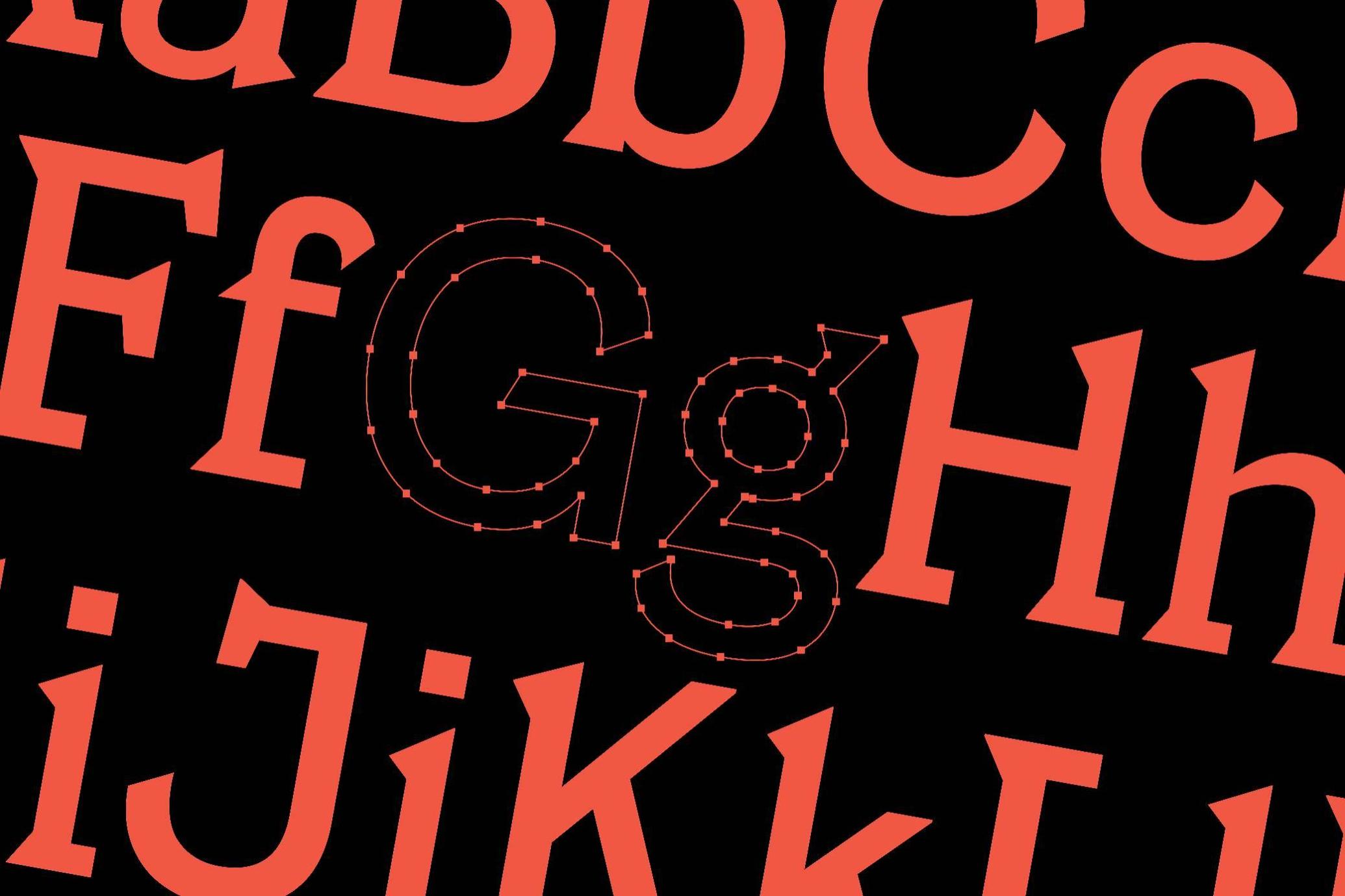
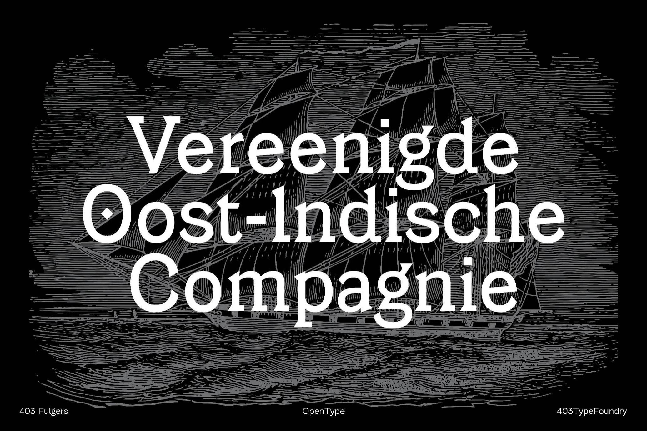
Back in the day, we drafted blueprints by hand, sliced Letraset sheets with scalpels, and thought kerning was a full-time job. 403 Fulgers feels like it was forged in that same analog fire. It’s the kind of typeface that looks just as comfortable etched into a steel sign outside a mid-century factory as it does on the title page of an old science manual. The slab-and-flare combo has that engineered precision mixed with a humanist swagger — not too rigid, not too loose — just right.
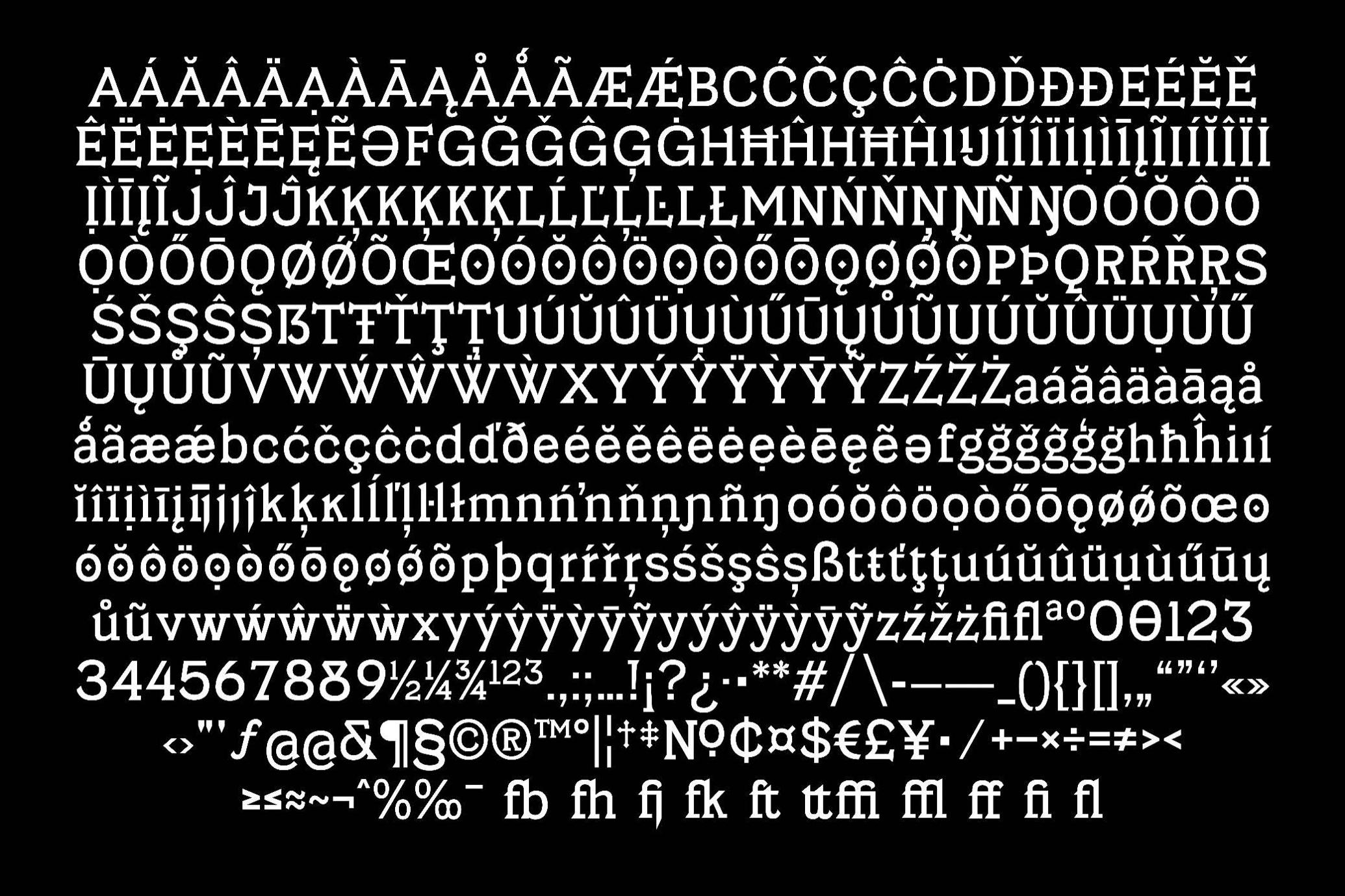
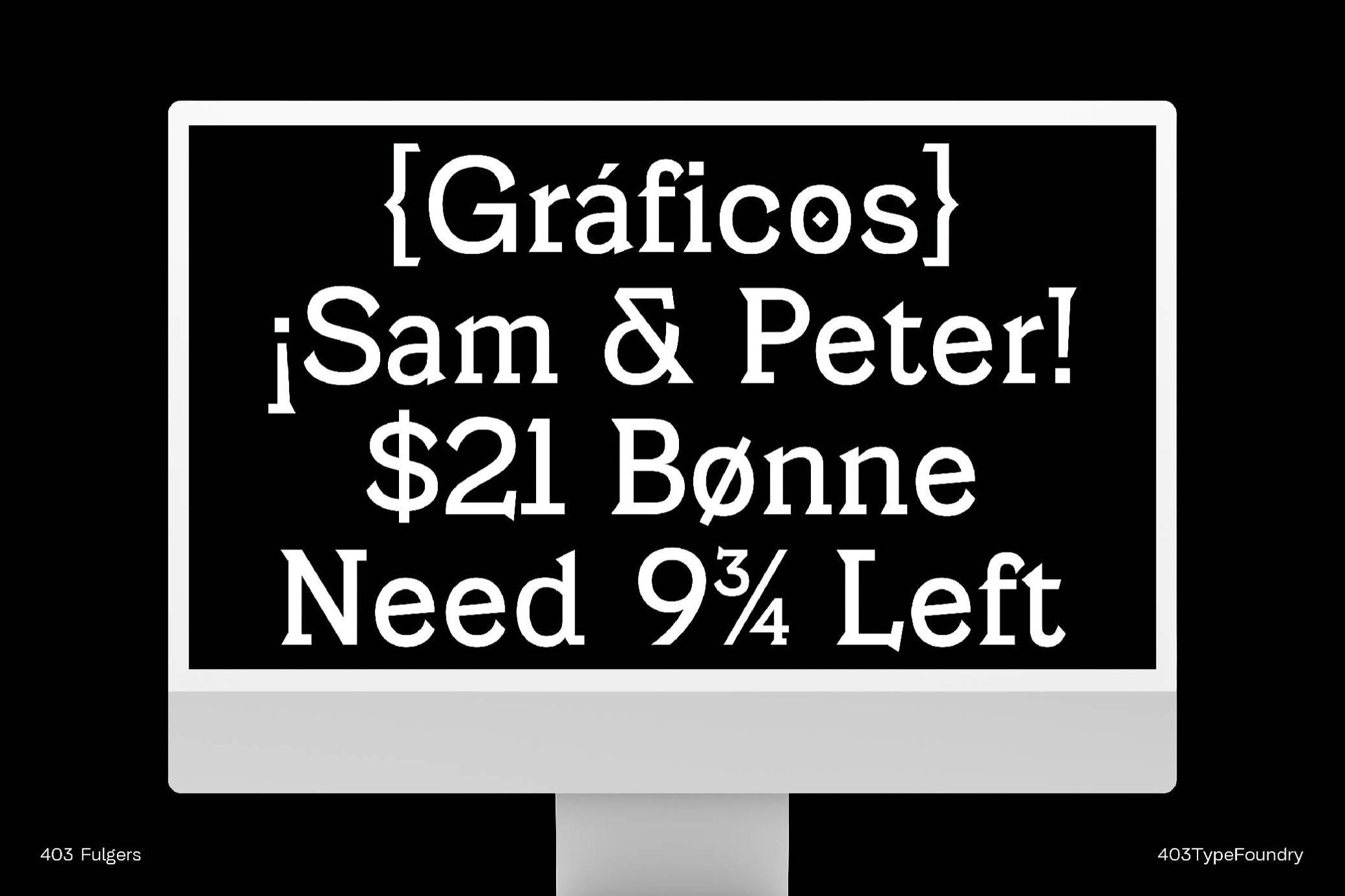
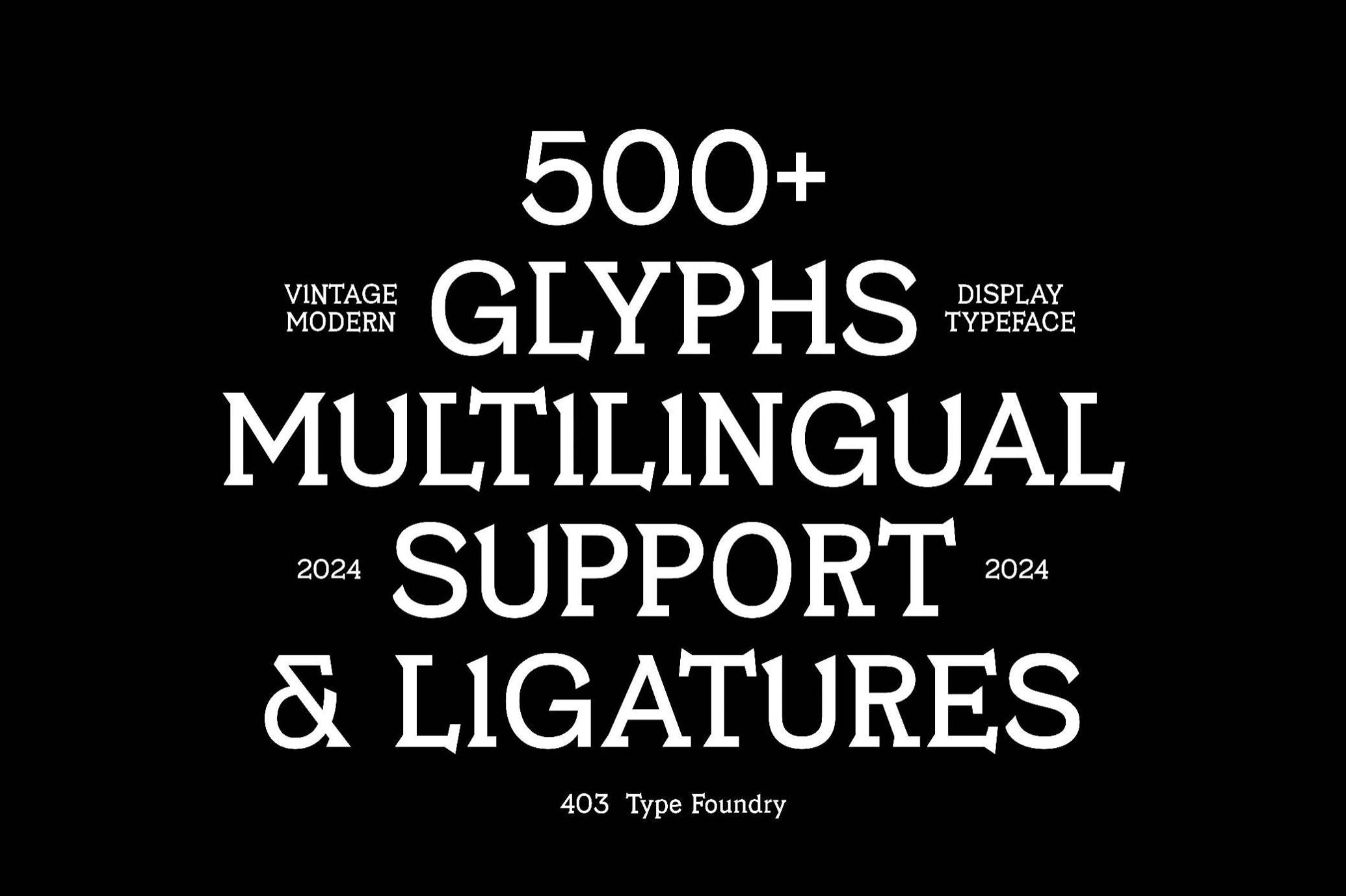
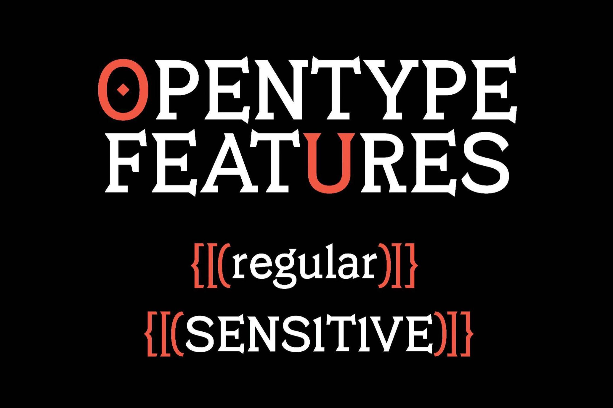
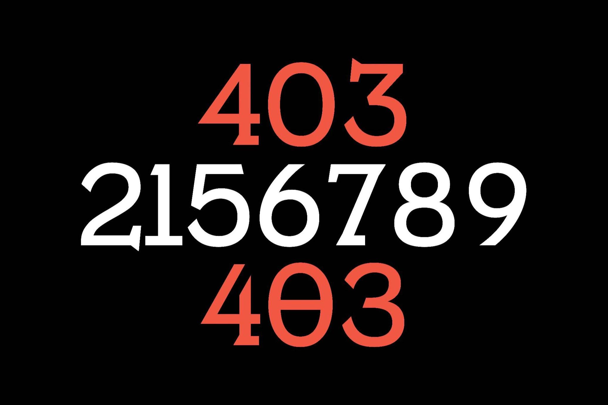
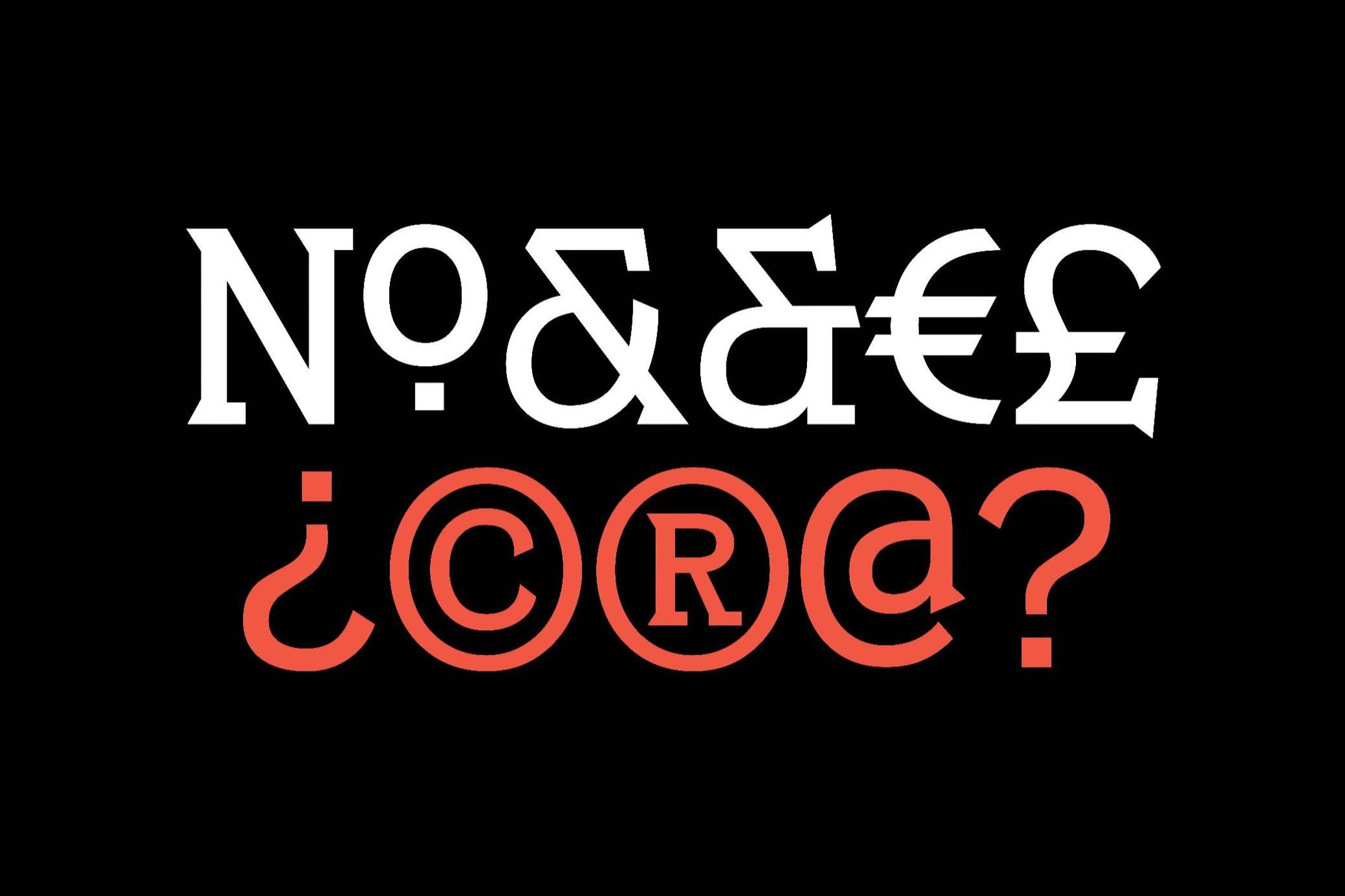
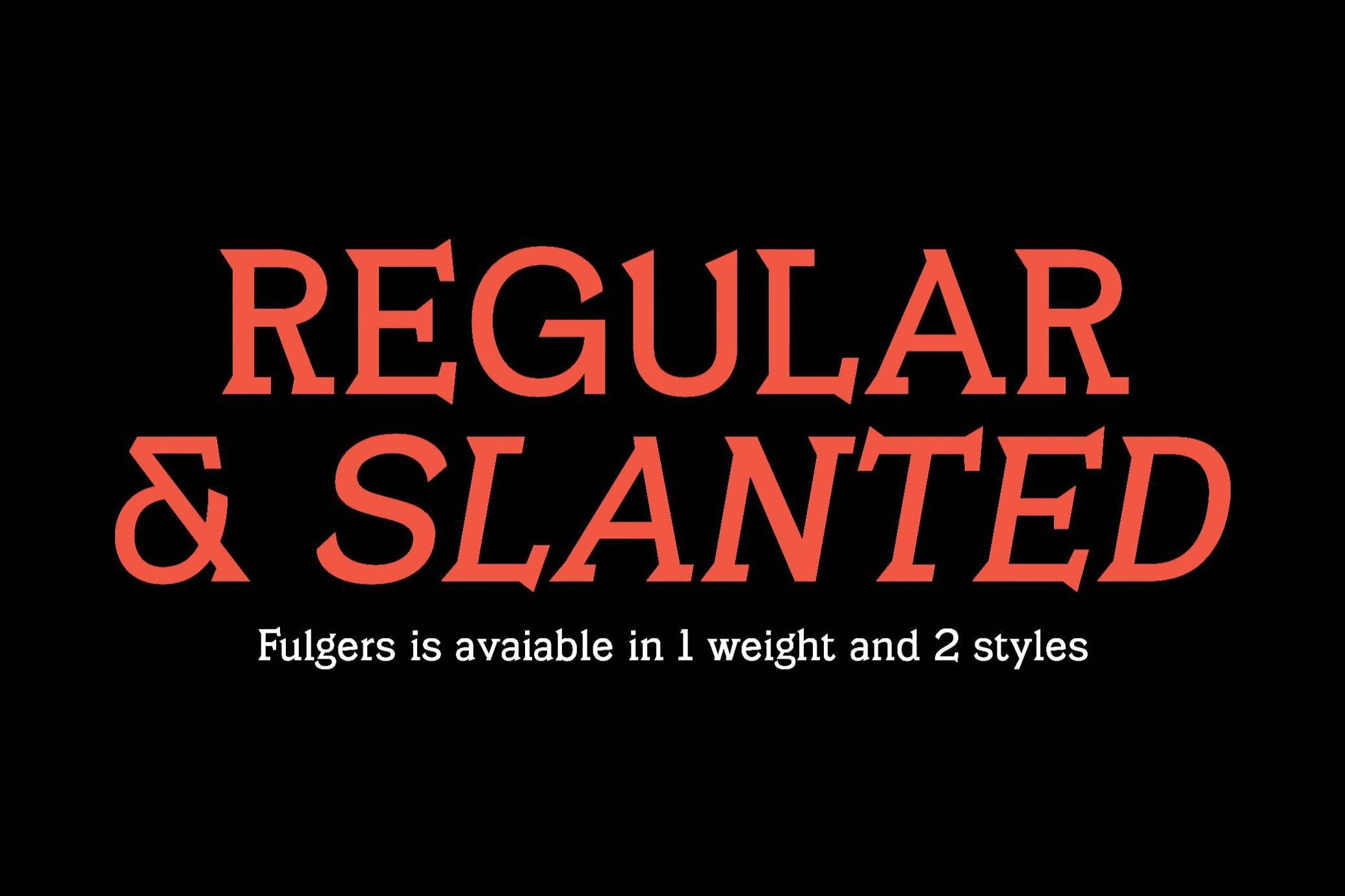
With over 500 glyphs, multilingual support, and beefy ligatures that stretch and snap like technical rulers on a drafting table, Fulgers doesn’t mess around. It comes in two distinct styles and one assertive weight, perfect for identity systems, editorial spreads, or anything that calls for typographic authority.