

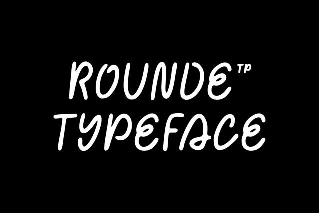


Rounded fonts for warm, friendly, and approachable branding
Rounded fonts take the edge off, literally. By softening every terminal and corner, they turn the precision of a sans into something warm and welcoming, and we've gathered the fonts that do it well across the full range from clean geometric rounds to chunky, characterful designs.
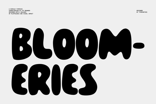
The difference good rounded fonts make
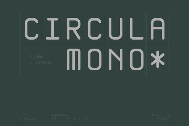
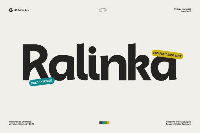
Not all rounded type is created equal, and the gap shows up fast at scale. A properly drawn rounded font keeps its curves even and its rhythm steady; a sans with the corners crudely filed off reveals lumpy joins and uneven terminals. We favor fonts that were rounded by design, not by shortcut.
Where the soft & rounded fonts fit
Rounded type has found a natural home in the brands that want to feel human:
- Technology, apps, and digital products that prize approachability.
- Healthcare, wellness, and care-focused identities.
- Children's products, education, and family brands.
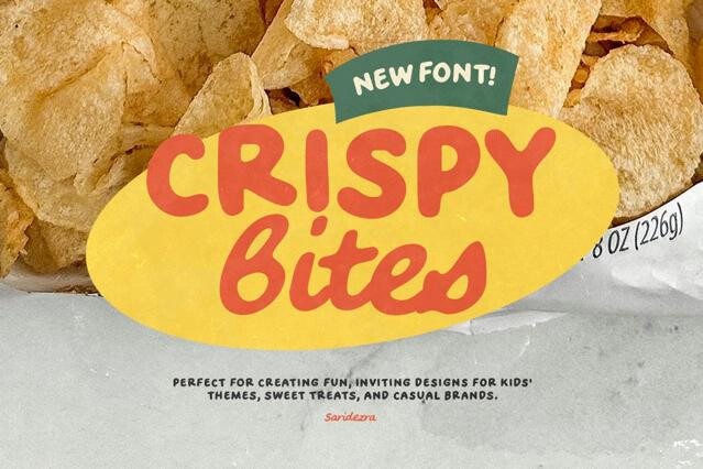
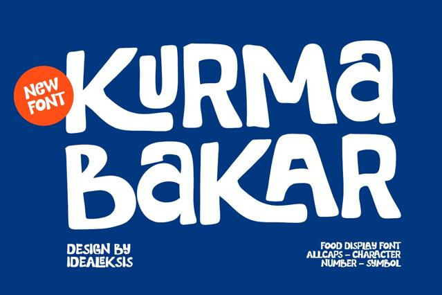
- Food, lifestyle, and friendly consumer packaging.
- Interfaces and signage where warmth aids accessibility.
Building and pairing
Many rounded geometric families arrive with deep weight ranges, enough to run a whole system in one consistent, friendly voice. When you do pair, keep the company gentle — a rounded body under a slightly crisper display font reads as warm and intentional, while a severe high-contrast partner fights the soft tone the rounding worked to create.
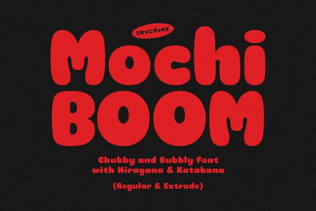
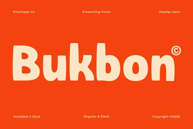
Rounding the terminals and corners removes the visual sharpness that reads as formal or technical, replacing it with softness the eye registers as approachable and calm. It's a small geometric change with a big tonal effect.
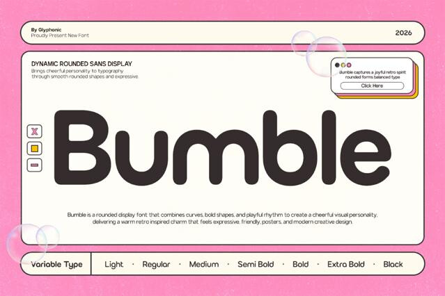
The best ones aren't. Quality rounded fonts are redrawn so the curves stay even and the rhythm holds — naively rounding a sharp sans creates uneven joins and clumpy terminals. The difference shows most at large sizes, where lazy rounding gives itself away.
Generally yes — the open, soft forms read well in interfaces and captions, which is part of why they're popular in apps. Very heavy rounded fonts can close up their counters when small, so check the boldest weights at your target size.
Technology and apps, healthcare and wellness, children's products, food and lifestyle, and any brand prioritizing warmth and accessibility. The softness signals "friendly and human," which is increasingly the tone modern brands want.
Many rounded geometric families come with broad weight ranges and some as variable fonts, making them capable of carrying headline, interface, and body alike. Weight coverage is listed on each product page.
They pair naturally with other soft or humanist fonts, and a rounded sans makes a warm body companion under a slightly sharper display headline. We'd avoid pairing them with severe, high-contrast type, which clashes with a gentle tone.