

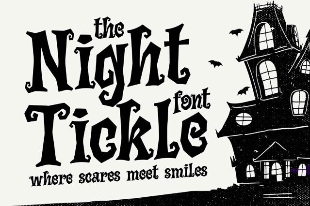
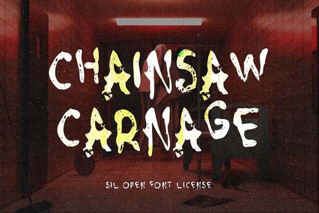
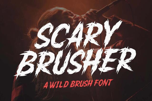
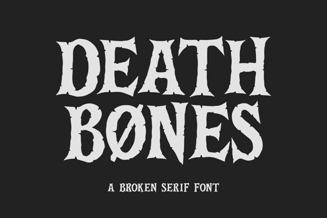

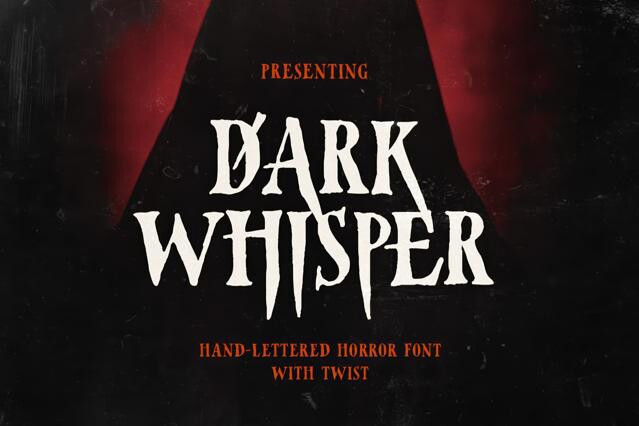


Creepy fonts for horror, dread, and unsettling design
Creepy fonts are made to disturb. Jagged, dripping, distorted, and broken, they signal dread and the uncanny the instant they appear. And unlike seasonal Halloween type, they work year-round across horror media.
We've gathered the fonts that get under the skin, from overt gore to the subtly, deeply wrong. The selection covers the full toolkit of unease, suited to horror branding, films and games, thriller editorial, and any design meant to unsettle.
What creepy fonts are used for
Creepy fonts do emotional work faster than almost any other design element. Their tense, threatening mood lands the instant the letterforms appear, priming an audience to feel unsettled before the story starts. That speed is why horror and thriller projects lean on type so heavily, treating it as a core tool for atmosphere.
- Horror film and game titling.
- Thriller and mystery book covers.
- Haunted attraction and escape-room branding.
- Album art for darker music genres.
- Posters and key art for horror campaigns.
The flavors of fear
The instinct is to assume scarier means bloodier, but the most unsettling type is often the most restrained — a letterform that's almost normal yet subtly wrong lingers far longer than an obvious splatter. Different fears call for different approaches: the slow dread of a thriller is a world away from the gleeful gore of a slasher:
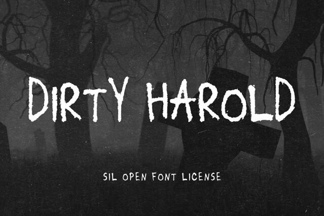
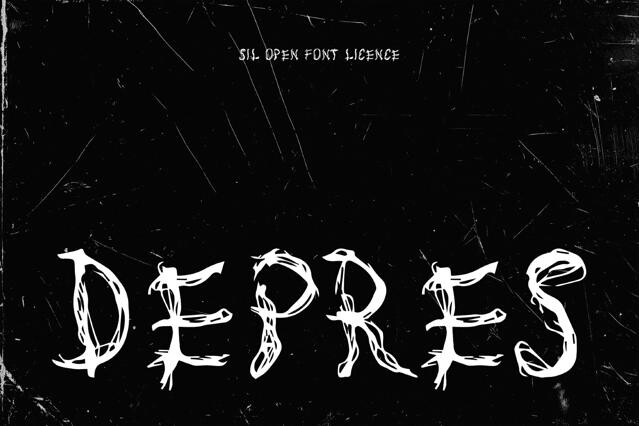
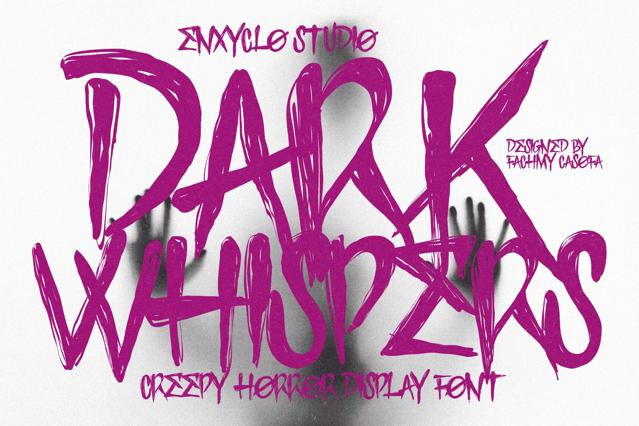
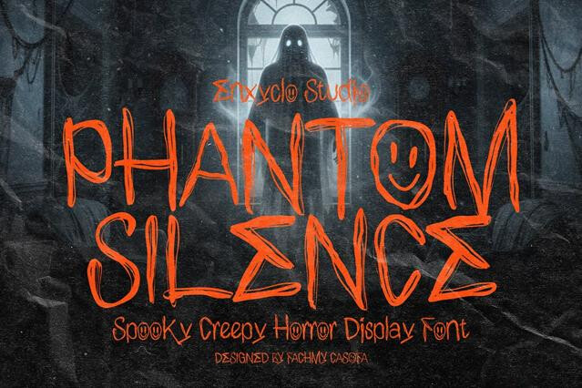
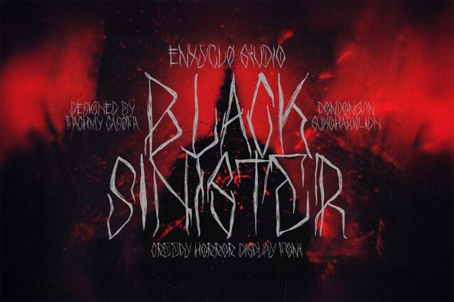
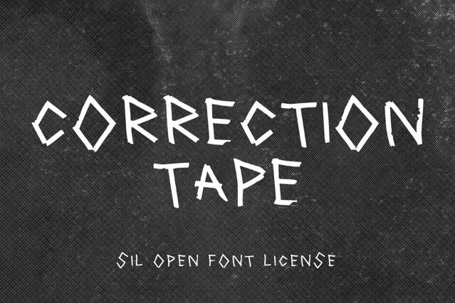
- Scratchy handwritten — frantic, unstable scrawls full of tension.
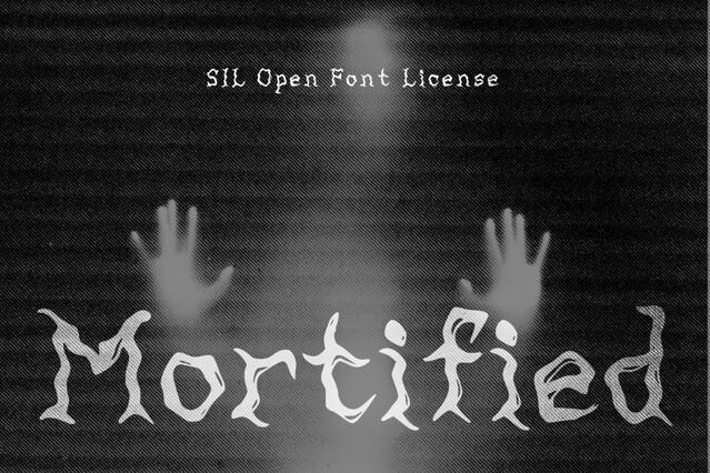
- Decaying and eroded — rotting, broken-down letterforms.
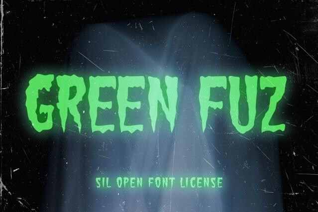
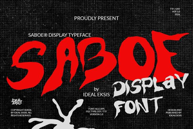
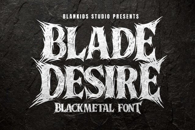
- Distorted display — warped, wrong-feeling fonts for unease.
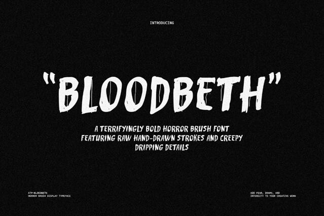
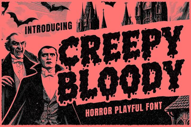
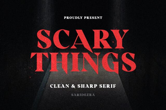
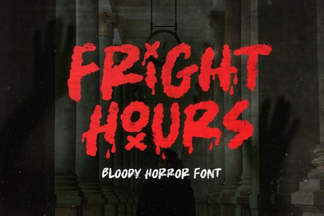
- Blood and drip — visceral type built for slasher aesthetics.
Creepy fonts aim for genuine unease and dread, working year-round across horror media; Halloween fonts are seasonal and often lighthearted, tied to celebration.
Several: irregular, broken, or distorted forms; dripping and bleeding textures; scratches and claw marks; uneven baselines; and the subtle "wrongness" of letters that look almost normal but aren't. Sometimes restraint unsettles more than gore.
Often, yes. Overt blood and slime read as theatrical, while a font that's just slightly distorted or off-kilter creates a deeper, more lingering unease. Match the intensity to the project: cinematic dread versus splatter-fun.
Horror films and games, thriller and true-crime branding, haunted attractions, dark editorial and book covers, metal and dark music.
Heavy drip and texture can clog at small sizes and needs high-resolution export for print. Keep the most detailed fonts at display size and test at final scale before committing.