


Modern fonts for contemporary branding and current design
Modern fonts are about being of the moment. We curate the fonts that keep a project reading as present: clean lines, confident spacing, and the contemporary edge that signals a brand understands where design is right now.
The category bridges several styles on purpose: minimal sans for systems and interfaces, sharp high-contrast serifs for editorial and fashion, and forward-looking display fonts with a current attitude. Together they form a working toolkit for branding, publishing, and digital design.
Two meanings, both useful
The word carries a bit of history worth knowing. In classification, "modern" names the high-contrast Didone serifs of the late 1700s; in practice, it means contemporary. We embrace both — the dramatic Didones and the clean current fonts sit side by side here, because designers use the term to mean "looks like today."
What keeps type looking present
Current style is less a fixed look than a set of instincts, and the reliable ones rarely change:
- Clarity and confident, generous spacing.
- Restraint with ornament — simplicity over decoration.
- One distinctive detail rather than a dozen.
- Variable-font technology used as part of the toolkit.
Modern without going generic
The risk with "modern" is blandness — reaching for the most default clean option and landing somewhere forgettable. We'd choose fonts with a genuine point of distinction, build the durable parts of a system from timeless designs, and save the trend-driven display type for the places a refresh is expected anyway. Clean and characterless are not the same thing.
In type history, "modern" can mean the high-contrast Didone serifs of the late 1700s. In everyday design use — and in this collection — it means contemporary: the clean, current styles defining today's work. We use the practical meaning, with both senses well represented.
Contemporary fonts tend toward clarity, generous spacing, restrained ornament, and either crisp neutrality or one sharp distinctive detail. Trends shift, but the throughline is confident simplicity — type that doesn't try too hard reads as modern longest.
The most neutral, well-built fonts age slowly; the trend-driven display styles date faster by design. We'd build the durable parts of a system, like body and interface, from timeless modern fonts, and use of-the-moment display type where a refresh is expected anyway.
Tech and startup branding, contemporary editorial, digital products, fashion and lifestyle, and any identity that needs to signal that it belongs to the present. The style is about positioning as much as aesthetics.
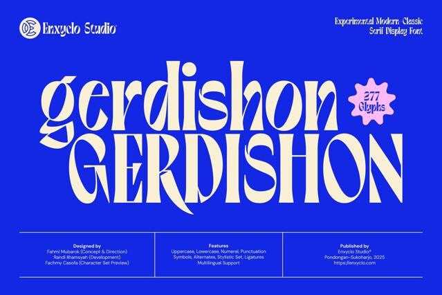
Increasingly, yes — variable technology is itself part of the modern toolkit, letting one file cover a full weight or width range. Many families in this collection ship variable; the format is noted on each product page.