


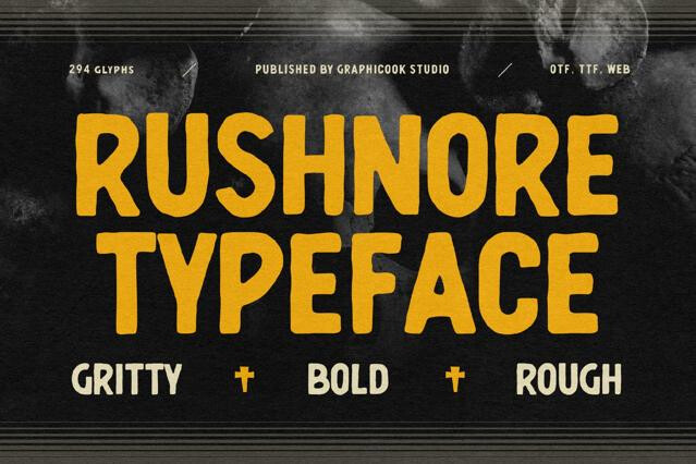
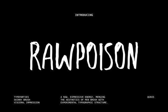


Rough fonts with distressed texture and raw, authentic character
Rough fonts carry the marks of the physical world — ink that bled, edges that chipped, a stamp that didn't land evenly. That texture is the point. We've collected fonts across the grit spectrum, from lightly weathered to heavily eroded, so you can match the wear to the medium and the mood.
Where the rough fonts pay off
Set a mark against flawless vectors and a bit of wear starts to read as proof — of a hand, a press, something physical behind the design. That texture of authenticity allows independent and craft brands work hardest to project, and rough fonts supply it directly. They suit:
- T-shirts, merch, and apparel graphics.
- Posters, gig flyers, and event art.
- Stamps, badges, and seals.
- Craft, vintage, and small-batch packaging.
- Logos and wordmarks with an edge.
- Editorial accents that need grit and contrast.
The grit you can choose from
Texture here is a dial, so how far you turn it decides the message. A faint weathering suggests age and quality; heavy erosion suggests edge and defiance. The complication is medium: the same grit looks rich screen-printed on a poster but can choke on a small label.
- Stamp and letterpress textures — uneven ink and pressed-in detail.
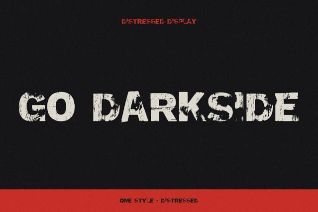
- Distressed display fonts — chipped, eroded, and weathered.
- Grunge and spray styles — gritty, urban, and energetic.
- Lightly aged fonts — subtle texture for a refined vintage feel.
- Clean-plus-rough pairs — both cuts for flexible output.
Working with texture, not against it
Rough type is medium-sensitive. What looks rich on a screen-printed poster can turn to mud on a tiny label or a low-res screen, so we'd always preview at the final size and reach for lighter-textured cuts where reproduction is tight. When in doubt, keep a cleaner version of the same font on hand as it makes scaling across formats far less painful.
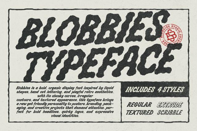
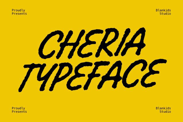
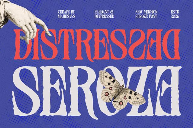
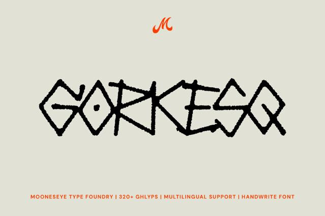
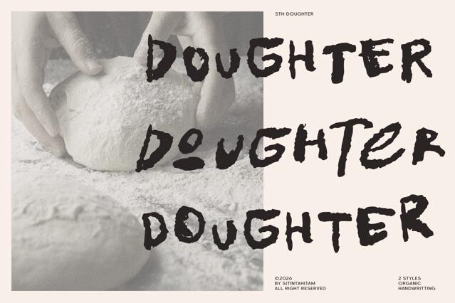
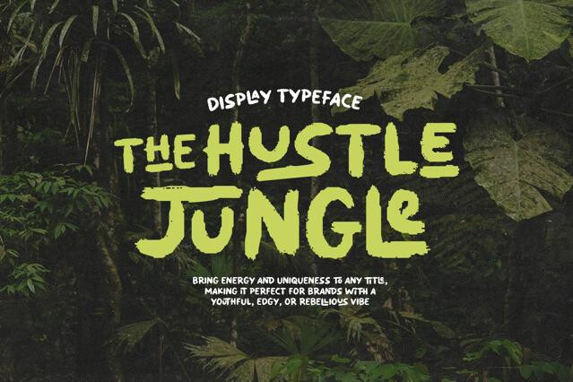
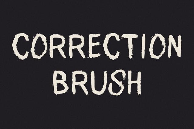
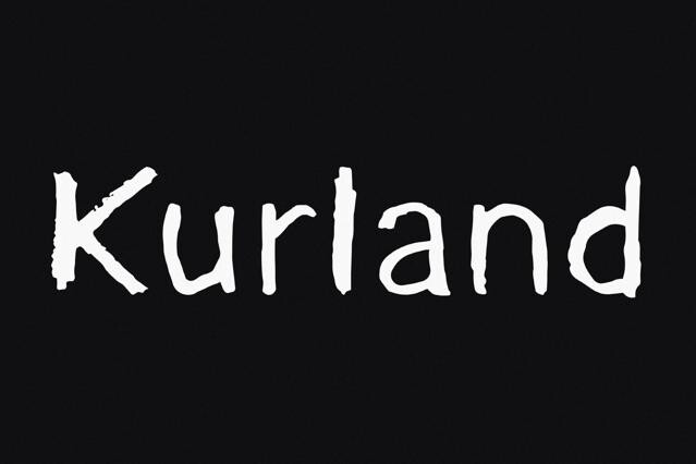
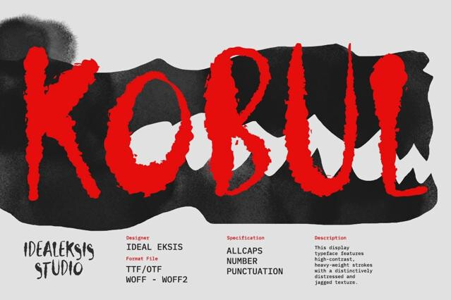
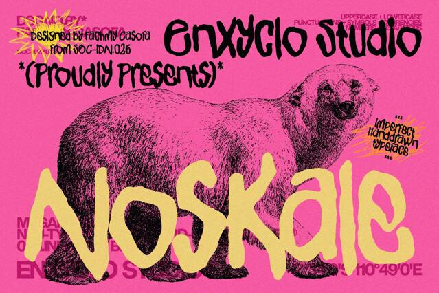
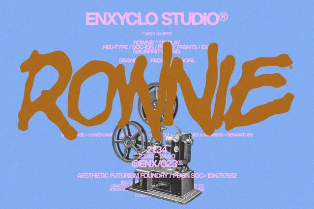
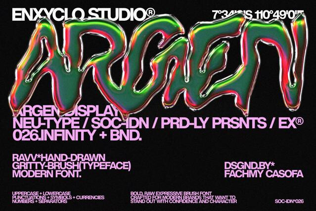
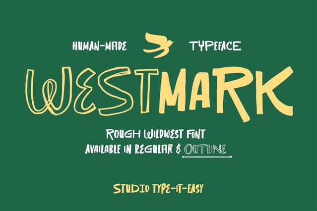
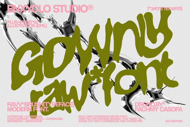
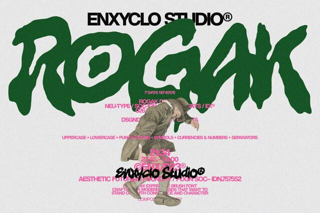
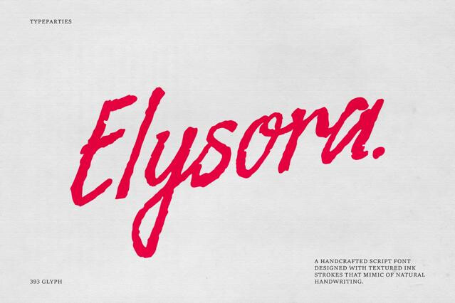
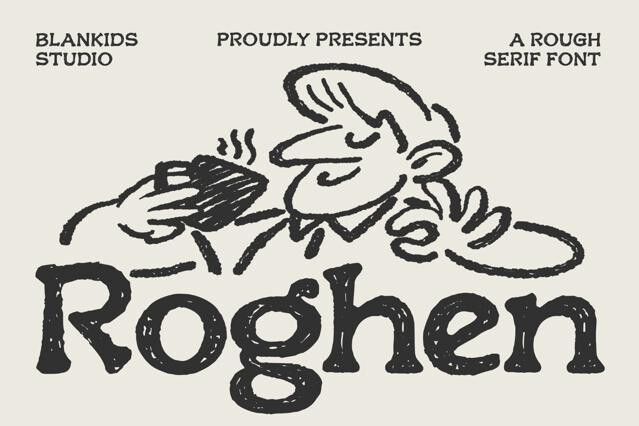
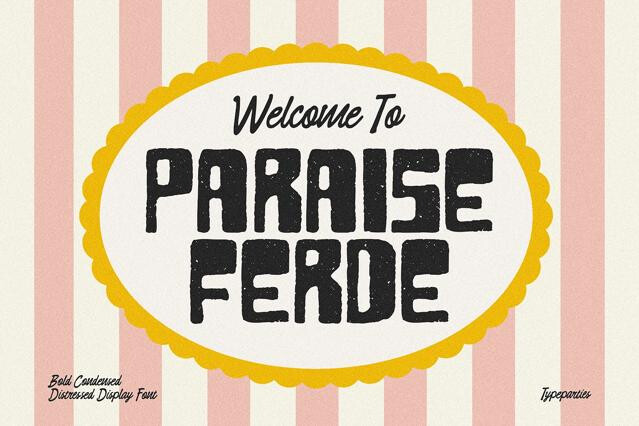
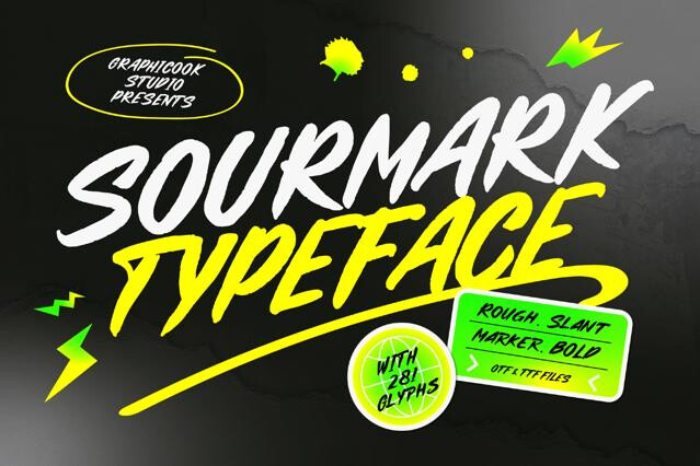
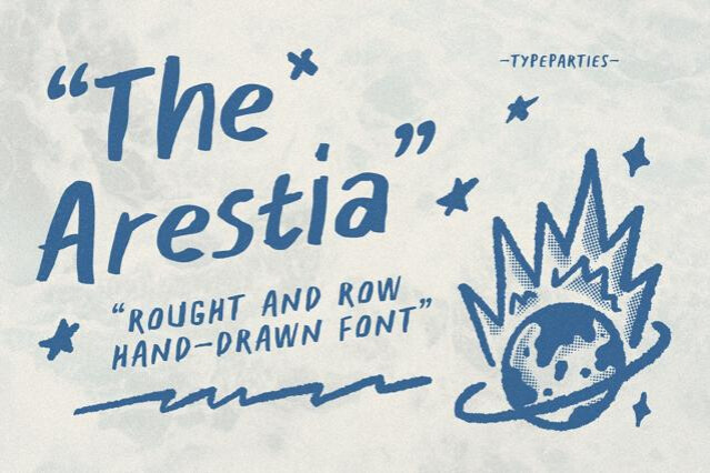
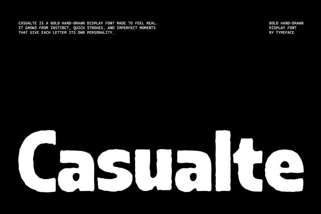
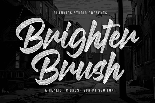
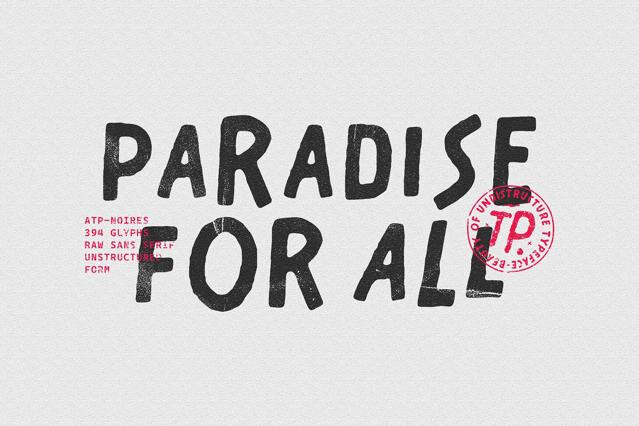
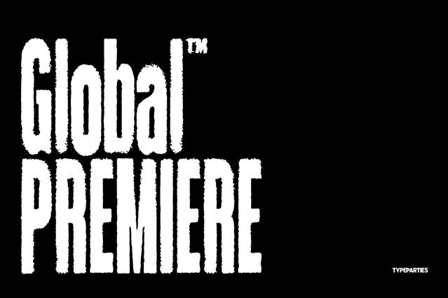
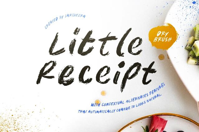
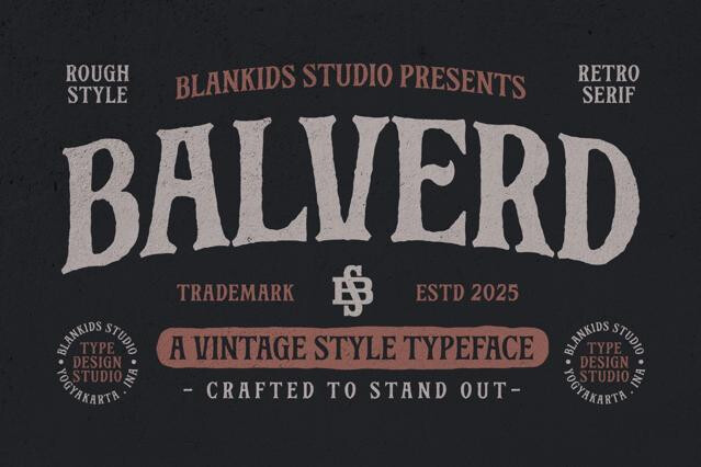
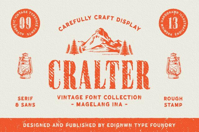
A typeface with deliberate texture. Distressed edges, ink bleed, grain, or stamp-like erosion make the letters look printed, worn, or hand-stamped rather than digitally clean.
Apparel and merch, posters and flyers, craft and vintage packaging, stamps and badges, and handmade branding.
Fine detail can clog or disappear when scaled down, so we'd test at final size and choose lighter-textured versions for small print and packaging.
They can give a logo real character, but reproducibility matters — heavily distressed marks are harder to render across formats, so consider a cleaner backup version.
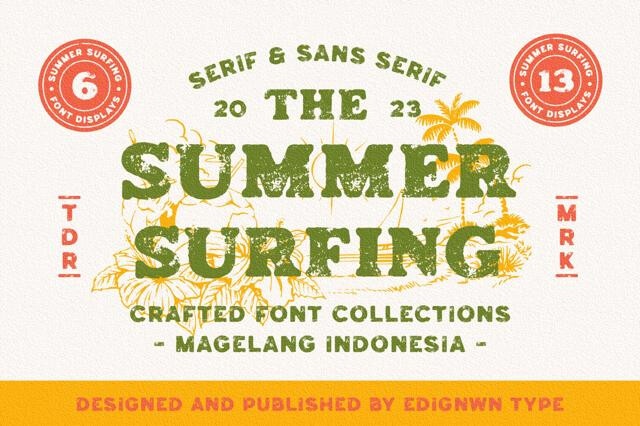
A vintage font borrows old proportions; a rough font adds physical wear on top. Many designs combine both for an authentically aged result.
Some releases offer multiple texture levels or clean and distressed cuts of the same font, letting you match the grit to your medium. Check each product page.