


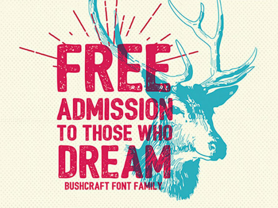


Distressed fonts for grunge, apparel, and raw textured design
Distressed fonts wear their history on the surfont. Rough edges, ink bleed, erosion, and honest grit make them feel weathered and real — the opposite of slick. So we've gathered the fonts that bring that texture to grunge branding, apparel, posters, and anything wanting raw character over polish. The selection covers the full range of wear, from lightly roughened type to heavily eroded grunge and stamped, printed-texture lettering.
Where distressed type fits
In a feed full of flawless vectors, distressed fonts read as honesty and bare emotion. Texture signals that something is handmade and far from corporate, which is the impression small and independent brands fight to earn.
- Band merch, posters, and album artwork.
- Streetwear and apparel graphics.
- Craft beer, coffee, and small-batch packaging.
- Vintage-style logos and badges.
- Skate, punk, and underground culture design.
Degrees of wear
With distressed type the real dial isn't style so much as intensity, and where you set it fully changes the message. A faint roughness reads as age and heritage; a heavily eroded letterform reads as rebellion and edge. Push it too far for a craft-coffee label, or too little for a punk poster, and the texture works against the brand:
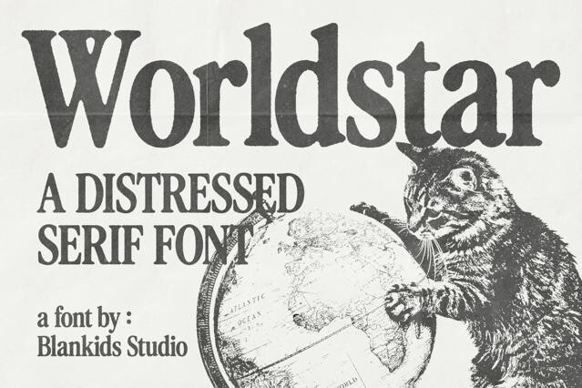
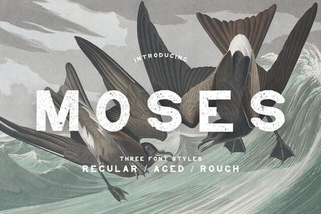
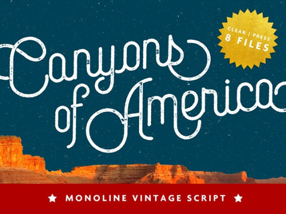
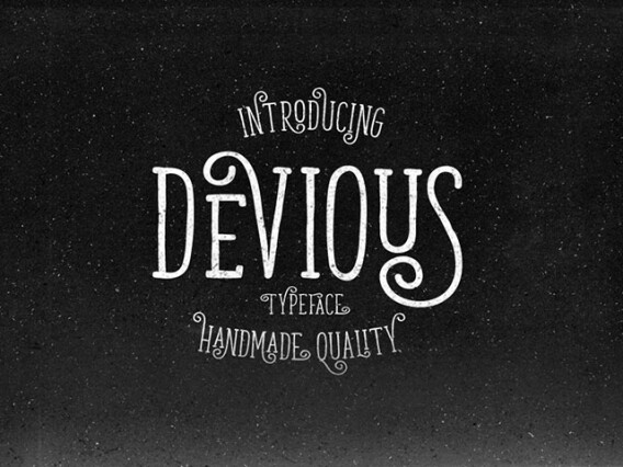
- Lightly weathered — subtle texture that suggests age without noise.
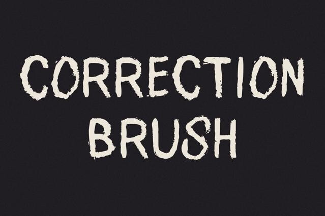
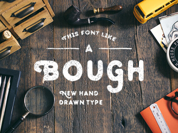
- Stamped and inky — uneven coverage like rubber-stamp or letterpress.
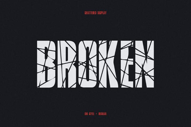
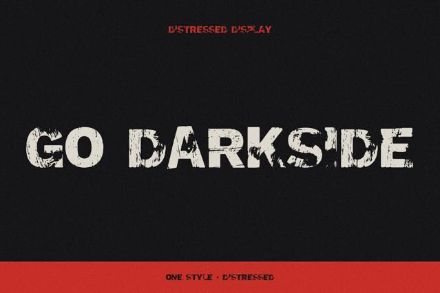
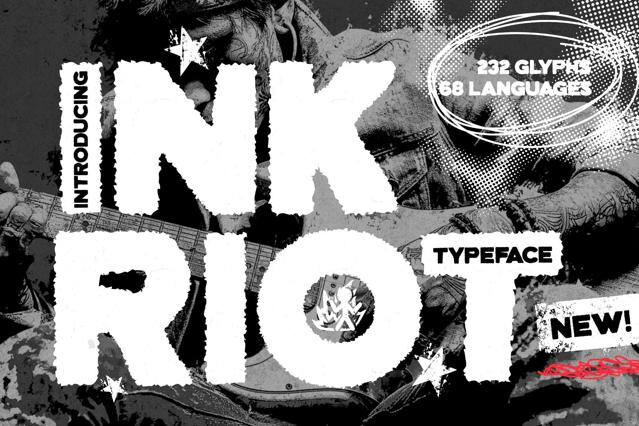
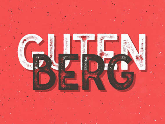
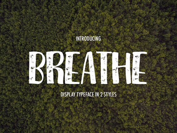
- Heavy grunge — broken, eroded letterforms full of grit.
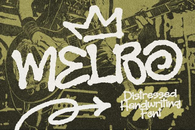
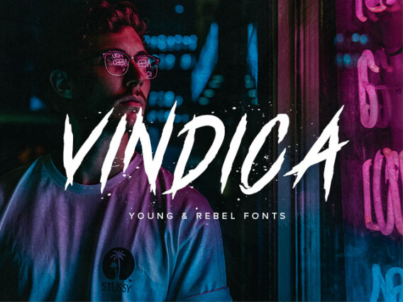
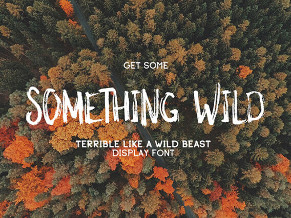
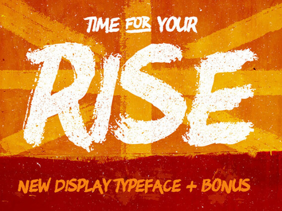
- Spray and stencil — rough, urban fonts with a street edge.
Distressed is about texture and wear specifically — grunge, erosion, ink bleed — regardless of era or mood. Vintage aims for period authenticity; creepy aims for an unsettling, horror-adjacent feel. A font can be distressed without being old or scary.
Often not cleanly. Fine grunge texture clogs when shrunk and can pixelate if not exported at high resolution. We'd keep heavily distressed fonts at display size, test at final scale early, and export high-res for print.
It varies. Vector-based distress scales better; raster textures can degrade. Check the format on the product page, especially if you need the font to work across very different sizes.
Grunge, rock, and punk branding; apparel and merch; gig posters; rugged outdoor and workshop identities, etc.
Use it with restraint and let the texture be a deliberate accent. One strong distressed font against clean space reads as intentional, while distress layered on everything turns muddy.
Some families offer multiple distress levels (light to heavy) within one design, letting you match the wear to the project. Where available, this range is noted on the product page.