


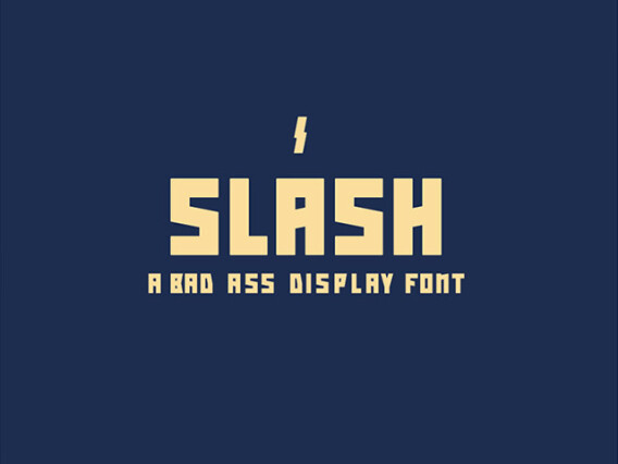
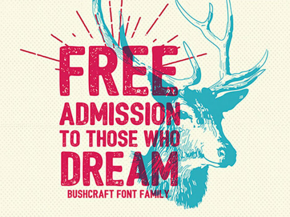


All-caps fonts for bold statements and confident wordmarks
All-caps fonts are built to look intentional and balanced when set entirely in capitals. Where an ordinary text font turns cramped in all caps, these are drawn with the proportions and spacing that uppercase demands.
We've collected fonts that range from towering display headlines to tightly engineered geometric caps. They'll dominate a layout, hold a poster together, and give body copy something powerful to lead it.
Why purpose-built caps matter
Setting an ordinary text font in all caps almost always disappoints, and the reasons are technical. Most fonts have their spacing tuned for the rhythm of lowercase, so forcing them into uppercase leaves the letters cramped and uneven. Purpose-built all caps fonts solve this at the drawing stage.
- Capitals need more letterspacing than mixed case to breathe.
- Text fonts are tuned for lowercase rhythm, not caps blocks.
- All-caps fonts carry the proportions to hold together as a unit.
Where the block works
Every font here answers the same brief — words set in capitals — yet the results sit at different volumes and temperatures. The line can come across as calm and modern, urgent and economical, brutally loud, or quietly elegant, purely from how the caps are drawn:
- Logos and wordmarks.
- Posters, headlines, and titles.
- Fashion and editorial layouts.
- Packaging and authoritative branding.
The all-caps styles in range
The same all-uppercase brief can be answered with clean geometric forms, tall condensed columns, brute-force heavy weights, or refined editorial serifs, and each changes the entire tone. A geometric cap goes modern and calm; a condensed cap goes urgent and economical; a heavy block goes loud. So the selection on our website spans several distinct registers.
- Geometric caps — clean, modern letterforms built on simple shapes.
- Condensed display — tall, narrow fonts that pack a punch in tight space.
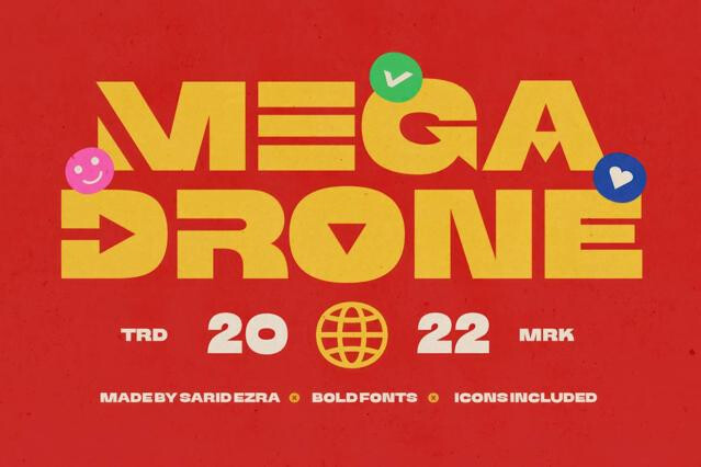
- Heavy and blocky — maximum-weight type for unmissable headlines.
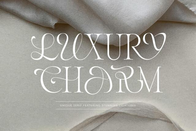
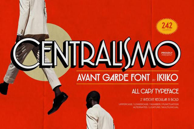
- Refined serif caps — elegant uppercase for premium, editorial work.
Spacing and restraint
Two habits get the most from all-caps type. First, open the tracking — uppercase almost always wants extra letterspacing, and these fonts take it until the word reads as a balanced block. Second, keep it short: all caps slows reading by removing word-shape cues, so we'd save it for statements and hand long copy to a mixed-case font.
Technically yes, but most text fonts look cramped and poorly spaced in all caps because their letterspacing is tuned for mixed case. All-caps fonts are drawn specifically for uppercase setting with balanced proportions, generous spacing, and forms that hold together as a block.
Capitals need more letterspacing (tracking) than lowercase to breathe, and many fonts lack the proportions for it. Without that adjustment, all-caps text reads as tight and clumsy.
Largely, yes. All-caps setting slows reading because it removes the word-shape cues lowercase provides, so it tires the eye over length. Use these fonts for logos, headlines, labels, and short statements, not body copy.
It varies. Some are true caps-only designs, others fill the lowercase slots with small caps or alternate capitals. Check the product page so you know what you're getting if you need any case flexibility.
Logos and wordmarks, posters and headlines, fashion and editorial, packaging, and branding wanting authority, structure, and impact. The uniform height creates a strong, architectural block of text.
Add tracking. Uppercase almost always benefits from extra letterspacing, and these fonts are built to take it. We'd open the spacing until the word reads as a balanced unit rather than a tight cluster.