Orioner Display Typeface
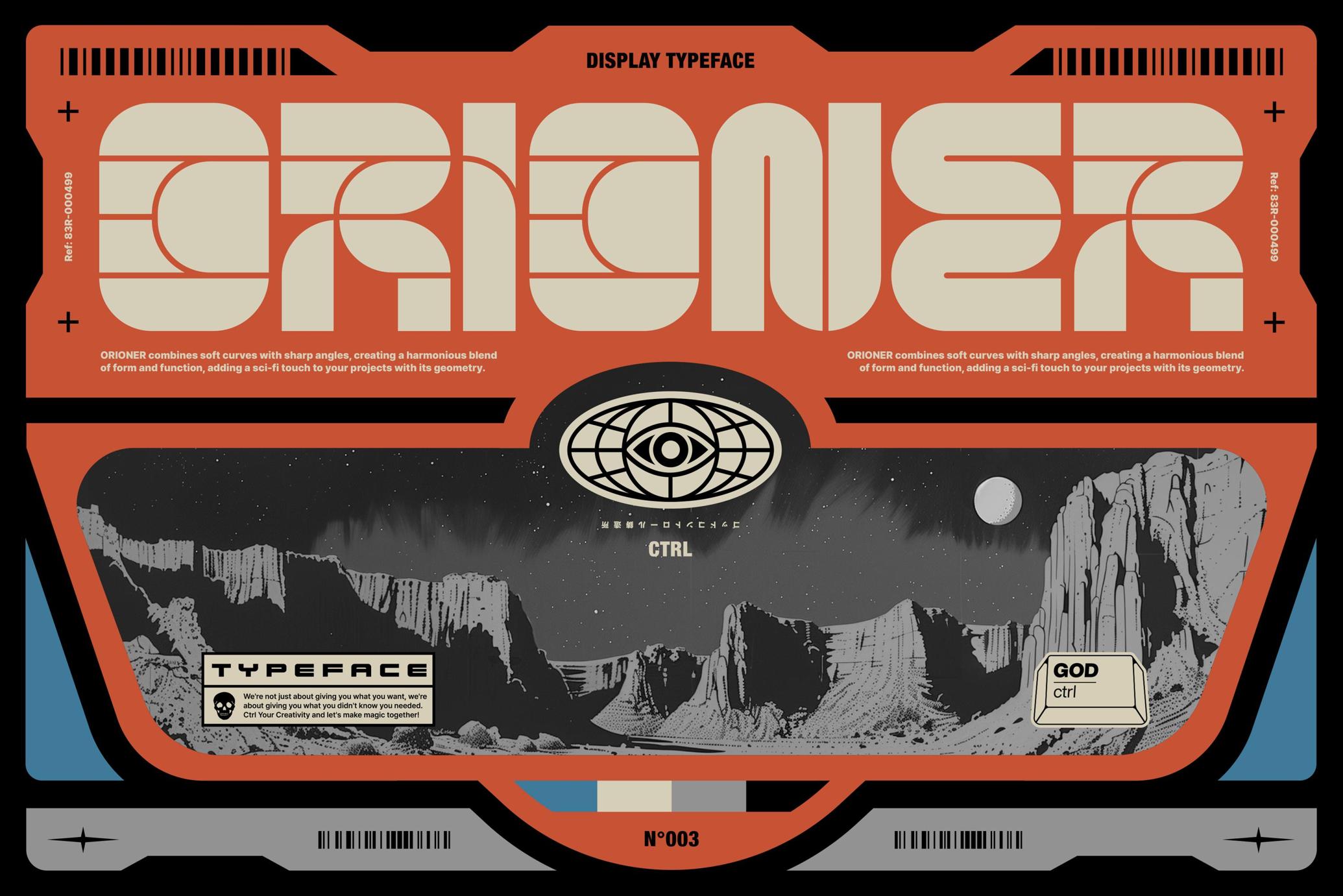
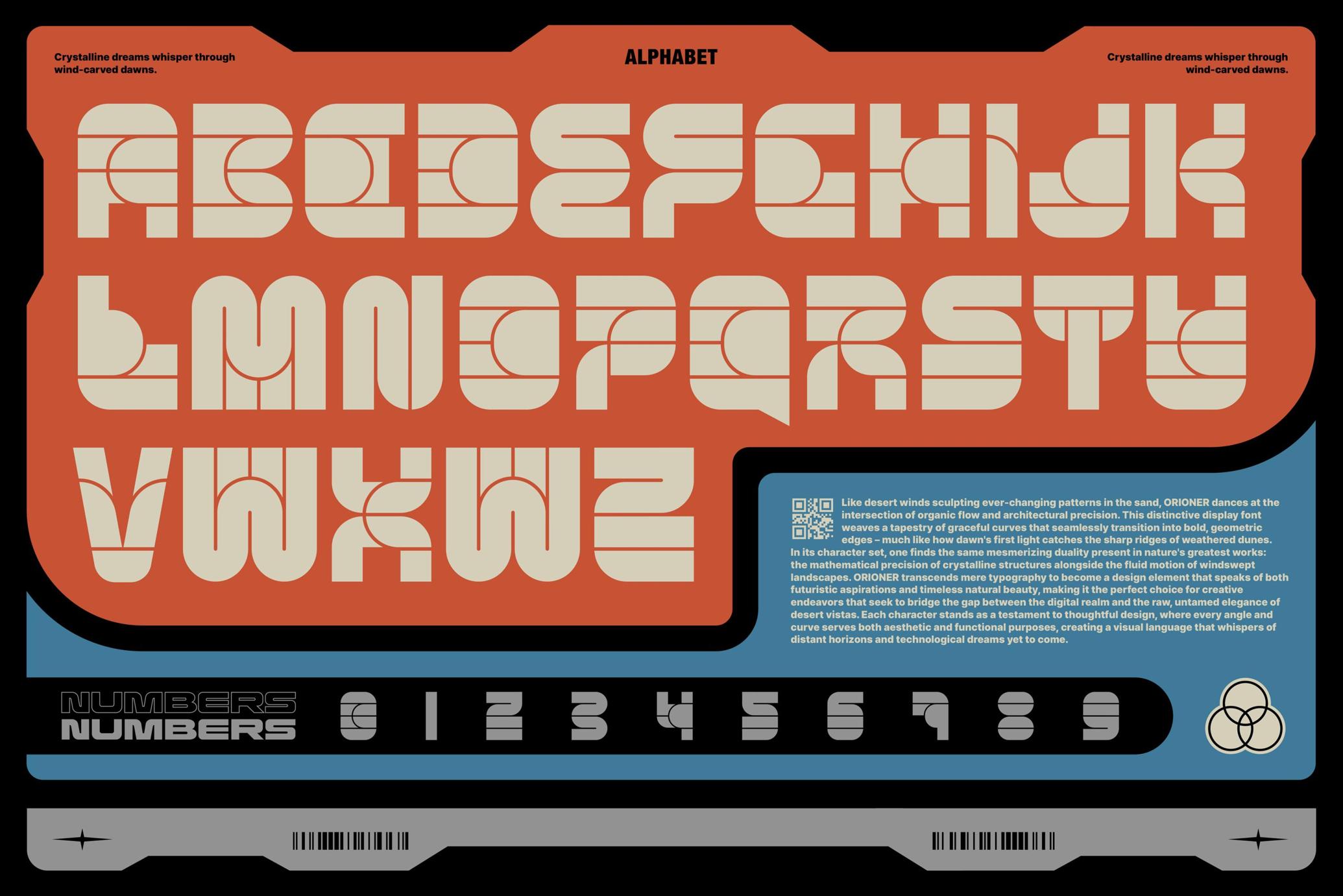

About the product
Orioner feels like it beamed straight from a retro-futurist space station co-designed by Isaac Asimov and Konstantin Tsiolkovsky’s grandkids. There’s something wonderfully engineered about its architecture: precise, symmetrical geometry tempered with soft orbital curves, like a blend of Soviet cosmonautics and mid-century sci-fi optimism.
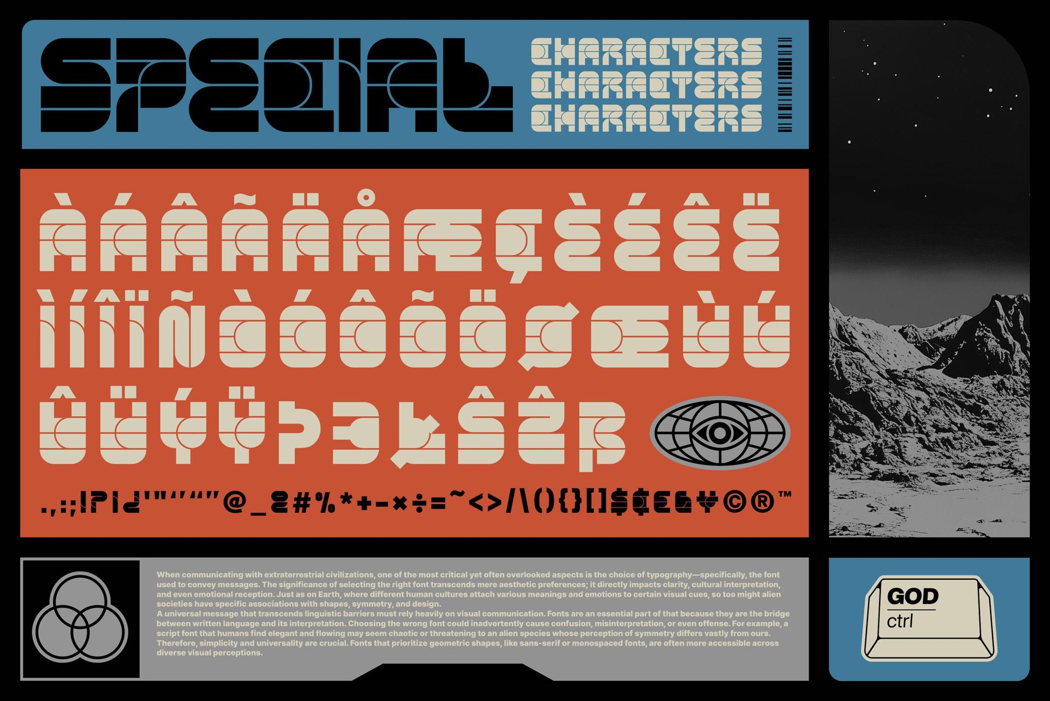
The font speaks in modular panels, like signage found deep inside a 1970s vision of a lunar base — practical yet poetic. It’s got the Brutalist-meets-Bauhaus thing going on, reinterpreted through a digital lens. Orioner features a whole of 190 characters: the standard set, plus special characters and punctuation. And the detailing? Feels like it’s been hand-calibrated for a dystopian propaganda poster or a UI dashboard on a terraformed Mars.