AT Normish
. Featured in Urban Fonts, Sans Serif Fonts
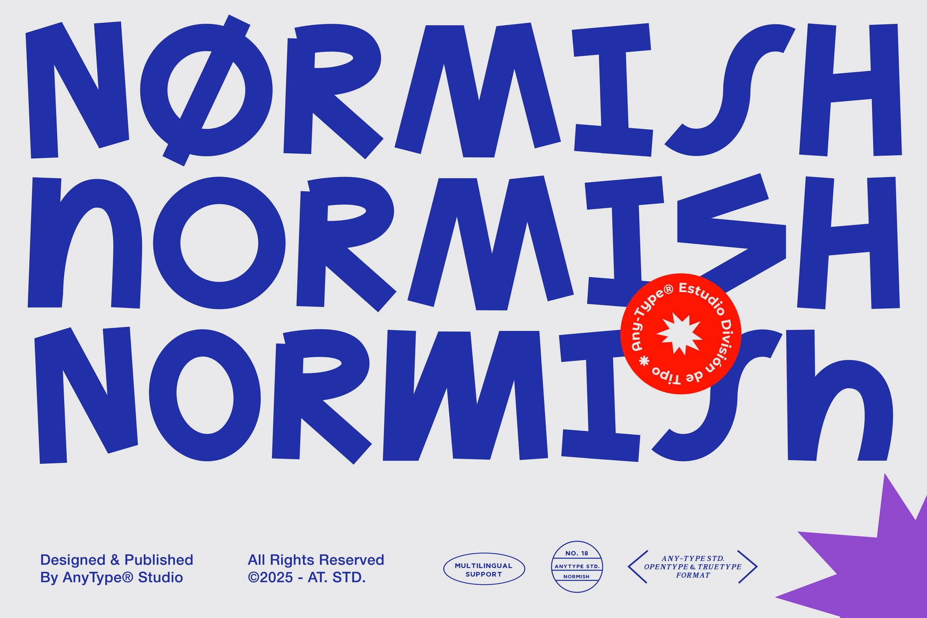
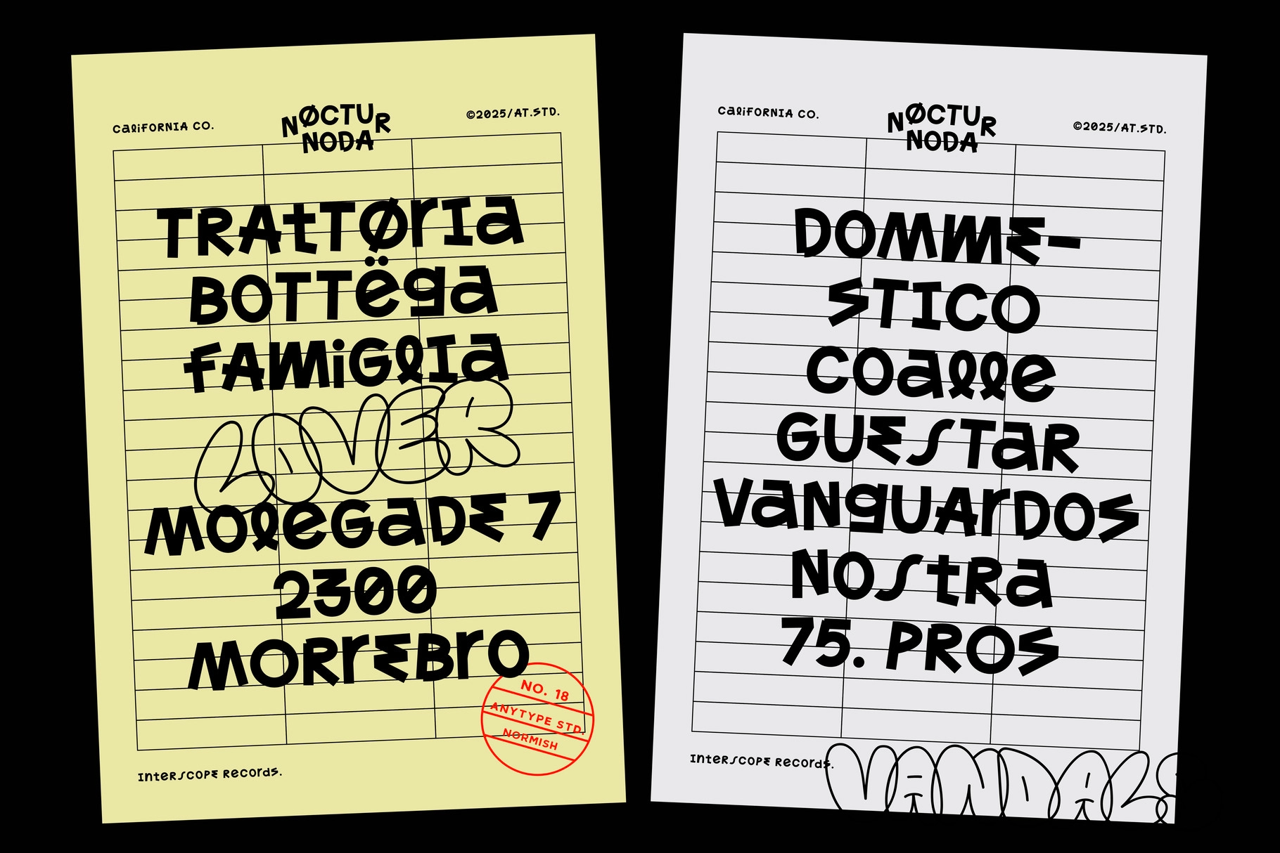

Normish
About the product
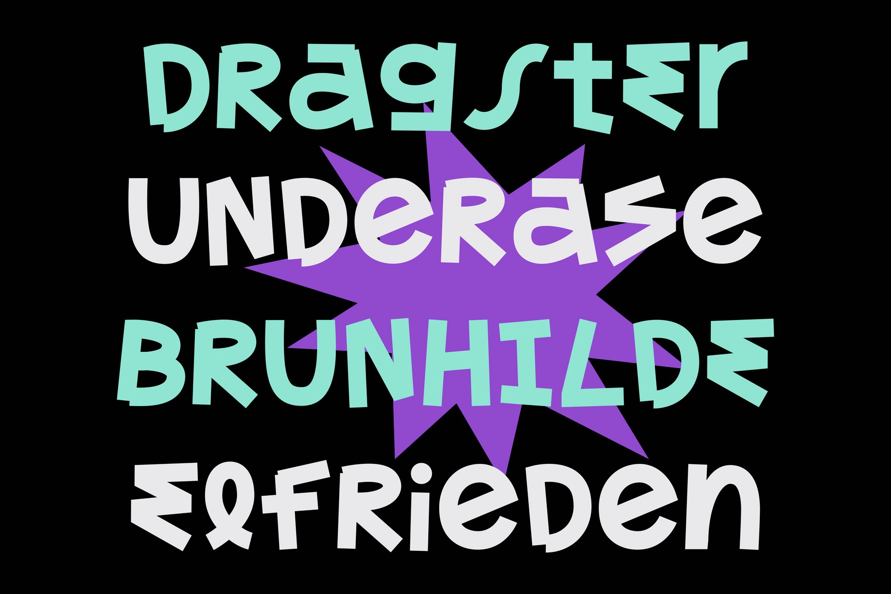
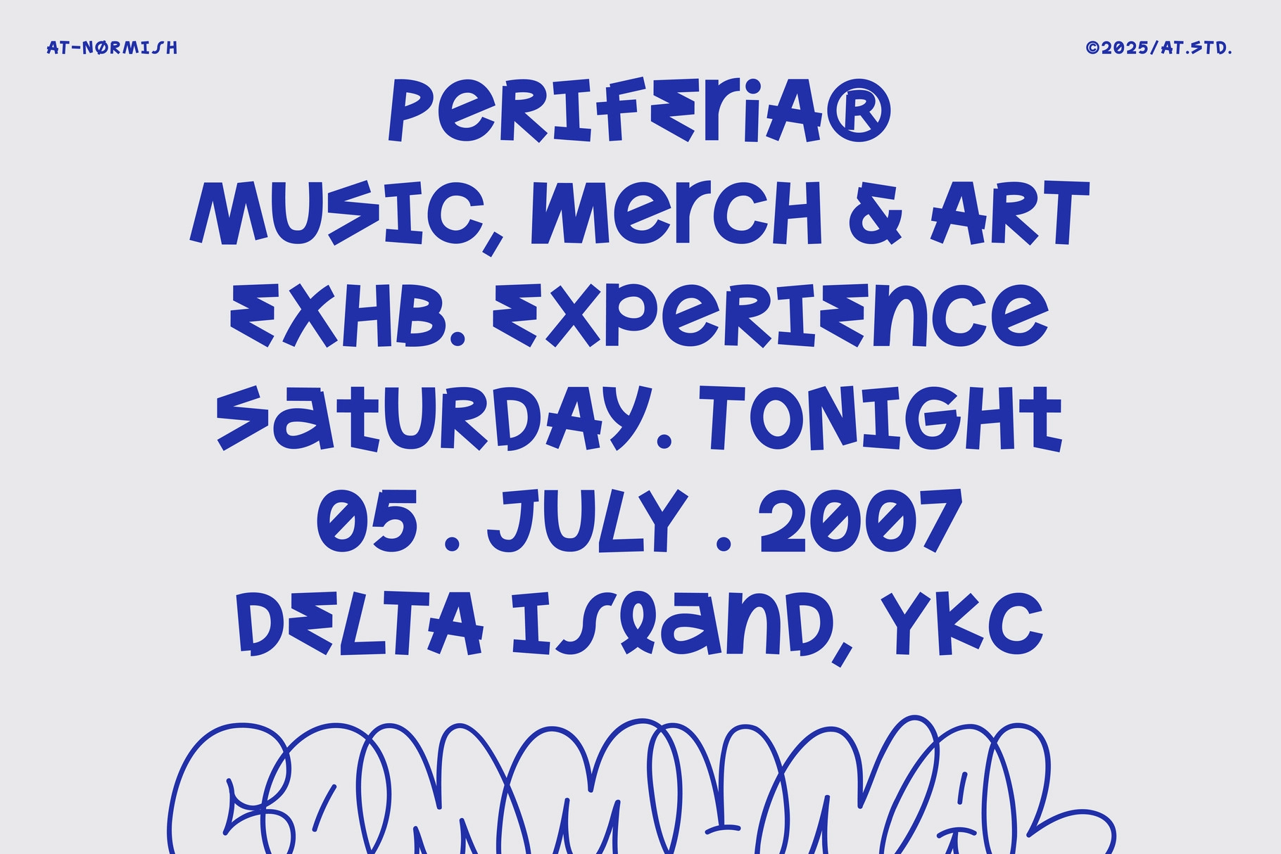
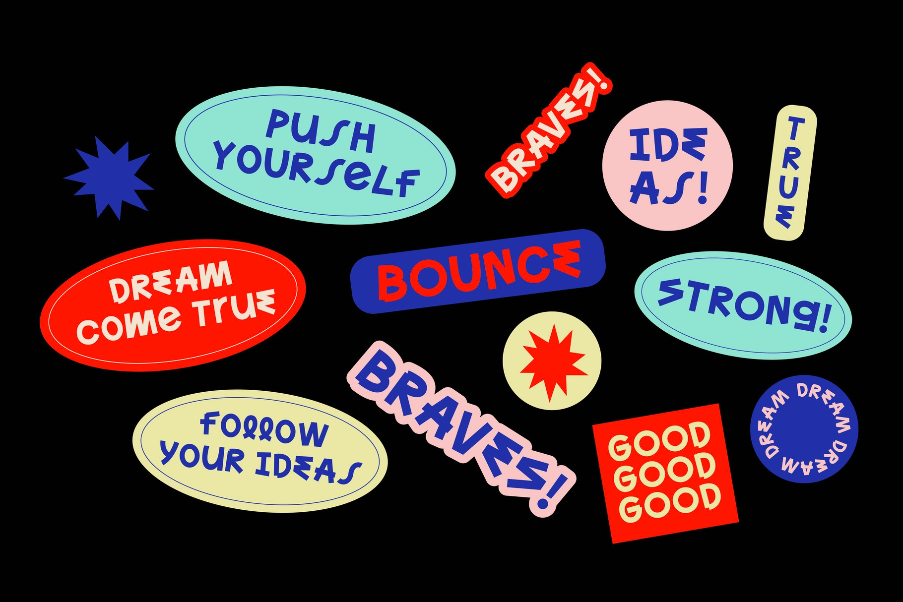
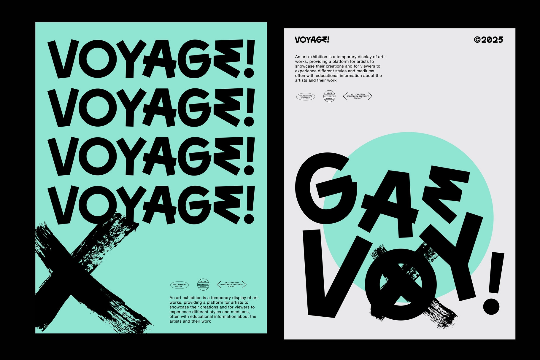
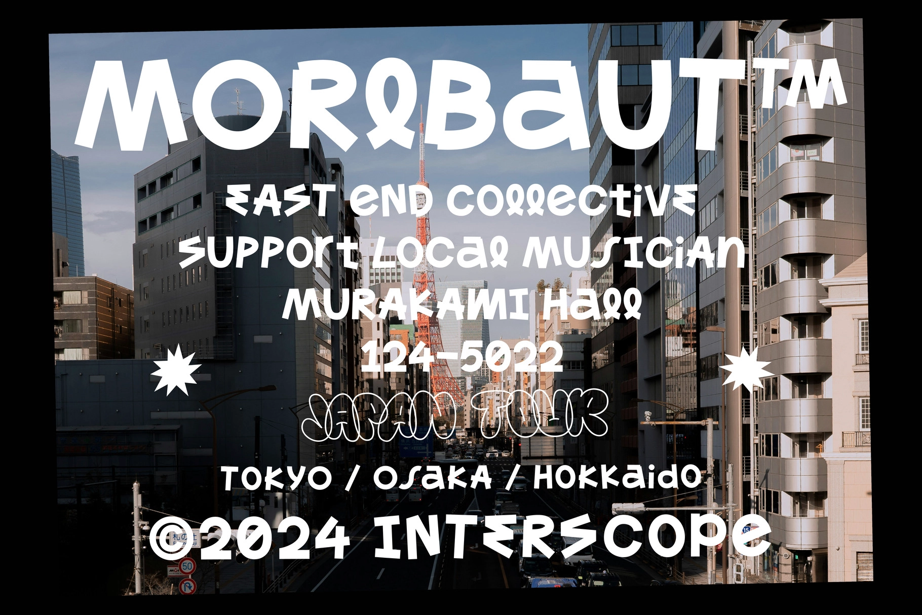
AT Normish is an offbeat sans playing with proportion, giving each letter a slight tilt or tension. Angled cuts, exaggerated terminals, and a few sly asymmetries give it a handmade edge — but the construction stays clean enough for typographic balance across a page or screen.
Its playful irregularity makes it a standout in poster series, museum graphics, exhibition branding, editorial subheads, typographic merch, festival signage, zines, and pop-up campaigns. Even short bursts of text feel active, especially when paired with graphic shapes or collage-style layouts.
**Inside: **
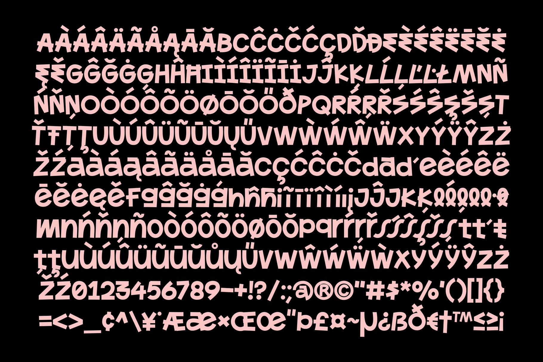
- over 450 glyphs;
- multilingual support;
- OTF and TTF formats.