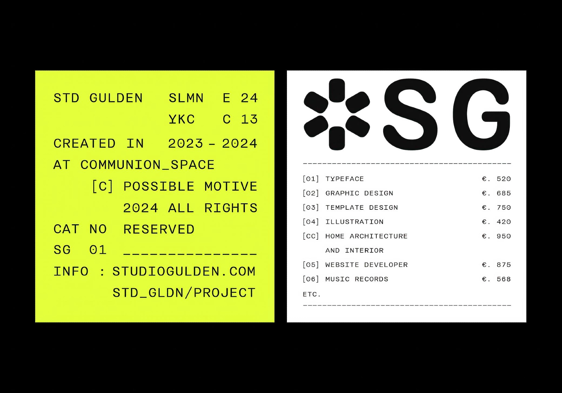
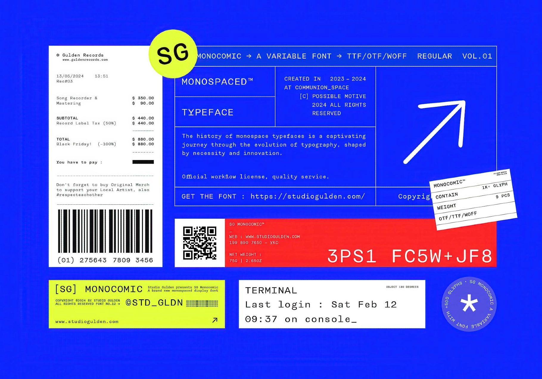
SG MONOCOMIC


About the product
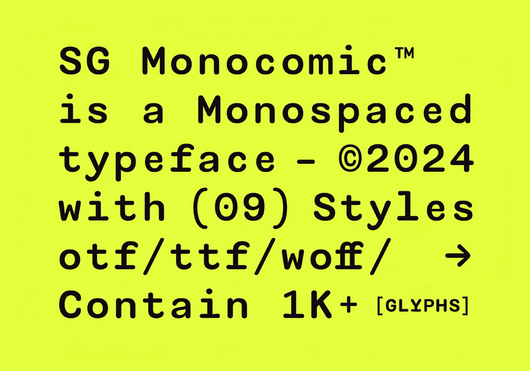
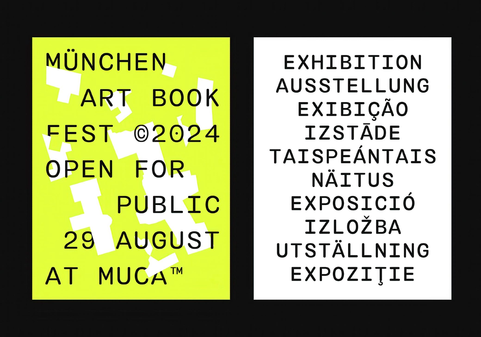
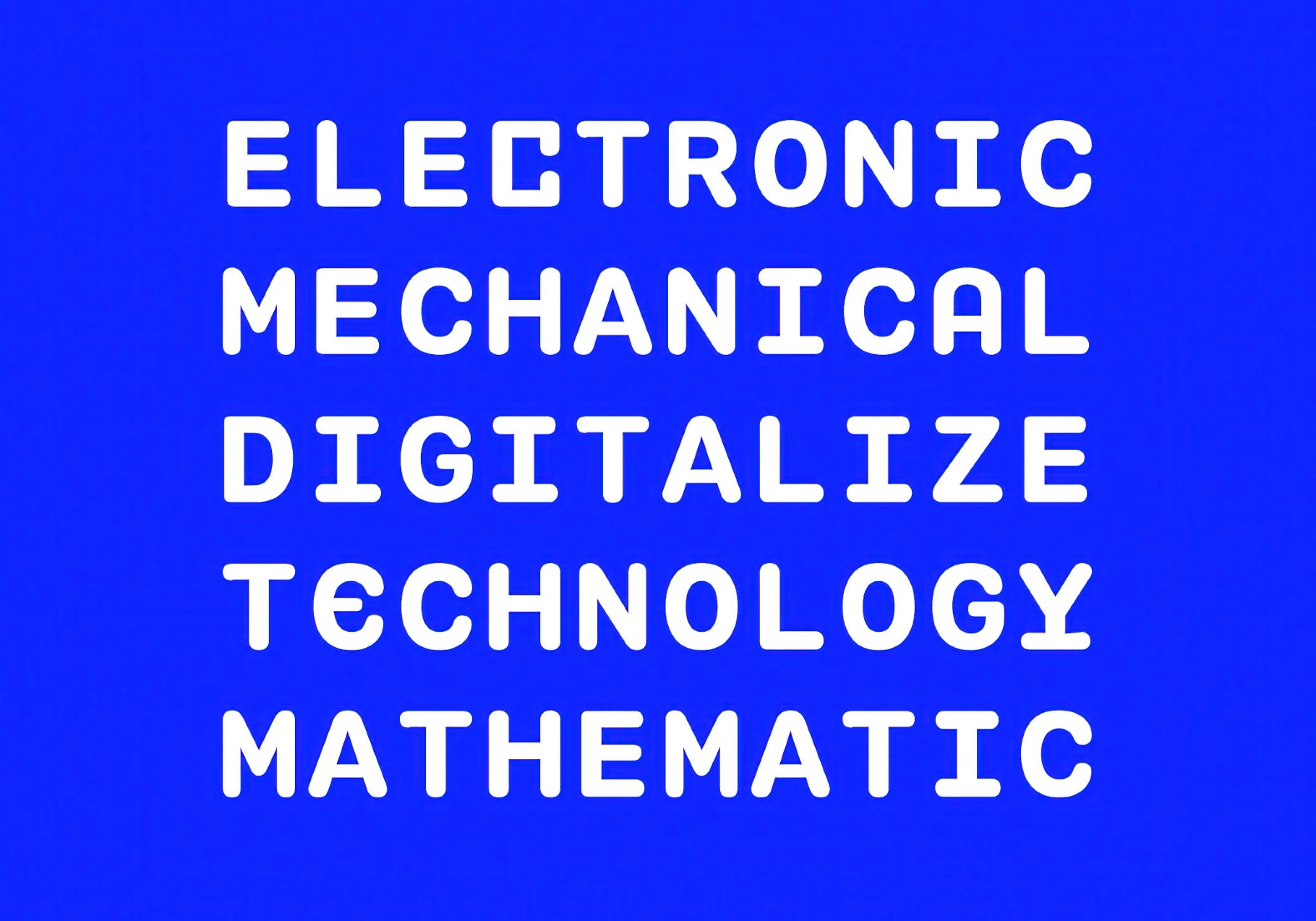
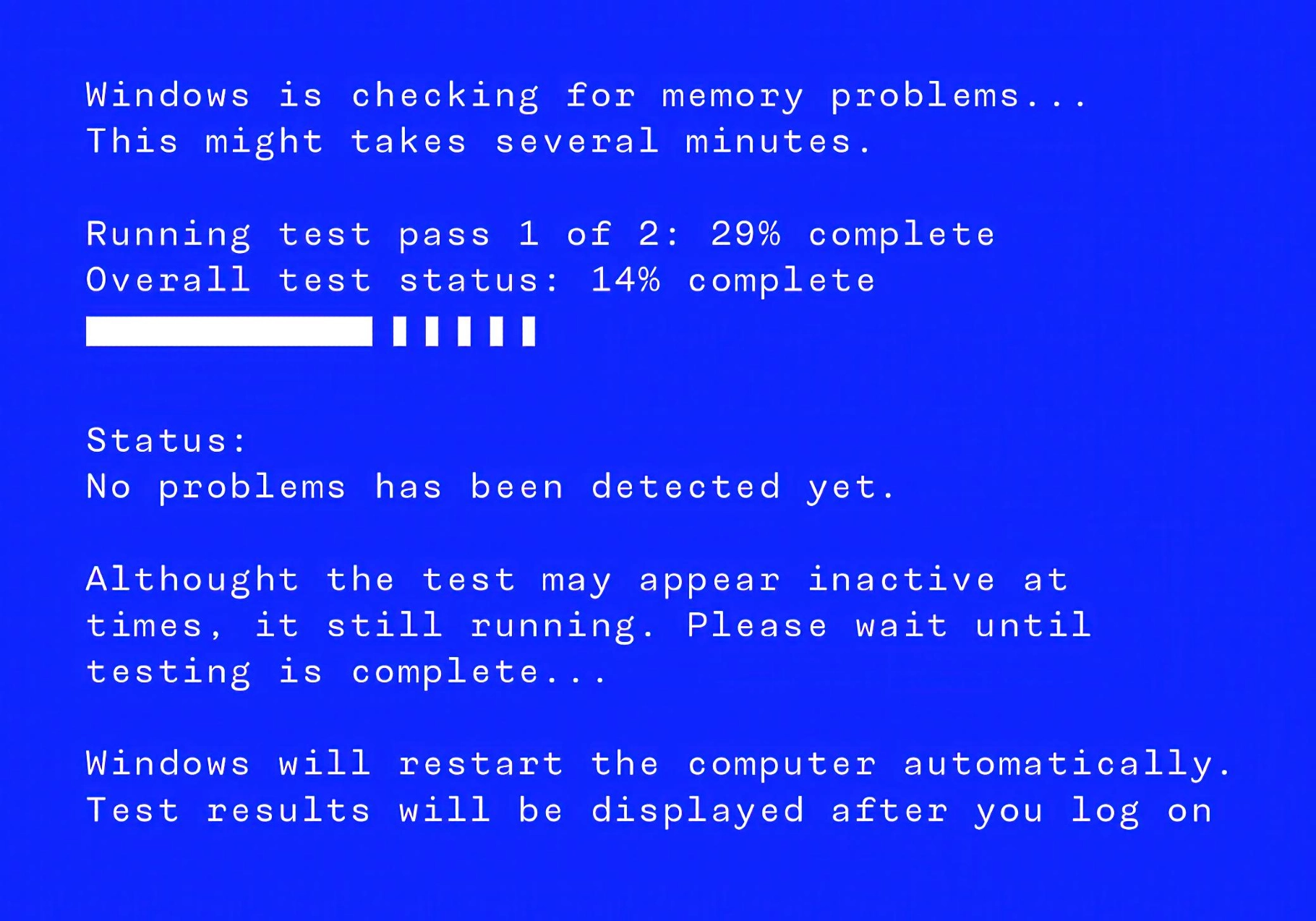
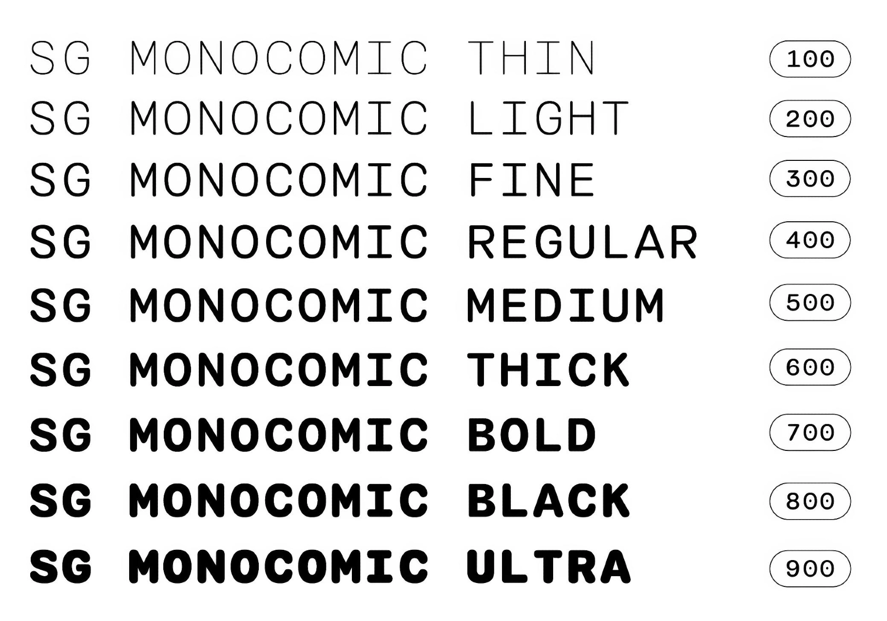
SG MONOCOMIC blends utility and character across nine weights, from whisper-thin to ultra bold. This monospaced family is influenced by the typographic DNA of airport boards, ticket stubs, system interfaces, and printed bills. It captures that familiar, functional rhythm — then softens it with rounded terminals and a human touch.
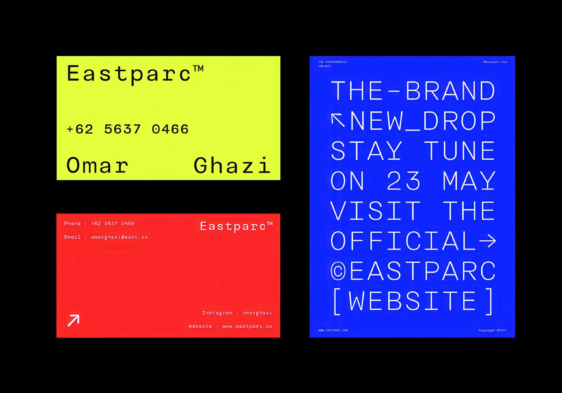
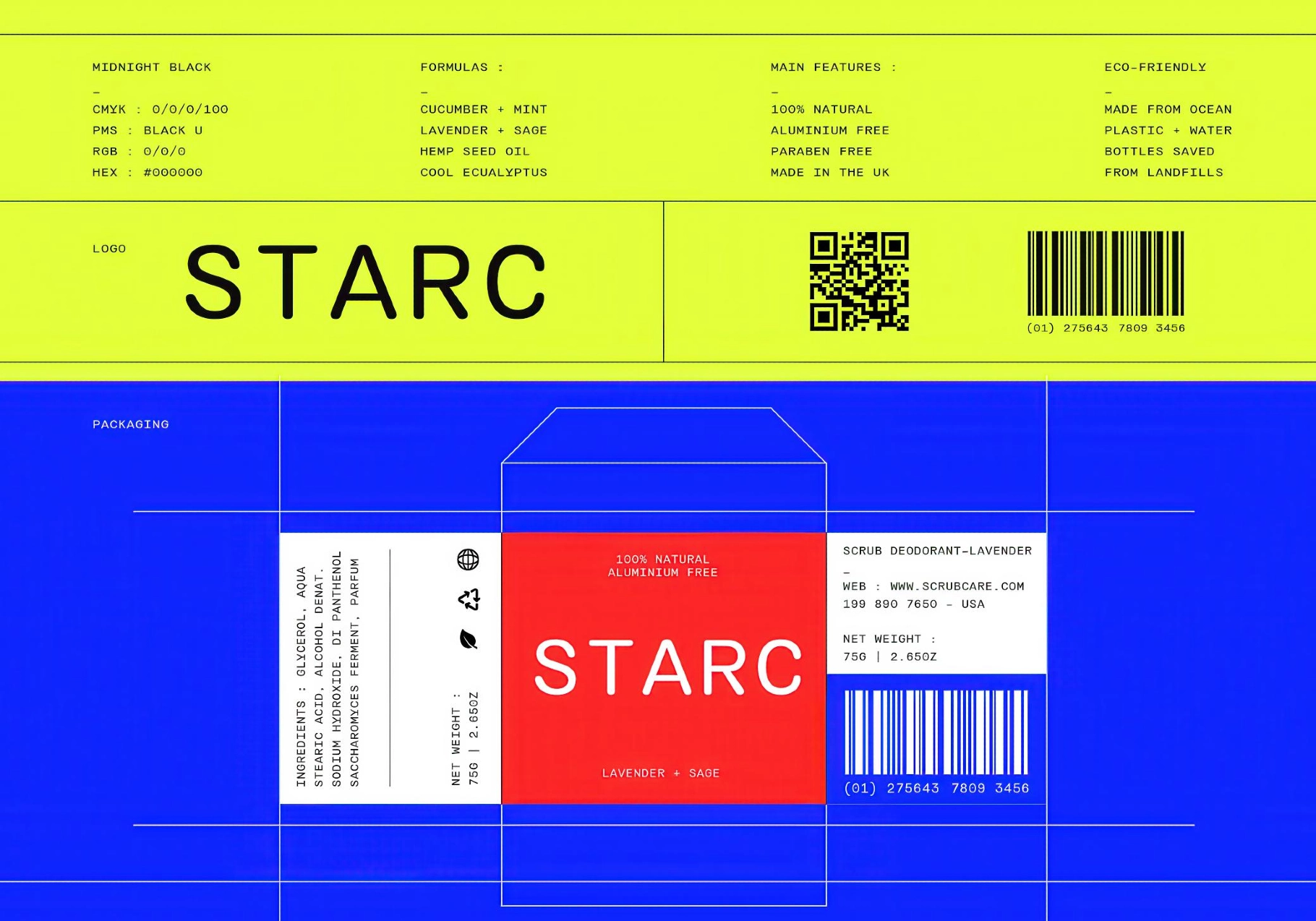
The fonts' fixed-width structure makes them a natural fit for coding environments, tech interfaces, price tags, receipts, data-heavy layouts, or any application that demands grid-perfect alignment. In print, SG MONOCOMIC brings clarity to manuals, forms, packaging, and publication metadata. Across weights, the tone shifts from technical to expressive — adaptable for posters, timelines, album covers, infographics, and branded collateral.
Inside:
- 9 weights (Thin to Ultra);
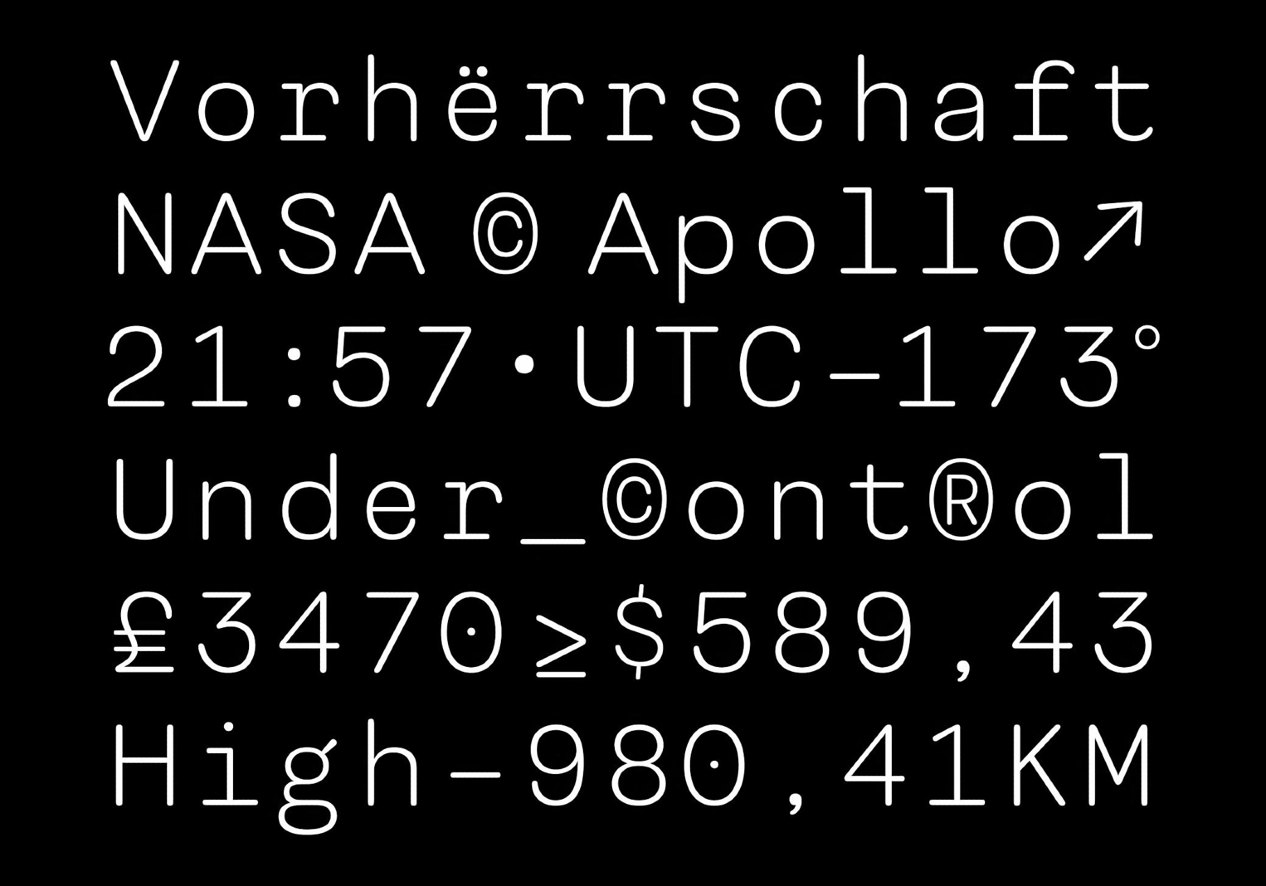
- full Latin character set with diacritics, arrows, math symbols, currency, fractions, stylistic alternates, ligatures, oldstyle figures, and more;
- OTF, TTF & WOFF formats.