


Tech fonts for software, startups, and engineering-led design
Unlike speculative sci-fi or cyberpunk, this is the typography of the real present — the look of a terminal, a dashboard, a well-built product. Clean, precise, and often monospaced or geometric, tech fonts carry the cool credibility that software brands, startups, and data-driven products want.
Our collection brings together grid-based sans, mono-inspired display fonts, and minimal geometric type tuned for screens. We've focused on legibility and scalability, because tech type spends most of its life inside interfaces and small UI labels.
What tech fonts are built for
Modern tech fonts live most of their lives inside interfaces: at tiny UI sizes, across countless screen resolutions, in dense data tables and long documentation. It forces clarity to come first and personality second. The fonts that get this balance right become the backbone of an entire product:
- SaaS and startup brand identities.
- App and web interface design.
- Data dashboards and product UI.
- Developer tools and documentation.
- Pitch decks and product launch graphics.
Tech styles on offer
Tech fonts can all look interchangeably "clean" at a glance, but each is making a claim about the company behind it — that it's design-led, or rigorously engineered, or built close to the hardware:
- Geometric sans — clean, circle-based letterforms for modern branding.
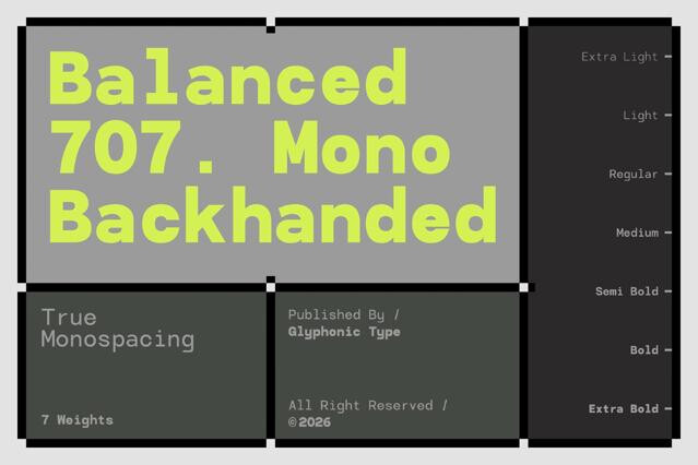
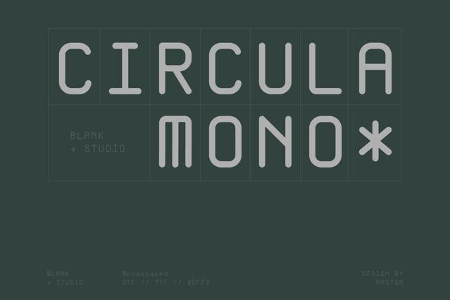
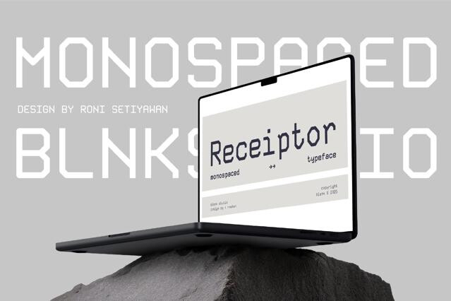
- Monospaced — fixed-width type with a coding and terminal feel.
- Minimal display — stripped-back headline fonts for product pages.
- Technical and squared — precise, mechanical type with engineered edges.
Tech is what a real software brand uses; sci-fi is what the movie about it uses. Tech fonts feature real digital and engineering aesthetics, clean and credible. Sci-fi and cyberpunk are speculative and dramatized, set in imagined futures.
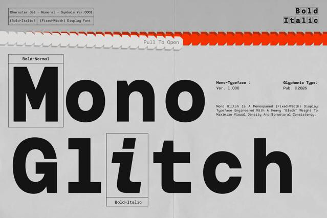
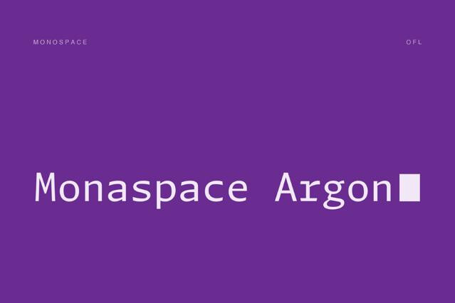
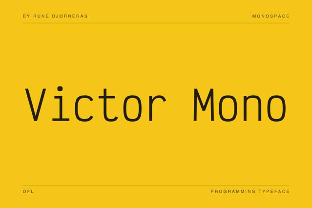
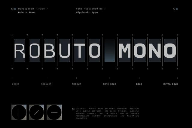
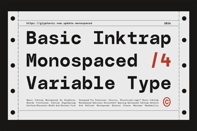
Monospace — where every character occupies the same width — comes from typewriters and code editors, so it carries strong associations with programming, terminals, and engineering.
Many technical sans and well-designed monospaces are highly legible and built for screens, making them strong for interfonts, documentation, and data display. Favor the more readable designs for genuine UI work.
Very well. A clean technical sans for interfont and body, with a monospace for code, labels, or accents, is a coherent and current combination.
Restraint and precision — even strokes, clear forms, careful spacing, and a lack of unnecessary ornament.
Yes. Humanist technical sans and rounded tech fonts soften the engineering edge while keeping the clarity. If a tech brand wants to feel approachable, those are the directions to explore.