


Sci-fi fonts for imagined futures, interfonts, and game titling
Sci-fi fonts build worlds. Angular, technical, and often dystopian, they're the type that belongs on a spaceship hull, a HUD overlay, or the title card of a future that doesn't exist yet.
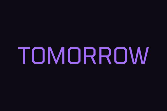
We've gathered the fonts that do the world-building in a single line. The collection spans the genre's range — sleek interfont-ready sans, aggressive angular display, and glitch-touched futuristic fonts — for gaming, film-style branding, edgy tech, and any concept reaching for tomorrow.
What sci-fi fonts power
Sci-fi fonts sell the believability of a world that doesn't exist yet. The moment the lettering appears, an audience accepts a timeline, a technology level, and a mood without questioning it. That's why the type shows up to make the project feel engineered, immersive, or a step ahead of the present. Done well, it does the real worldbuilding.
- Game UI, titles, and in-world interface design.
- Film and series titling with a futuristic edge.
- Tech product launches and concept branding.
- HUD and dashboard mockups for product design.
- Posters and key art for sci-fi worlds.
Styles in the lineup
A sci-fi font is really a decision about what kind of future you're selling. Is it ordered or collapsing, hopeful or hostile, clean enough to trust or broken enough to fear? Those questions place a project on a spectrum, and the letterforms have to agree with the answer — because a hopeful world rendered in corrupted type sends mixed signals:
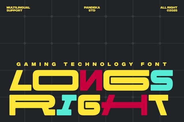
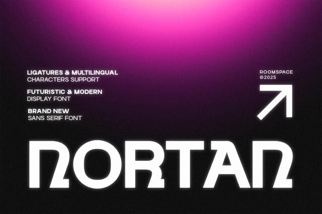
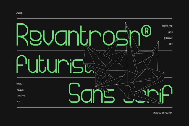
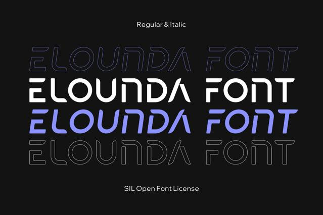
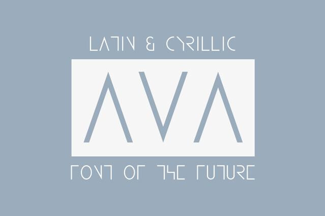
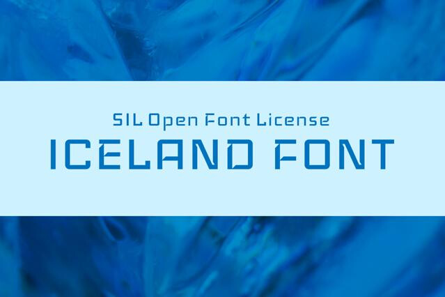
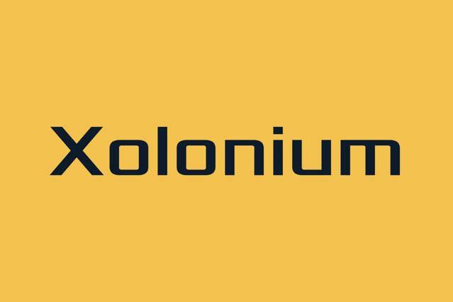
- Interface sans — clean, technical letterforms built to read like a working UI, in the on-screen lineage of Star Trek's Eurostile control panels and the menus of games like Mass Effect.
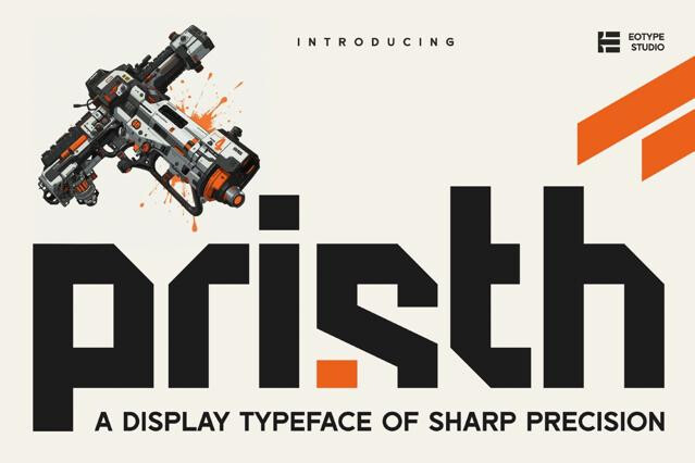
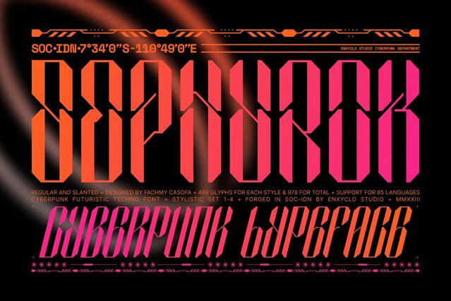
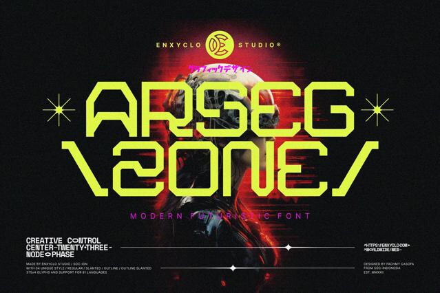
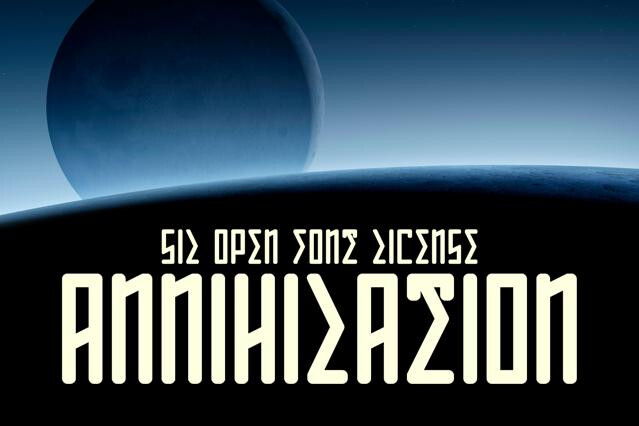
- Cinematic display — heavy, dramatic letterforms for titles and key art, the title-card tradition of films like Alien, Blade Runner, and Dune.
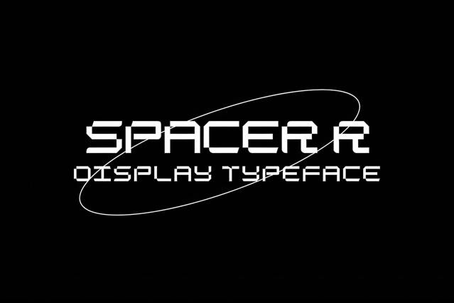
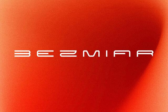
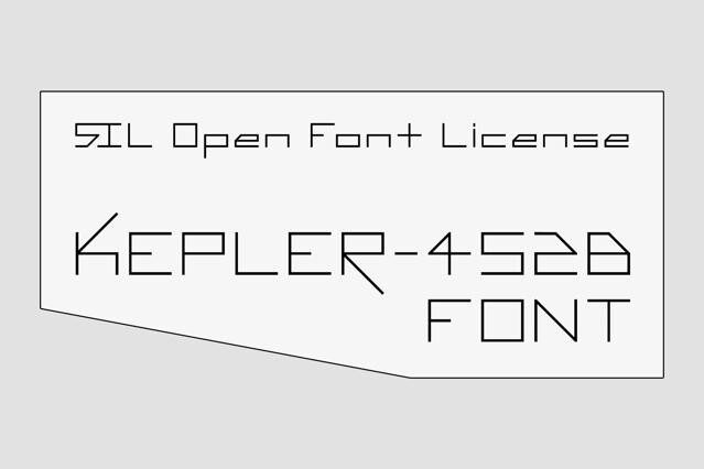
- Angular and faceted — sharp, mechanical type with cut corners. The squared military-sci-fi register of Bank Gothic as it appears across games like Halo and Deus Ex.
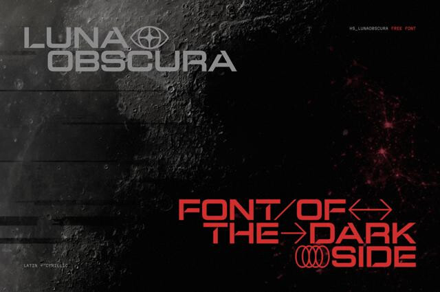
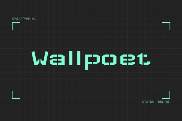
- Glitch and corrupted — broken, signal-loss letterforms for darker worlds, the screen-decay aesthetic of dystopian stories like Black Mirror and Mr. Robot.
Sci-fi is the broad genre of imagined futures — clean utopias or grim dystopias alike. Space focuses on cosmic exploration specifically; cyberpunk is a darker, neon-soaked, tech-noir subset.
Angular geometry, technical detailing, cut corners and notches, condensed or stretched proportions, and a constructed, machine-made quality. The forms suggest engineering and a world built by someone other than us.
Many are drawn exactly for that. The clean, technical, screen-friendly fonts suit dashboards, game HUDs, and interfont mockups. Favor the more legible designs for genuine UI; reserve the heavily stylized ones for display.
Yes — bold sci-fi display is a staple of title cards, logos, and key art for games and films.
Not always. Extreme angularity and notching can hurt readability at length or small sizes. We'd use the most stylized fonts for short titles and pair them with a clean technical sans for body and interfont text.
Tech brands wanting an edge, gaming and esports, futuristic events, and editorial or campaigns reaching for tomorrow.