


Cyberpunk fonts for neon, glitch, and tech-noir futures
Cyberpunk fonts drop a design into a neon-soaked dystopia — high tech, low life, lit by city signage and corrupted by screen decay. Glitchy, aggressive, and tech-noir, they're the fonts we reach for when a project needs a dark, electric future.
We've gathered the type that flickers like a sign over a rain-slicked street. The collection runs from glitch display and neon effects to angular futuristic sans, suiting gaming, music, streetwear, and events.
Where this aesthetic belongs
Cyberpunk fonts are mood-first by design. They trade some legibility for atmosphere, and that's a feature, not a flaw, in the right brief. The look thrives wherever a designer wants to go edgy, immersive, and a little overwhelming on purpose, pulling an audience into a neon-lit world:
- Game branding, UI, and key art.
- Electronic, techno, and hyperpop music covers.
- Club, rave, and underground event posters.
- Streetwear and merch with a futuristic edge.
- Sci-fi worldbuilding and concept design.
The looks inside cyberpunk fonts
Cyberpunk works as a vocabulary you combine. The convincing tech-noir look usually comes from playing one element against another, not from any single trick. The danger is piling every effect on at once until it tips into cliché:
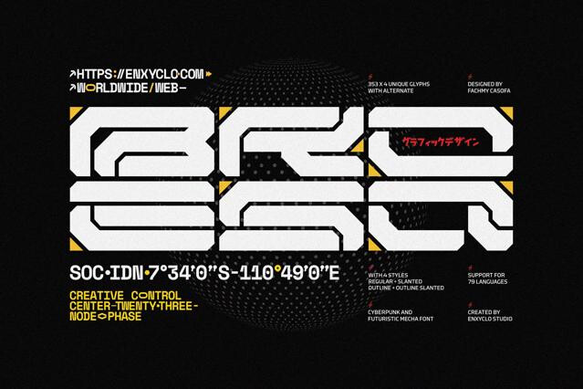
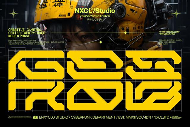
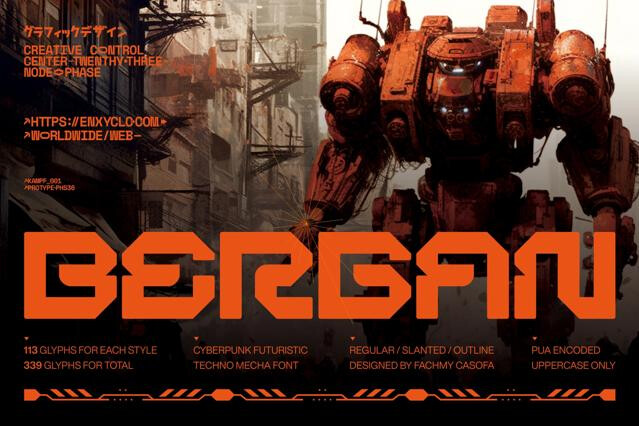
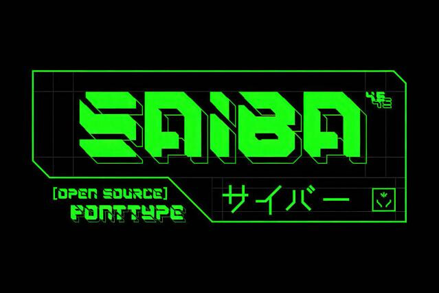
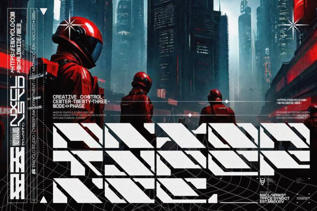
- Glitch and corrupted — fragmented, signal-loss letterforms, the datamoshed, screen-broken treatments that brand games and key art across the genre.
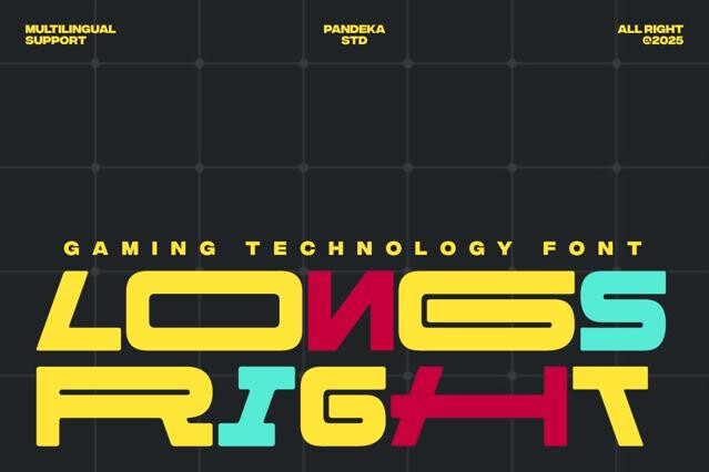
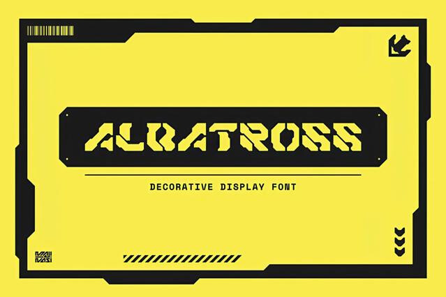
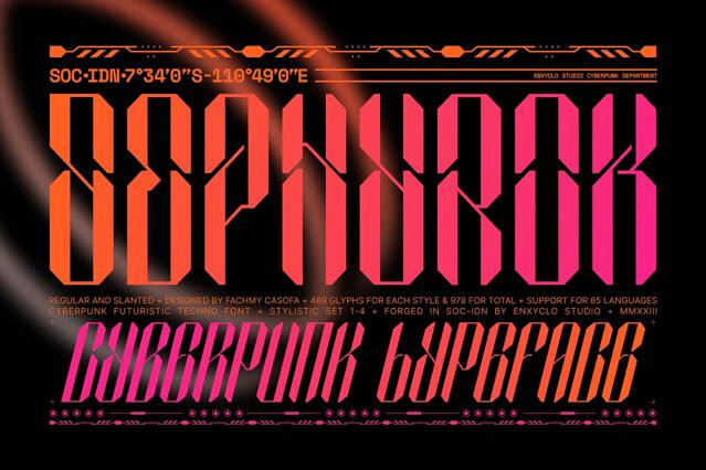
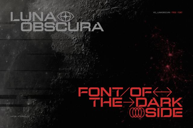
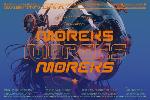
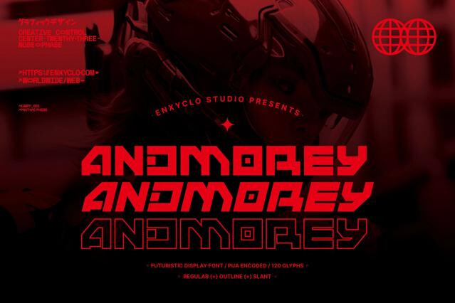
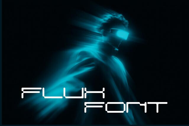
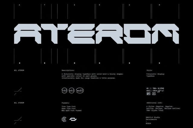
- Neon techno display — sharp, glowing fonts built for headlines, in the neon-sign lineage of Blade Runner and the synthwave and outrun cover art it inspired.
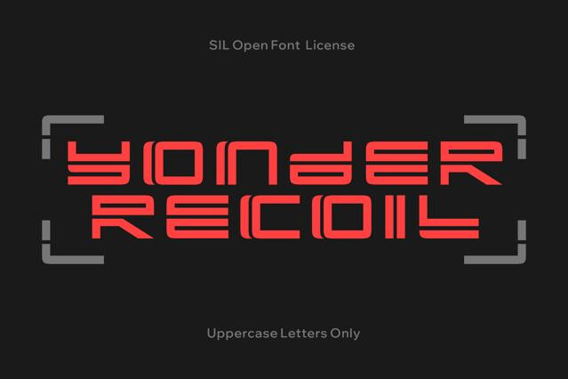
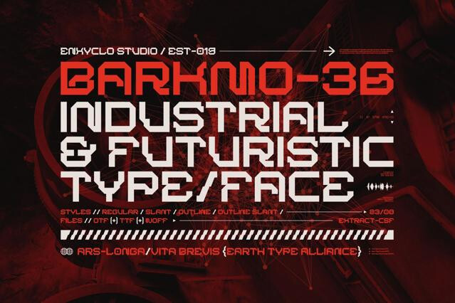
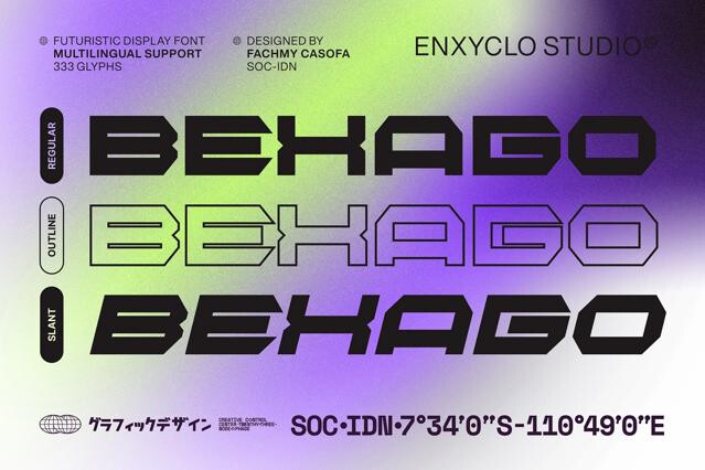
- Squared and mechanical — rigid, industrial type with a machine feel, the clean near-future-corporate look of angular faces like Rajdhani, which Cyberpunk 2077 pushed into the mainstream.
- Mixed-script accents — decorative faux-kanji and symbol-heavy styles, the Japanese-inflected signage that runs from Blade Runner's streets through Akira and Ghost in the Shell.
Neon glow, glitch and corruption effects, aggressive angular forms, and a dark, dystopian "high tech, low life" mood. The style fuses futuristic technology with urban grit.
Cyberpunk is a specific, darker subset of sci-fi — neon-lit, dystopian, street-level, and tech-noir — where broad sci-fi can be clean or utopian.
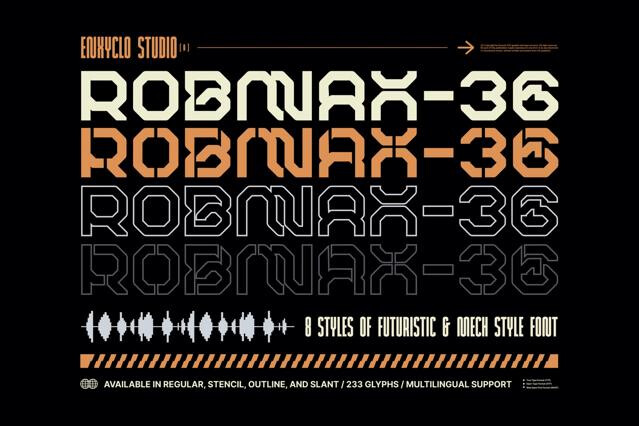
Many cyberpunk fonts ship with glitch, scan-line, neon-glow, or chrome effects, sometimes as layered or color fonts. Those formats need supporting software, so check the product page before relying on the effect.
The heavily glitched and corrupted ones prioritize mood over readability and are display-only. For text that has to be read, pair an aggressive cyberpunk title with a clean angular sans for body and interfont.
Gaming and esports, electronic and club music, streetwear, tech events with an edge, and any design reaching for a neon dystopian future.