
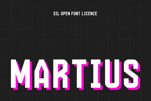
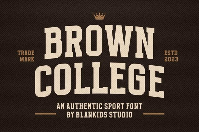
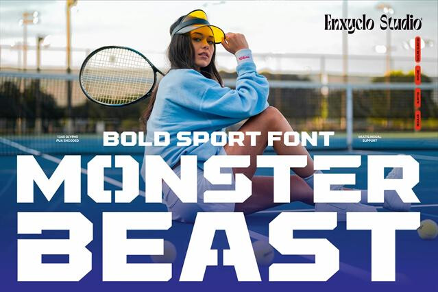
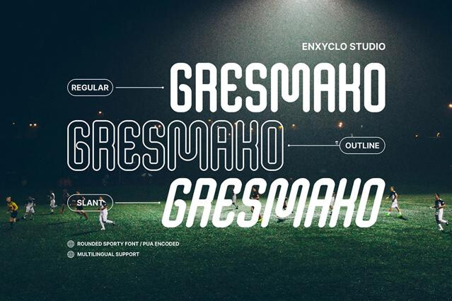


Sports fonts for team branding, jerseys, and athletic energy
Sports fonts are bold, athletic, and built to read across a stadium. They carry the varsity and collegiate cues that signal strength and speed instantly: block serifs, twill outlines, jersey-number legibility.
We've assembled fonts that cover the full athletic spectrum — classic varsity blocks, modern esports display, and aggressive italic types built for motion. They hold up across jerseys, scoreboards, merch, and broadcast graphics alike.
What you'll build with sports fonts
Athletic type is functional before it's decorative. It has to read from the back row of a stadium, on a moving body, across a pixelated broadcast feed, and on a tiny merch tag, all without losing the punch. That demand shapes every choice: heavy weights, open counters, and numerals built to be legible at speed and distance. When those fundamentals are right, sports fonts hold a whole team identity together across every surface it touches:
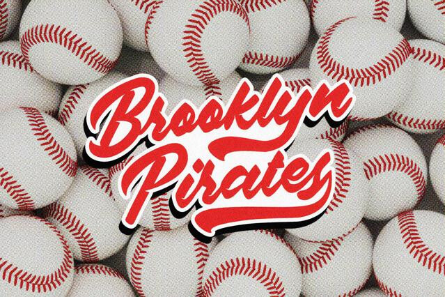
- Team logos, crests, and league identities.
- Jersey numbers, names, and uniform lettering.
- Gym, fitness, and athleisure branding.
- Esports and gaming team graphics.
- Event posters, schedules, and scoreboard design.
The range of athletic styles
The biggest decision in athletic type is era. A font can plant a team in a decades-old tradition of campus rivalries and stitched wool, or in the screen-lit, fast-cut world of digital competition. The choice colors how fans read everything else about the brand:
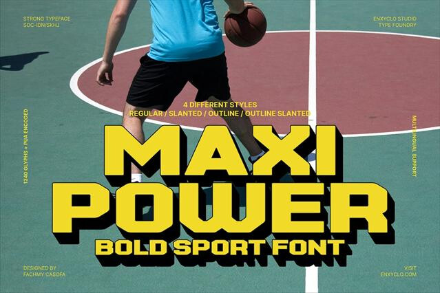
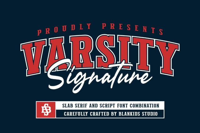
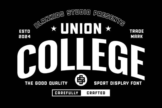
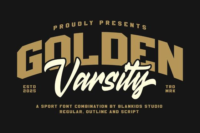
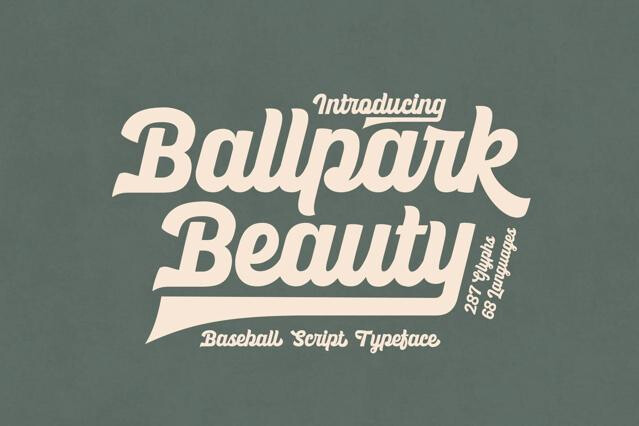
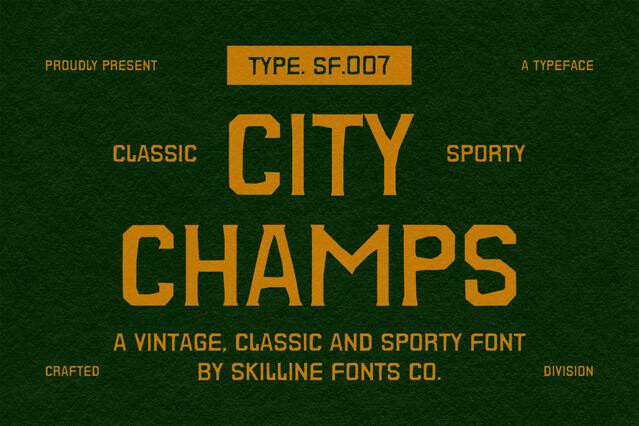
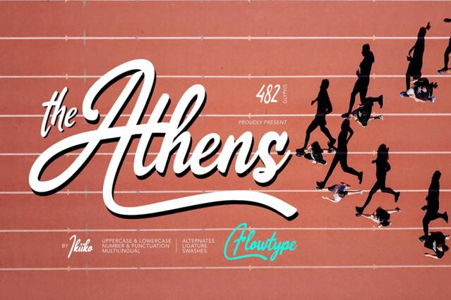
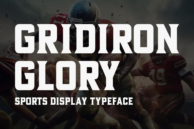
- Varsity and collegiate — the block lettering of American university athletics, rooted in early-20th-century letterman jackets and stadium signage.
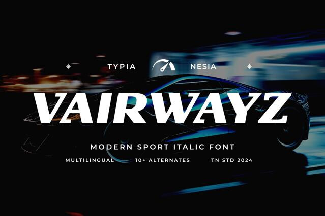
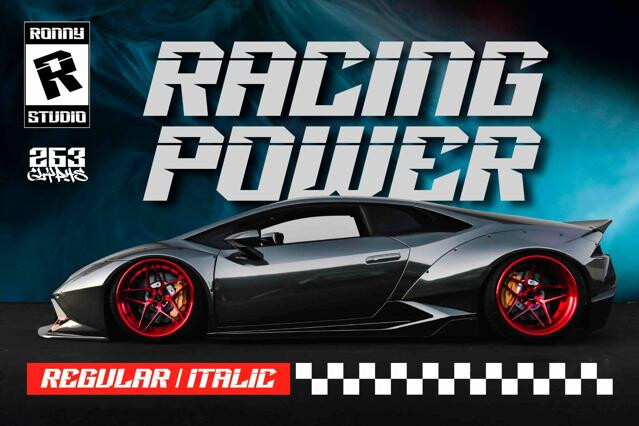
- Athletic italics — slanted, forward-leaning forms drawn from mid-century sports and racing graphicsn.
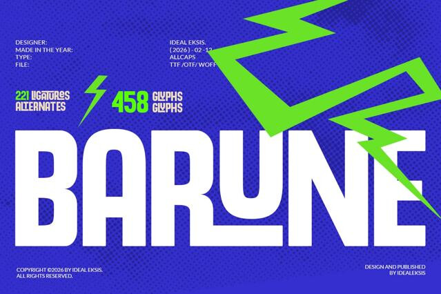
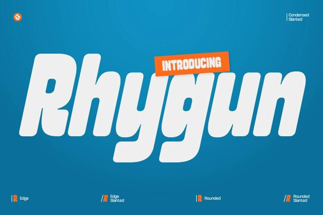
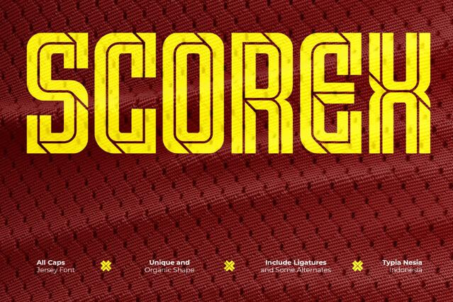
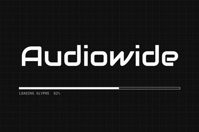
- Esports display — the digital-native edge born from gaming and streaming culture, with angular, tech-forward forms that signal a sport played on screens.
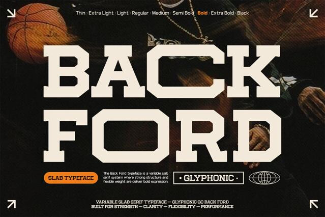
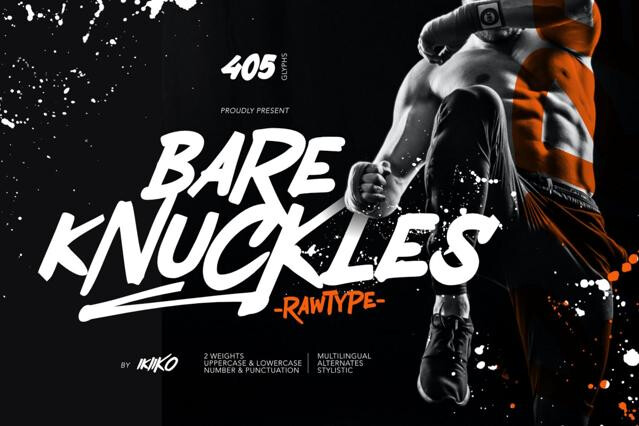
- Stencil and military-sport — utilitarian stencil lettering carried over from military and industrial use, adopted by tougher athletic brands for its no-nonsense grit.
Why teams rely on them
Reading from the back row
Distance legibility is non-negotiable in sports work. The type has to land from the stands and on the broadcast. Favor fonts with strong weight and open counters, test numerals and names at small and far-away scales, and match the edge to the era: classic collegiate for heritage teams, sharper angular forms for modern esports.
Heavy weight, wide or condensed proportions, sharp confident shapes, and often collegiate or varsity detailing — block serifs, tackle-twill outlines, and jersey-number styling.
That's their core purpose. Many include numerals designed to read clearly at a distance and on fabric, plus the bold proportions that hold up on uniforms and signage. Check that the numerals and full character set fit your application.
Some sports fonts ship with built-in outlines, shadows, or layered versions for the classic stitched-twill look. Layered and color formats need supporting software, so confirm the format on the product page.
All sports type is bold, but sports fonts carry specific athletic cues — varsity collegiate styling, jersey legibility, and a competitive energy — that generic bold display lacks.
Designed well, yes. Distance legibility is part of the brief for stadium and broadcast use. Favor fonts with open counters and strong weight; very tightly spaced styles can fill in when seen from far away.
Absolutely. The category now spans traditional varsity through aggressive modern esports styling. Match the era and edge to the brand: classic collegiate for heritage teams, sharper angular fonts for esports.