

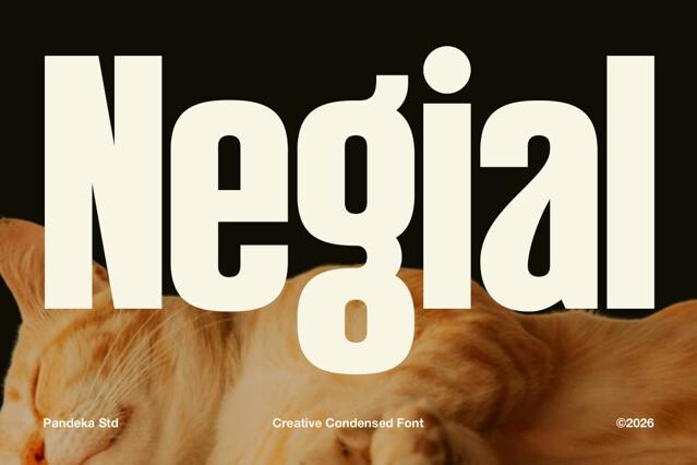
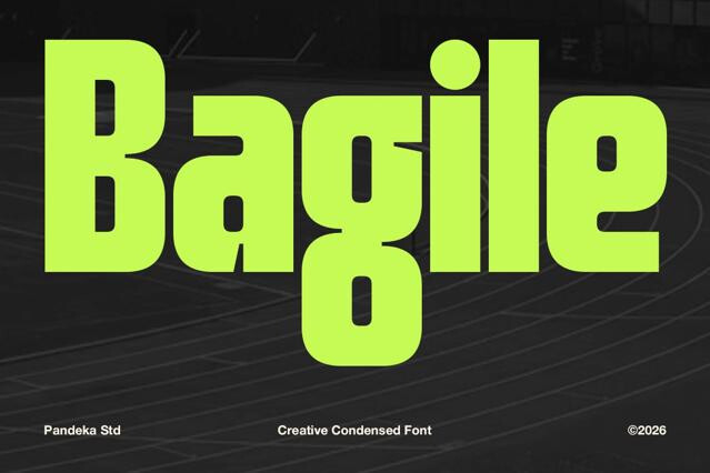
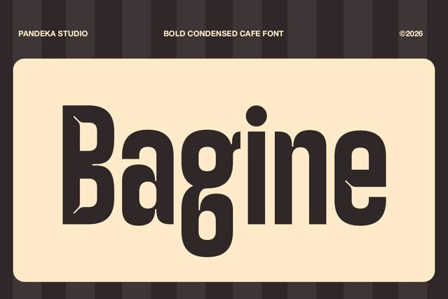


Tall fonts for vertical impact and space-efficient headlines
Condensed, elongated, and vertically emphatic — tall fonts pack drama and impact into narrow space. Which is equally useful when you want elegant height and when column space is simply tight.
It's a category designers reach for constantly — in posters, fashion editorials, or packaging. We've gathered styles from clean condensed sans to elegant elongated serifs and decorative display fonts, so you can balance presence with the economy of space your project demands.
What tall fonts unlock
The vertical proportions solve real layout problem. Plus, they lend a poised kind of elegance, and at the same time they squeeze long words into columns too narrow for anything else. The mix of looks and economy keeps tall fonts in constant rotation whenever width is the thing in short supply:
- Big headlines that fit in tight columns and sidebars.
- Fashion and editorial layouts with dramatic verticality.
- Posters and covers that need scale without sprawl.
- Packaging where label space is narrow.
- Stacked wordmarks and logo lockups.
- Social graphics built for vertical formats.
The proportions you can pick from
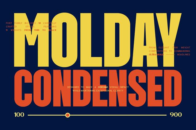
Tall is a sliding scale, and every step up trades a little legibility for a little more presence. A gently condensed sans stays clean and efficient; an extreme compressed display hits hardest but starts closing its counters as it narrows. The question is how much drama a project can take before reading gets difficult:
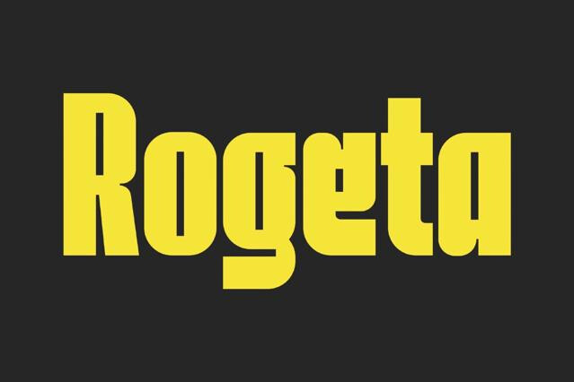
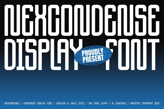
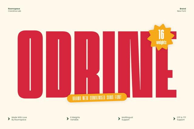
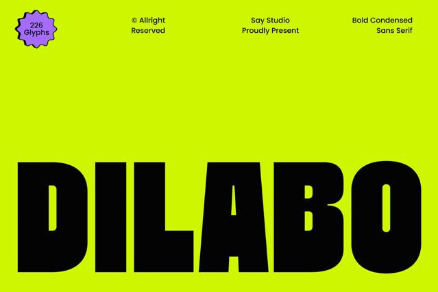
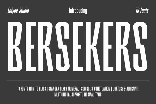
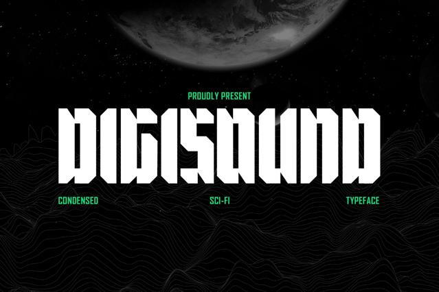
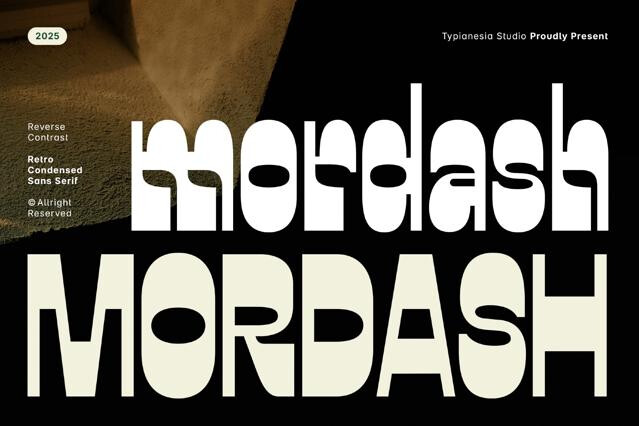
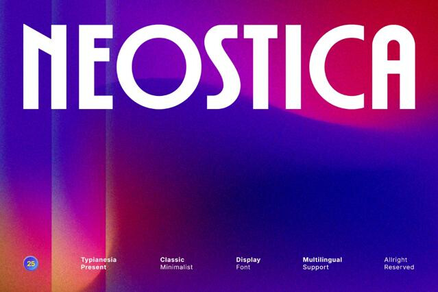
- Condensed sans — clean, modern, and highly efficient.
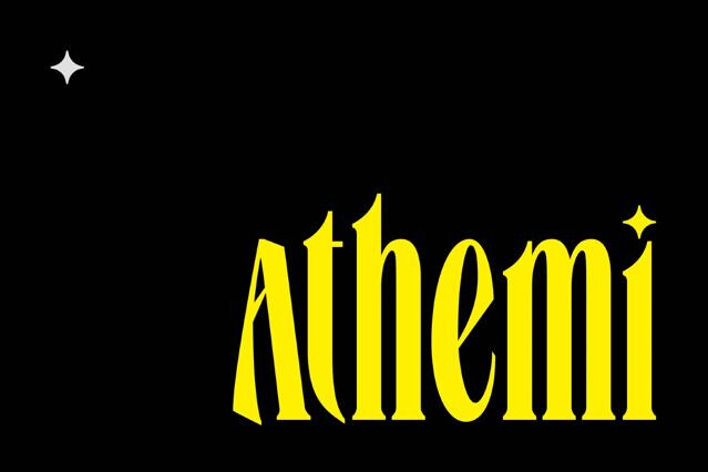
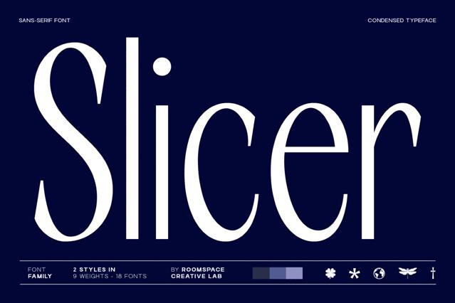
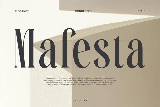
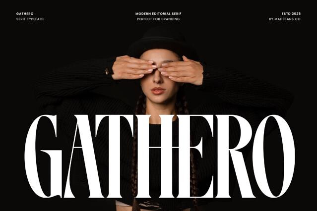
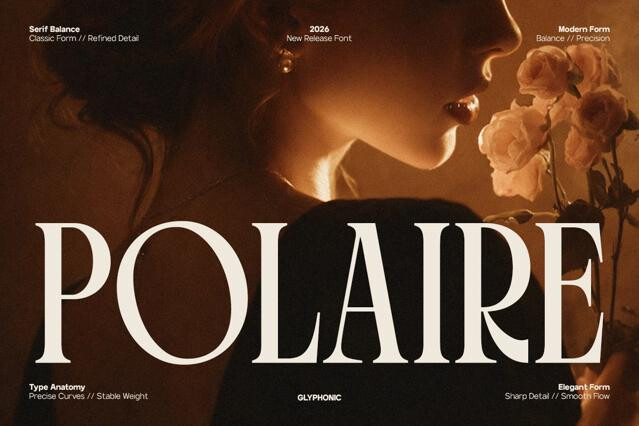
- Elongated serifs — elegant and editorial with vertical drama.
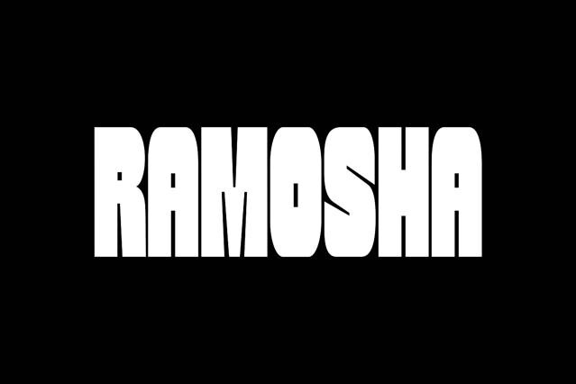
- Compressed display fonts — maximum impact in minimal width.
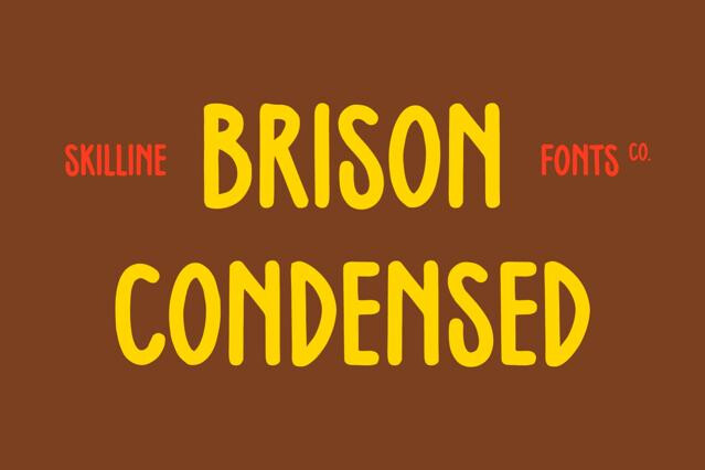
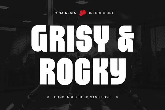
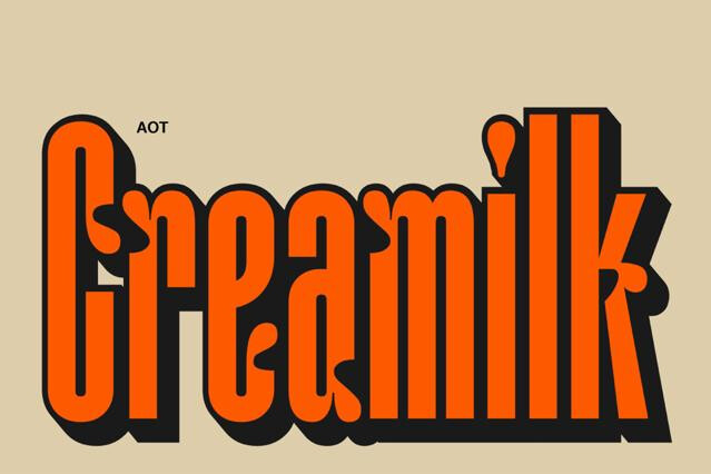
- Tall decorative styles — distinctive, characterful headline options.
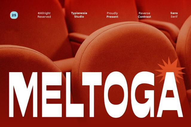
- Stencil and industrial cuts — narrow forms with a structural edge.
Making the most of the vertical
Tall fonts reward designers who commit to the format. Stack words, set tight, confident headlines, and give the lines enough leading that the elongated letters feel deliberate rather than squeezed. Keep them in the display role and let a wider companion handle the body copy, so the height becomes a feature instead of a legibility problem.
They're closely related — "tall" describes the overall vertical emphasis, achieved through condensed width (narrow letters) and/or elongated height (extended ascenders and caps). The shared effect is type that emphasizes the vertical, reading as elegant, dramatic, or space-efficient.
They pack more characters into limited width, which is invaluable for long headlines, narrow columns, packaging panels, and layouts where horizontal space is tight.
Extreme condensation can close up counters and reduce legibility, especially at small sizes.
Fashion and editorial, posters and headlines, packaging with narrow panels, architectural and luxury branding.
Many condensed families offer multiple widths, and some are variable across a width axis, letting you tune the narrowness precisely. Width options are noted on the product page.