
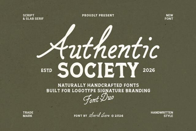

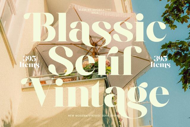
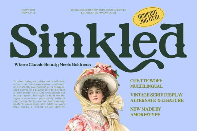
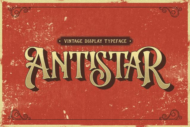
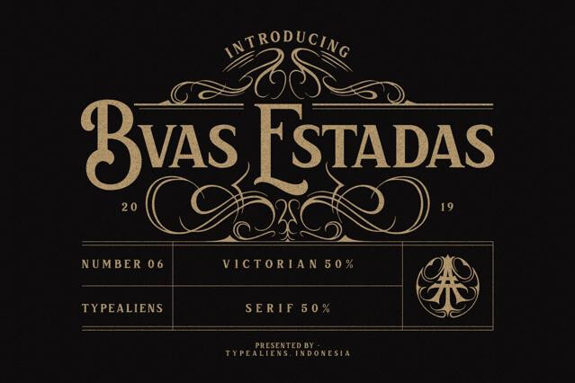
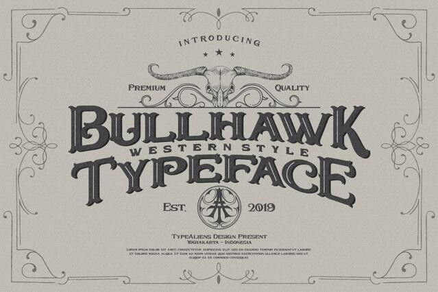
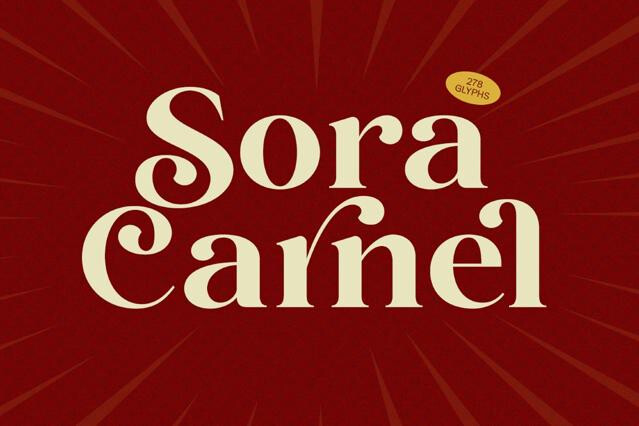
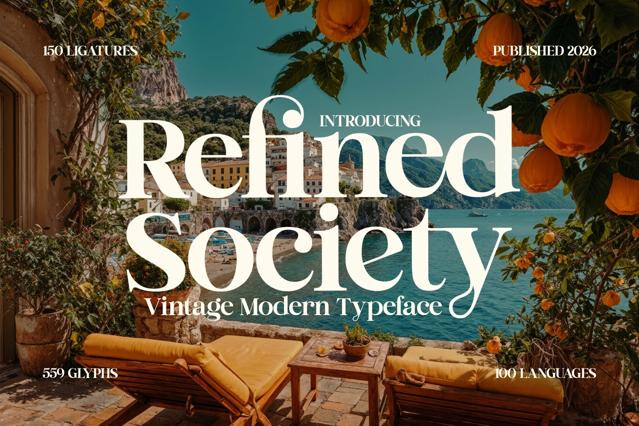
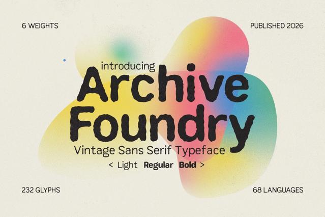
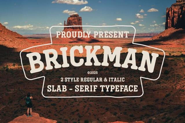
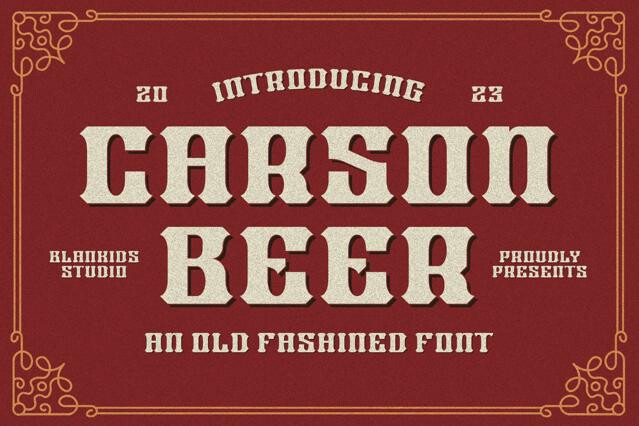


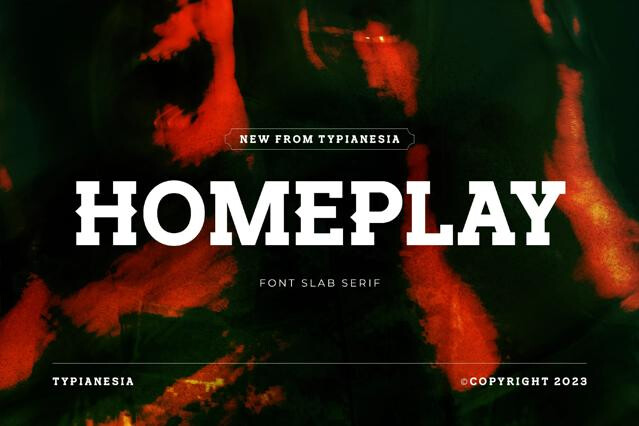


Vintage fonts for heritage branding and period-authentic design
Vintage fonts carry history in their bones. The worn terminals, the period proportions, the honest imperfection of old presswork — these are the details that make a layout feel discovered rather than designed, and we've gathered the fonts that summon that feeling convincingly.
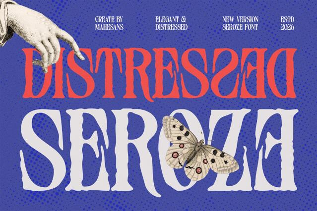
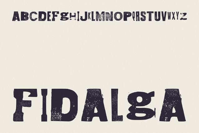
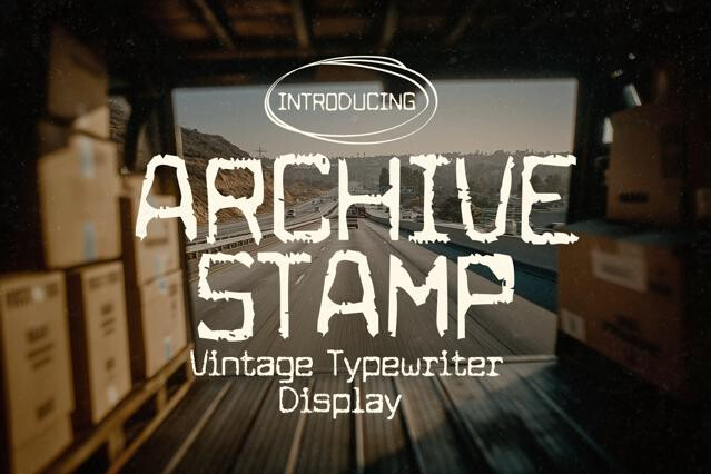
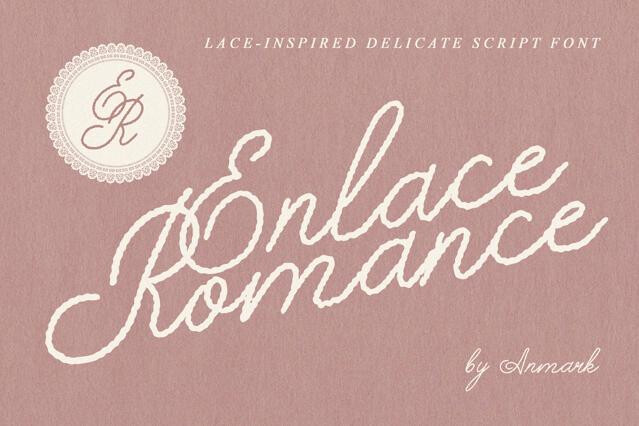
The collection reaches back to early-20th-century type specimens, hand-painted shopfronts, and the rough texture of letterpress and screen printing. Some fonts arrive pre-aged with built-in distress; others are clean period designs you can weather to taste.
Telling vintage from retro
It's a distinction worth holding onto. Vintage aims for genuine age and authenticity — type that could plausibly have existed decades ago. Retro quotes a specific era with a knowing, stylized nostalgia. We keep them separate because the projects that need one rarely want the other.
What a vintage font does well
Vintage type tells a story of tradition and craft before a single line of copy is read, which is why it anchors a particular set of projects:
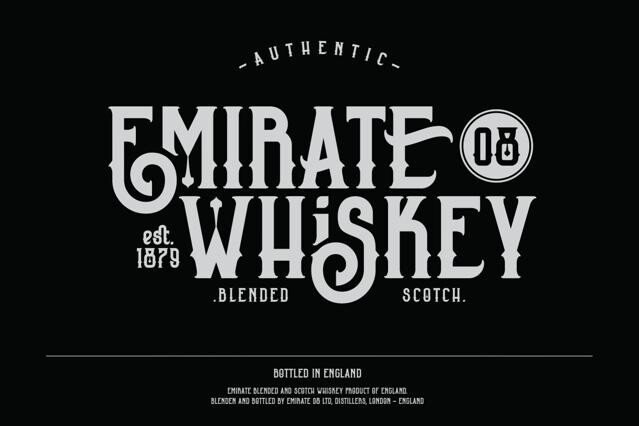
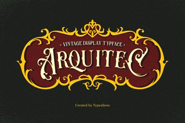
- Heritage brand identities and "established in" wordmarks.
- Beer, spirits, and coffee packaging with an artisanal claim.
- Barbershop, workshop, and trade signage.
- Editorial features and posters with a historical mood.
- Apparel and merchandise leaning on authenticity.
Aging gracefully, not loudly
Texture is powerful and easy to overdo. Heavy distress clogs at small sizes and turns a tasteful nod to the past into costume when it's applied everywhere at once. We'd use one strong period font with room around it, test the worn cuts at final size, and let the restraint read as heritage rather than pastiche.
Vintage fonts evoke a genuine sense of age and period authenticity — they feel like artifacts. Retro fonts reference a specific recent era (the 60s through 80s, often) with a stylized, nostalgic wink. Vintage is about feeling old; retro is about quoting a decade.
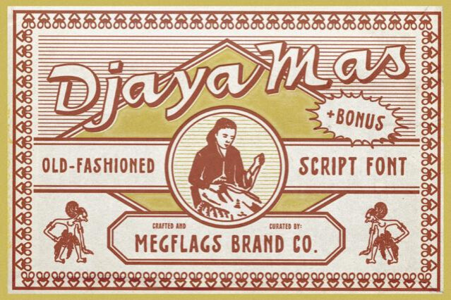
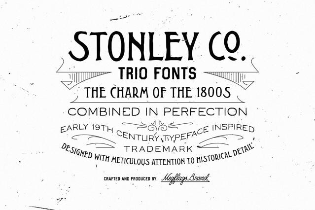
Some do — distressed, rough, or letterpress-style versions are common — while others are clean designs in a period style that you can age yourself. Product pages note when textured or distressed cuts are included, which matters if you want grit without faking it in post.
They take a little more care. Heavy distress can clog at small sizes and may not scale cleanly, and rough edges sometimes need a high-resolution export to hold up in print. We'd test them at final size early rather than at the end of a project.
Heritage and craft branding, beer and spirits packaging, barber and workshop signage, editorial features with a historical angle, etc.
Yes, when used with restraint. A single well-chosen period font set cleanly, with generous space and a modern layout grid, reads as considered heritage. The kitsch creeps in when everything is distressed at once.
Coverage varies, and some authentic styles have limited character sets by design. If you need full punctuation, accents, or specific ligatures, check the glyph map on the product page before committing.