


Wedding fonts for invitations, monograms, and celebration design
Wedding fonts carry more weight than most type ever will. They spell out names, dates, and promises that people keep forever. We've gathered types equal to that responsibility: flowing scripts, refined serifs, and delicate supporting designs to make a couple's stationery personal and bespoke.
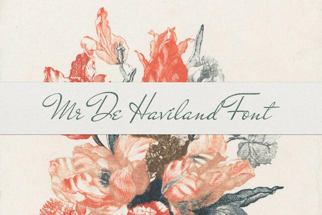
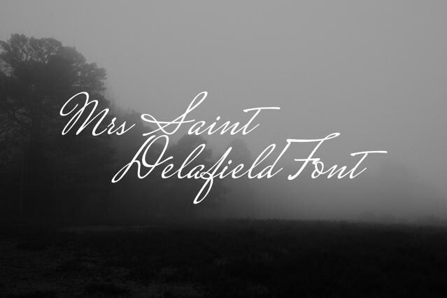
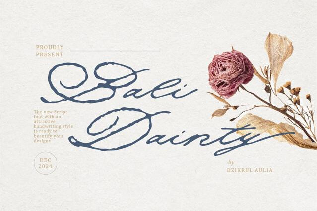
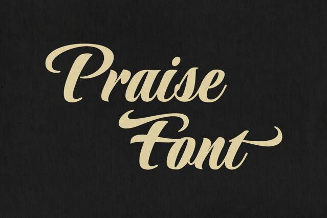
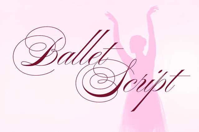
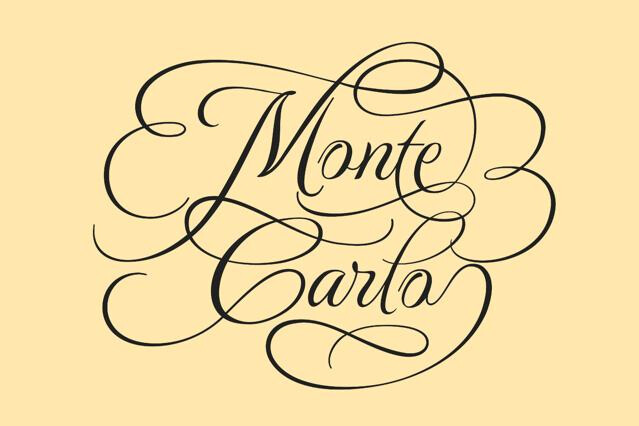
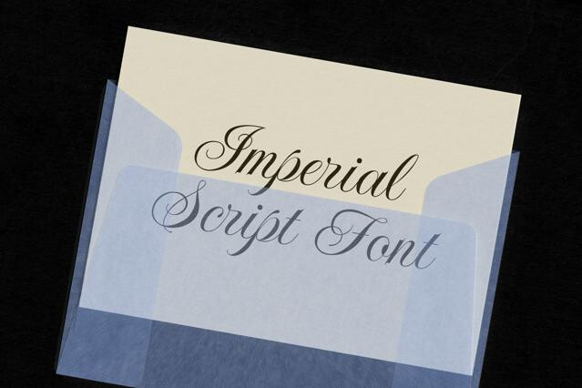
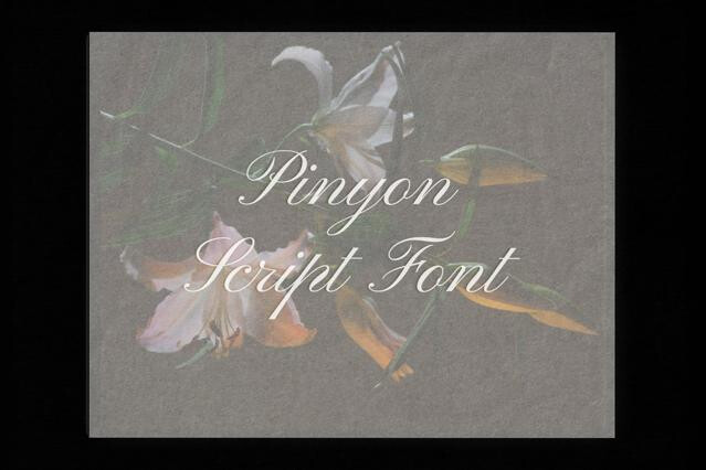
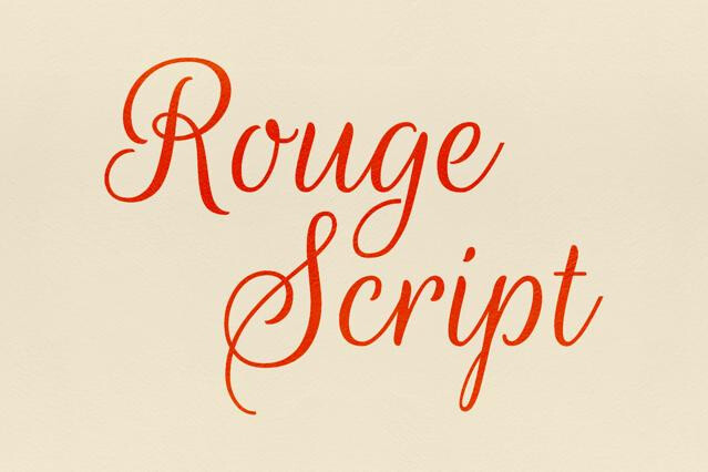
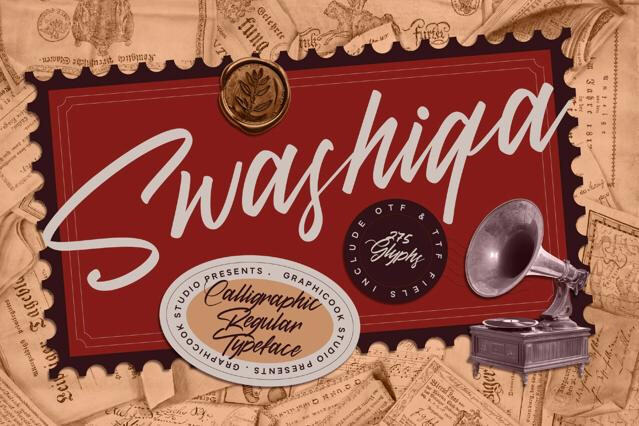
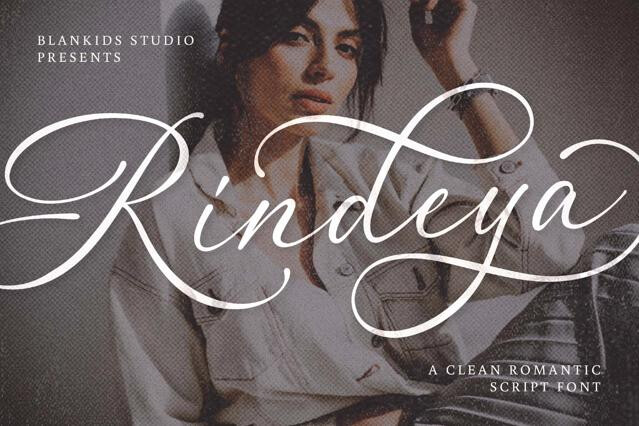
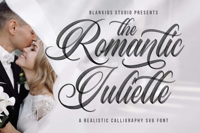
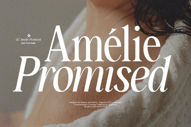
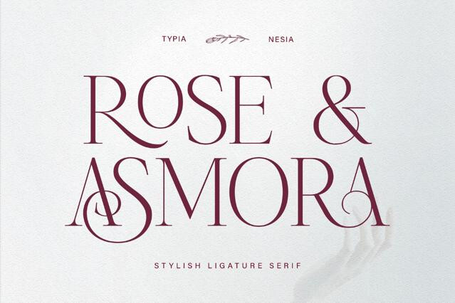
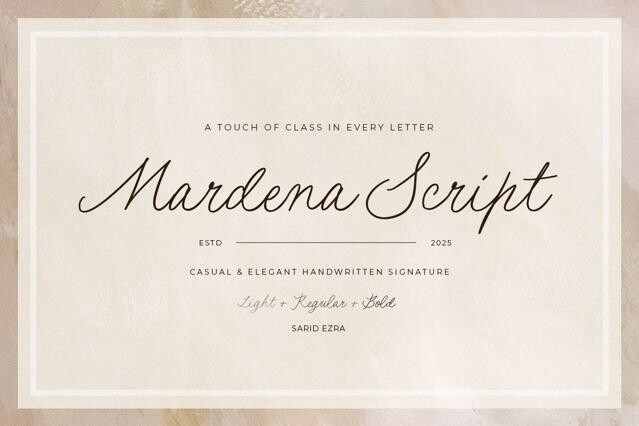
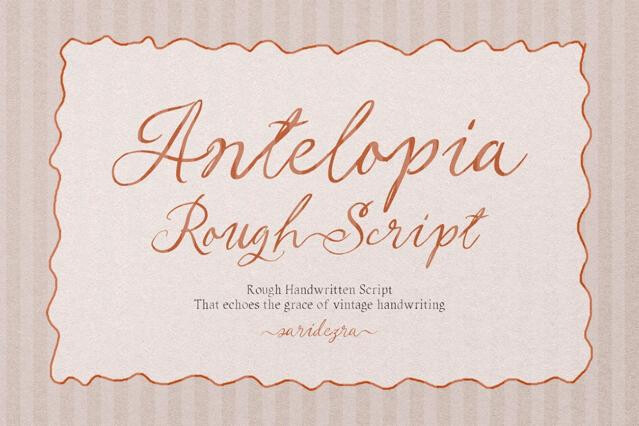
This collection leans into romance. Many fonts ship with the swash capitals, ligatures, and alternate glyphs that let you shape two names into lettering that looks made for them alone.
Building a suite, not a single font
Wedding work is rarely one piece. A coherent suite usually rests on a small, disciplined palette:
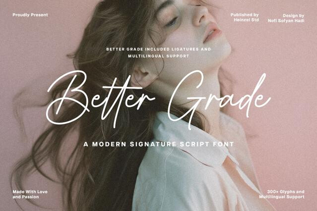
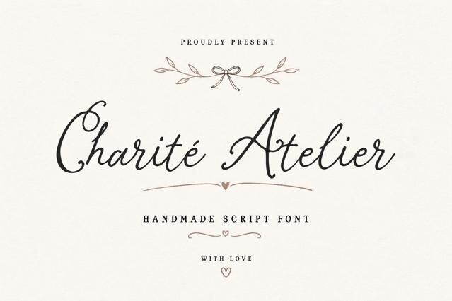
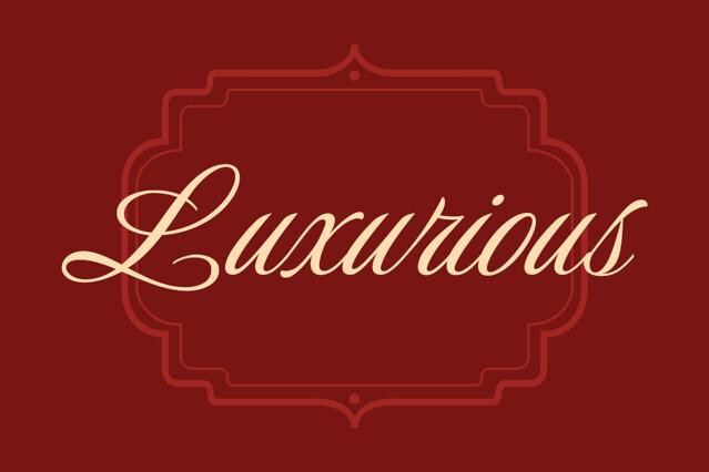
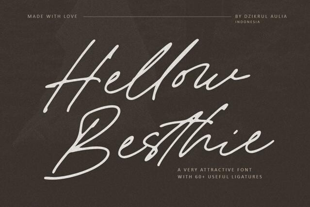
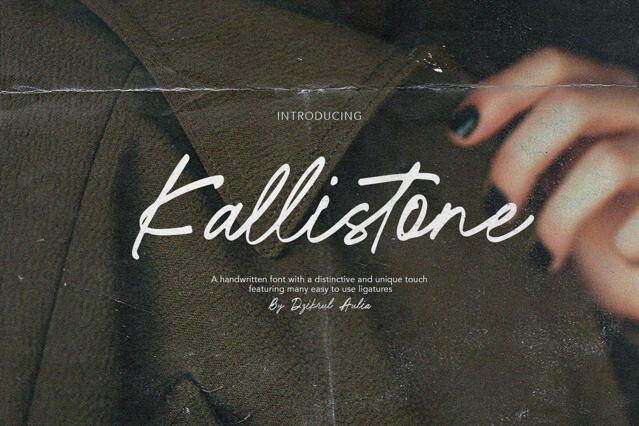
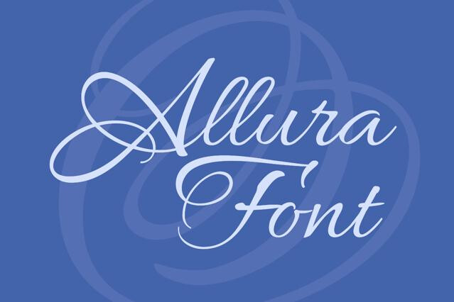
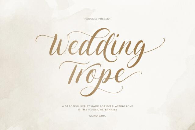
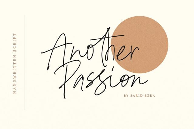
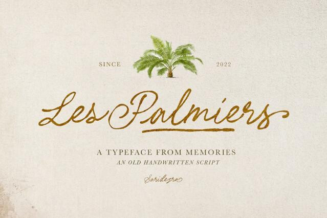
- An expressive script for names, titles, and the emotional headline.
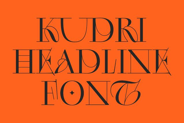
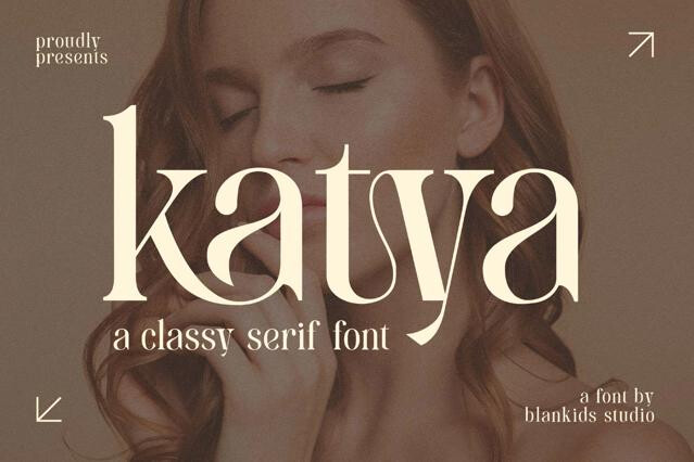
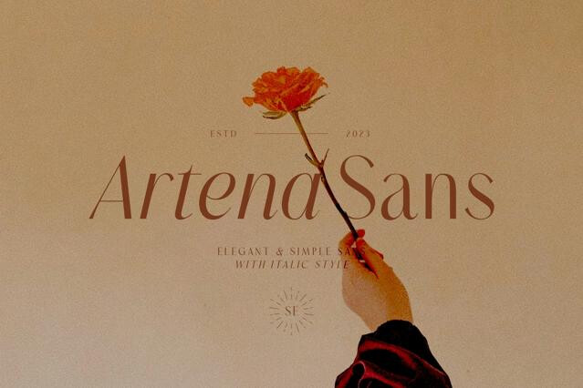
- A refined serif or clean sans for dates, addresses, and details.
- Consistent pairing carried across invitations, menus, place cards, and signage.
Why the alternates earn their keep
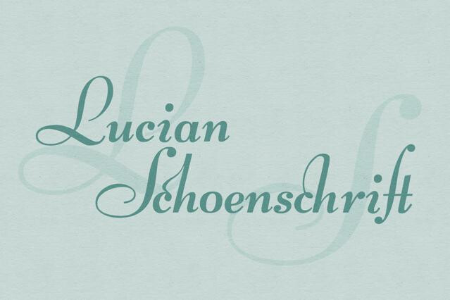
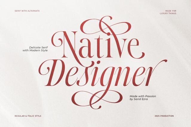
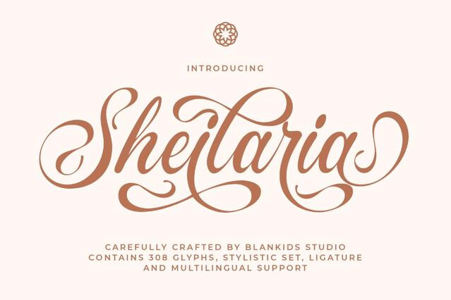
The names are the whole point, and that's where OpenType features do quiet, important work. Swash capitals, contextual alternates, and ligatures let you tune the exact letters in a couple's names into something graceful and one-of-a-kind.
Proofing before you print
Wedding stationery lives or dies in the print, and delicate type is unforgiving. High-contrast scripts and fine serifs can drop their thinnest strokes on textured or uncoated stock, so we'd always run a proof at final size on the actual paper before the full run.That’s the place to catch a vanishing hairline is on a sample, not on two hundred invitations.
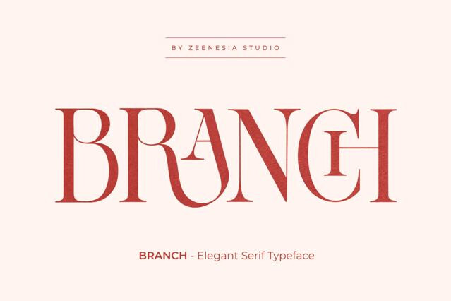
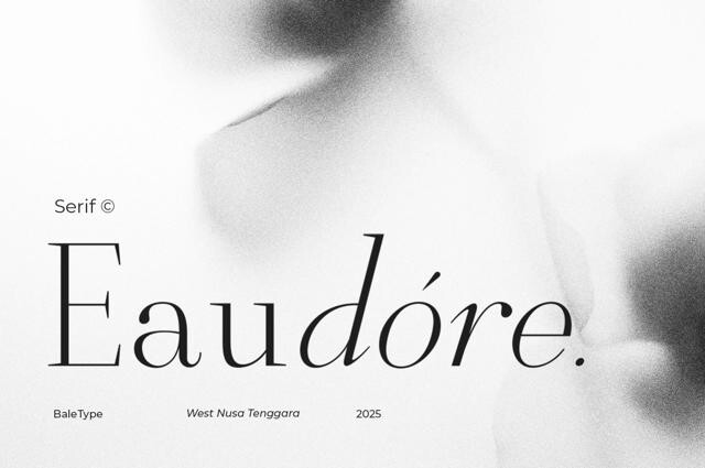
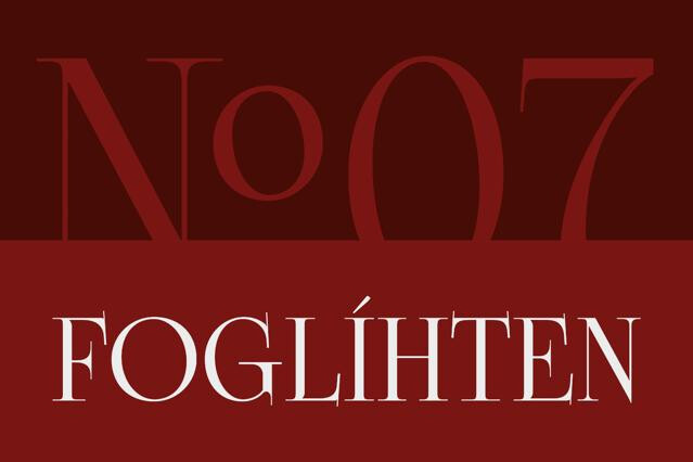
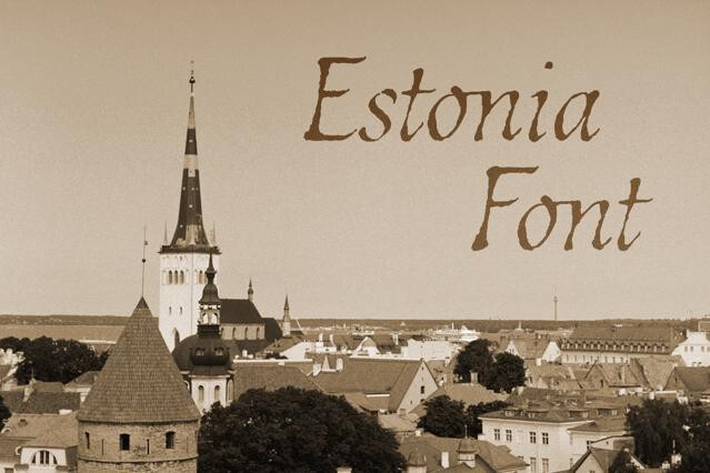
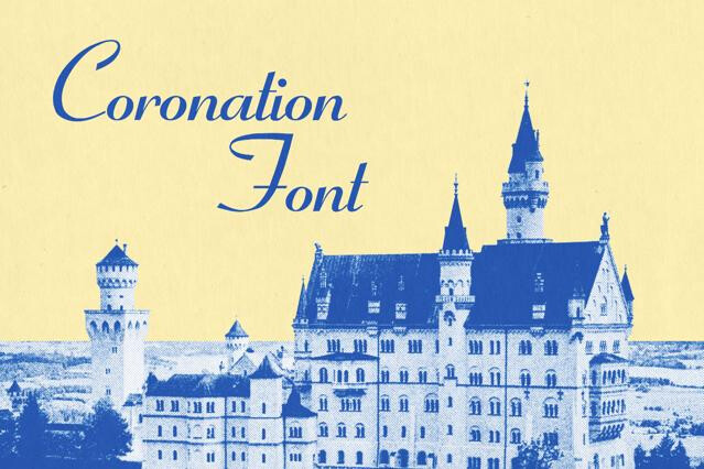
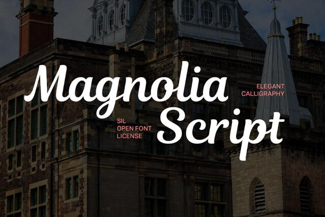
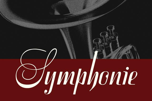
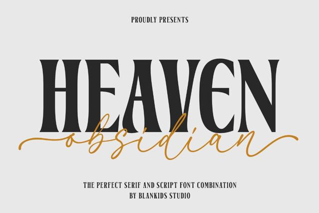
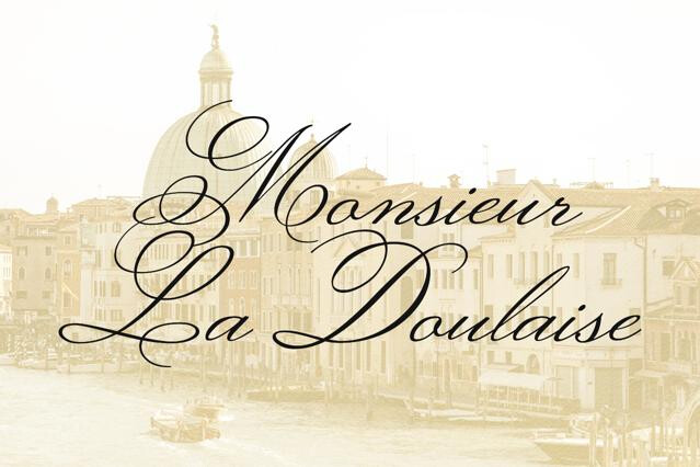
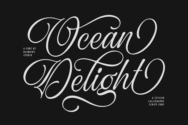
Flowing formal scripts, high-contrast elegant serifs, and clean modern sans for the supporting details are the classic trio. The script usually carries the names and headline; the serif or sans handles dates, addresses, and logistics for legibility.
A couple's names are the emotional centerpiece, and swash capitals, ligatures, and alternate glyphs let you tailor those exact letters into something that feels made for them. These OpenType features are what turn a stock font into bespoke-looking lettering.
Keep one expressive font for names and titles, and one or two restrained fonts for everything else. Consistency across the invitation, menu, place cards, and signage is what makes a suite feel designed — so we'd build the whole set from a single small palette.
High-contrast scripts and fine serifs can lose their thinnest strokes in small print, especially on textured or uncoated stock. Test a proof at actual size on your chosen paper before committing to the full run.
Many do, but coverage varies and some elegant fonts have limited glyph sets. If the names or guests' details need specific accents or non-Latin characters, check the character map on the product page first.
Absolutely — engagement parties, anniversaries, upscale dinners, and elegant brand launches all draw on the same refined, emotional typography.